&#x;
A special pro-level font package for The Futur-ists
It’s one thing to invest in others and another thing to invest in yourself. But what if you could do both?
We’ve partnered with the incredible team at The Futur (YouTube, Instagram) to present this investment in yourself and your business, and ultimately to help you invest in your clients. This pro-level font package has it all — fonts for display, for text, and for multipurpose use.
We’ve partnered with the incredible team at The Futur (YouTube, Instagram) to present this investment in yourself and your business, and ultimately to help you invest in your clients. This pro-level font package has it all — fonts for display, for text, and for multipurpose use.
In this 20-font package we’ve included six display styles, two styles specifically for setting text, and another three families of four styles each (the regular, italic, bold, and bold italic in each family for 12 total more) for general purpose use. Let’s take them one at a time to see this deal’s incredible range.
Display styles: For large headings, posters, billboards, and for happy eyeballs.
- Temeraire Italienne Italic: By design this reverse contrast style flows and bends in ways not in step with the rest of the family. All the weight has been pushed to either hemisphere within each glyph, resulting in a display style that demands space and peacefulness around it so its presence can impress.
- Temeraire Display Black: An historically grounded exploration into salvaged styles, intended for attention, reference, and modern use. This one style comes from expressive gravestone artistry. The details most easily noticed are the ‘g’ with its descending bowl that has been pressed back up in the centre, and the additional serif on the ‘t’ crossbar that holds its neighbour at bay.
- Fino Stencil Medium: Titling family that’s stenciled in appearance, tapping into the archetypes of drama and contemporaneity.
- Trevor Extralight: Trevor is a narrow, sturdy slab serif — both heavy and kind — arousing sympathy for the subject at hand. It connects with others by consciously riding the line between being personal and commanding, inky and rounded.
- Molto Fat: A slab serif font family that is a tonal master, tempering toughness with exuberant flourishes. Molto’s weights set the stage for a surprise — alternate swash capital letters act as refined garments laid atop its concrete skeleton.
- Catalpa Heavy: Catalpa was made to be an overwhelming headliner, like the quirky and hulking wood type that inspired it. Being a display family is its single-minded purpose.
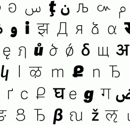
- Noort Regular and Italic: The designer’s complex job of layering information and stylistic design choices can be balanced by Noort’s easily-read nature and analogue details.
- LFT Etica Sheriff Regular, Italic, Bold, Bold Italic: The perfect slab serif to take on various tones and communication types. It attracts the reader with its headline swagger and retains its plainspokenness in conversational paragraphs.
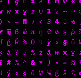
- Soleil Regular, Italic, Bold, Bold Italic: (If we tell you that this is Ben Burns’ favorite, does that make a difference? It’s in this package at his personal request.) A sans serif font family that excels in geometric tranquility. Where other geometric typefaces lean toward the austere or bland, Soleil gives slight hints of a real personality and bring what could have been another tasteless sans into our current time.
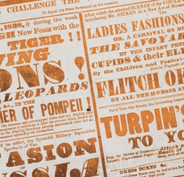
- Coranto Regular, Italic, Bold, Bold Italic: The late and celebrated Dr Gerard Unger created this refined serif newsface with distinctive character and clarity, able to create an ambience and give editorials a clearer identity of their own.
The whole bundle spans from overwhelming sans headliners and refined, logo-worthy families to hearty slab serifs, a do-it-all modern sans, and newspaper-proven serifs. We’ve never created a package this wide-ranging and high calibre, but when The Futur said they wanted to offer something unbeatable, we made sure it was one for the books.
This entire bundle is normally $900. But for the next two weeks only, we’re making it available to you for only $149, which is about 85% off.
We are so excited to get this into your digital font library to help you on your design journey, so create your account and then hit the big red button at the top of the page to download the entire bundle at one time.