Noort Bengali in progress
March 2021
The award-winning Noort family was expanded with display styles a little over a year ago. Now, Juan Bruce is busy preparing a Bengali companion to Noort, with help from our very own Pooja Saxena.
The award-winning Noort family was expanded with display styles a little over a year ago. Now, Juan Bruce is busy preparing a Bengali companion to Noort, with help from our very own Pooja Saxena.

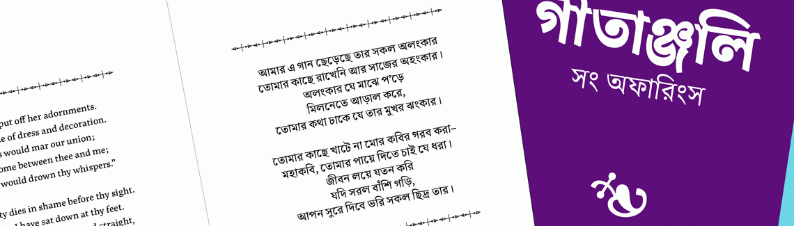
For the last few months, type designer Juan Bruce — winner of TypeTogether’s second Typeface Publishing Incentive Programme (now the Gerard Unger Scholarship) — has been working on the Bengali complement to his Noort family, with support from our very own Pooja Saxena, who is providing advice on the design and completing the necessary OpenType engineering. Noort Bengali is a spirited design which borrows enough from its Latin sibling to echo its texture and typographic colour, but stands just as well on its own. Recognisable by its interrupted headline, it has a lively appearance on the page, achieved through artful mimicry of pen-lifts that occur during handwriting.

In working with Bengali, Juan observes that it is quite apart from other Indic scripts that also have a headline. He describes Bengali as being much more dynamic: “It has prominent diagonal strokes and flourishes, as well as rounded terminals that make it unique. These traits give it a rich and angular texture.” Juan also recognises that working on a multi-weight Bengali typeface family is not without its challenges. “It is difficult to maintain consistency and to balance stroke weights, so I have taken special care to open up the counters so paragraphs have air from within,” he says.

One major feature that makes Noort Bengali distinctive is its interrupted headline. Juan explains, “The headline in Bengali is usually generated in tandem with the in- and outstrokes of the underlying letter, rather than being added independently after all the letters that make up a word are written. Noort Bengali maintains this calligraphic fluidity, but the headline is not entirely curvilinear; like the letters in the typeface, it has a constructed design.” The visual effect created by the broken headline is further exaggerated by introducing a large number of interruptions, which give Noort Bengali its unique appeal.
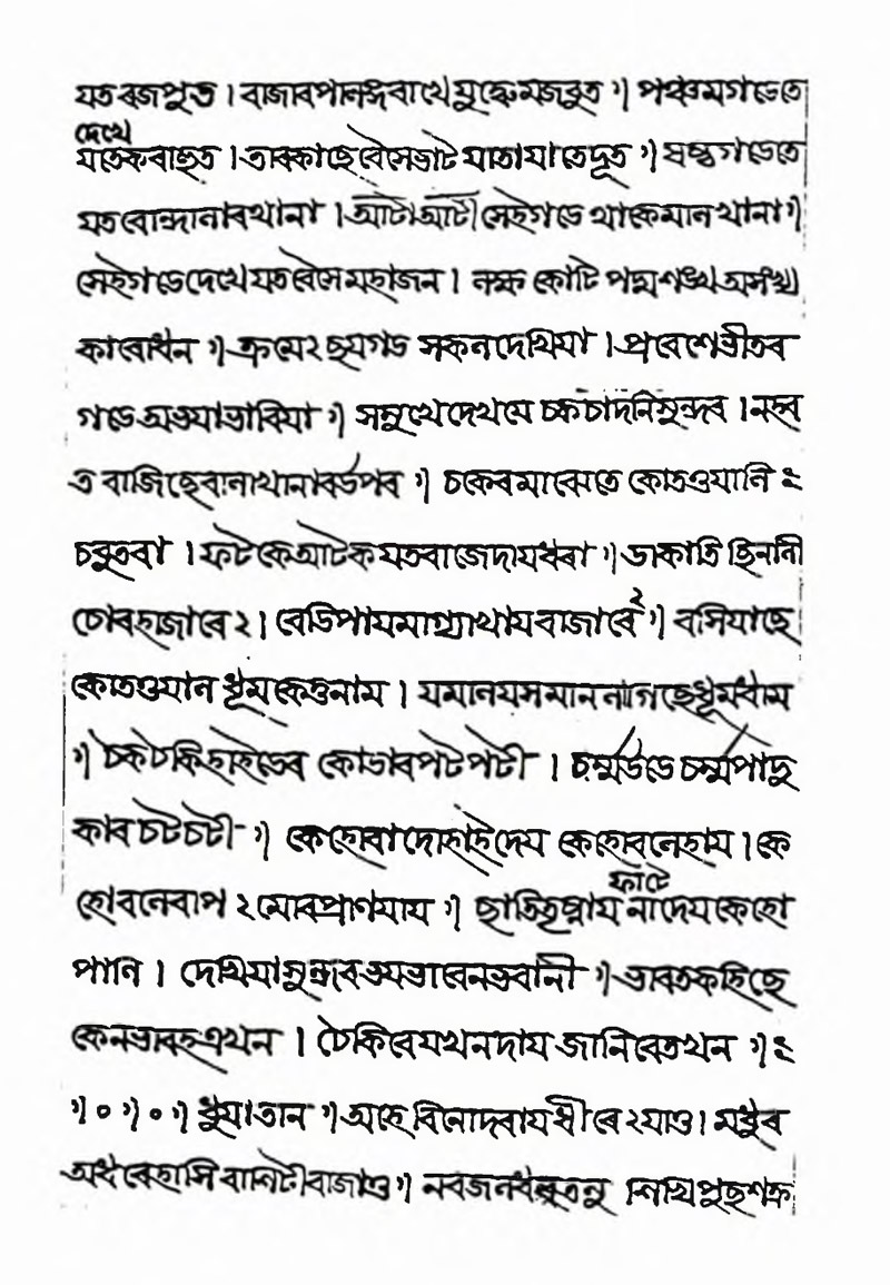
Bengali manuscript: BL MS Add. 5593 - Vidyasundara. From Fiona Ross, The evolution of the printed Bengali character from 1778 to 1978, thesis submitted in 1988, University of London.

Noort Bengali’s headline breaks, instrokes, and outstrokes.
Noort is not the first typeface to highlight this feature of handwritten Bengali. In 1826, the Baptist Mission Press in Calcutta (now Kolkata) published Specimen of Printing Types in use at the Calcutta Baptist Mission Press. Its design named Bengalee Type No. III used a curved headline in lieu of a straight horizontal one, which was already common in metal type.
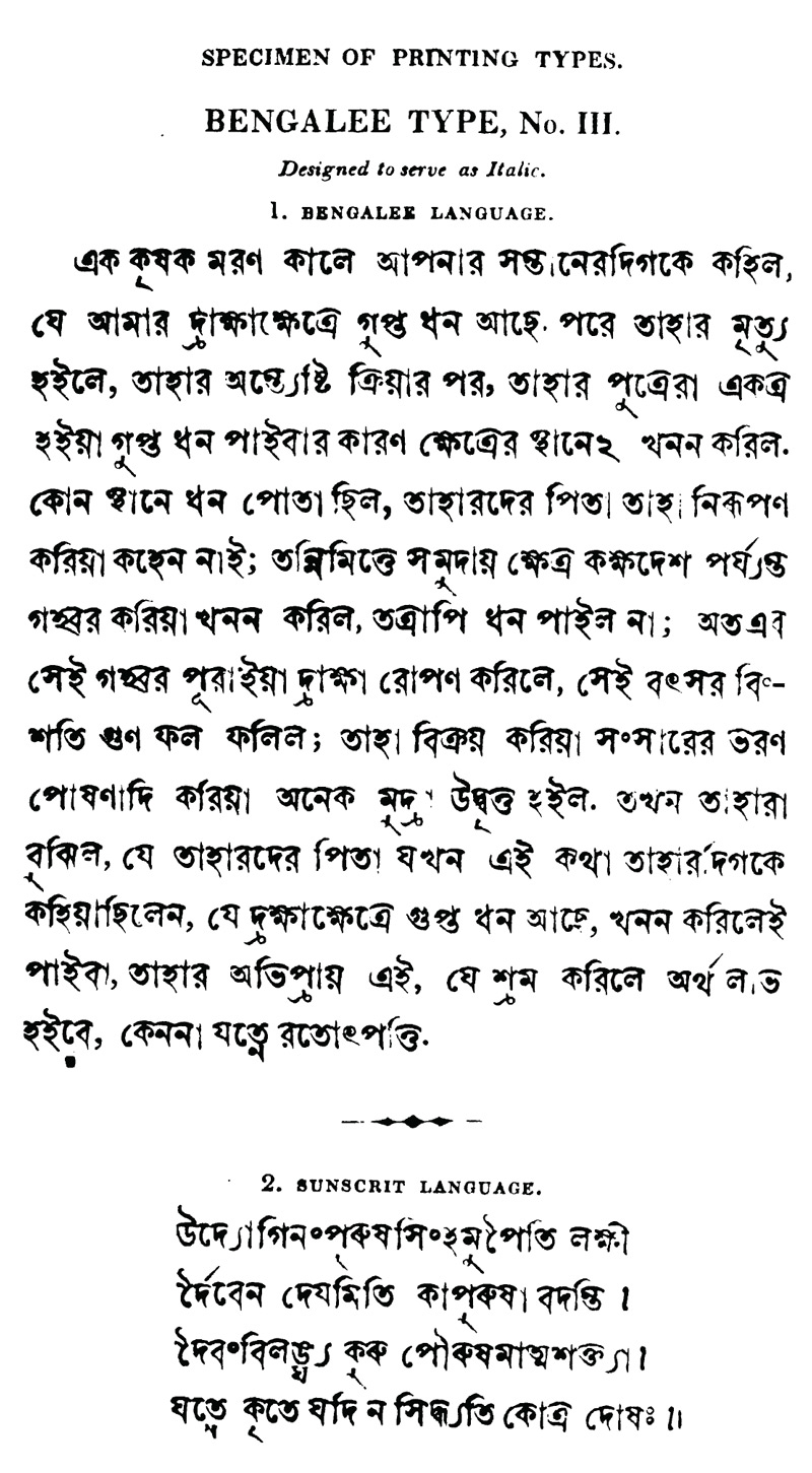
‘Bengalee No. II’: (BM II), from Fiona Ross, The evolution of the printed Bengali character from 1778 to 1978, p.141, thesis submitted in 1988, University of London. .
Designing a Bengali font family is a delicate dance between drawing delightful curves and paying due attention to the script’s shaping intricacies. Building on a foundation of research, Juan and Pooja have been working closely with each other to harmonise these two threads to create a family that represents the Bengali script beautifully and responsibly.

We at TypeTogether are thrilled to add yet another script to our oeuvre, especially one that is used to write languages spoken by over 200 million people, and hope this preview piques your interest too!
TypeTogether is an indie type foundry committed to excellence in type design with a focus on editorial use. Additionally, TypeTogether creates custom type design for corporate use. We invite you to browse our library of retail fonts or contact us to discuss custom type design projects.
Schedule an introduction meeting to learn more.