A sans like no other: designing Arlette

March 2021

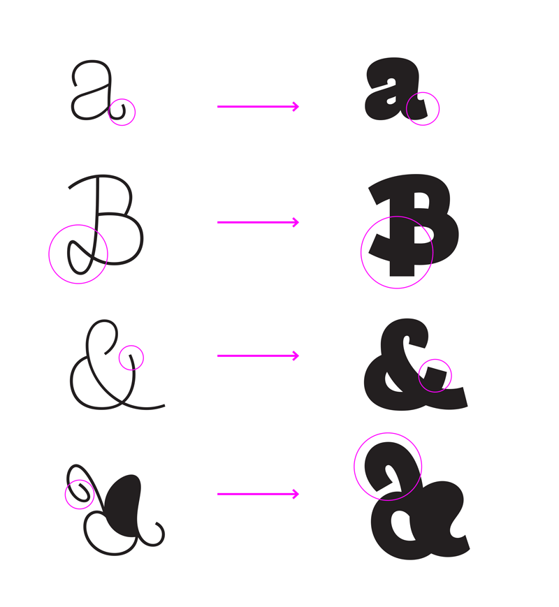
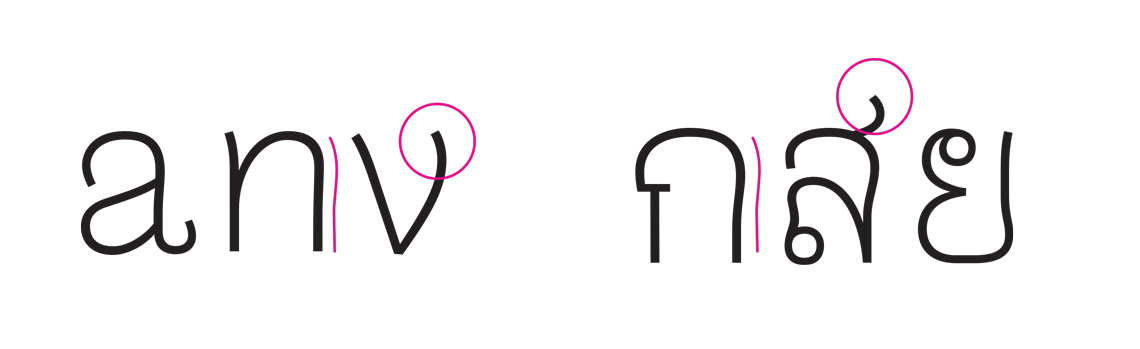
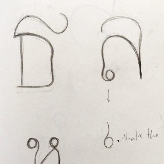
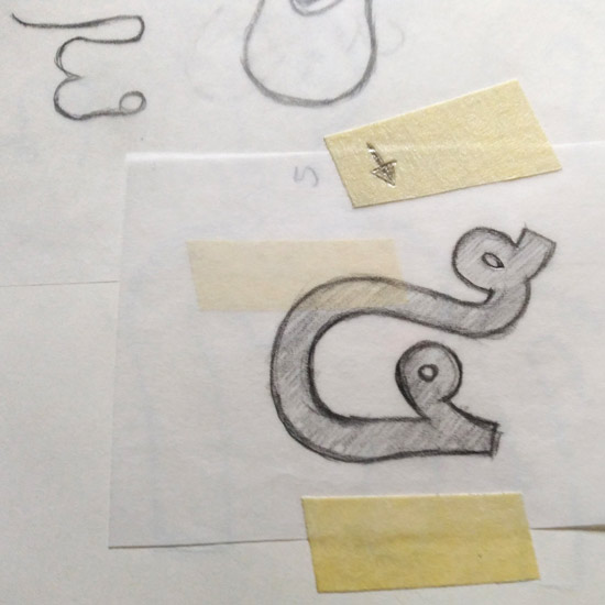
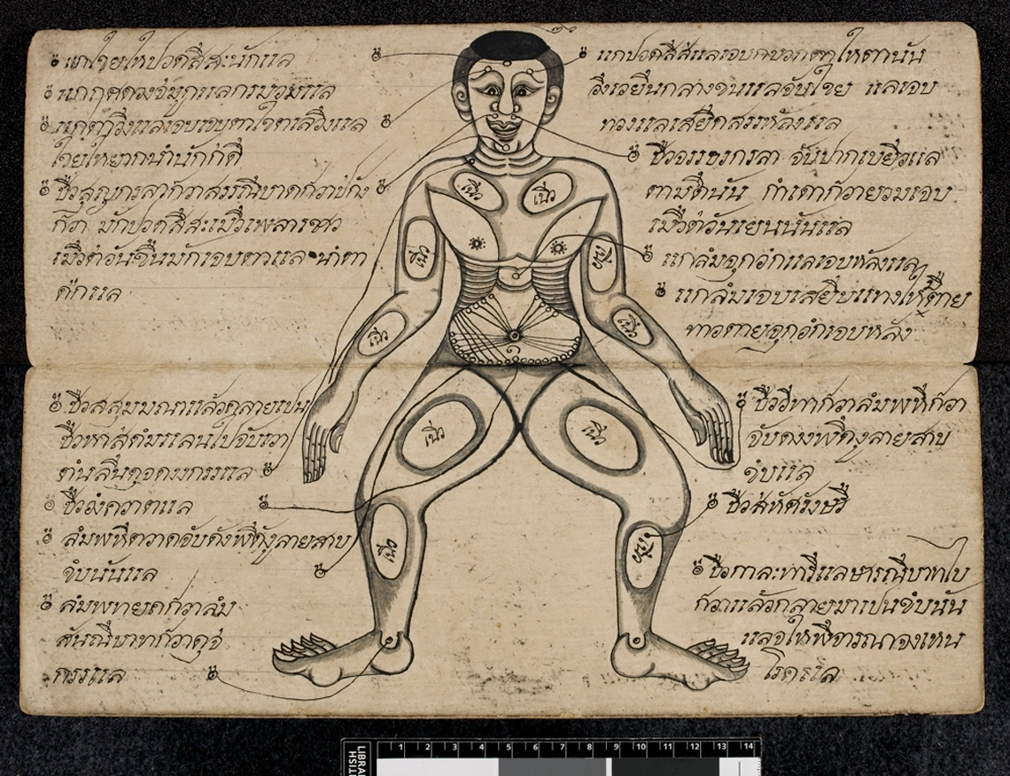
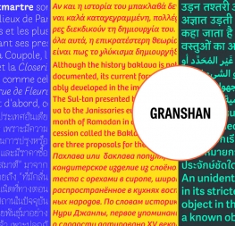
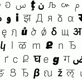
One of the most unique and invigorating multiscript typefaces in our catalogue is Arlette by Pilar Cano and Ferran Milan. It comes in Latin and Thai and is a category-expanding sans serif font that’s part experiment and part modern update. In this article Pilar gives a look at its inspiration and design process, from sketch to finished work.


ArletteEarly sketches of Arlette’s swashes, 2014


Choc full of inspiration

For a long time we had been captivated by the beauty of Roger Excoffon’s typefaces and his artistic background present in all his work. He had a unique way of designing, full of energy and experimentation. This approach of working on type design as if it was an art piece is what caught our attention to the point of wanting to design a typeface using the same approach.

So the main concept of Arlette’s development is Roger Excoffon’s work: in general his experimental approach to type design, more specifically his typeface Choc, and even more specifically its lowercase ‘c’. Its fast stroke movement and its energy fascinated us.


Choc, typeface designed by Roger Excoffon for Fonderie Olive, in a type specimen from the 1950s. Image from Letterform Archive.


But inspiration is just the starting point. As soon as we had something we thought was worth developing, we abandoned Choc and started working just from the ‘c’ of Arlette. It all came along very naturally after that.


Novelty for all

We also wanted to experiment with the weights of the family, but with having such novel shapes already, it was a challenge to push it to its limits. Excoffon’s body of work is filled with handwriting typefaces. In a similar way, we pushed the character set by experimenting with swashes. We took them out of their natural italic environment and placed them also in the romans.

Furthermore, we developed swashes for accented and special glyphs, adding this feature to all the languages we cover instead of relegating it to a few languages. To implement those complex shapes into the heavier upright styles was an interesting experiment, and for it to be successful we had to find a way to simplify some shapes in the darkest weights.

Our second inspiration source was the concept of the sans serif itself: what is it that defines a sans and what makes them so enduring and useful? Like all design, font use goes through cycles and sans serifs have grown in popularity since the 1990s. This caused many sans serif designs — often similar and uninspiring — to flood the market; we find these are of little interest unless they are needed for a specific purpose.

So combine the energy of Excoffon’s ‘c’ with our belief that more (and different!) could be done in the sans serif genre, and Arlette is our answer. It is our interpretation of a sans serif and a reaction to bland uniformity.


Thai it together

Arlette’s Thai was an even more complex experiment. It is always challenging to match two very different writing systems under the same type family, even more so in this case where the Latin is already quite complex. We took the same fast stroke curves and extravagance from the Latin, which adapted very naturally to the Thai.

It is important when matching scripts not to impose anything from one onto the other. What can be translated is the way curves are built, their flow and energy, some details like the terminals, and the overall colour of the text. Those three elements (plus matching the proportions) are enough for the scripts to register as one family.

It is also important to take into account the tool traditionally used to write each specific script. In this case Thai uses a stylus, which is perfect for a Latin sans serif since the stylus produces monolinear letterforms.


Type of curves and terminals are crucial tools in the relationship between two different writing systems.


Sketches exploring the possibilities for Arlette Thai, 2015


Flair trade

We also looked into adapted the idea of the swashes to the Thai writing system. We did not want to impose a Latin feature onto another script so we looked at handwritten palm leaves, searching for clues based in Thai tradition. Are swashes normal in Thai or are they not accepted? We would have been fine not having these decorative characters in the Thai, but we found that some historical characters had a purposeful, added flair.


Palm leaf manuscript: Manual for pressure massage, believed to have been produced at Wat Phrachetuphon, Bangkok, in the first half of the 19th century. Image British Library.


So for Arlette Thai we designed a set of alternate characters inspired by those handwritten forms, only applied in those glyphs which made sense according to what we saw in the palm leaf manuscripts. The marks above characters appear to be very playful in those early examples, with elongated strokes and exaggerated features — exactly what Arlette needed!

Arlette explores the boundaries of the sans serif landscape and returns with forms developed from gestural vigour. With its range of OpenType features and alternates, it has the ability to master an unseen world of countless emotions and physical applications: magazines, branding, editorial, teen and young adult works, book covers, and a host of products and packaging. Arlette uses its eight weights plus italics to speak in Latin-based scripts. The Thai variant has six weights (hairline through bold) to meet every challenge, whether in text or display. Try Arlette Latin and Arlette Thai on our desktop type tester now!


About Us

TypeTogether is an indie type foundry committed to excellence in type design with a focus on editorial use. Additionally, TypeTogether creates custom type design for corporate use. We invite you to browse our library of retail fonts or contact us to discuss custom type design projects.