“No one achieves anything alone”: interview with Anya Danilova
January 2021
The winner of the sixth Gerard Unger Scholarship, awarded by TypeTogether to talented young type designers, is Anya Danilova, a Russian type designer and graduate of the 2019 Type and Media Programme at KABK, the Hague. We talked about expressionism, horse blinders, working alone, and about knowing as the most important thing.
Welcome on board, Anya! Tell us something about your background, how did you become a type lover?
I earned my bachelors at Moscow State University of Printing Arts. During the second year we had a type design course. I was very interested in it and since my class had a ridiculously small amount of time scheduled for that section, I would join another class taught by Alexander Tarbeev.
That next year I went to Tarbeev’s “Type Design Workshop”, which was basically one cozy university building room where people would sit at very old iMacs and make type. This was not in the studies schedule, and meetings would usually take place in the evenings after studies. I created a typeface for my bachelor’s project, and I was lucky enough to get to work as a type designer after graduating. It all was just very fortunate for me, and my love for type design developed rather organically.
As a KABK Type and Media student, you were probably familiar with the work of TypeTogether, right?
Of course! I think back to the days when I thought of maybe establishing a type foundry someday, and TypeTogether was in my mind as a great example of how you can do things when collaborating.
The submission of your typeface Rezak to the Gerard Unger Scholarship was a logical next step then?
Actually, this was one of the few works I’ve ever submitted to a competition in my life!
I like your note that when type designers work alone, sometimes they start questioning everything, want to leave the whole design behind, and start from scratch. How “final” did you consider Rezak, when you submitted it for GUS?
Well, as you know, type designers usually feel that their typefaces are never truly finished; they could always use more tweaking. It was finished to the extent of being able to submit it and to show it in the specimen and process book, but that is not quite good enough or complete enough to publish it for retail sale and normal use.
And how final do you consider it now after the initial rounds of consultations?
I find myself in the luckiest position here because Veronika and José are helping me greatly! They look at what there is and give their opinion on what to change and what to leave as is. This is the perfect approach for me now, since, as I mentioned before, I tend to get too lost in my own thoughts. I would look at my typeface with panic, thinking I need to redo everything, but I wouldn’t know how and most importantly why.
It’s like horse blinders, which can be dangerous for a designer in certain moments. It can lead to focusing too much on wrong things and even going in a wrong direction, wasting an enormous amount of time. When there is another pair or two of eyes, discussions can happen, the field of view expands, and you find yourself knowing what to do next. That knowing is the most important; then it’s only a matter of time to do it since you know where you are going. (And this is the moment when horse blinders can be useful!)
So, how exactly do you expect Rezak to improve thanks to the scholarship?
Starting with the fact of publishing it in the near future, apart from the money and fame (ha!), the scholarship is also a responsibility I have to take on. I don’t want to spend — nor can I afford to spend — 20 years on this typeface before publishing it. I have deadlines now. It works best for me when the deadlines aren’t only in my head.
And the second important thing is that the scholarship is a form of recognition. When someone says you are doing a good job, you are more inspired to continue doing a good job (who would have thought!).
Rezak on the first sight reveals links to the European tradition of early 20th century wood-cut inspired typefaces as an opposite to, or revolution against, the perfectionism of 19th century typography. Were you inspired by Preissig and others of the era?
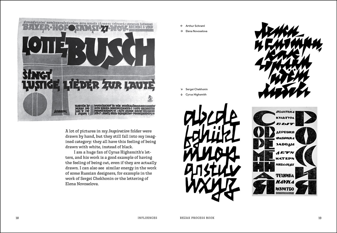
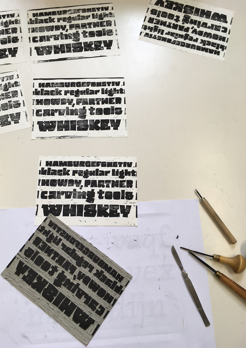
Yes, Preissig, Koch, and Crous Vidal certainly were on the type side of my inspiration. But I always had an affection for wood engravings and linocuts. I even made some linocuts (very bad ones) in my second bachelor year and I always wanted to go back and make more. And indeed, I was a fan of expressionism and its visual revolution: German Die Brücke, for example.
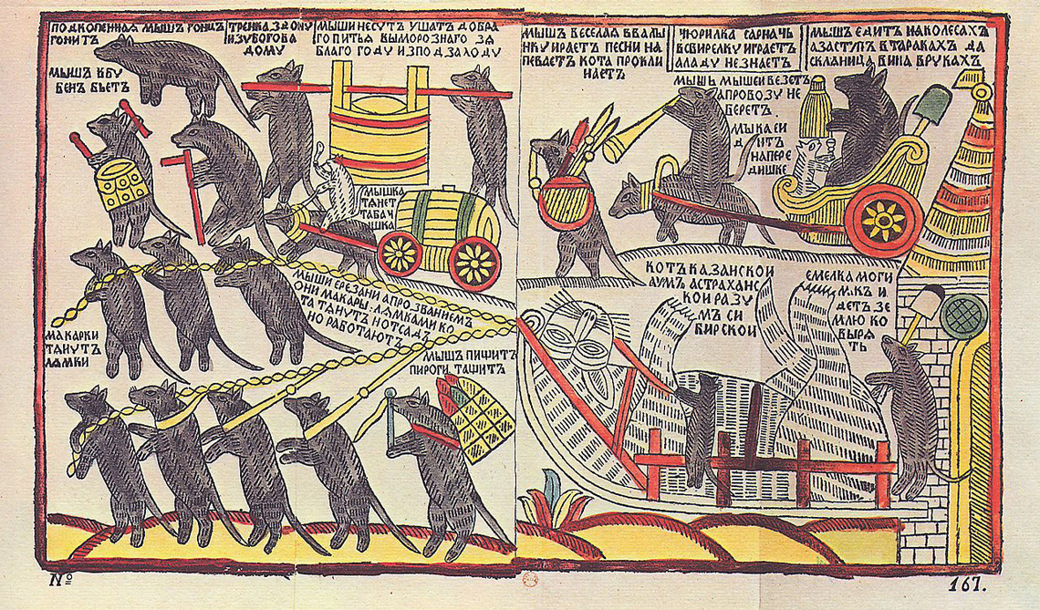
But it’s not only the 20th century that has amazing examples of that raw energy in graphics, as it started with woodcuts in the Middle Ages (and in the Far East much earlier). A good example is the Biblia Pauperum (Paupers’ Bible) designed specifically for the mostly illiterate society of the era — basically it was first comic book, at least in Europe. And since it was made for ordinary people, the graphics are so basic and clear that they become a piece of art themselves. This eventually matriculated to the whole world of amazing woodcuts made for individuals instead of expensive manuscripts. In Russia those woodcuts were called lubki (singular, lubok) and were popular with the masses.
Coming back to present, I also want to point out my admiration and inspiration from Cyrus Highsmith and Elena Novoselova. Whether they are drawing landscapes or letters, you can see their energy — it doesn’t have to be a linocut, but they do cut the white space with their tools.
Can you explain where the name of your typeface comes from? Not everyone is familiar with Slavic languages.
Rezak means “cutter”. I would usually call the box knife (for opening cardboard boxes) or an X-acto knife Rezak. I sometimes would use it for linocut, even though it’s not the main tool for this. I like the harsh sounds this word has, so in the world of nice, soft sounding English font names, I wanted mine to sound sonorous.
Who is Rezak meant for? Florian Fecher, your Gerard Unger Scholarship predecessor, wanted to see the headline “Brexit cancelled” set in his Lektorat. History decided otherwise in his case. What is your dream use of Rezak?
Of course, my thoughts of ideal use for Rezak would most likely differ from the reality, as one never knows what their typeface will be used for, unless it’s made exclusively for some company. So when I worked on it I hardly thought of the usage. (This is considered to be a bad approach in type design world, I know.) But now that I look at it, I could imagine it being used in children books that would have the same type of illustrations — cut-out styles, naïve, and quite expressive.
I also would love to eventually see Rezak somewhere in DIY newspapers or zines. I can imagine seeing Rezak in a local newspaper writing about recycling problems in the neighbourhood, community gardens, or folk art.
TypeTogether has always maintained a very cooperative environment. How do you feel about sole authorship and cooperation in favour of a better result?
I find it the most optimal way of working so far. I think there always has to be someone who takes responsibility, but it’s much more efficient to work with someone. As my favourite fictional character Leslie Knope (from the American sitcom Parks and Recreation) says, “No one achieves anything alone.”
Pages from Anya’s Process Book, featuring some of the pieces from her inspiration folder. Specimen designed by Anya Danilova as part of her KABK Type and Media studies, 2019.
Another source of inspiration for Anya’s Rezak family were lubki prints: cheap and popular Russian prints, originally woodcuts. “The Mice are Burying the Cat”, a 1760s lubok print, that could be a caricature of Peter the Great’s burial or a representation of carnivalesque inversion, “turning the world upside down”
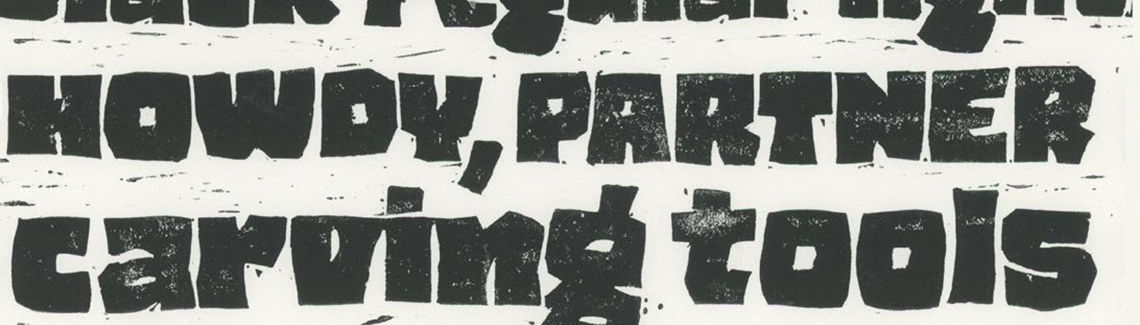
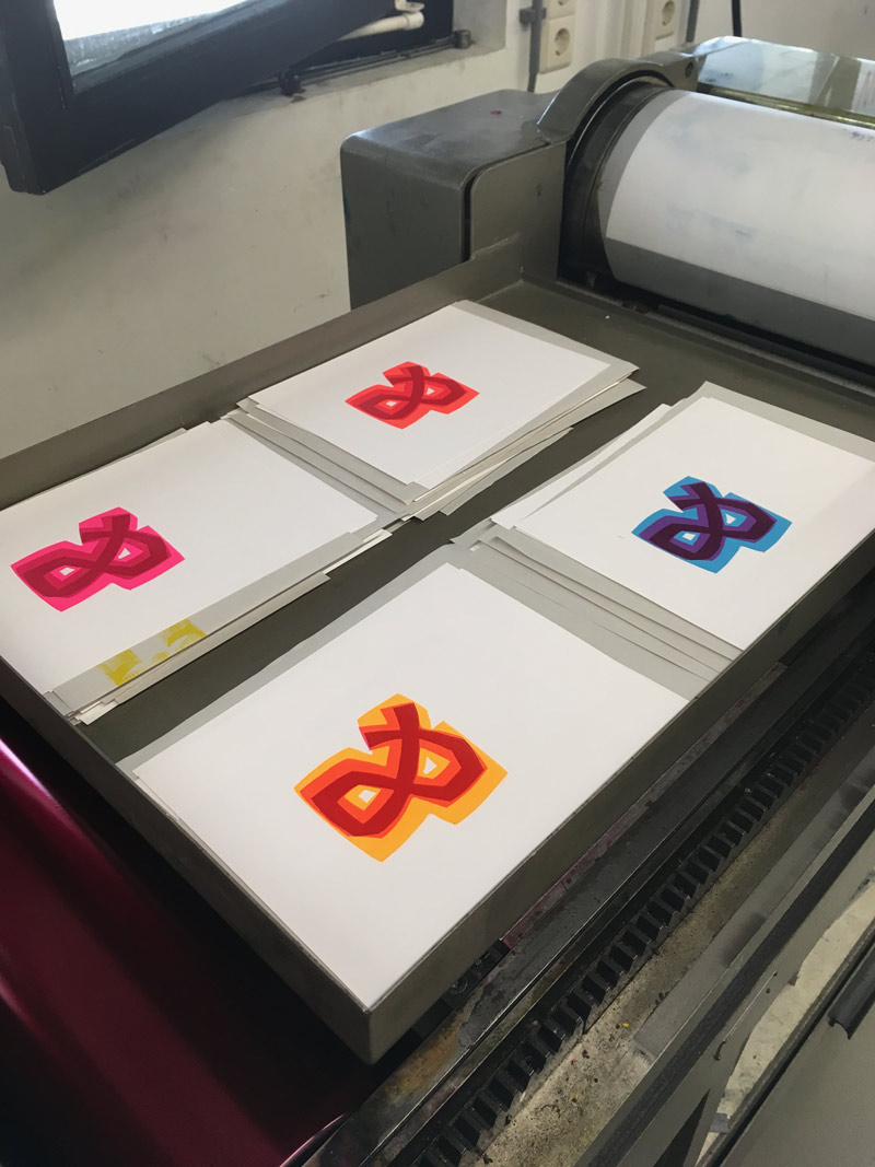
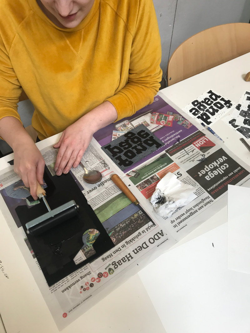
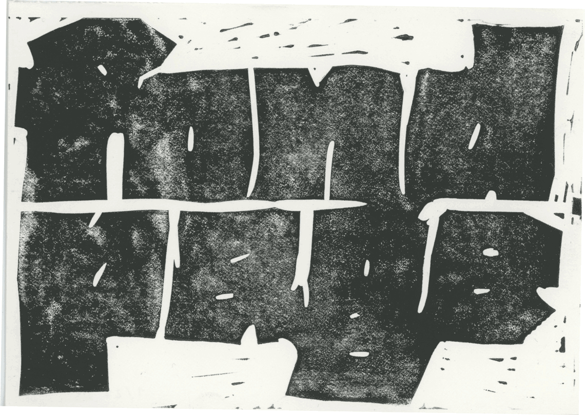
Some of Anya’s linocut experiments to explore the limits of letter shapes.
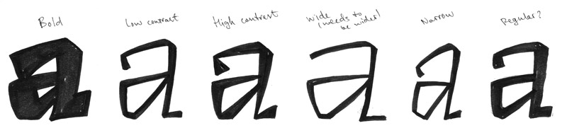
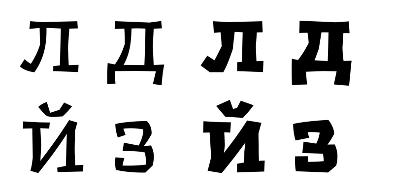
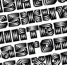
An alphabet using linocut logic was one of Anya’s Drawbot results during her time at Type and Media. This sort of experimentation paved the way for Rezak’s design.
TypeTogether is an indie type foundry committed to excellence in type design with a focus on editorial use. Additionally, TypeTogether creates custom type design for corporate use. We invite you to browse our library of retail fonts or contact us to discuss custom type design projects.