Enjoying the Journey: Interview with Chorong Kim
May 2023
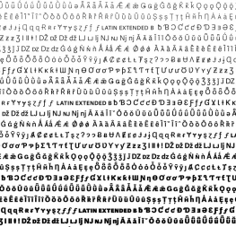
Adelle Sans Korean is the 12th script released in the Adelle Sans superfamily. In this interview, Chorong Kim discusses what it took to create it and how it’s best used.
Adelle Sans Korean is the 12th script released in the Adelle Sans superfamily. In this interview, Chorong Kim discusses what it took to create it and how it’s best used.

TypeTogether has recently released a new contribution to the Adelle Sans family, Adelle Sans Korean. We had the opportunity to talk to the designer behind the project, Chorong Kim of the Korean type foundry Sandoll. We discussed her personal approach to designing Hangul alphabets, the importance of taking cultural context into account when harmonising different scripts, as well as “the sunset-coloured letters in white fluffy clouds”.
Could you tell us more about your journey to type design?
When I was studying visual design in Korea, I was really bad at typography. One of my professors even said I was not really cut out for it. However, while studying in France in a foreign language other than my native tongue, I became increasingly interested in Latin typography and font design. Learning French was tough for me, but it made me look into Latin type design seriously and my interest increased, thanks to Thomas Huot-Marchand. If I hadn’t met him, I might be doing something else by now.

How did you come to work on Adelle Sans Korean?
At the time the discussion about Adelle Sans Hangul was starting between Sandoll and TypeTogether, we were already developing another Hangul font for our retail library. We thought, since it wasn’t too far along, it could be modified and made into Adelle Sans Korean. It’s a kind of customisation, but rather than customising a font that was already released, we changed one that was in the beginning process of being designed. I was in charge of the project at the time, and since I had met Veronika Burian and José Scaglione before at international conferences, it was a natural fit.


Could you briefly describe the process of designing Hangul to match an existing Latin typeface?
First, we need to study the existing Latin font family. We explore how and why they were created, their design concepts, and their visual characteristics and details as well. Then we establish the most important values from this study in a variety of cultural and social contexts of Hangul. And we decide the process for how we can apply those values to the Hangul font.
In the font creation phase, we’re designing for visual harmony — shape, size, weight, and positioning — to make sure it works with the Latin. However, based solely on visual considerations, users from different scripts may have very different impressions. Therefore, we need to check for both visual and cultural contexts.
Is there any particular detail that, if not harmonised, the whole family would not work together?
While specific details are important, I think the overall impression is the most crucial. For example, physical size and position, stroke thickness and contrast, and spatial homogeneity should be considered first, and only then should expressive details be considered. No matter how well certain small details work together, if the former conditions are not in harmony, I think it is more likely that the result won’t look like a good match.
Was the work on Adelle Sans Korean specific in any of these aspects?
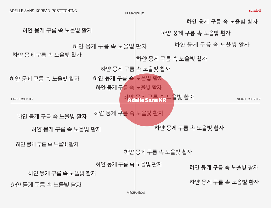
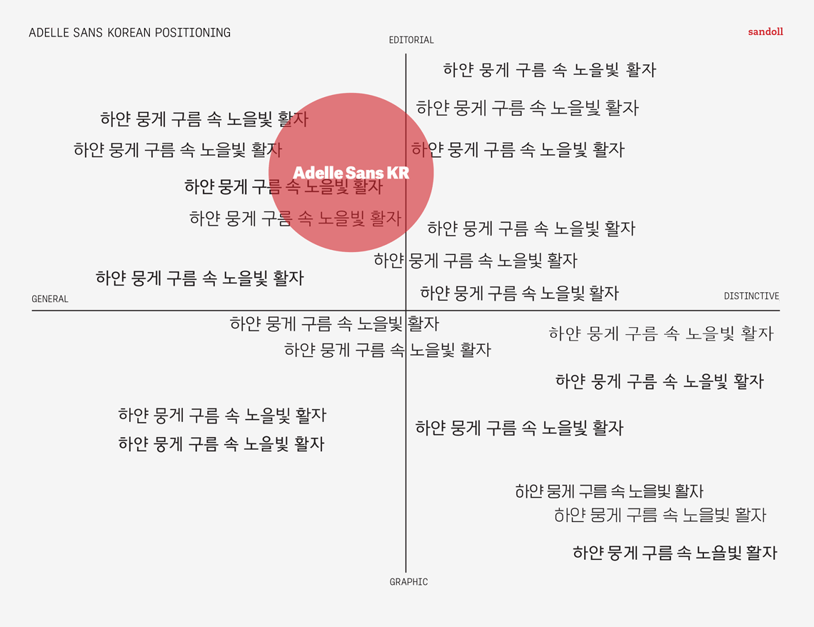
While it was important to harmonise the Korean with the features of the original Latin design, the Korean design concept should work for Hangul all on its own. So we first thought about the keywords of Adelle Sans Latin and applied them to the Hangul context. We also created a positioning map to determine how it would work in the Hangul font market. Based on the result, we created Hangul ideation samples and then tuned the visual details to make it work with Latin.
When designing Hangul, do you personally have any character or detail you like to start with? Are there even any general rules specific for Korean type design?
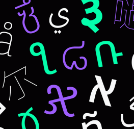
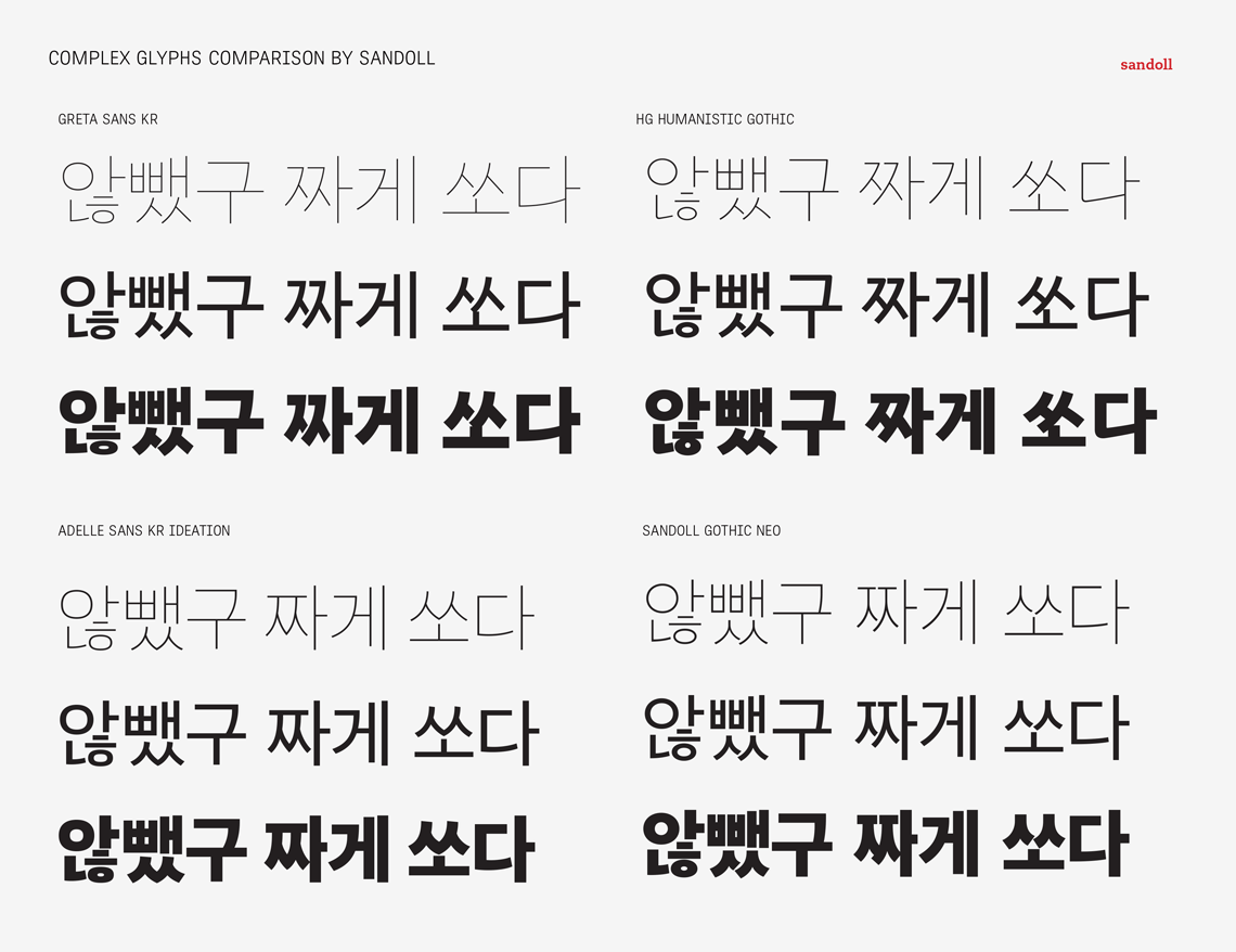
It’s hard to say that there is a such thing that we can call ‘standard’ in the industry, but Sandoll has a set of letters we use to start our work. They are ‘하얀 뭉게 구름 속 노을빛 활자’ which means ‘the sunset-coloured letters in white fluffy clouds’. It has all six combination styles of the Hangul letters, a good mix of 2-3 letter words, and general spacing to give the basic feel of the typeface. With these letters, we can define the skeleton of letters and the combination rule. This string also contains letters with several basic graphemes, so it helps when checking some design details as well.

What use is Adelle Sans Korean meant for? Where does it fit the best?
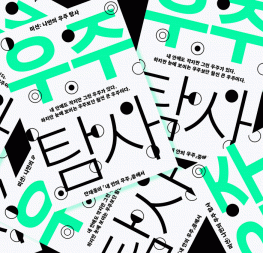
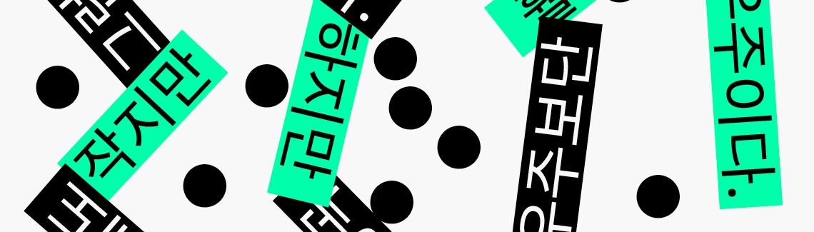
Overall, Adelle Sans Korean maintains the readability and impression of a Hangul Gothic font that people generally use for the text, so it’s familiar to the native reader. At the same time, the unobtrusive and subtle features reflected in certain characters create a different atmosphere from the traditional ones. The structure of Siot(ㅅ), Jiut(ㅈ), and Chiut(ㅊ) especially reflects the writing order but the overall shape is very similar to the symmetric styled grapheme. And the bottom horizontal curved bar has a soft and loose curve. This goes well with the curves of Siot(ㅅ), Jiut(ㅈ), Chiut(ㅊ). Therefore, Adelle Sans Korean can be used any place where the general Hangul Gothic is used. It would be a good choice especially when you want to use a Hangul Gothic that’s a bit more unexpected in long texts.


And where would you personally like to see Adelle Sans Korean used?
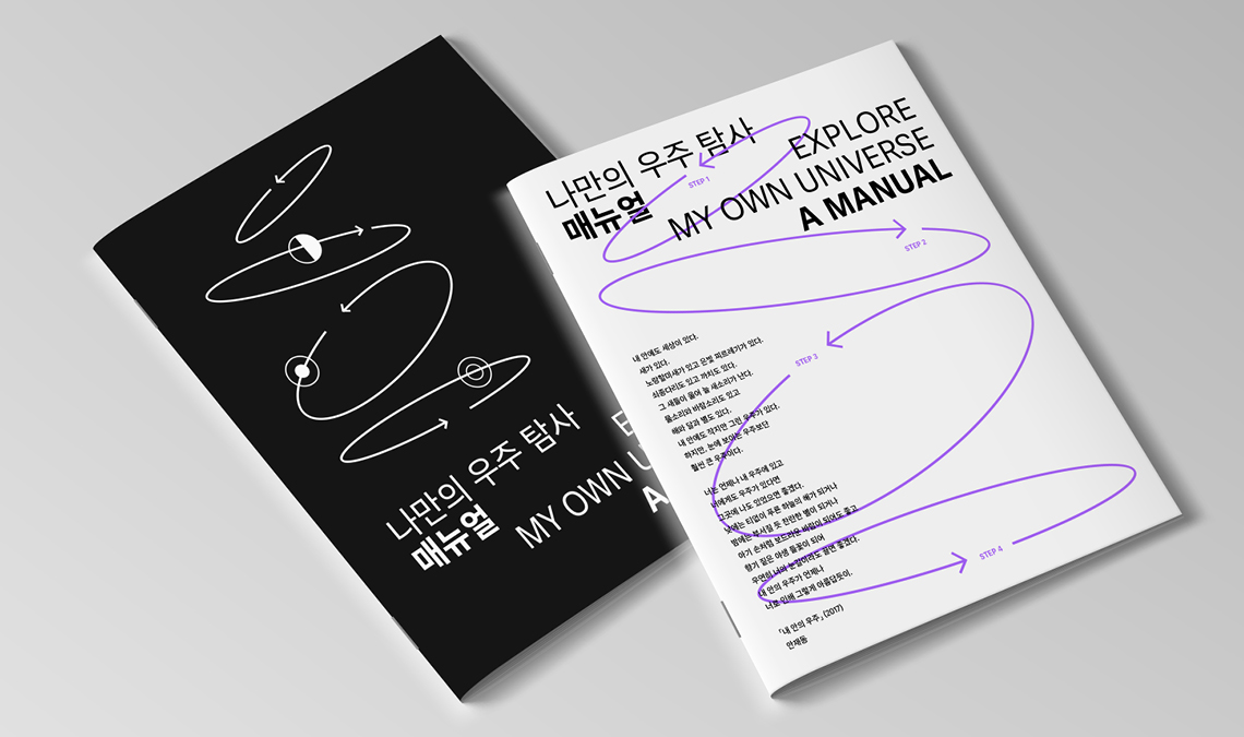
I personally think it would be great to use it for song lyrics and album covers. The quantity of the text in these cases is not as long as a general novel, newspaper, or magazine, but it contains a lot of information and requires obvious hierarchy (song titles, lyrics, staff names, and roles, etc.). In particular, the text is often used in conjunction with photos or images, and listeners often read the words to understand the lyrics. So I think Adelle Sans Korean, which has good readability and a subtle identity, will play well in all these cases.
Would you have any recommendations or some simple advice for type designers who want to design their first Hangul typeface?
Hangul is a relatively young script with a lot to explore design-wise. This means there are many areas that have yet to be discovered or explored, and the possibilities are almost endless. So do it! Compared to Latin type design, it may be a little more unfamiliar and challenging, but I hope you’ll enjoy the journey.


*Chorong Kim is a type designer who makes a living by designing, thinking, and talking about fonts and their environment. She studied graphic design in Korea and type design in France after working as a font designer at Cadson Demak in Bangkok. She currently works at Sandoll, participating in and leading several international brand font projects and collaborations. Chorong teaches at the Hangul Typography School, lectures in various institutes, and also mentors for the Alphabettes mentorship program.
TypeTogether is an indie type foundry committed to excellence in type design with a focus on editorial use. Additionally, TypeTogether creates custom type design for corporate use. We invite you to browse our library of retail fonts or contact us to discuss custom type design projects.