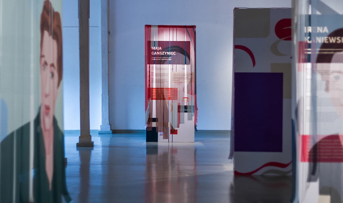
Exhibition
May 2020
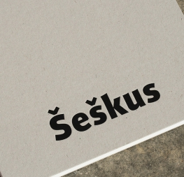
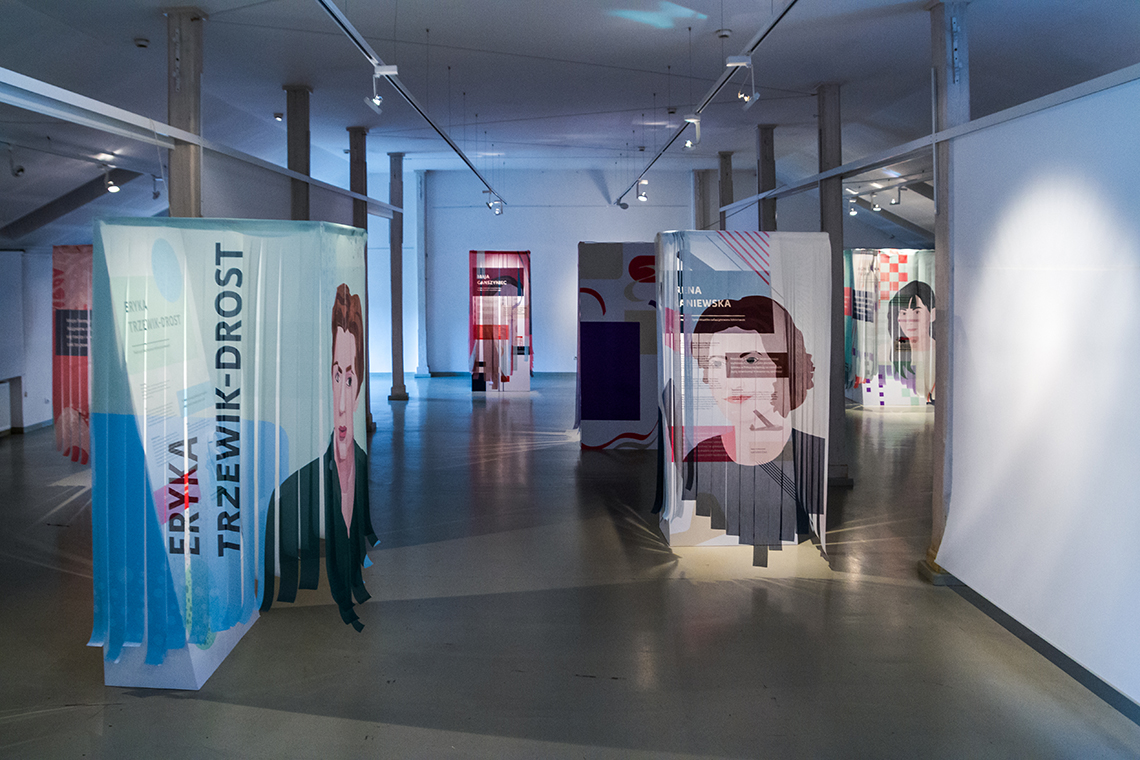
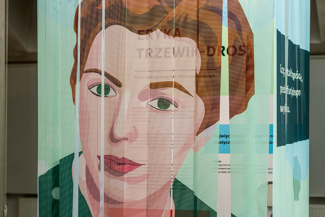
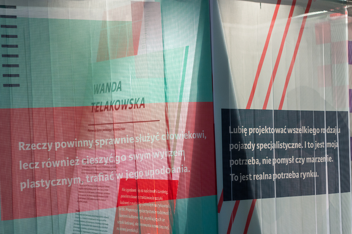
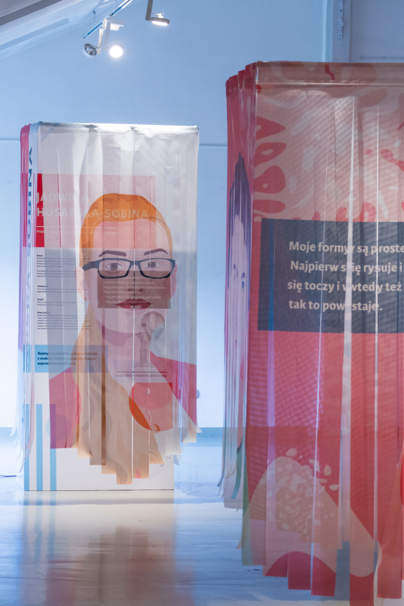
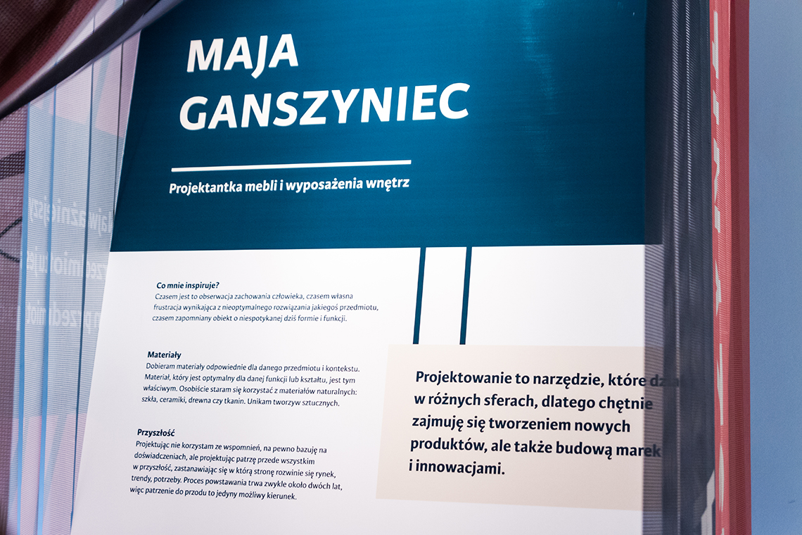
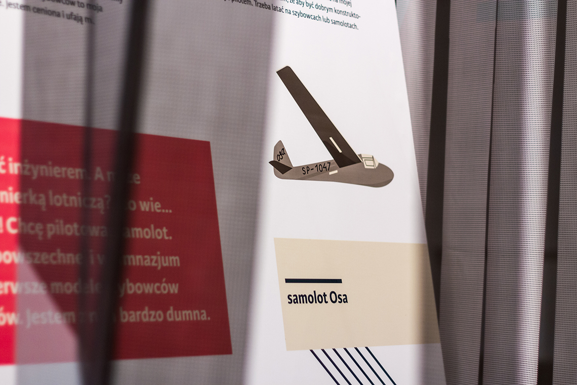
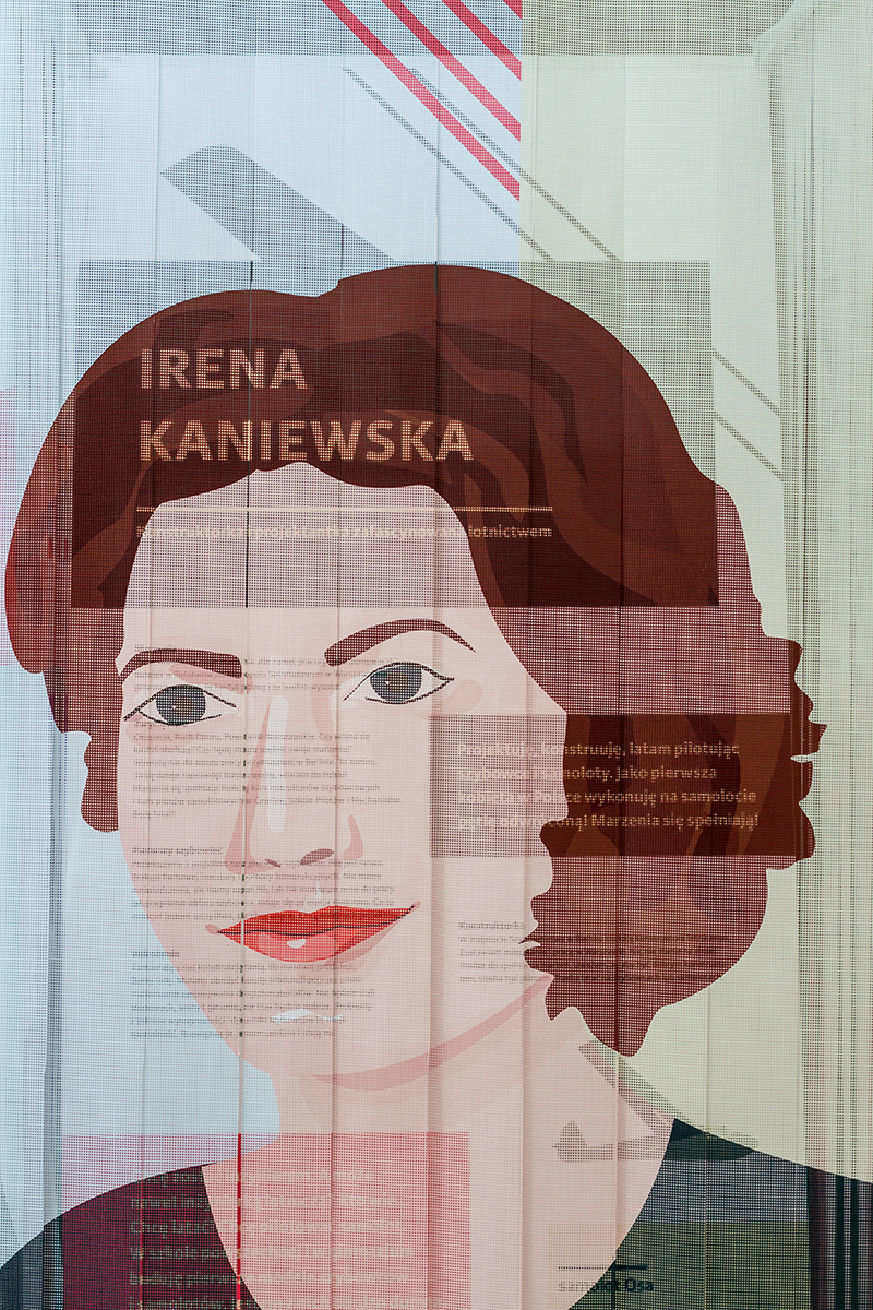
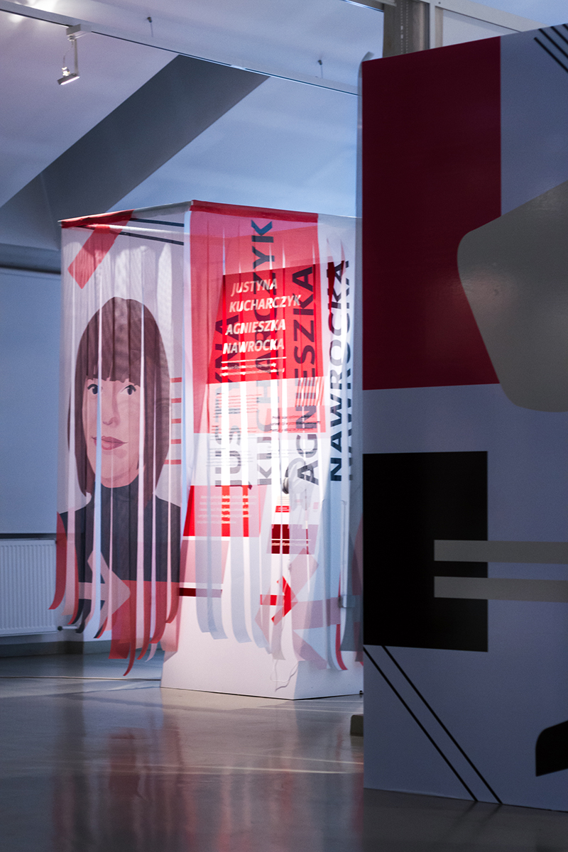
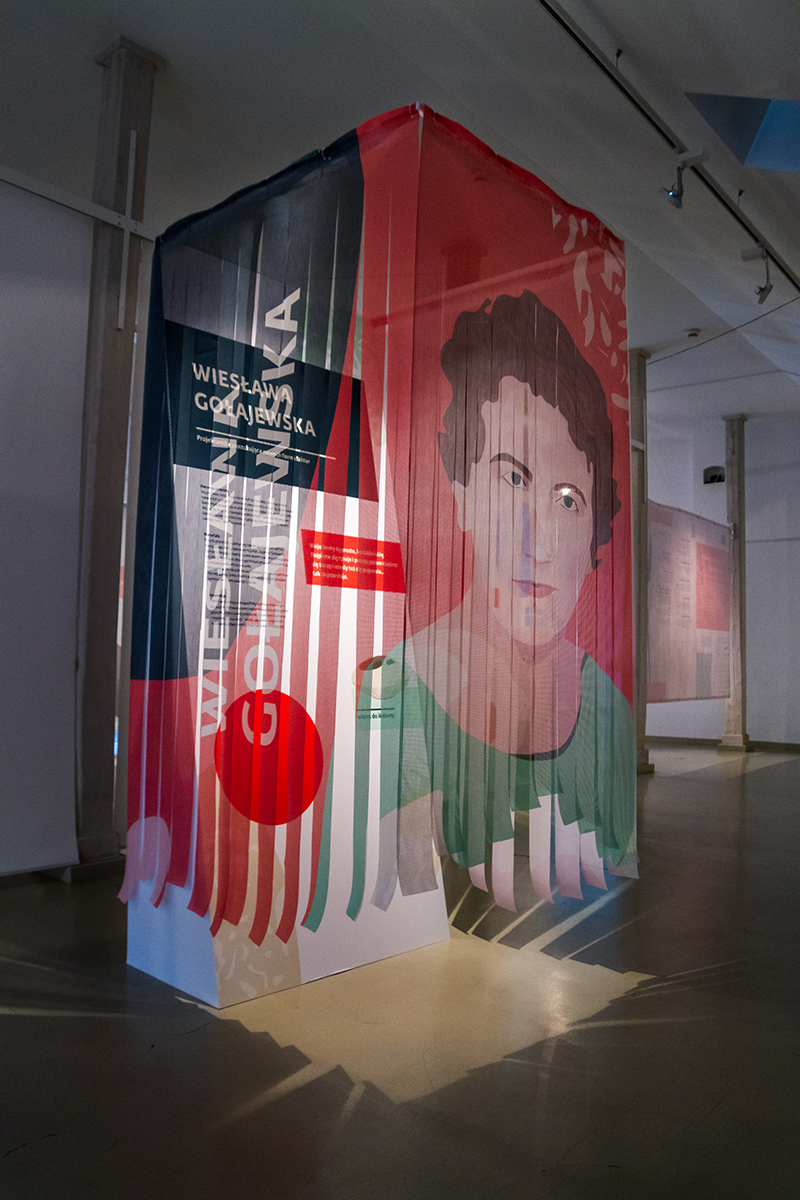
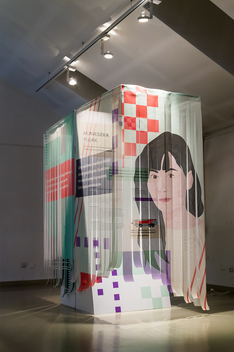
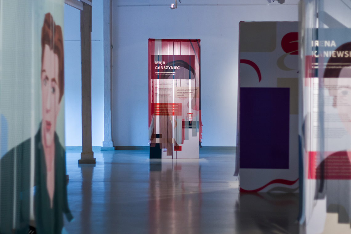
Karmina Sans in use
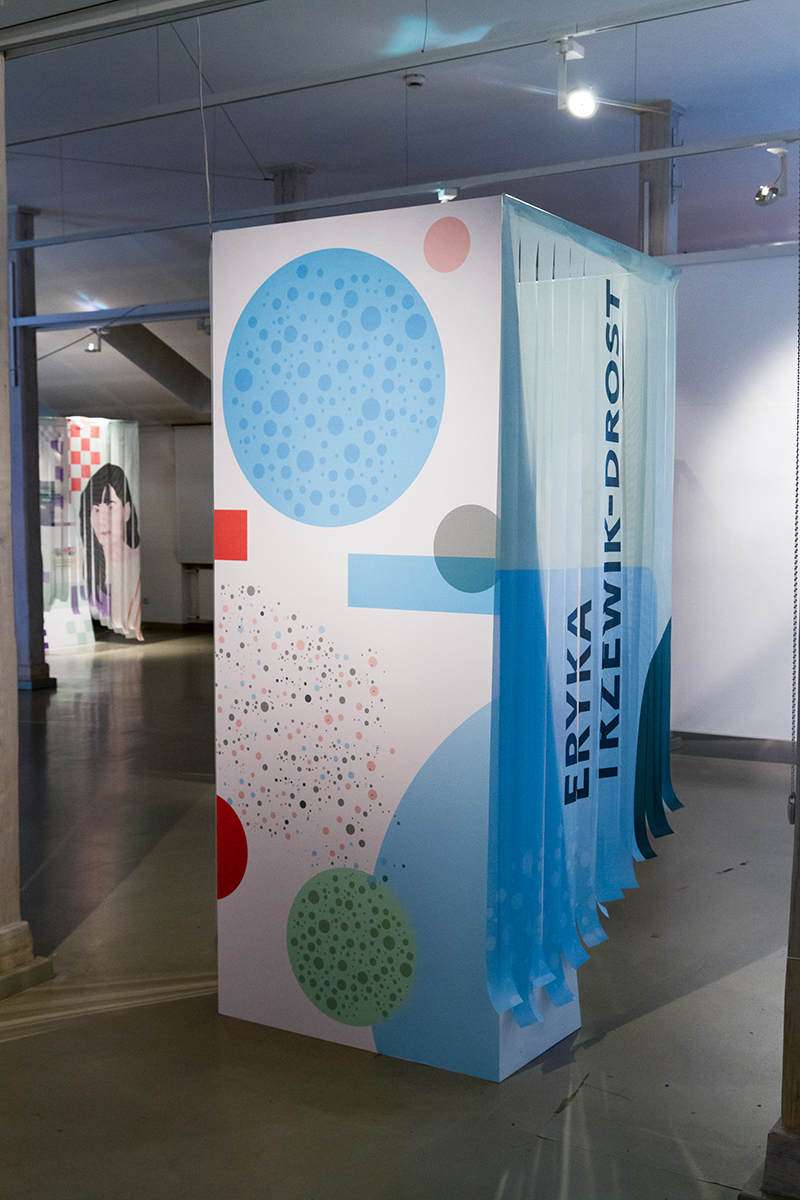
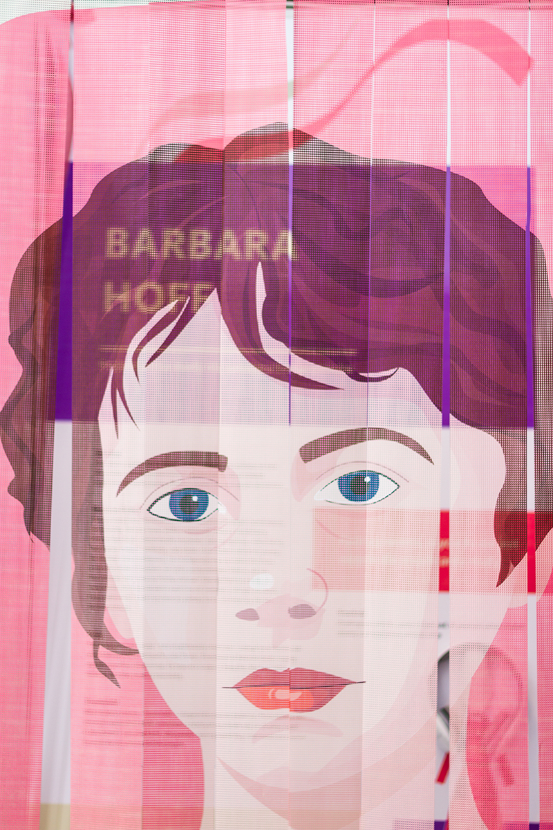
Karmina Sans in use
Summary. Romanesque capitals were varied endlessly. The letters were reversed, joined together to make ligatures and were intertwined, small examples being nested – placed inside or alongside the capitals – and both letters and the spaces between them would often be widened or narrowed, often to fit text into the space available, but sometimes for no apparent reason. The most intriguing of these variations is the seemingly random positioning of Insular letterforms and uncials in a text (6a, b).
TypeTogether is an indie type foundry committed to excellence in type design with a focus on editorial use. Additionally, TypeTogether creates custom type design for corporate use. We invite you to browse our library of retail fonts or contact us to discuss custom type design projects.
Schedule an introduction meeting to learn more.