REWE Bio
February 2019
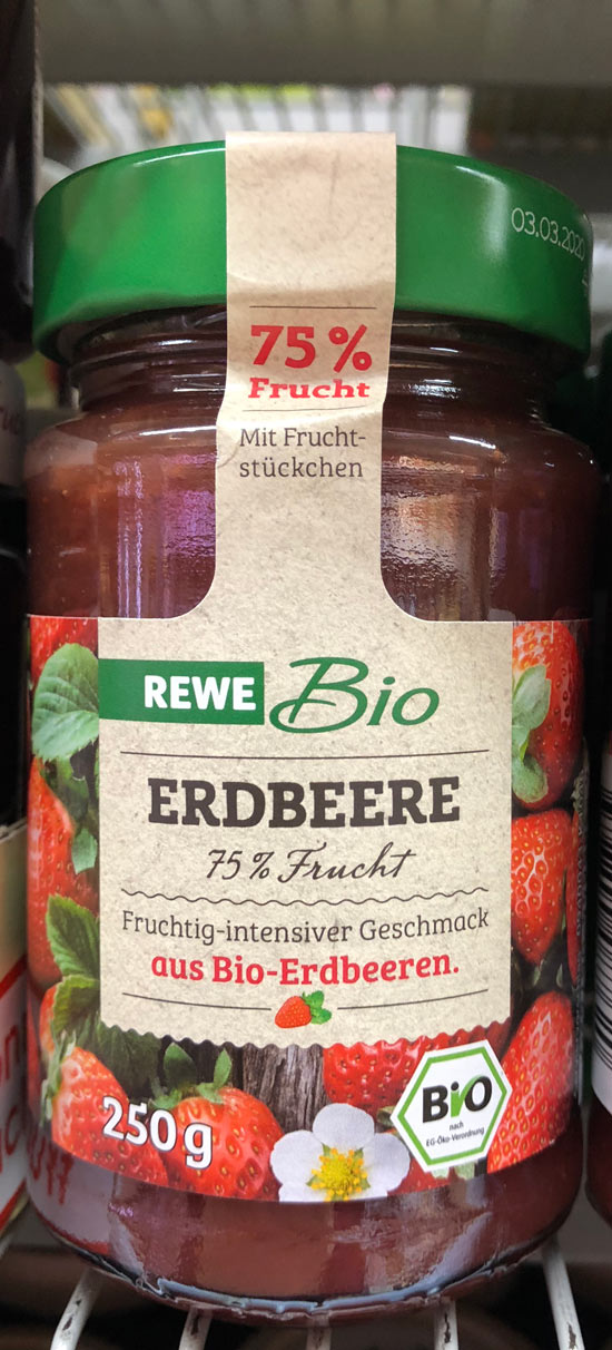
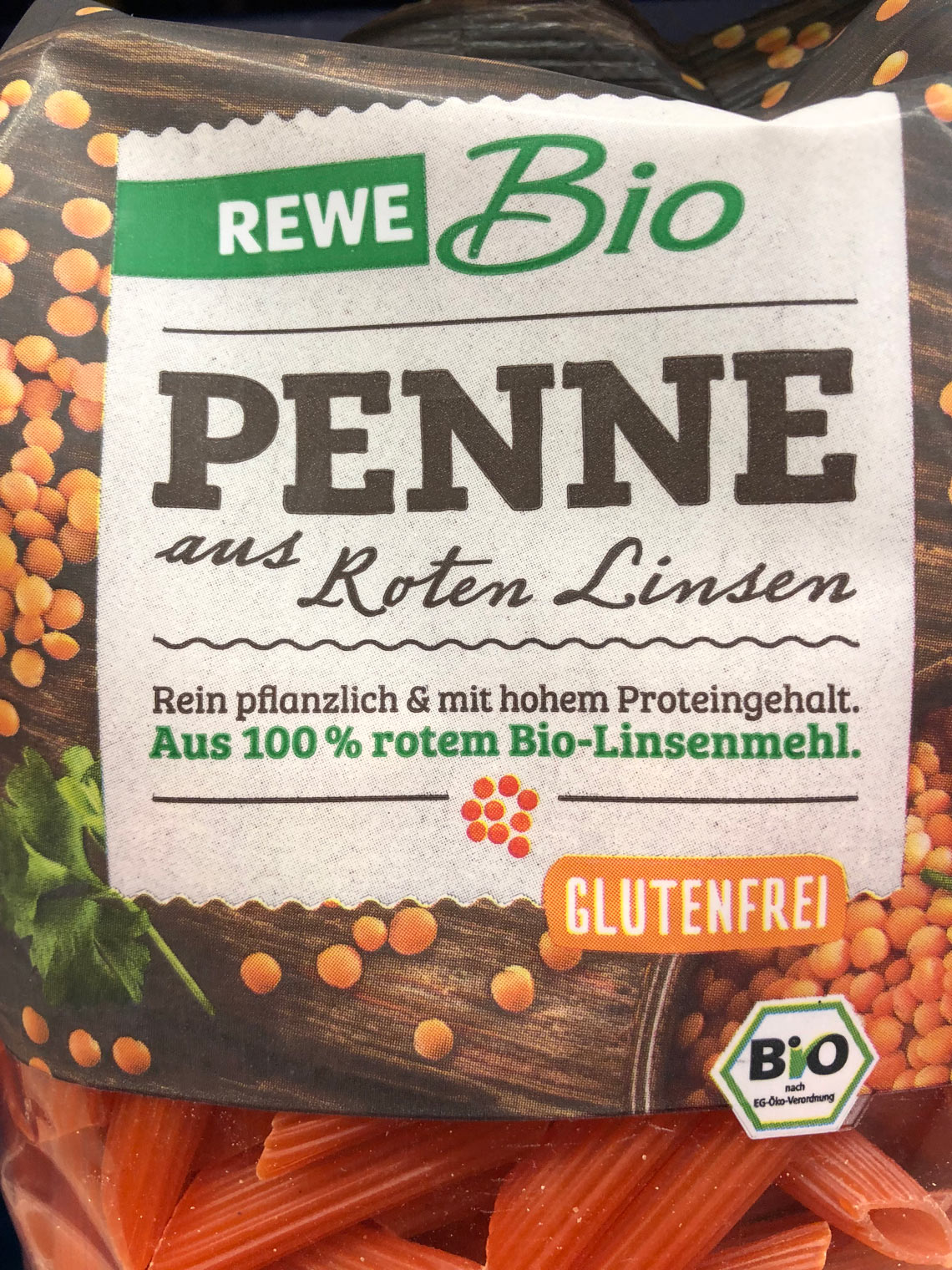
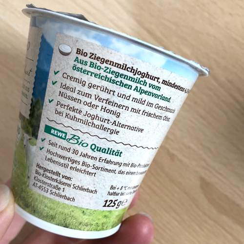
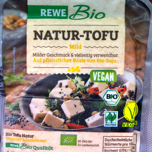
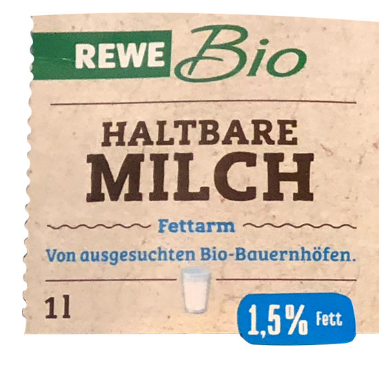
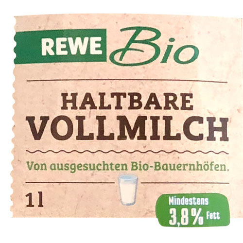
Germany’s second largest supermarket chain, REWE, is using Bree Serif as the main font on their own line of organic products, including more than 500 items.
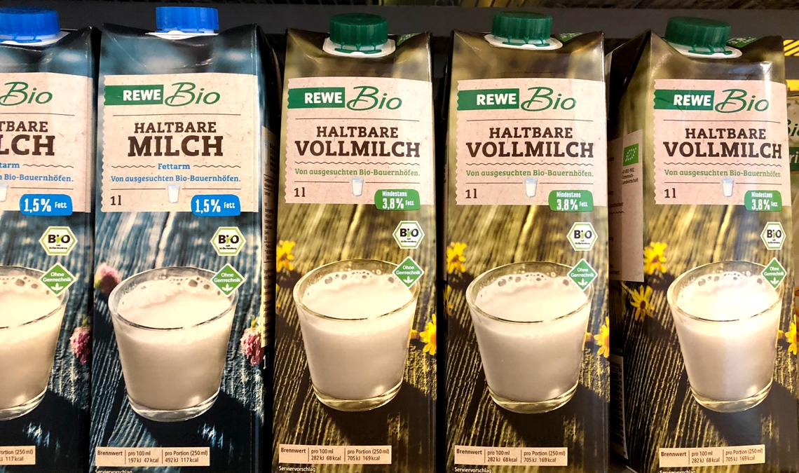
Germany’s second largest supermarket chain, REWE, is using Bree Serif as the main font on their own line of organic products, including more than 500 items.
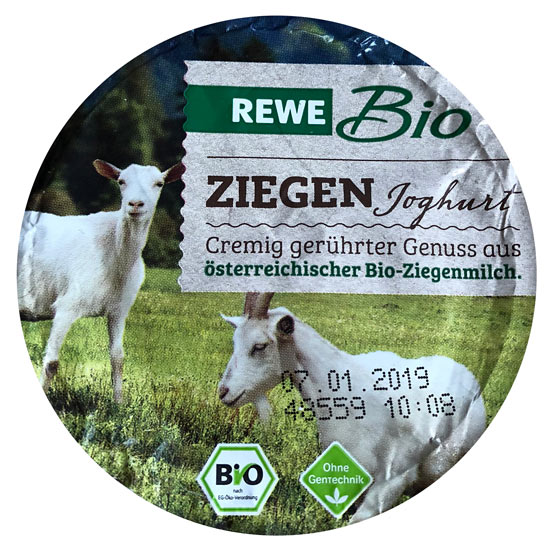
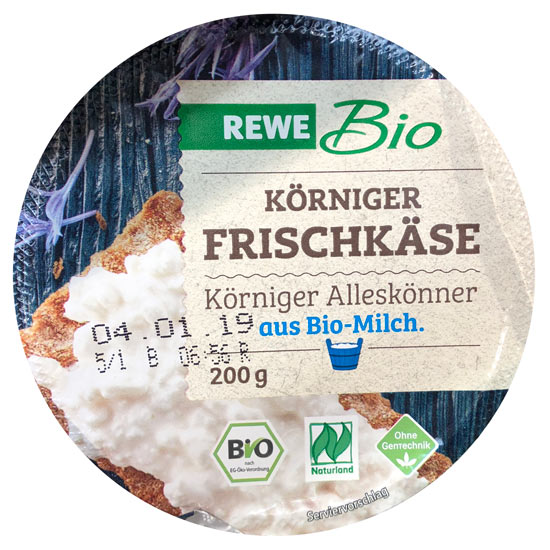
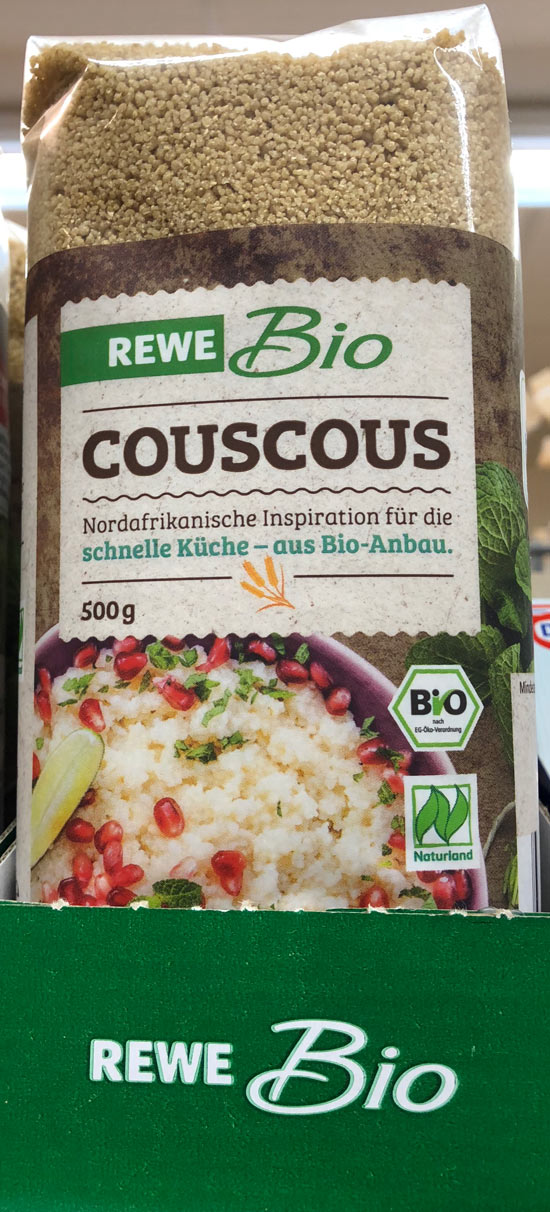
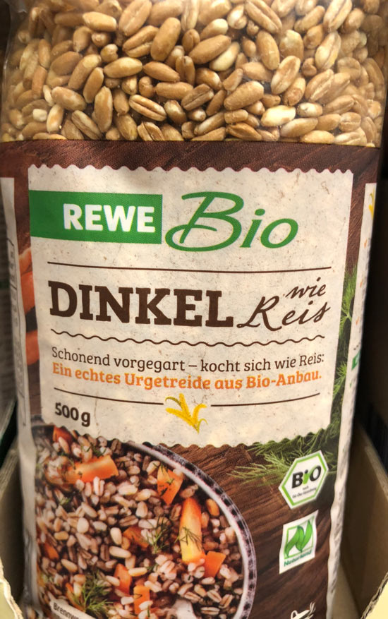
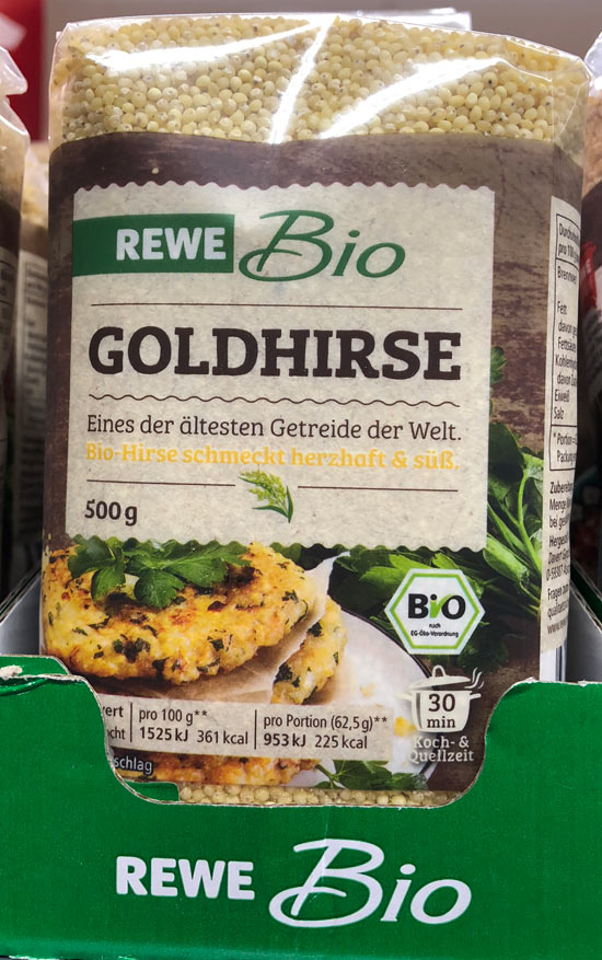
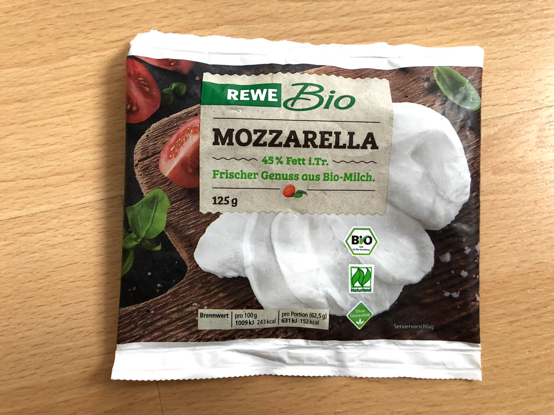
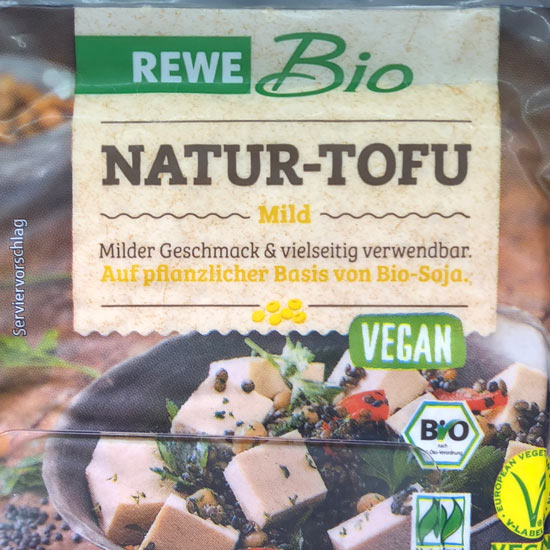
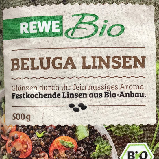
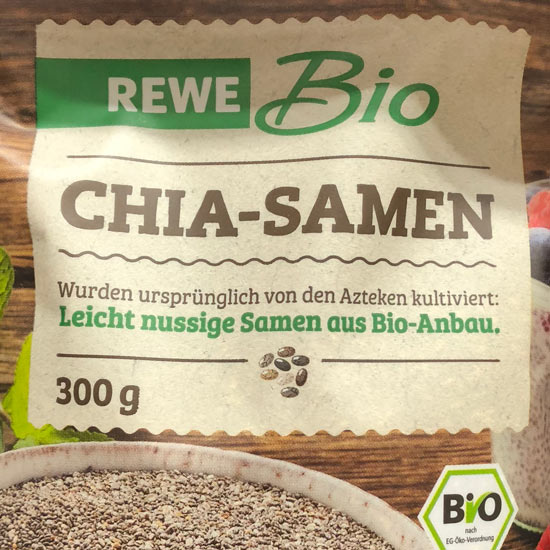
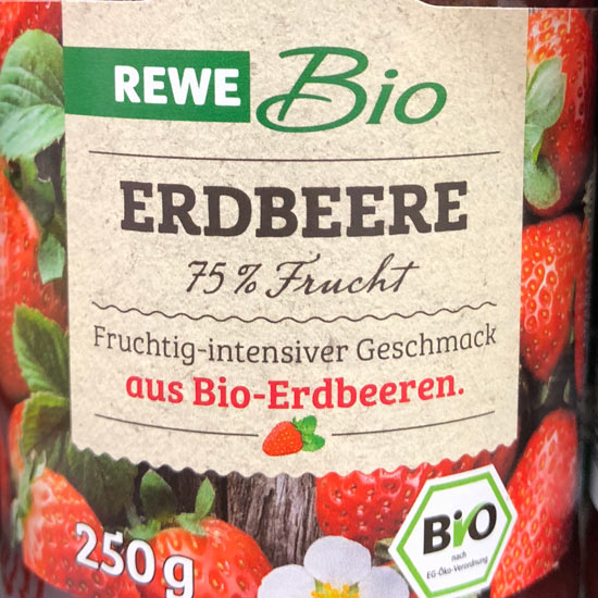
REWE Bio was founded over 30 years ago, producing high-quality organic foods according to European Organic standards (EU-Öko-VO) — without GMOs, pesticides, or additives. REWE Bio’s collaboration with Naturland, one of the most important organic farmers’ associations, ensures their commitment to local produce, better climate and nature protection, animal welfare, and social responsibilities.
In 2016 REWE got a brand revamp and it seems the REWE Bio sub-brand was updated as part of the overhaul. For the titles and product names, the free Regular style of the Bree Serif font was modified and roughened to make it appear hand-made and earthy. Additional text on the product labels are set in an unmodified Bree Serif Light and Regular, lending cohesiveness and a tactile nature to the overall packaging.
TypeTogether is an indie type foundry committed to excellence in type design with a focus on editorial use. Additionally, TypeTogether creates custom type design for corporate use. We invite you to browse our library of retail fonts or contact us to discuss custom type design projects.
Schedule an introduction meeting to learn more.