Bree: Celebrating a decade of curve appeal
January 2019
Our beloved Bree font family is now ten years old. Celebrate with us as we take a look back and then grab the update!
Our beloved Bree font family is now ten years old. Celebrate with us as we take a look back and then grab the update!

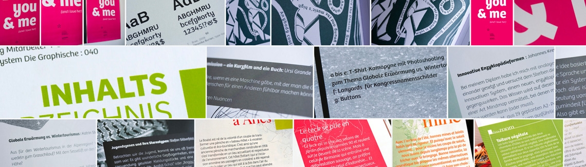
Everyone’s favourite upright italic is turning ten, and we have a few stories to tell about her. The Bree font family was released in 2008 by Veronika Burian and José Scaglione, and since then has seen quite a few successes. But do you know how it started?
Right after TypeTogether was founded in 2006, we released a few type families that garnered immediate awards and set the trajectory for the rest of the company. But one thing we had early on was our logo, which Veronika created by hand. Its evenness, unique forms, and fun e–t ligature serendipitously inspired quite a few inquiries: “What font is used for your logo? And where can I get it?”
The secret was that it wasn’t a font — yet. So, from repeated requests for our logo’s font and with some encouragement from other trusted sources, the logotype’s eight different letters were expanded into the Bree font family. Five roman weights were released first, followed quickly by the obliques that year, and a few more weights were added in 2013. Bree isn’t the first upright italic, but it has certainly been one of the most popular over the past decade.

TypeTogether was an early supporter of the digital type revolution that made it simple to put real fonts on websites, such as with Typekit (now Adobe Fonts). Bree quickly became widely used in digital formats and still continues its popularity today. Its easily recognised forms and spry personality caught the eyes of many around the world.
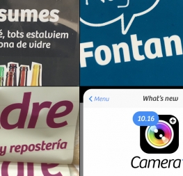
With a few choice modifications, Bree became the voice to attract tourism in Perú. The Camera+ photo app used Bree Oblique from the start, becoming the top app of its kind and, of course, praised for its pixel-perfect UI. Oprah used Bree for a while in various formats, as did Breast Cancer Awareness in the US, several editorials, and companies looking for an approachable and memorable wordmark. The bottom line is Bree has proven itself a master of the digital and printed world.
Other designers recognised Bree’s importance and uniqueness among the type landscape and had a few nice things to say about it.
“Some of the best typefaces are hybrid typefaces. Bree is an excellent hybrid: a fusion of roman and italic sans-serif, flexibility and individualism. Based on the Type Together logo, it has been their most distinctive typeface for years. A decade later, her unique personality still stands out. As part of a growing and multicultural group of typeface families for all occasions, Bree remains ‘that special face’.”
Jan Middendrop, writer and editor
“Distinction meets joy to produce one of the most remarkable branding fonts of the last decade.”
Octavio Pardo, type designer
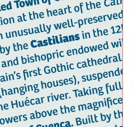
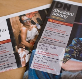
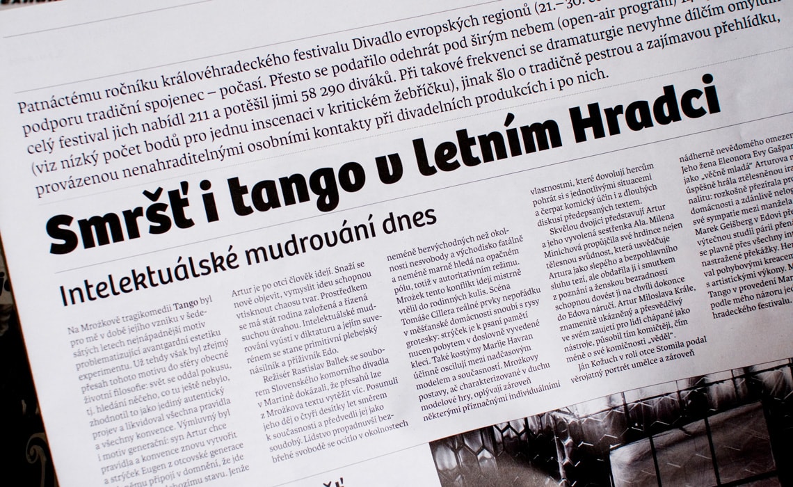
“Ten years ago, our studio was commissioned to design the twice-weekly Czech Divadelní noviny theater. We tried Bree for headlines and it soon became clear that she was an excellent choice. Bree is not only legible, it also gives newspapers a unique and distinctive character. And after ten years he still has a fresh look!”
Filip Blážek, typographer, graphic designer, editor and writer.
‘Bree has a charming, open personality — a great font to achieve a wide and yet coherent variety of tones. The upright italic is highly distinctive by its playfulness and fluency. On the other hand, the alternate characters communicate with clarity and warmth at the best sans serif standards. Bree is a humanist font in its most literal connotation.’
Cesar Sesio, graphic designer

Now for the great news: Bree is getting a massive update today! For anyone with a previous licence of Bree, we are giving you a FREE update to the entire family. So what’s new? A few shapes have been updated or added (the ‘k’ and German capital ‘ß’), two entirely new weights have been added (Book and Book Italic), spacing has been perfected, and Vietnamese is now supported. More than that, we are now releasing Bree in Cyrillic and Greek… and, drumroll please, the variable font format!
For those who have the complete Bree family, the Latin update is free and the Greek and Cyrillic can be gotten at an extreme discount. This basically means we're releasing almost four new typefaces for the cost of a smile. Grab yours right now (the fonts and the smile)!
Sign in to your account at https://www.type-together.com and go to the My Purchases section to get Bree’s massive update.
TypeTogether is an indie type foundry committed to excellence in type design with a focus on editorial use. Additionally, TypeTogether creates custom type design for corporate use. We invite you to browse our library of retail fonts or contact us to discuss custom type design projects.