Hebrew type anatomy

September 2021

This is our fourth text in a series of articles about type anatomy in different scripts. First we had Azza Alameddine’s insights on Arabic type anatomy, then Pooja Saxena offered her informed take on Devanagari script, later Irene Vlachou gave her insight on Greek font anatomy terminology. And now it is time for Shani Avni, type designer and researcher with a focus on Hebrew type design, to investigate and suggest a nomenclature for Hebrew type anatomy.

By Shani Avni

Modern Hebrew developed from the Aramaic or Assyrian alphabet around 560 BCE. It is a single case alphabetic script consisting of 22 letters and 5 additional final forms. Written from right to left it is used for Hebrew, Yiddish, and Ladino. One of its distinguishing features is its square-like forms, having very few ascending and descending strokes.

The development of the Hebrew script took a unique course largely due to the fact that Jewish tradition perceived its alphabet as sacred. The Hebrew letterforms were considered to be divine and to carry a complex religious meaning. Since the second century BCE and for centuries to come, Hebrew was mostly confined to religious use and only qualified devout scribes were permitted to write religious manuscripts under strict rules.

The invention of movable type in the 1440s was welcomed with relative enthusiasm by Jewish communities that were scattered in Europe among other nations. As religious Hebrew manuscripts played a central role in their lives, printing them instead of copying them by hand increased the production and distribution of these texts and contributed to Hebrew readership. However, the Jewish communities suffered persecution repeatedly and were often forced to flee and relocate their presses, which prevented the continuous natural development needed for the refinement of type. With the Jewish punchcutters facing these social and political obstacles, it was the non-Jewish punchcutters who made significant contributions to the improvement of the Hebrew type.


Fragment. Lusitania. Ordo precum rit. Hispan. Census P. 179, C. 15c. B 44 2. Freimann, Aron and Marx, Moses. Thesaurus Typographiae Hebraicae Saeculi XV. BerlinWilmersdorf: UniversitasBooksellers, 1924–1931.


In the late 18th century Hebrew began its journey away from the traditional religious confines and toward its revival as a common, spoken, everyday language. Over time a wide range of new Hebrew texts were produced in Europe and in Palestine, from biblical stories to original literature, translations of European classic and modern literature, and newspapers.


Palestinian newspapers and periodicals from the mid 1940s. From: Hobman J.B. (ed). Palestine‘s economic future: a review of progress and prospects, with a message from Field Marshal Smuts, London: Percy Lund Humphries, 1946. p. 245.


Those printed items required new Hebrew typefaces, that would accommodate the scope of printing as well as reflect the secular nature of its content. The demand for new Hebrew typefaces grew stronger around the 1950s with the declaration of Israel as a state. Around that time Jewish-Israeli type designers of European descent who were deeply familiar with the Hebrew script and language introduced new and groundbreaking designs.

Considering the fact that Hebrew printing largely evolved in Europe, it is not surprising that Hebrew type has developed mostly using Latin terminology to describe its anatomy. However, this terminology describes the specific structure of Latin characters and is inaccurate for describing Hebrew characters. For example, the Hebrew instroke is commonly called a serif. While visually resembling the shape of a Latin serif, it is constructed in a completely different manner: it is originally a stroke of a blunt reed pen traveling inward from left to right, creating a triangular shape at its beginning. When Hebrew was applied to stone carving, the characters did not undergo a mechanical adaptation to the material and tools as the Latin characters did. Contrary to the Latin, Hebrew did not include the deliberate and calculated work of expert stone-cutters that led to the use of serifs, but rather kept their written form.


Portion of the Isaiah Scroll, labeled 1QIsaa, one of the longest of the Dead Sea Scrolls, 2nd century BC, The Israel Museum’s Dead Sea Scrolls Digital Project. (Photographs by Ardon Bar Hama via Wikimedia Commons).


Hebrew inscription from King Uzziah’s grave: “Hence Were Brought the Bones of Uzziah, King of Judah…” Images, n.d. c.580 B.C. Courtesy of Artstor.


Nomenclature and type anatomy
While efforts to create a new professional Hebrew vocabulary were reflected in early 20th century articles, books, and dictionaries dedicated to printing and graphic arts glossaries, it seems none included typographic terms for the purposes of type design. The Hebrew type terms that are being used today are borrowed from different disciplines such as paleogeography, calligraphy, and religious scribal practice. Therefore, nomenclature is fairly inconsistent: a single term may be interchangeably described by several words that carry different meanings (for example, a character’s instroke is referred to as a sting, a thorn, a tag, or a serif); other terms are too specific as they apply only to a single character; some terms are antiquated and therefore confusing; some terms correlate with the human anatomy, but are used interchangeably in counterintuitive placements (for example, using the term “heel” to describe both bottom and top parts of a letter); some terms refer to construction: beam, pillar, roof; some terms are directly translated from English and some are merely transliterated.

The need for a coherent description of Hebrew type anatomy is growing, paralleling the rising interest in type design for global scripts. Hopefully this interest will generate additional academic resources and stimulate a discourse in search of accurate language that would support future practices.


Hebrew type anatomy’s most common terms, shown in Adelle Sans Hebrew and Noam Text.


Summary
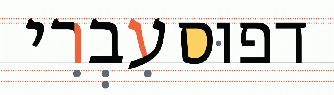
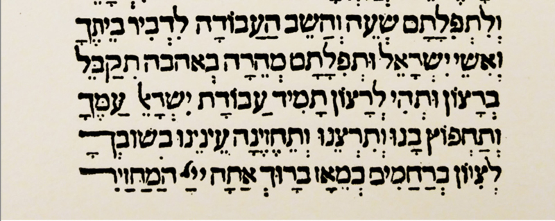
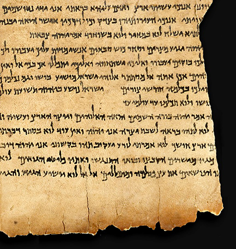
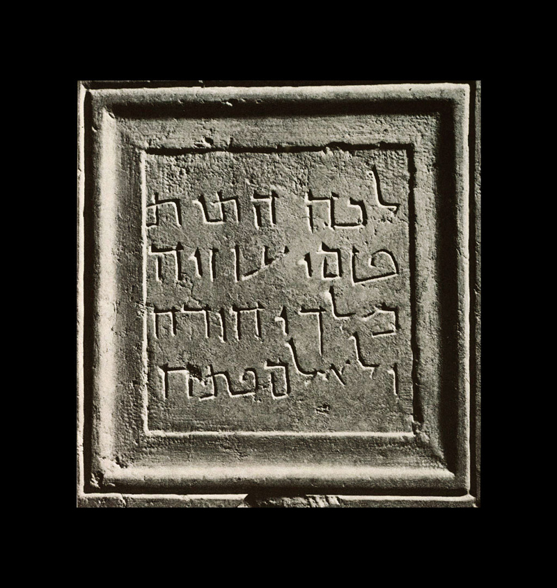
• Hebrew is a single case alphabetic script consisting of 22 letters and 5 additional final forms. It is written from right to left.
• Traditionally Hebrew typefaces do not include typographic ‘tools’ such as italics or small caps.
• The Hebrew script is used for Hebrew, Yiddish, and Ladino.
• Hebrew letters are written below the top guideline (as Ismar David described, “...Hanging like laundry from a clothesline.”). Although Hebrew is written from right to left, each individual character is produced by pulling the pen from left to right and from top to bottom. Hebrew traditionally has a horizontal stress.
• The Hebrew alphabet has no vowel letters. The vocalisation marks (Niqqud) is a set of diacritics added above, below, and within the characters in order to distinguish between alternative pronunciations of letters. Biblical text requires additional specialized marks as well as cantillation marks used as musical notation for chanting rituals.
• Hebrew uses Arabic numerals and Latin punctuation marks with the addition of the Hebrew high-hyphen. Although the punctuation marks are identical to the Latin ones, their height and angle should be adapted to Hebrew.
• There is a traditional Alef-Lamed ligature, and a Shin-Het ligature which is used for the Israeli currency sign.
• Using Hebrew in publishing software: to correctly set Hebrew texts in Indesign or other desktop publishing software make sure the right-to-left typesetting is activated. For InDesign, activate the Adobe World-Ready Paragraph Composer; for Illustrator, activate the Middle Eastern Single-line Composer, and make sure the text has the Hebrew LOCL feature activated.

Bibliography
David, Ismar. The Hebrew letter: calligraphic variations. Northvale, N.J. J.: Aronson Inc., 1990.
Lavi Turkenic, Liron. From Frank Rühl to Peninim. A story of people, type and technology. MA Typeface Design studies at the University of Reading, 2013.
Narkiss, Mordechai. Dictionary of graphics terms. Bialik Institute and The Hebrew Language Committee, Jerusalem, 1936–7.
Pludwinski, Izzy. Mastering Hebrew calligraphy. New Milford, CT; Jerusalem, Toby Press, 2012.
Sadan, Meir, ‘An introduction to Hebrew type (2018), what is a “serif” in Hebrew? (2017)’ Medium.com. 
Silberberg, Gershon. Principles of printing, The organisation of printers in Israel. Merhavia: Ha’shomer Ha’tzair press. 1968 [Heb]. 
Spitzer, Moshe. The development of Hebrew lettering: and other selections, Ariel; quarterly review of arts and letters in Israel, No. 37, January 1, 1974.
Stern, Adi, Some guidelines and recommendations for the design of a Hebrew book typeface, MA dissertation Typeface Design, University of Reading, 2003.
Wardi, Ada. (ed). The graphic design of Moshe Spitzer, Franzisca Baruch, and Henri Friedlaender. Jerusalem: The Israel Museum, 2015–16.
Yardeni, Ada, The book of Hebrew script : history, palaeography, script styles, calligraphy & design, 3rd Edition, Carta, Jerusalem, 2010.

Files
Download the PDF Hebrew Type Anatomy.


About Us

TypeTogether is an indie type foundry committed to excellence in type design with a focus on editorial use. Additionally, TypeTogether creates custom type design for corporate use. We invite you to browse our library of retail fonts or contact us to discuss custom type design projects.