Adelle Mono in motion
July 2020
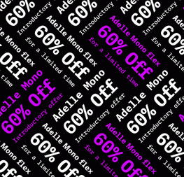
Adelle Mono is monospaced. Exactly what it says on the tin. Adelle Mono Flex is a proportional font that looks like a mono but is easier to read. Check out in this inspiring video!
Adelle Mono is monospaced. Exactly what it says on the tin. Adelle Mono Flex is a proportional font that looks like a mono but is easier to read. Check out in this inspiring video!
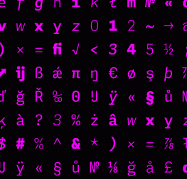
Twenty styles designed with both the developer and the aesthete in mind, the Adelle Mono family has a true monospaced width (Mono), a proportional width (Flex), and a variable font that modulates between the two to boost creativity and coherence. Adelle Mono’s experimental design explores the space between proportional and monospaced types. It boosts creativity and coherence by providing flexible options in the same family, including italics and the variable font format with an axis of weight and a spectrum axis between multi-width and monospaced characters. Combining Adelle Mono with either Adelle or Adelle Sans adds more layers and adaptability to your work.
Credits
Motion Design: Cecilia Brarda
Typeface Design: Veronika Burian, José Scaglione, Irene Vlachou
TypeTogether is an indie type foundry committed to excellence in type design with a focus on editorial use. Additionally, TypeTogether creates custom type design for corporate use. We invite you to browse our library of retail fonts or contact us to discuss custom type design projects.
Schedule an introduction meeting to learn more.