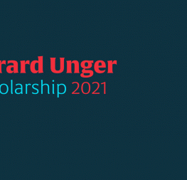
Launching Aeroplan: interview with Nina Faulhaber

February 2023

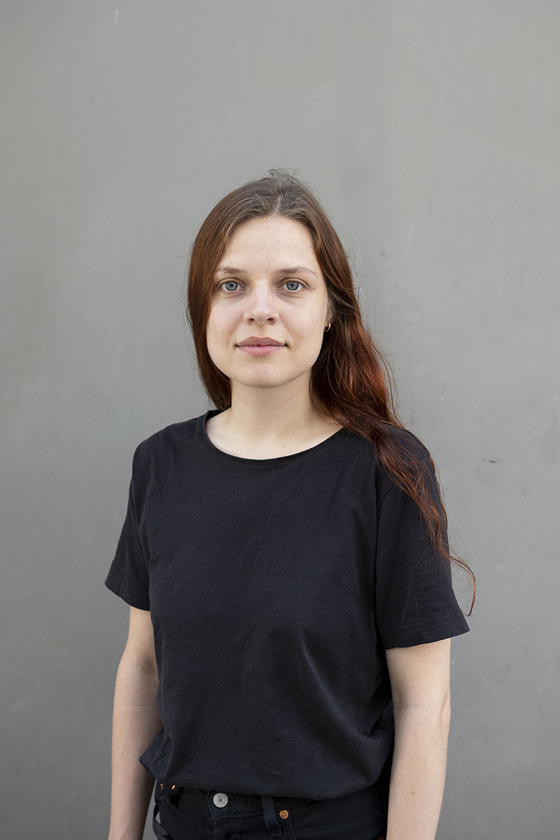
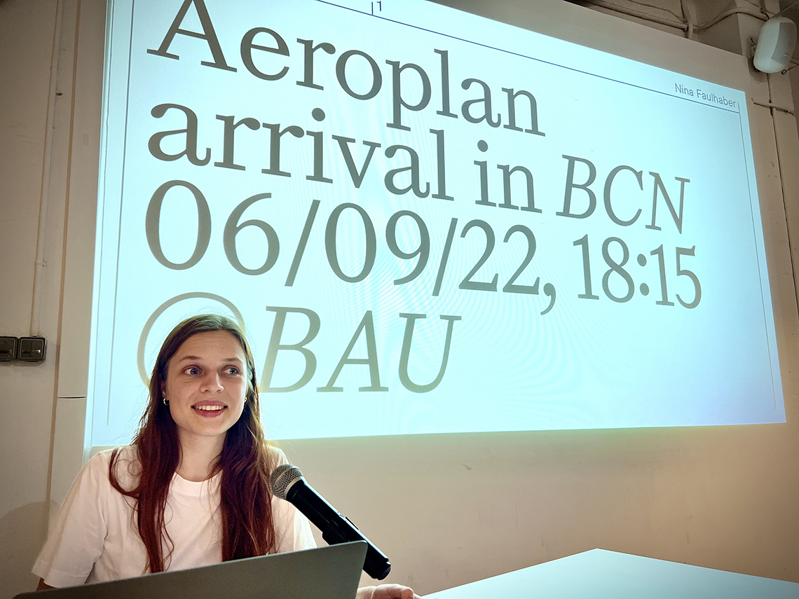
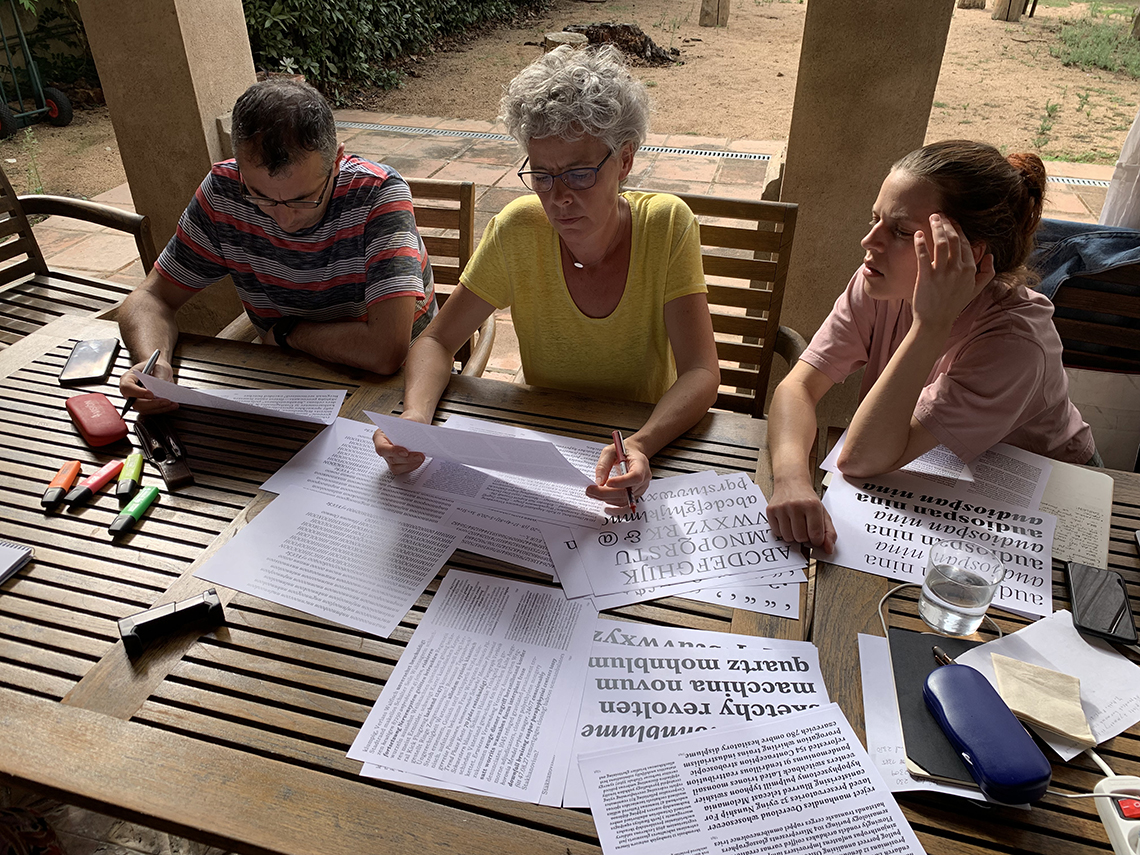
Nina Faulhaber became the 2021 recipient of TypeTogether’s annual Gerard Unger Scholarship. Nina’s modern antiqua came to us under the name Flieger and was later renamed Aeroplan. In September 2022, Nina presented her Aeroplan work-in-progress for the first time at TypeTogether’s book launch-related type event in Barcelona, and TypeTogether has scheduled the release of the Aeroplan font family for late Spring 2023. Over the course of those two years, we have had the chance to follow Nina’s great work, and now it’s finally time to talk with her about typefaces, inspiration sources, and ideal use of her font.


Nina Faulhaber


Nina presents her Aeroplan process in Barcelona in 2022.


Tell us more about your background. How did you come to love type?
I was born in Frankfurt (Oder), a small town in the east of Germany, but I have been living in Bavaria for ten years now. I came to Bavaria because I did an apprenticeship in the Alps as a wood sculptor. During this time I also came in touch with type, because letter carving and calligraphy were part of the education. Later, during my communication design studies in Augsburg, I had the opportunity to more intensively study type and type design again. This is where my interest in this field emerged and also when I designed the first version of Aeroplan.

How does your background in sculpture influence your approach to type design?
I see some parallels there. Both fields have craft elements, requiring both creative freedom and precision. I think the process of cutting into wood can also be related to my work as a type designer through the precise setting of clear digital forms, as well as the search for interesting shapes, compositions, and spaces.


“Ride”, oak, carved, 2022.


“Herd”, smoked oak, carved, 2016.


“Figurines”, lime and Swiss stone pine wood, carved, 2018.


Where did Aeroplan come from in the first place?
In a second-hand shop I found a small, inconspicuous brown book on aircraft engines from 1916 entitled “Motorschule für Flieger” (“Engine school for aviators”). I particularly liked the unusual format, the extravagant illustrations, and the interesting layout. On the first pages of the book — later the text font changes — I found a somewhat irregular, awkward text font with unusual details in the lettershapes. It is similar to the body types distributed at that time by many foundries as “Mediäval Antiqua”.

I have not been able to determine the exact origin of the typeface. However, the publishing house, Waldheim-Eberle A.G. Wien-Leipzig, had its own foundry that produced  type for in-house use only. Therefore, it’s reasonable to believe that the typeface was produced there, was never advertised outside the publishing house, and has since been forgotten. Due to its unusual characteristics, however, it seemed to me worth digitising, so this was the original inspiration for Aeroplan.


Cover of “Motorschule für Flieger” (“Engine school for aviators”), 1916.


Inside text samples from “Motorschule für Flieger” (“Engine school for aviators”), 1916.

Aeroplan process samples, 2022.


One main feature of Aeroplan seems to be the italics. Even an untrained eye can recognise its long outstrokes and instrokes right away. What do you personally consider the main innovation of your typeface?
Aeroplan was created as a revival based on a historical source. This process of translation into a new medium itself involved many innovations, so that the design could become a contemporary typeface which nevertheless shows its roots.


Text Regular + Italic

Text design space

Titling master sketches

Titling Regular + Italic

“With Aeroplan, Nina has achieved the confidence of an accomplished artist with a meticulous attention to detail that can only be seen in the best contemporary type designs,” says José Scaglione.


TypeTogether has always maintained a very cooperative environment. How do you feel about sole authorship versus cooperation in favour of a better result?
Both have their pros and cons. I think the “right way of doing things” depends a lot on the project and the personality of the designer. For me, working with others is often an inspiring, empowering process. The dynamics of having a common project and goal can provide enormous power. But this also requires a good team that works with and not against each other. Too many opinions can also slow down the process extremely and create a feeling of dissatisfaction and stagnation.

How do you think Aeroplan improved thanks to the Gerard Unger Scholarship?
Through the collaboration with TypeTogether, the typeface has changed a lot. This process is important to turn a first draft into a finished typeface. Aeroplan has benefited greatly from the feedback and modifications, which have been very careful and have preserved the original character with its awkward, peculiar charm. I learned a lot thanks to this mentorship program, which of course shows in Aeroplan’s overall final form.


Left to right: José Scaglione, Veronika Burian, and Nina Faulhaber checking Aeroplan process samples, 2022.


2020:2023 compared


And how does Aeroplan fit into TypeTogether’s portfolio?
Aeroplan has its own character, which I think complements TypeTogether’s portfolio well. The typeface has a certain digital feel and at the same time a playful naïveté, which makes it somewhat stubborn in some parts, but gives it individuality and expressiveness.

What would be your dream use of Aeroplan?
The great thing about type design is that the creative process doesn’t end with the publication of the typeface. I’m excited about sending Aeroplan on its journey and seeing what other people do with it. For me, a typeface is not a rigid tool that only works for one purpose, but it is flexible and expandable in different directions. The more surprising and unusual the use, the better!


Text Bold + Italic

Text design space

Titling Regular + Italic

Titling Regular + Italic

“Aeroplan is more than a contemporary revival. Designed with clear shapes and sharp edges, the well-crafted typeface shows off how modern digital ‘cutting tools’ can create a special word rhythm in text,” says type designer and Nina’s instructor, professor Maurice Göldner.


Nina Faulhaber
is a type designer, graphic designer, and sculptor from Frankfurt (Oder), Germany. After completing three years of professional training as a wood sculptor in the Bavarian Alps, she moved to Augsburg, Germany, where she studied communication design and specialised in type design. Nina is fascinated by the interplay between precise craftspersonship and artistic freedom, which she practices both in her work as a designer and as a sculptor.

About Us

TypeTogether is an indie type foundry committed to excellence in type design with a focus on editorial use. Additionally, TypeTogether creates custom type design for corporate use. We invite you to browse our library of retail fonts or contact us to discuss custom type design projects.