Interview with Florian Fecher

December 2020

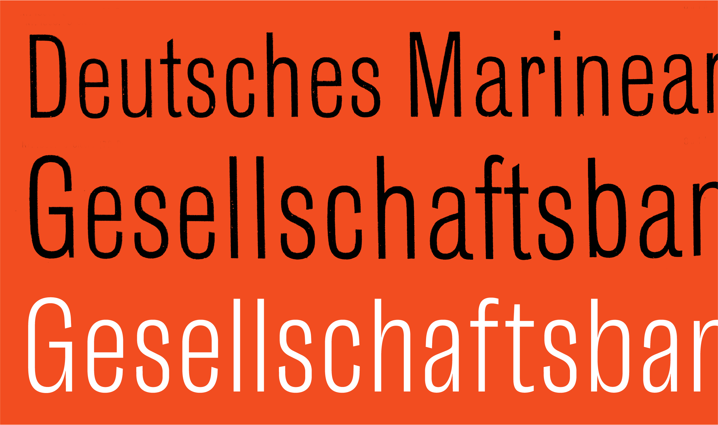
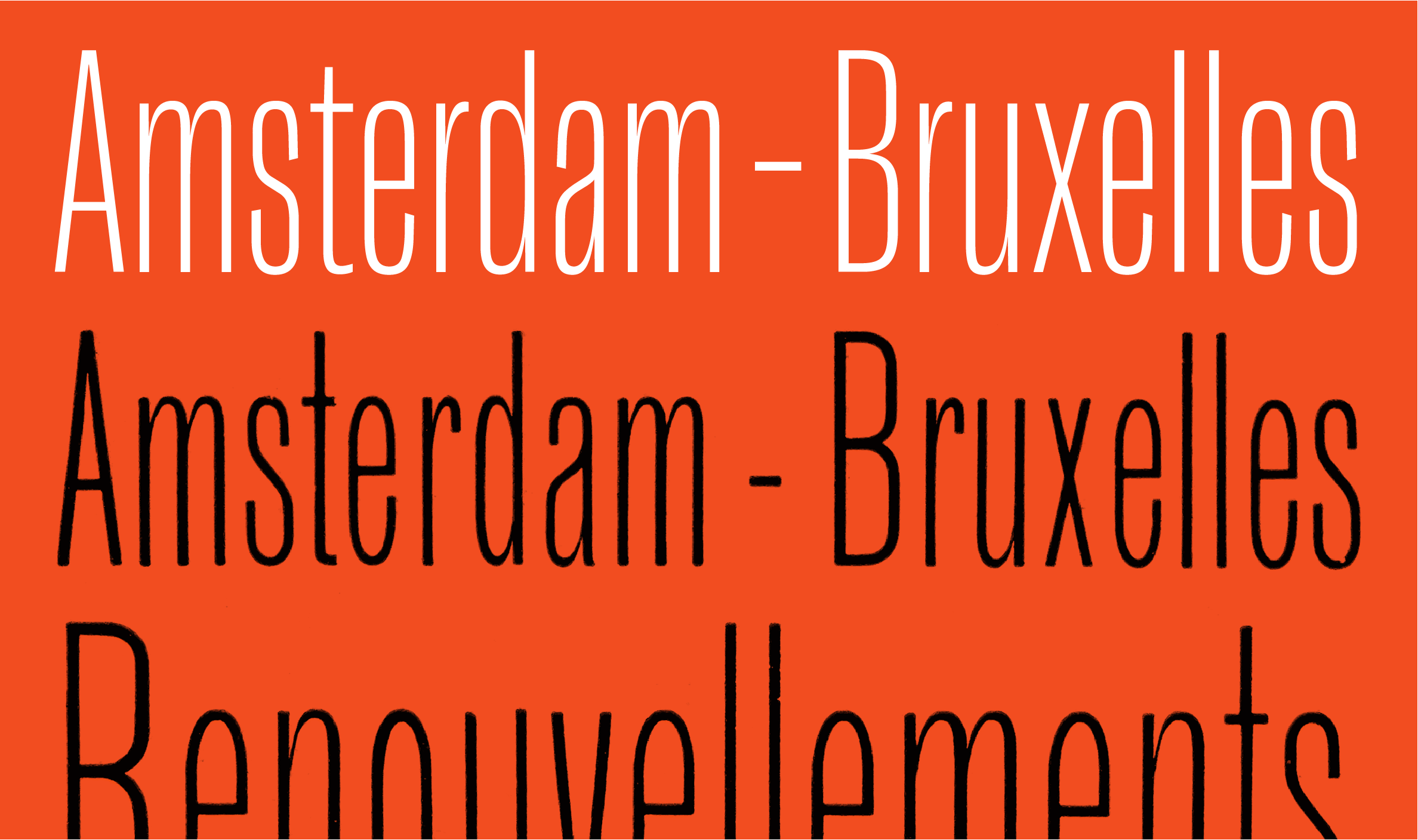
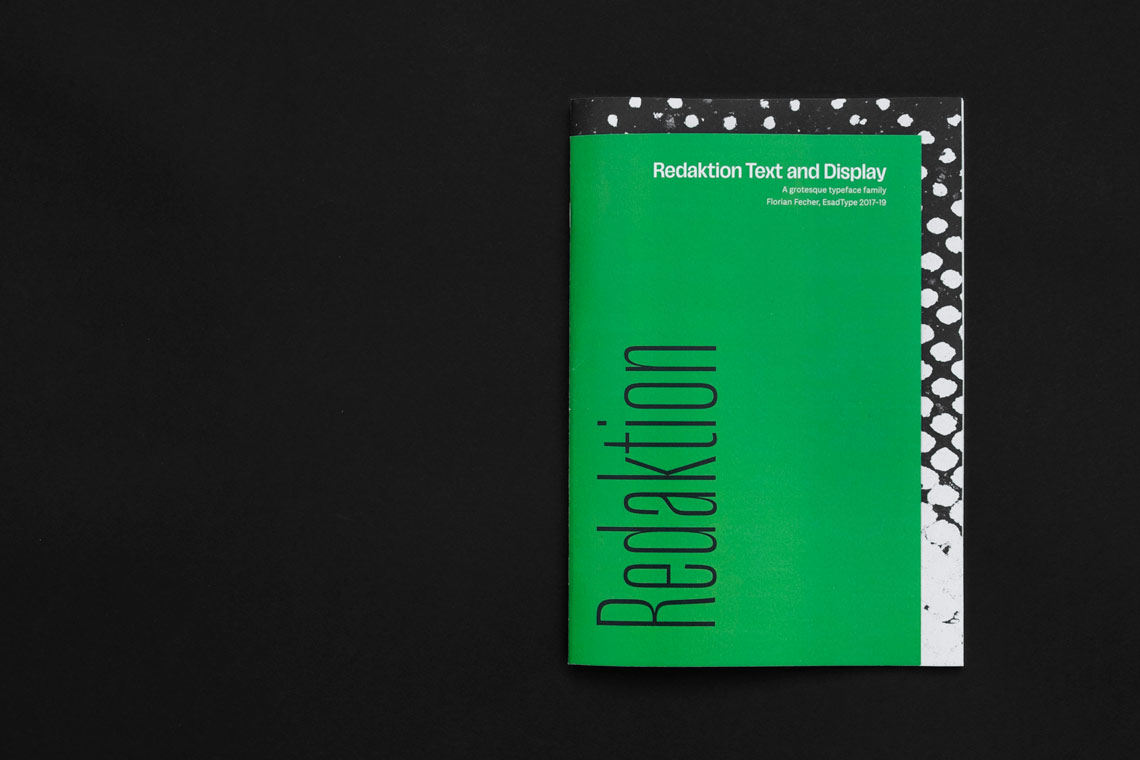
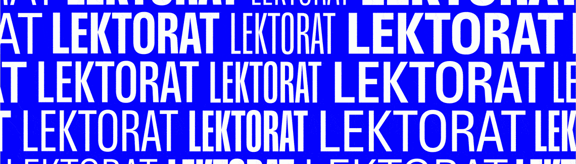
Florian Fecher is a German type and graphic designer, calligrapher, letterer, typographer, and writer. We talked together for the first time over a year ago, when he was chosen as the fifth winner of the Gerard Unger Scholarship. Fecher finalised Lektorat, his graduation typeface made during the EsadType programme in Amiens, France, under the supervision of Veronika Burian and José Scaglione. Now that TypeTogether has released the Lektorat family, we reconnected to see what has transpired.


By Linda Kudrnovská

Florian, can you briefly describe your Lektorat family? What kind of typeface is it?
Lektorat is a grotesque for headings from deck to display sizes. It is a response to the needs of complex layouts, offering seven upright weights in three widths: Compressed, Condensed, and Narrow. Lektorat’s light and heavy weights are especially well suited for activating typography — being used as a stimulus to read, grabbing attention while informing about a subject matter, and competing with or assisting large images.

Lektorat Text is its companion for body copy. A sober typeface, not distracting from the content, with a concise setup from regular to bold and with matching obliques. While suited for informative or selective reading, this is a sans serif specifically aimed at immersive reading — the long reads.


The world has changed in many ways since we last talked. We will not see Lektorat used to announce “Brexit cancelled!” anymore, as you suggested in the previous interview. Who is Lektorat meant for?
Though Lektorat was originally developed in the context of news magazines, this family’s possible applications are not limited to editorial design environments. It can deliver a broad range of subjects appropriately, on- and off-screen. Even bad news, if it must.


Gerard Unger Scholarship

Could you describe your general experience with the Gerard Unger Scholarship?
Two EsadType alumni before me had completed this mentorship programme. That was one of the reasons I applied to this course and submitted an application to the Gerard Unger Scholarship upon graduation. The sponsored trip to the ISType conference in Istanbul — where I met Veronika and José in person — marked the beginning of TypeTogether’s support. During four months in 2019, I benefitted from intensive, weekly sessions with the two of them. Most of this time went into the display part of the typeface. Their experience in developing large families helped me a lot with determining the final design space, fine-tuning weight and width of redrawn masters, and completing the character set, especially diacritics.

The first time the TypeTogether team was introduced to you was during our annual company trip to Italy in May 2019. Even back then we had a video conference with you, long before it was trendy. Was it a new experience for you to work remotely, or were you used to it even before the pandemic?
Meeting Veronika and José in person, like we did at ISType 2019, would have been impossible in 2020. Our weekly reviews sessions were held online. Of course, the pandemic affected our everyday lives, but the working relationship was set to be remote from the beginning and proceeded like pre-COVID-19.


Florian fecher and josé scaglione, istype 2019
veronika burian & florian fecher, istype 2019


Lektorat, the beginning

You are well aware of the sans serif tradition. Could you name a few milestones you looked back to when designing Lektorat?
Two historic, narrow, lightweight references by the German typefoundry Schelter & Giesecke were a main source of inspiration. I was fascinated by the tapered, highly contrasted junctions of Schlanke Grotesk (published in 1882). Schmale Grotesk (published around the turn of the 19th to 20th century) on the other hand preserves a monolinear stroke with squarish letterforms. My intention was to combine features of both into a new design with squarish, high raised shoulders and thin joins where curved strokes flow deep into the stems.


Lektorat variable font (white, tracking +30/1000) vs. Schmale Grotesk (black, 36pt. & 48pt.) from: J. G. Schelter & Giesecke: Hauptprobe, 1. Band, Leipzig 1912.


Lektorat variable font (white) vs. Schlanke Grotesk (black, 36pt. & 48pt.), here as Antiques Maigres Étroites from: J. G. Schelter & Giesecke, Caractères, Leipzig 1910.


How about Lektorat’s contemporary competition? And was there anything you wanted to avoid in this field?
Production Type’s Libé Sans, a custom type system for the French newspaper Libération (Media Sans is the retail version) is a personal favourite of mine and definitely had its impact on the bolder side of my family. Lektorat is more restrained in terms of high x-height, low descenders, and tight spacing, but I’ve constantly shown Libé to demonstrate what is possible in the realm of news publishing.

An expressive character trait of Lektorat are closing apertures like in the letter ‘a’, where the top terminal reaches down to the bowl below. The idea originated from a variable font experiment during my studies. I wasn’t the first person to do it and I really like seeing other designers’ recent takes on sans serifs with overlapping contours: Sombra by Paul Eslage with TypeMates, for example, or the FutureFonts work in progress Jaune by Studio Triple and Saiga by Teo Tuominen.

By the way, I’ve come to realise some of my curve constructions show similarities with DIN, which happened completely sconsciously. One might assume that’s because I’m German and its variants have been all around me my entire life.


Lektorat Compressed Black, Condensed Black, and Narrow Black.


A new Lektorat

Lektorat began as Redaktion, your EsadType graduation project. How much does the final Lektorat family differ from Redaktion?
During our first encounter in Istanbul, we decided I should alter the design space. The condensed widths were more interesting and their horizontal space efficiency would prove valuable in the targeted display use environment. Consequently, the Normal width was abandoned.

Redaktion’s most compressed width consisted only of a single lightweight style back then. I had been under the impression this range didn’t allow for a satisfying Black or Extrabold extreme. Fortunately, José and Veronika encouraged me to give it a try. The resulting Lektorat Compressed Black is one of my favourite styles from this family now. Fine-tuning the weights necessitated redrawing masters, and I changed the construction of certain letterforms, shortened descenders even more, and many more little changes. However, the shifted design space certainly is the most obvious sign of the revision process.

In contrast, differences concerning the upright text styles are marginal. It became slightly more squarish, junctions are minimally thinner and the diacritics have been improved. The Lektorat obliques were redrawn from scratch because I was unhappy with my first try. This new one is a true oblique; I followed Kai Bernau’s advice (he was an external guest critic for our post-diploma presentations) and got rid of the italic ‘a’ and ‘g’ in favour of their double-story shape.


Specimen designed by Florian Fecher for ESADType, 2017–2019.


Is there any shape, glyph, or detail of which you are particularly proud?
Lektorat’s section symbols and ampersands were challenging. I wouldn’t pride myself on either in particular, though. Their structural complexity is a demanding design challenge on its own. Following through with the concept of forcedly closed apertures in Extrabold and Black only increased the level of difficulty for those two characters. Anyway, I am under no illusion. During all that time spent on heavy weight section characters I was aware I’d probably never see them in action.


Plans

Did the scholarship change your career plans or actually life in any way?
It didn’t alter my career path, but the additional funds, mentoring, and acknowledgement were reassuring, especially after finishing my formal education. Furthermore, the scholarship enabled me to stay longer in France, where I had completed my studies. I’ve greatly improved my language skills, gotten to know this country better, and met people with whom I am very close now.

Did the Gerard Unger Scholarship meet your expectations at all?
In every aspect! The final months of the postgraduate type design course passed by fast. Picking up where I had left off, and guided by TypeTogether’s feedback, felt like an extension of my studies while it offered me the chance to learn about working within a remote foundry environment at the same time.

By the way, are you happy with the final Lektorat family?
Yes. And I cannot wait to see it in use!


About Us

TypeTogether is an indie type foundry committed to excellence in type design with a focus on editorial use. Additionally, TypeTogether creates custom type design for corporate use. We invite you to browse our library of retail fonts or contact us to discuss custom type design projects.