Literata Book

April 2015

In April 2014, the TypeTogether design team, led by Veronika Burian and José Scaglione, started work on a brand new tailored type family for the overhaul of the Google Play Books application. Google’s brief for the project was exhaustive in its requirements. A new book typeface was needed that would provide an outstanding reading experience on a whole range of devices and high resolution screens running different rendering technologies. Additionally, the new Play Books type family was meant to establish a recognisable visual identity for Google’s native eBook app and stylistically distinguish itself from other eReader competitors. Literata satisfied every requirement and is now the default type family on all works from Google Play Books.

Literata. A custom typeface for Google Playbooks

Literata. A custom typeface for Google Playbooks

inspired by both Scotch and oldstyle Roman types

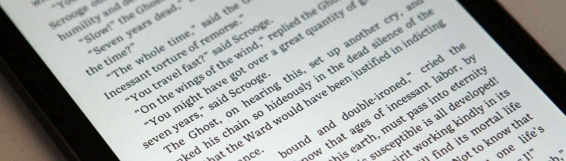
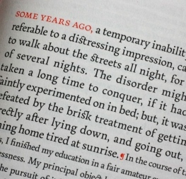
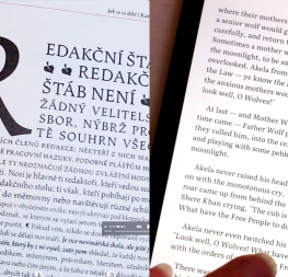
The electronic or digital book represents one of the most important challenges designers and developers face today. The technical limitations of devices regarding rendering of type, together with their variety of physical sizes, are only two of the main obstacles eBooks must tackle. These facts contribute to an unfair yet appropriate comparison with their analogue counterpart, where typography plays a leading role. The Play Books custom font project offered an opportunity to approach some of these problems from a new perspective.

Literata. A custom typeface for Google Playbooks

Type-founding and printing are as much interlinked as digital type and rasterization are. The limitations imposed on type rendering due to coarse grids on low-resolution screens have therefore effected the way lettershapes look. This became very clear when analysing book typefaces in use in the most common eBook readers on different devices. The existing typefaces had a very uniform and almost mechanical feel. This is excellent for rendering purposes but does not help with immersive and continuous reading. In other words, they were not fonts meant for digital book design.

TypeTogether’s counterpart team at Google, led by senior UX designer Addy Lee Beavers, agreed that the desired typeface should have a more interesting and varied texture than other eBook fonts being used or ones generally developed for on-screen use. This could be achieved by means of slanted stress, less mechanic letter structure, and varied horizontal proportions of characters. Based on these premises and on an intensive iterative process, TypeTogether arrived at a solution of hybridisation — taking inspiration from both Scotch and oldstyle Roman types. The resulting letterforms create a pleasant organic texture that delivers very good results for ease of reading and comfort.

Literata. A custom typeface for Google Playbooks

Literata. A custom typeface for Google Playbooks


three scripts

After settling the primary design, TypeTogether suggested an upright italic as the secondary style to address the inherent limitations of the square pixel grid. This less common approach of creating italic shapes and style without slanting also adds high branding value to the type family by making it more unique and recognisable. By sight alone the public instantly knows they are reading on a Google eReader, which instills a sense of familiarity, confidence, and personal ownership.

Literata. A custom typeface for Google Playbooks

The final Literata family features two weights (regular and bold) with matching upright italics, including more than 1,100 characters for each of the four weights. It also includes PanEuropean language support — meaning Western, Central, and Eastern European languages are all included — as well as full Latin Extended, Polytonic Greek (designed by Irene Vlachou with external consultancy by Gerry Leonidas), and Cyrillic (designed by Vera Evstafieva with external consultancy by Kiril Zlatkov). The Literata custom font package can be found on Google Play Books version 3.4.5+.


Literata. A custom typeface for Google Playbooks

Literata. A custom typeface for Google Playbooks

SaveSave

About Us

TypeTogether is an indie type foundry committed to excellence in type design with a focus on editorial use. Additionally, TypeTogether creates custom type design for corporate use. We invite you to browse our library of retail fonts or contact us to discuss custom type design projects.