Literata: Renewed, Expanded & Free

December 2019

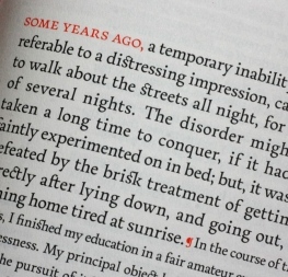
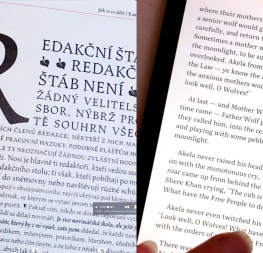
One of the most distinct pieces of typographic branding in recent years is Literata — the type family we created for all Google Play Books. Its combination of form and function came about by solving a serious challenge: reading a novel on any number of devices. It was so well received that Google asked TypeTogether for a serious update and to release it for free on Google Fonts. We’re happy to announce that version 2.1 was released in mid-2019, and that version 3 is well on its way. Read the story and get the free font family.


Everyone loves a little behind-the-scenes look at creative work, so we have that for you here. Literata is the brainchild of Veronika Burian, José Scaglione, and the UX team at Google Play Books. Google wanted a typeface that would be immediately recognised on sight, as well as comfortable enough on the eyes for a reader to polish off a digital novel over a long weekend. The new type family had to be extensible to other scripts and languages and to perform incredibly well on myriad digital devices with untold possible screen configurations: wide pixel density ranges, e-ink, LCD, Retina, OLED, and more.


Veronika and José took each set of parameters to heart and created something functional, aesthetically pleasing, and unique in the world of digital book fonts — the Literata family. Originally in only four styles, Literata proved to be a game-changer, so Google returned with the request to expand the family. Literata 2.1 was released on Google Fonts in mid-2019 with a total of eight styles, including small caps and new characters for language support.

Google returned again with another request for Literata version 3: further typographic refinement and greater capabilities. For this, TypeTogether established a new design space so it could be made as a variable font. While around 50 discrete styles could be easily exported from the design space, the variable font format allows an almost infinite number of styles to be made on the fly by the user (whether the user is a piece of software that defines those parameters or a person making a choice about the style) and with a much smaller file size than traditional type families. This serves the reader well by freeing up storage space, providing additional developer bandwidth, and simultaneously giving the font an exponential increase in ways it can be used.

The core of the design remains unchanged. Literata is an effective digital book serif from Scotch and oldstyle Roman origins. It carries forward the familiar look of serifs made for reading, but with its separated stem and retraced curves (seen in the italic ‘r, n, m, u, b’), Literata’s upright italic stands apart as an aesthetic and functional solution to an array of digital problems.

Literata 2.1 is available now for free on our website. Version 3 will be available within a few months and we’ll be sure to alert you when it is released. In the meantime, grab version 2.1 to typeset your next novel in Latin, Greek, or Cyrillic, and revel in the upright italic that tames the pixel grid like none other.

Get Literata for free here!


About Us

TypeTogether is an indie type foundry committed to excellence in type design with a focus on editorial use. Additionally, TypeTogether creates custom type design for corporate use. We invite you to browse our library of retail fonts or contact us to discuss custom type design projects.