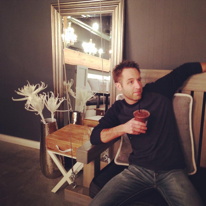
Meet Josh
February 2019
We continue our interview series with the TypeTogether team. Grab a coffee and a hardcore jazz album — it’s time to meet Josh, our writer and editor.
We continue our interview series with the TypeTogether team. Grab a coffee and a hardcore jazz album — it’s time to meet Josh, our writer and editor.
Joshua is the only TypeTogether teammate in the United States, but he has learned how to write British English-ly. He has been our writer and editor since 2015 and invests a lot of himself in order to make our texts shine. ‘Why?’ is his second favourite word and we believe his first favorite is ice cream (or coffee!). Josh is a drummer, so don’t be surprised when he taps on furniture. He has ghostwritten and edited seven books for others and can be a bit obsessive sometimes: fonts, the color blue, or studying one subject for months or years at a time — like typefaces!
1 · Where is your office located?
I can make my office wherever my laptop and a great cup of coffee are, but usually that’s at the desk in my room.
2 · In what countries or cities have you lived?
I was raised in Virginia, then moved to the central coast of California for a few years, and now I’m settled in Kansas City — right in the middle between the two coasts.
3 · What kind of music do you listen to, if you do, while working?
Since I deal with words, my working music either needs to be something I know so well that I don’t notice the words, or music without lyrics. I’m also a drummer, so I’ll often be listening to jazz that is based around the drummer. This includes the greats of the past like Miles Davis or the modern jazz of Dave Weckl, Anika Nilles, and Snarky Puppy. If instrumentation is needed then I opt for Hidden Orchestra, Tycho, or Clint Mansell.
If I’m ready for some blood-pounding complexity, I go for the intricate hardcore jazz of bands like Animals As Leaders or the syncopation of TesseracT. If I know the songs well, then it will fade into the background and I can keep working. That includes mainstream artists: My Epic, Mutemath, Sara Bareilles, Deadmau5, Norah Jones, Dave Matthews Band, and John Mayer.
4 · Can you name three fonts you love (designed by others)?
Oh, only three?! I can name one hundred! Full disclosure here: I’m one of the lucky ones. I started working with TypeTogether because I fell in love with their entire catalog(ue), and, as the person who gets to describe the type families, it means my job is incredibly rewarding. So my everyday digital writing is done in our Karmina Sans family because it’s perfect on any screen. I even installed it on my iPhone and use it in the Notes app, Messages, and in Mail. There are of course others in our catalog that I love — the Adelles, LFT Iro Sans, Noort, Maiola, Essay, Arlette, and the Finos — but I’ll pick some from other foundries.
For the rest I’ll pick designers rather than single typefaces. Underware’s Auto, Liza, Fakir, Tripper, and Sauna Mono are unique, current, beautiful, and demonstrate an extraordinary range. Besides, those guys are on the cutting edge of coding and experimentation, which makes them doubly brilliant.
Mark Caneso is an overly-talented letterer and has quite a few typefaces I love. For example, Hatch, Campaign, Ditch, Quatro & Quatro Slab, which are made for very targeted uses. There’s a few by Kris Sowersby that are high on my list: Feijoa and the striking sans and serif Domaine family. I also love the unique Remo and understated Alto by Thomas Thiemich, Vesper by Rob Keller, and Artigo and Artigo Display by Joana Correia. Of course I could go on for quite some time about many others that remain high on my list.
5 · Who is your everyday hero?
My wife is honestly the best human I know. She has a gift for being organized and for helping others do the same, she always puts others before herself, she cares deeply for our family and shows it in countless tangible ways every day. She’s also a real go-getter when she is focused on a goal, and even when her day seems overloaded she somehow gets it all done in stellar fashion. She is always trying to create moments with our family that the kids will remember later in life: everything from holiday events to simple, fun times. And she wisely maintains a hopeful perspective, keeping the value of others in first place.
6 · What are your love/hate glyphs when designing?
I wish I could design type, but besides messing around with Glyphs here and there, it’s not my gift. I’m a writer, editor, and graphic designer who gets to use type, and I enjoy that. But I do love seeing a well-designed ‘a’, ‘S’, ‘&’, ‘R’, ‘?’, ‘@’, and ‘g/G’.
7 · What is your hobby when not designing fonts?
I work part-time as a writer and editor for TypeTogether and other clients worldwide, mostly in the font world, like Martina Flor, Neil Summerour, Laura Worthington, and others. The rest of my week is spent as a realtor. With either position, my goal is to do an assessment of someone’s needs, come up with options to help, then solve that problem. I help people obtain the home of their dreams and spend the rest of my week on writing, editing, consulting, and sometimes teaching or pitching in at the local universities.
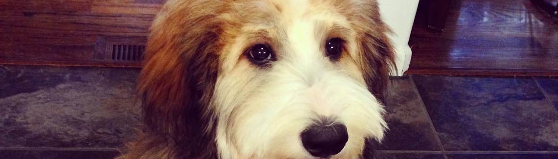
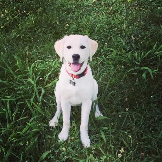
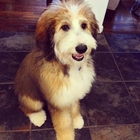
Besides that, I read a ton — philosophy, psychology, and theology especially — and our family breeds dogs as a side business. I also (no surprise here) read a lot about type and design. It really is a hobby of mine and has been for years. I’m one of those nerds who downloads every new Master’s essay or thesis I can get a hold of and watches every video from the latest conferences.
8 · You have one opportunity to do something different in your life. What do you choose?
I love the combination of form and function, so I would probably say architecture or some kind of industrial design, such as car design.
9 · What is your favourite word?
When I’m testing typefaces and looking for its voice, I always use “Ramburgefonstively@&?” as my keyword. But for real words, I love the word concomitant. I read it once in a research journal when I was investigating childrearing practices. It has stayed with me since, but there’s rarely a reason to use it. Of course there’s other words I enjoy — discombobulate, onomatopoeia, excellence — some for the way they sound and others for what they mean.
10 · What is the most amazing script you have worked with and why?
I love seeing other languages, though I don’t understand any of them. I love the shapes and the possibilities they present. For instance, there’s nothing that I know of in the Latin-based world that is comparable to the geometric and calligraphic artistry seen with the Arabic script, where the structure, the design, and the words function as one entity. And it can either be in repeating patterns based in geometry or with emotive calligraphy that forgoes structure in favor of vibrant expressiveness. English lettering or calligraphy can border on this, but it’s not nearly the same.
I love seeing other scripts: Cherokee, Devanagari, Thai, Burmese, Hebrew, Mandarin, Japanese. I’m jealous of those who are fluent in multiple languages (all you amazing Dutch!) and can understand them as well as I understand English, rather than just seeing interesting shapes. It feels like a superpower to me!
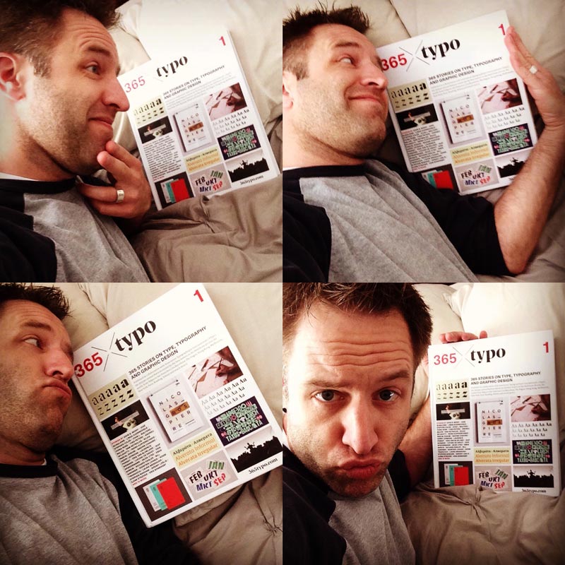
Josh enjoying the annual book 365Typo, of which he was a contributor for both volumes.
TypeTogether is an indie type foundry committed to excellence in type design with a focus on editorial use. Additionally, TypeTogether creates custom type design for corporate use. We invite you to browse our library of retail fonts or contact us to discuss custom type design projects.
Schedule an introduction meeting to learn more.