Interview with Patrycja Walczak

September 2023

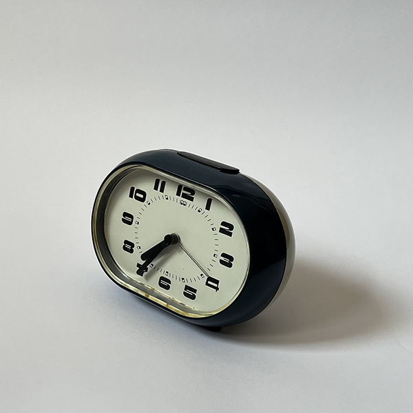
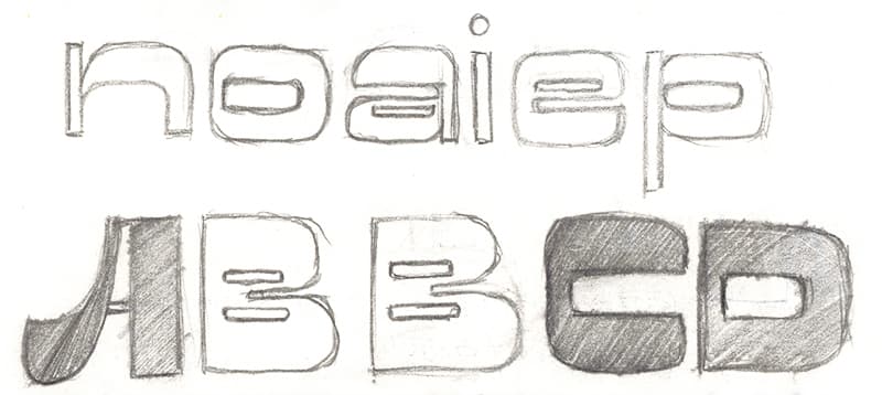
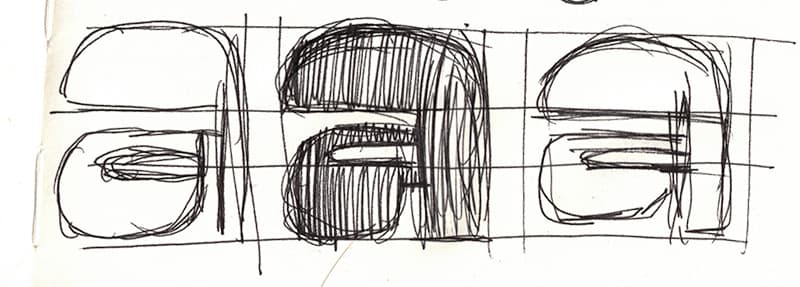
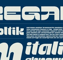
Patrycja Walczak is the winner of the ninth Gerard Unger Scholarship awarded in 2023 by TypeTogether to talented type designers. Her experimental font Poltik, inspired by the retro aesthetics of Polish product design, succeeded among this year’s record number of entries. We spoke to Patrycja about the boundaries of readability, calligraphy in her DNA, and the alarm clock found in her grandfather’s drawer.


What was the first thing that came to your mind when you learned you had been awarded the Gerard Unger Scholarship?
I wasn’t expecting it at all! It came as a surprise when I was in Berlin on a break. I was excited TypeTogether saw the potential in those lettershapes and understood the retro vibe I was going for. Also, I am thrilled to be able to learn from TypeTogether and that the team will help me complete the project I love.

Tell us something about your background. Have you always been attracted to letters?
I always paid attention to writing. Even as a kid I used to vary the way I write in my notebook because I couldn’t decide on one style!

But I only became a real type lover during the course of my studies, especially in the Type Design Studio run by Krzysztof Kochnowicz and Viktoriya Grabowska at Magdalena Abakanowicz University in Poznań, Poland. I figured out that making typography sensitised me visually and greatly contributed to my growth in various aspects of graphic design.

Only recently, I also learned that my great-grandfather was a lettering artist. My grandmother even told me that the calligraphy brushes he owned were so precious to him, he would not allow anyone else to touch them. I love those types of stories and I feel that joining the TypeTogether team will be a nice continuation of it.


One can immediately tell from your typeface Poltik that calligraphy is in your blood and genes. It has a strong retro feeling as well.
Yes, Poltik is a display typeface inspired by design from the 1960s–1980s, especially by the design of a nightstand alarm clock that was popular in Poland during that time. I stumbled upon the clock when my grandfather was looking for something in his drawer. I grabbed it and immediately fell in love with the design, especially the elegant yet funky numerals. I was surprised that something so beautiful had been sitting in my grandfather’s drawer for nearly 40 years.


Did you manage to find out more about the original design of the numerals?  
I was indeed looking for the designer to find out if the typeface existed somewhere else, but there was no information about it so I decided to create my own interpretation.

From existing numbers on the alarm clock, I made a grid and tried to preserve thick horizontals with a thin element somewhere inside the characters. I was focused on maintaining the flow of the existing numbers but also bringing in that retro feel and making the letters consistent. I’m amazed how such a small decision to open a random drawer would lead me to this huge opportunity.


We’ve used the term “retro” in this conversation, so how would you define it?
I think it refers to something that aims to have an older look but is actually designed now. Maybe also for something that is old but cool and solid so we can also enjoy it. I think it’s a positive term — some form of tribute to well-established design thinking of the past era.

And what does it mean to you personally? You didn’t live through the time when your treasured alarm clock was designed. So what feelings does the aesthetics of your parents’ and grandparents’ childhood evoke in you?
It was the time of the Polish People’s Republic with the strong influence of socialist realism in architecture. The overall design was functional and utilitarian, with a limited colour palette and bold, simple shapes. Most of the consumer goods were produced locally and unified visually.

I vaguely experienced the spirit of that time period by watching how it changed. I’m sure I romanticise that time, but based on the photos, stories, and music from it, I feel a kind of positive nostalgia about it.


How finished do you consider Poltik to be at the moment?
Poltik has the basic set of characters used in the Polish language in a regular and italic style. I think the overall design is decided at this point, but it needs some tweaks here and there for me to be fully happy with the basic set. From this point, I feel I can go in many directions and I’m excited to explore all the possibilities.


Do you have a particular idea of that direction? How would you like Poltik to improve over the course of the scholarship?
I would like to expand it to the full Latin alphabet, add ligatures, and multilingual diacritics. I plan to create various styles and weights so it can be used in many different design scenarios. I want to play with it and take it to extremes, see where the boundaries of readability are, and find out what more I can do with it.

Where would you like to see Poltik used?
I’d really appreciate seeing it applied in the context of identifying places like restaurants, buildings, or furniture stores, as well as in packaging. I used it in the packaging design of an amazing watch and it worked really well there. Ideally, since the project is supposed to have that retro funky vibe, I’d like Poltik to be a meaningful component of a larger story.


We enjoyed Poltik’s reinterpretation of a lettering style from half a century ago, and see a lot of potential in how this typeface could be developed and expanded. Moreover, Patrycja effectively connected the dots between industrial and typeface design — two disciplines more closely related than most people might realize. The commonalities extend beyond the mere combination of aesthetics and user-focused considerations: the concept of ergonomics, so well understood by industrial designers, is an important asset for those of us drawing letters.

–José Scaglione and the TypeTogether team


When Patrycja brought her grandfather’s clock to the studio, we were charmed by this little object right away. “I love it! I wonder what I can do with it?” she asked. The ten digits of an alarm clock dial from half a century ago (for Patrycja this is prehistory in her personal experience) became the impetus for the construction of all the Poltik characters, including italic.

We believe “construction” is the most appropriate word to address this typeface’s creation process. The adopted geometric principles are crucial for the final shape of Poltik (as well as distancing from them with a smile when they become a limitation). The designer’s great visual sensitivity was essential, as well as, contrary to appearances, her calligraphic experience.

Observing from where we sit, the process of working on Poltik brought Patrycja a lot of joy, pairing with her optimism, enthusiasm, and sense of humour. Her personality had a decisive influence on the final effect of interpreting a typographic artifact from the times of the Polish People’s Republic. It was a pure joy for us to go into this excellent time travel with Patrycja and supervise her project.

–Professor Krzysztof Kochnowicz and Viktoriya Grabowska, Patrycja’s tutors at the Type Design Studio of Magdalena Abakanowicz University in Poznań, Poland
 

Patrycja Walczak is a Polish graphic designer, currently finishing her Master’s degree at Magdalena Abakanowicz University in Poznań, Poland. In 2022 she took part in the Erasmus program at the National College of Art and Design in Dublin, Ireland. The main focus of her studies is letter design where she explores the power of typography in branding and communication. She also tries many different areas of design to keep her mind fresh and excited.


About Us

TypeTogether is an indie type foundry committed to excellence in type design with a focus on editorial use. Additionally, TypeTogether creates custom type design for corporate use. We invite you to browse our library of retail fonts or contact us to discuss custom type design projects.