Grano de Sal
April 2020
Toshi Omagari’s typeface Marco has been used as the main typeface in the Mexican publishing house Grano de Sal.
Toshi Omagari’s typeface Marco has been used as the main typeface in the Mexican publishing house Grano de Sal.
Grano de Sal is a Mexican publishing house founded in 2017 to promote cutting-edge thinking in science (social and natural), humanities, and arts for Spanish readers.
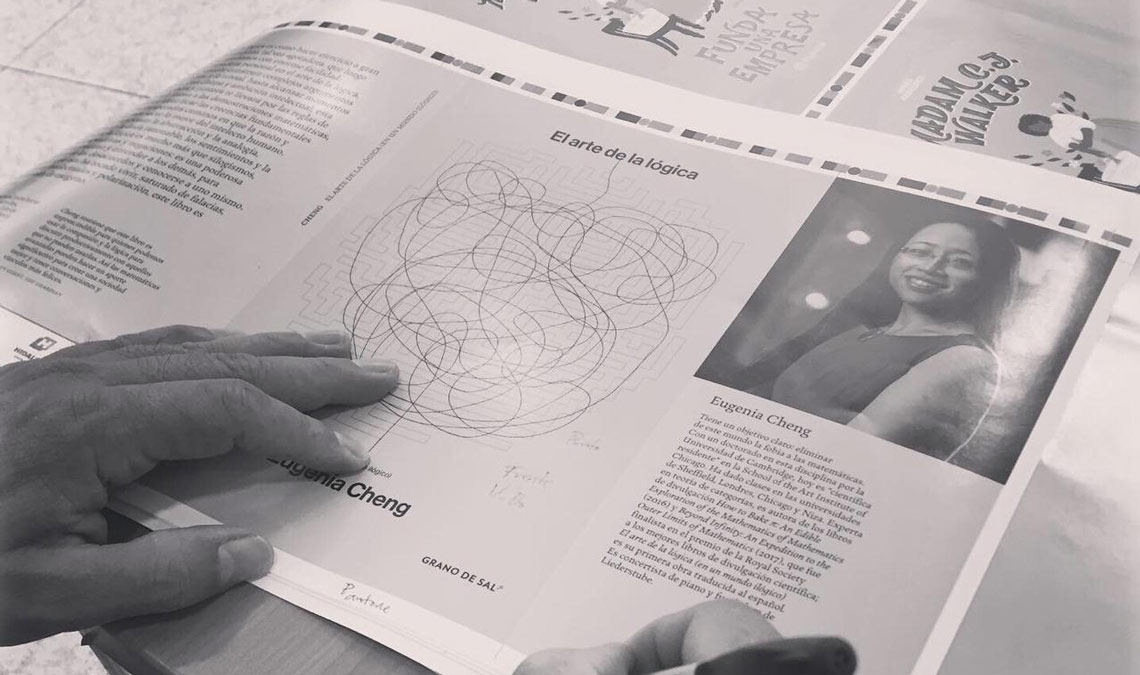
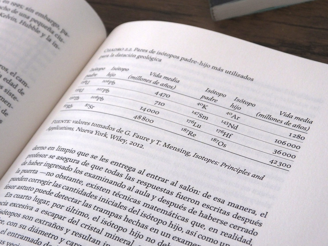
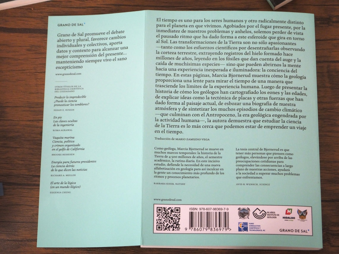
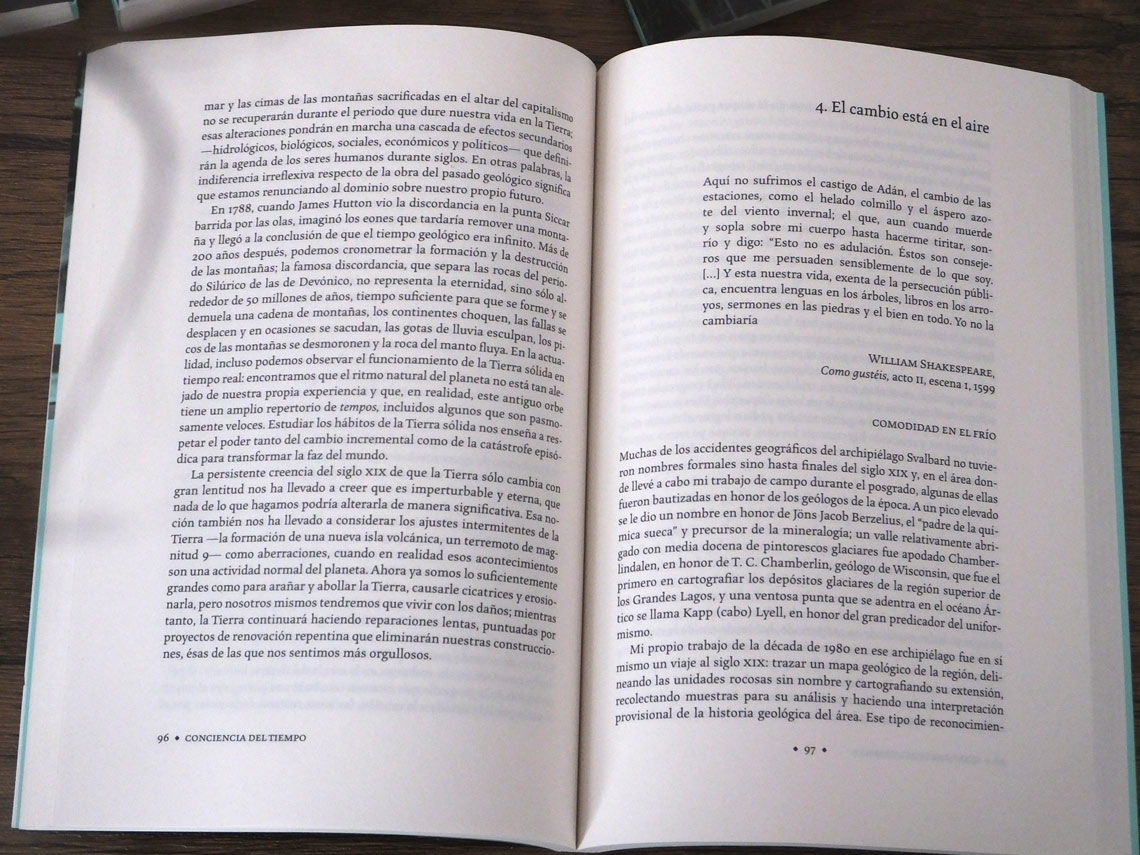
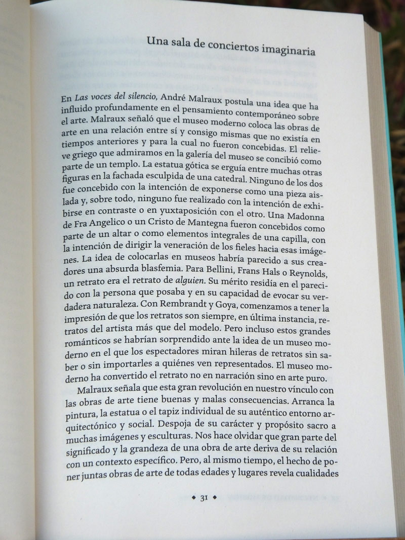
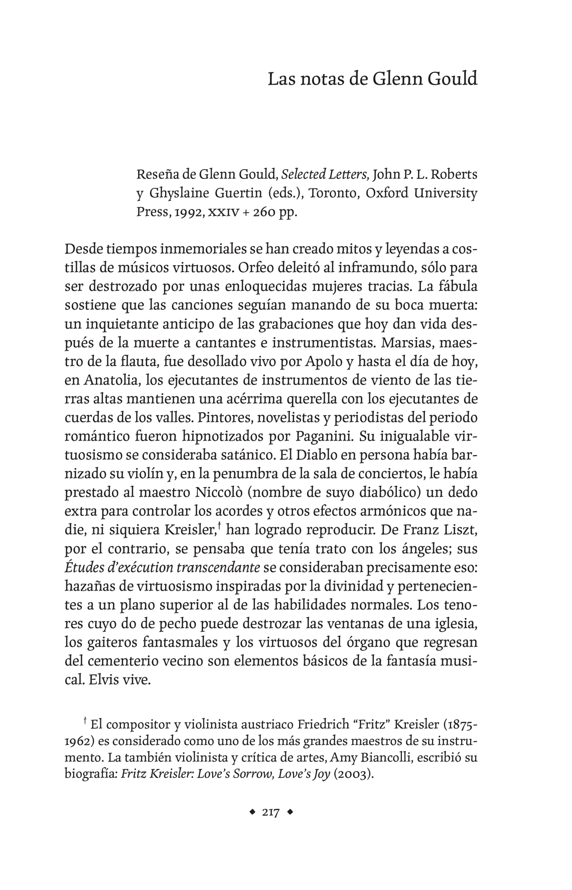
From the start they selected Toshi Omagari’s typeface Marco, a humanist serif with a touch of informality, which perfectly fit their branding and design brief.
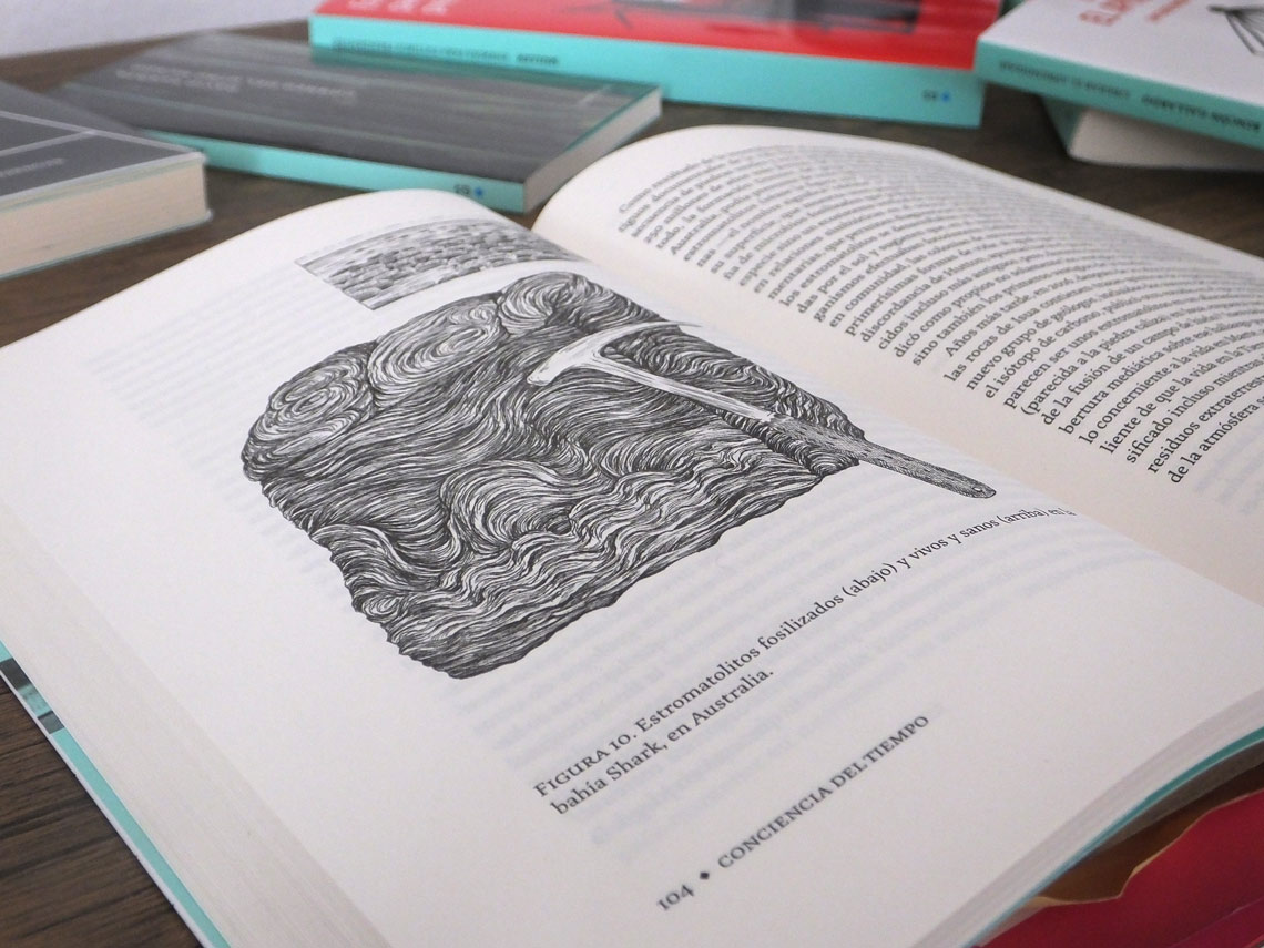
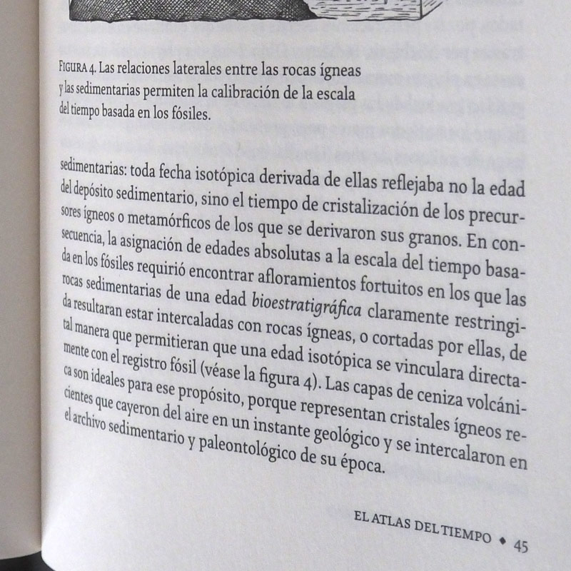
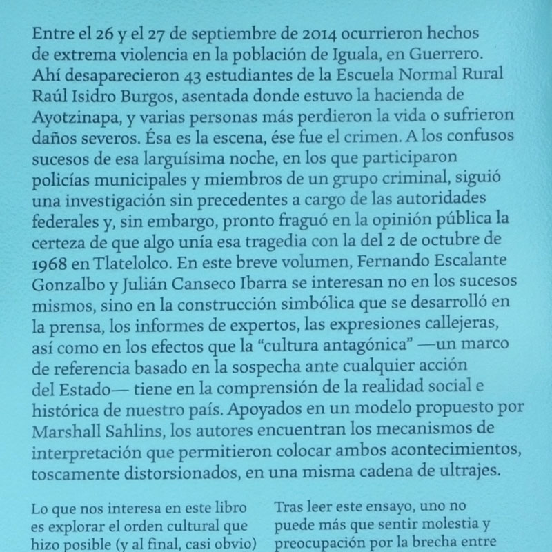
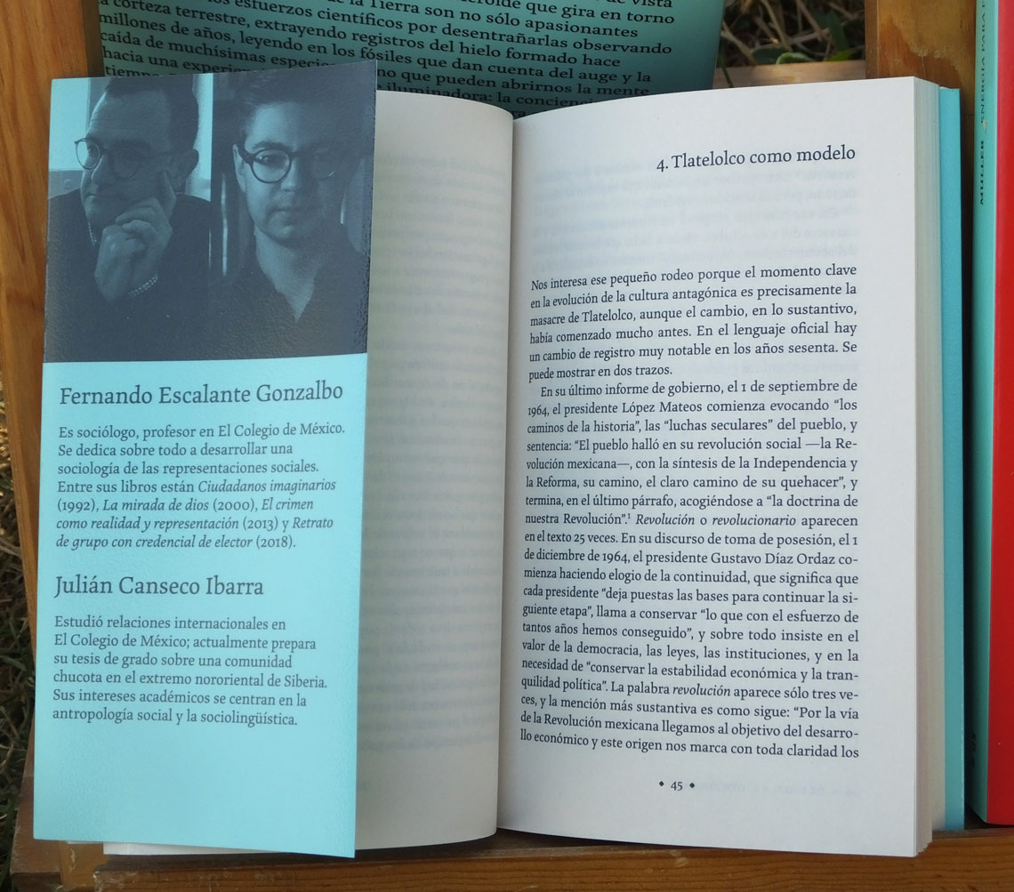
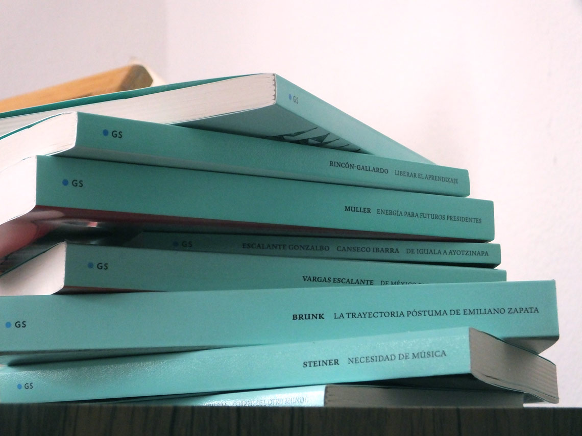
Marco is used for the main body text and also for footnotes, running headers and footers, in some headlines, on the books’ spines, backcovers, and in promotional material like their catalogue. This kind of intense, multipurpose use is exactly what Marco was made for.


TypeTogether is an indie type foundry committed to excellence in type design with a focus on editorial use. Additionally, TypeTogether creates custom type design for corporate use. We invite you to browse our library of retail fonts or contact us to discuss custom type design projects.
Schedule an introduction meeting to learn more.