“I would love to [provide the students] the opportunity of a partnership with an excellent and different foundry.”
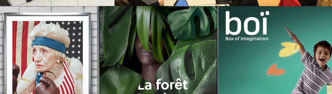
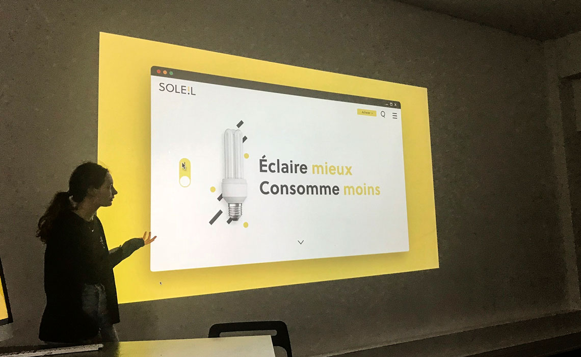
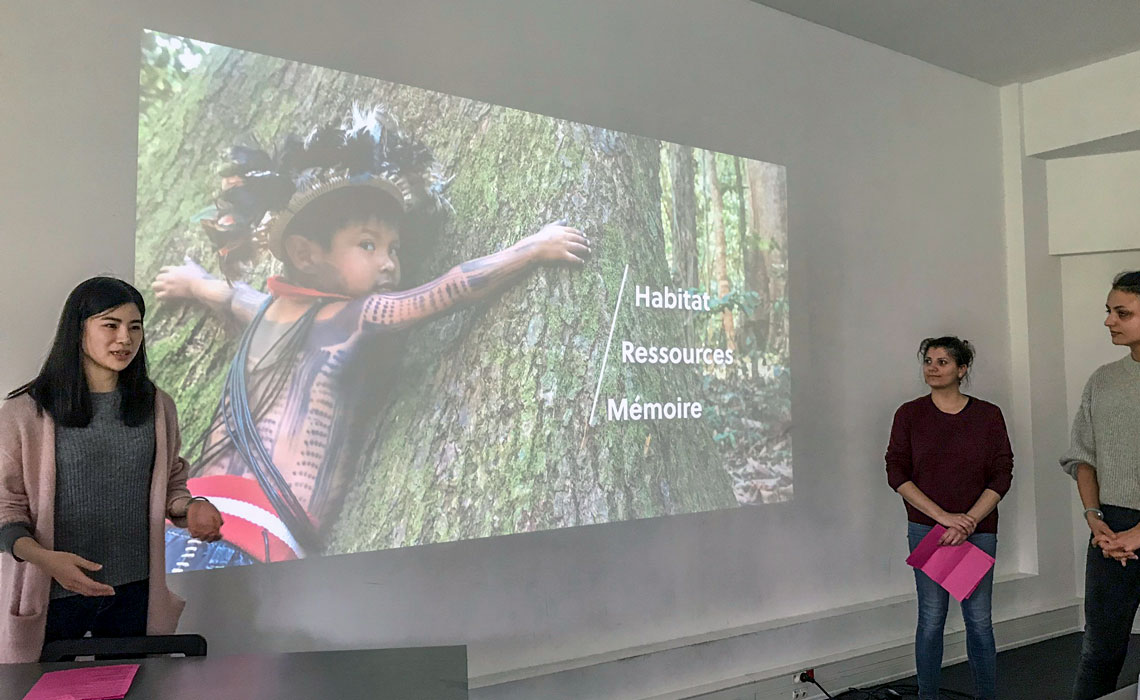
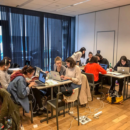
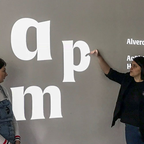
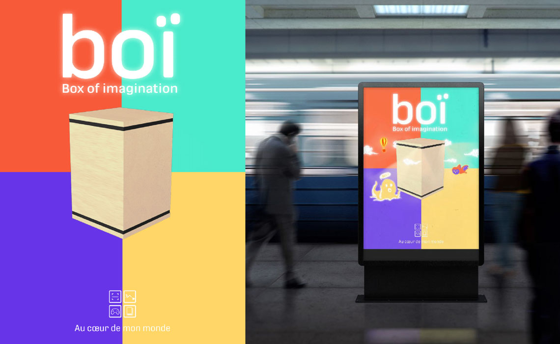
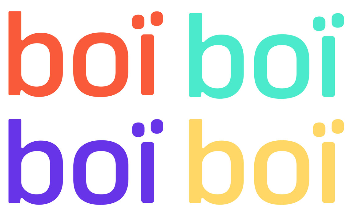
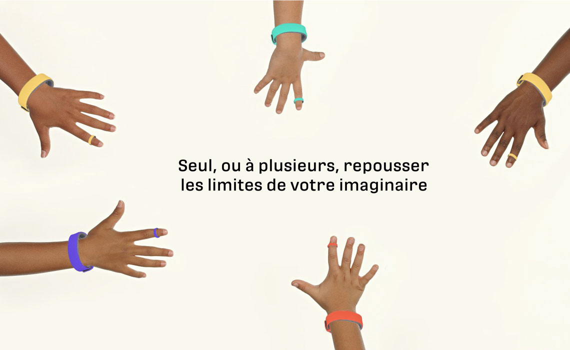
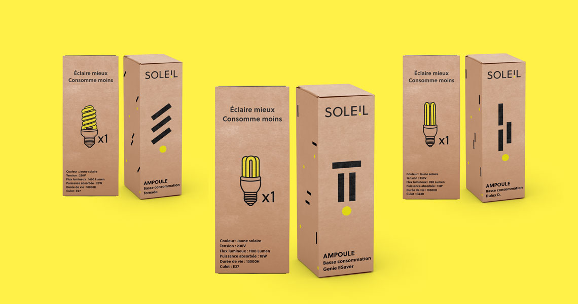
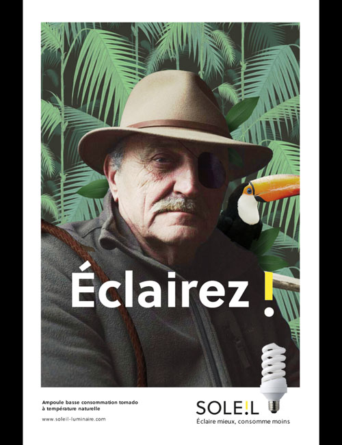
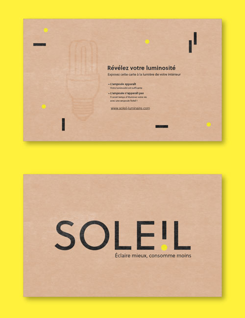
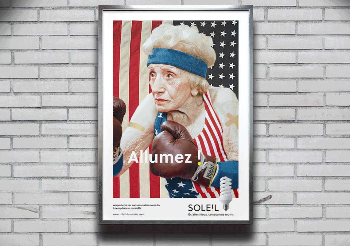
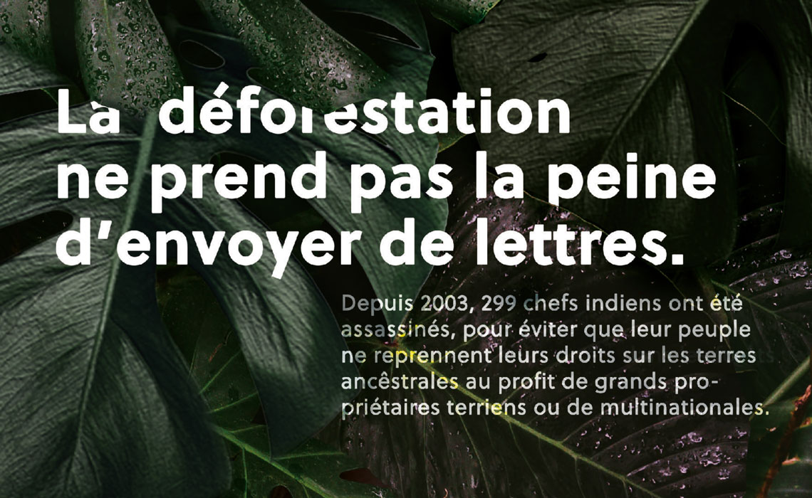
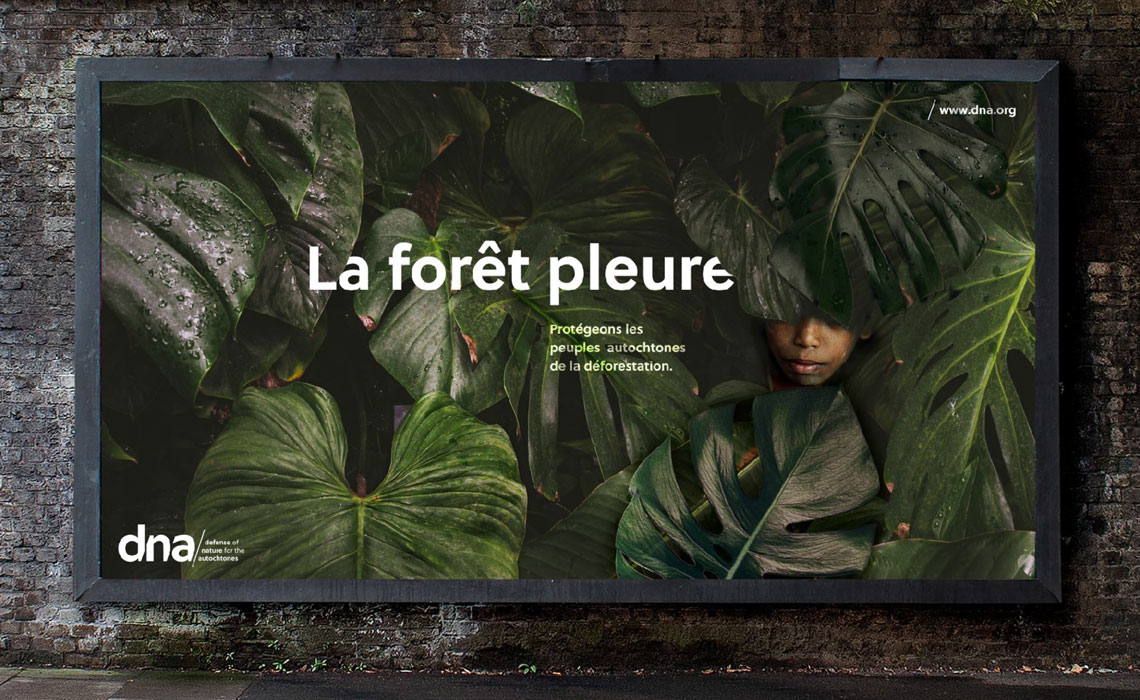
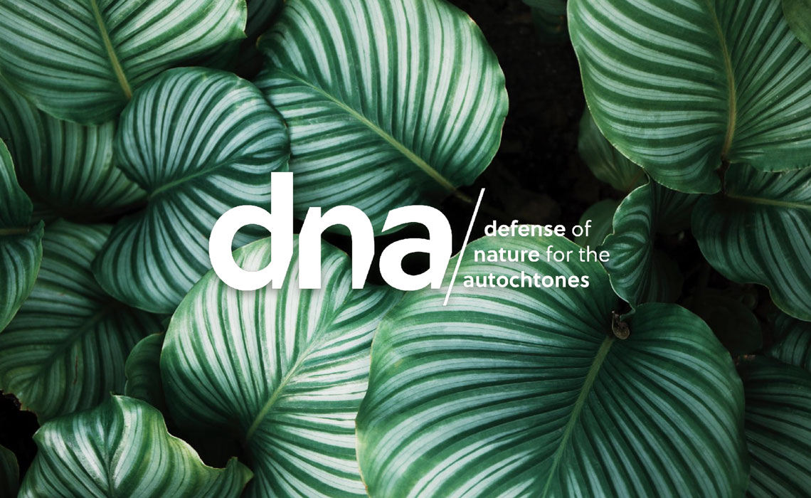
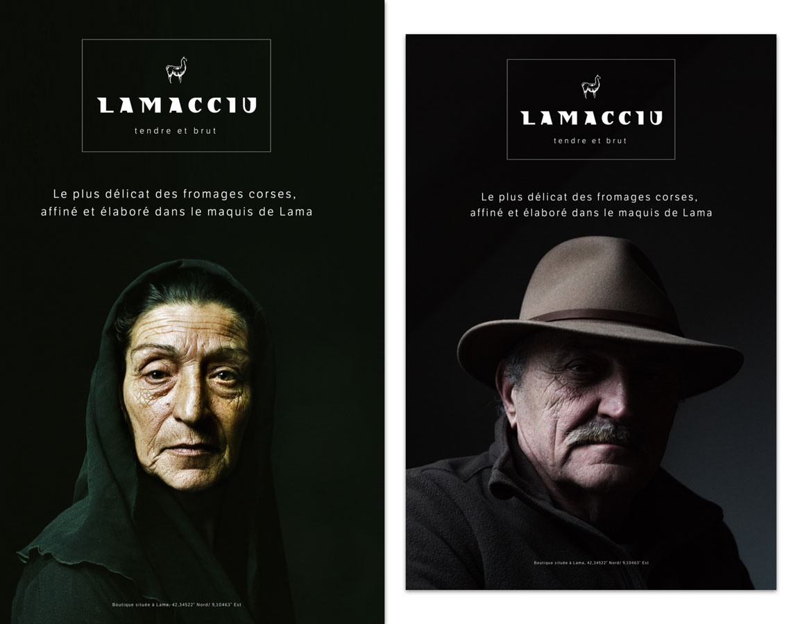
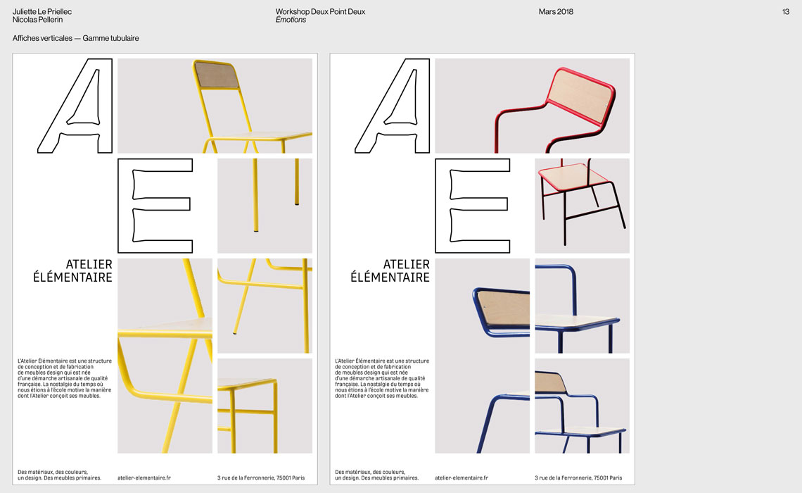
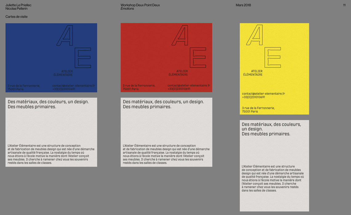
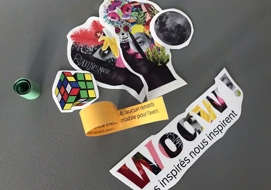
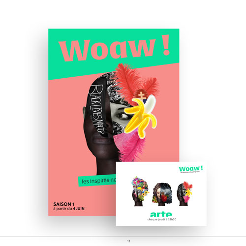
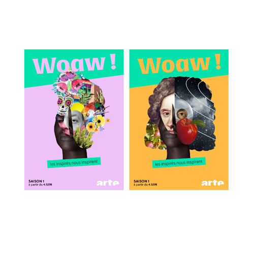
Laure and Renaud from deux point deux, chose the term ‘emotions’ as the subject for the workshop. Groups of two to three students were arbitrarily given one photo, lent by photographer Germain Herriau, and asked to use the emotions they felt while watching the images to imagine a fictive brand or non-profit organisation. This starting point led them to choose a typeface amongst TypeTogether’s outstanding catalog to convey these emotions and intuitions to the public. The selection fell to LFT Etica by Leftloft, Protipo and Abril by Veronika Burian and José Scaglione, Alverata by Gerard Unger, Lipa Agate by Ermin Međedović, and Soleil by Wolfgang Homola.
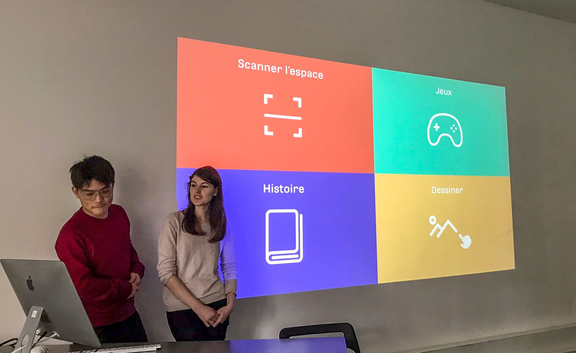
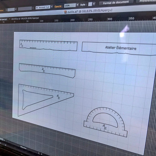
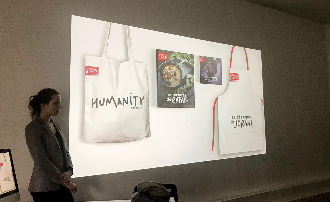
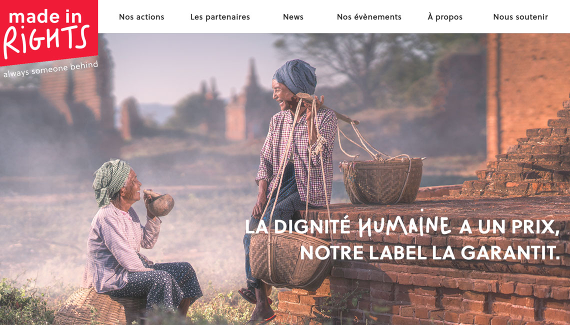
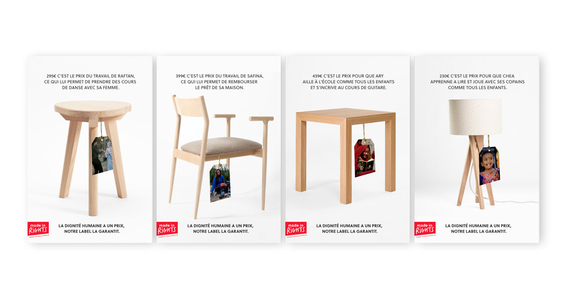
The students’ task was to create a brand and its visual identity using the chosen typefaces as a base, a poster, a website homepage, and two or three surprising communication tools. The aim was, using what the students know so far about emotional marketing, to effectively move viewers to agree with the students’ chosen cause.
”It's hard to express how much it means to us to allow students to use kick-ass photos and fonts!”