POP UK TV rebrands with Catalpa
March 2021
Superestudio rebranded kids channel POP UK with Catalpa, our heavyweight headliner with a fun attitude.

Superestudio rebranded kids channel POP UK with Catalpa, our heavyweight headliner with a fun attitude.
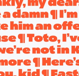
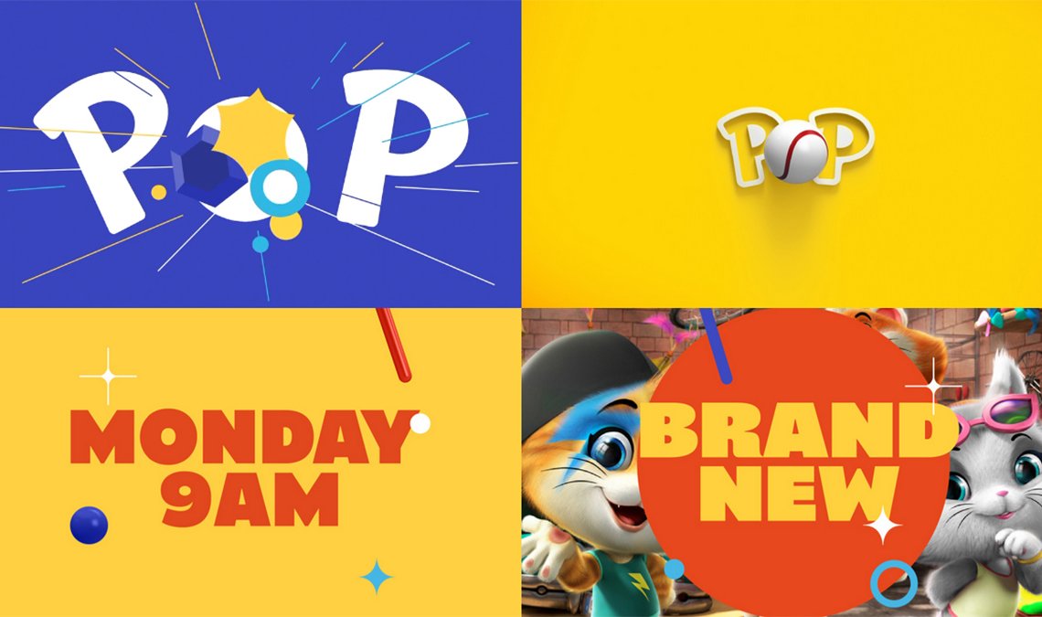
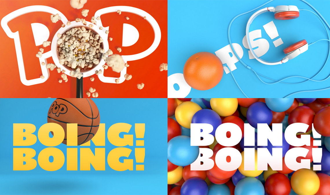
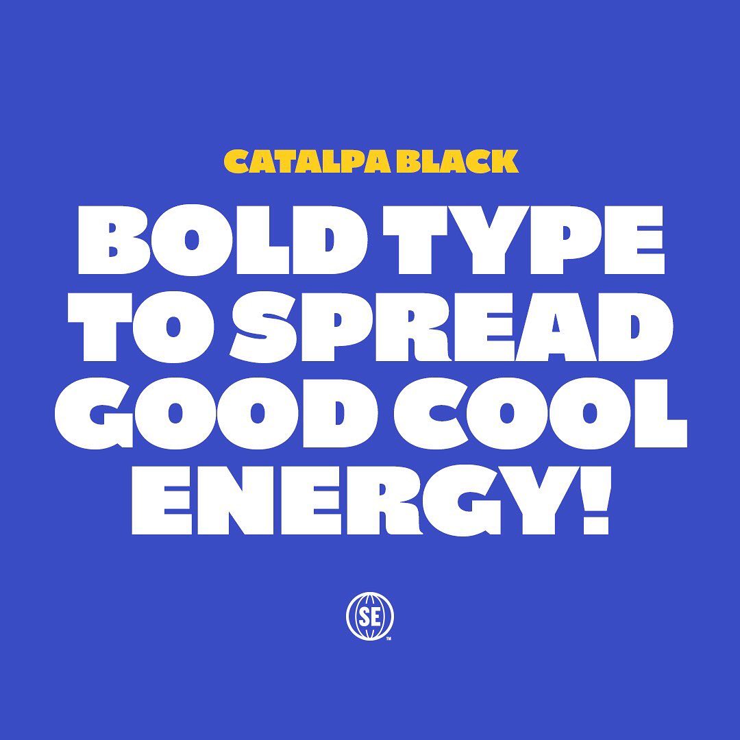
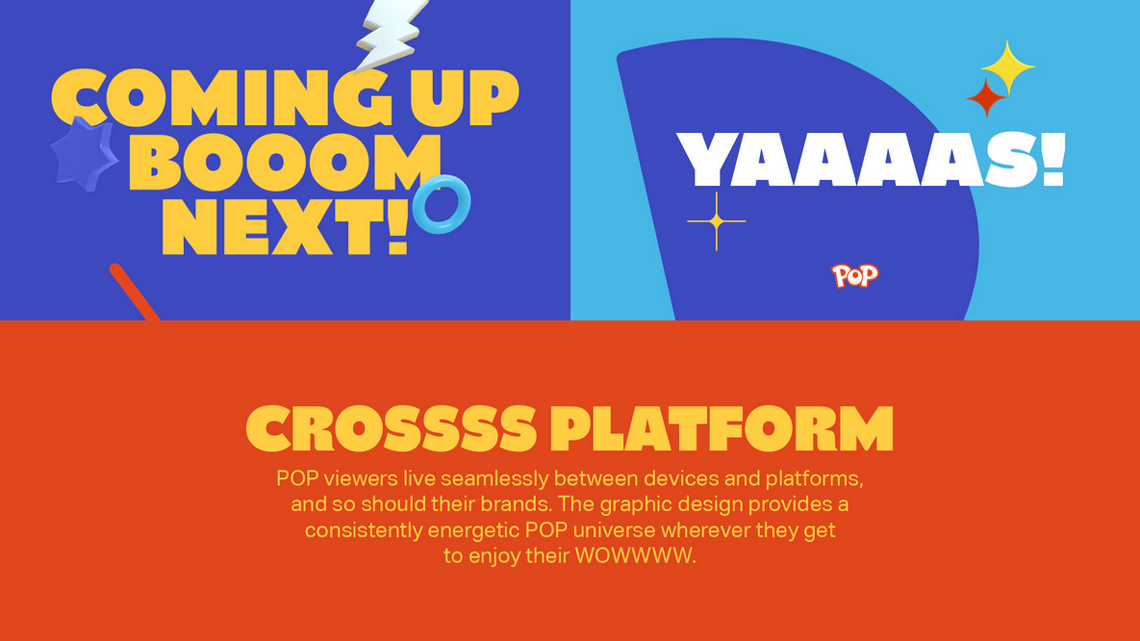
Buenos Aires-based design agency Superestudio has refreshed the UK’s leading kids’ commercial channel brand, Pop, using bold graphics, bright colors and lots of familiar faces. And we think it’s a perfect update — our headliner Catalpa in the Black weight. Catalpa has big impact and keeps everything bouncy and engaging. Bright, contrasting colors jive with Catalpa’s can-do all-caps attitude, and the whole brand stretches across every media platform and format popular today, even when on the go.
“Putting the logo at the center of this brand refresh meant we could work with and strengthen an already well-recognized brand element,” said executive creative director Ezequiel Rormoser. “We used the logo as the gateway to everything good that happens on the channel. And then we added more ‘pop’ to bring everything to life.”
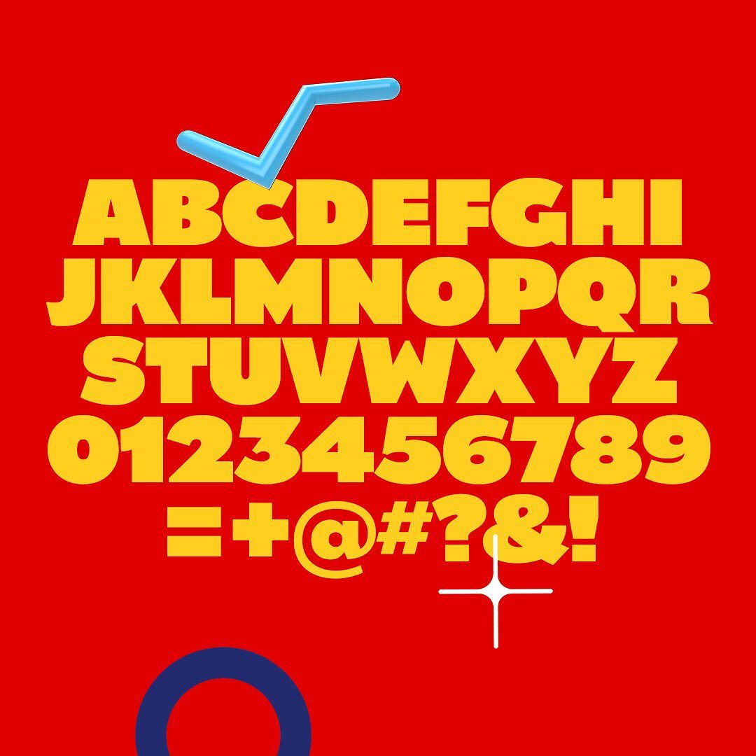
Big, round typefaces have been used for decades to represent comedy, approachability, and youth. Catalpa taps into this feeling for this brand specifically. “Key to creating a stand-out refresh was taking a bold position when it came to personality and tone of voice. The brand is designed to feel fun but also to have a cheekiness to the on-air energy,” said Fabio Ardemagni, director, creative centre UK for Pop.
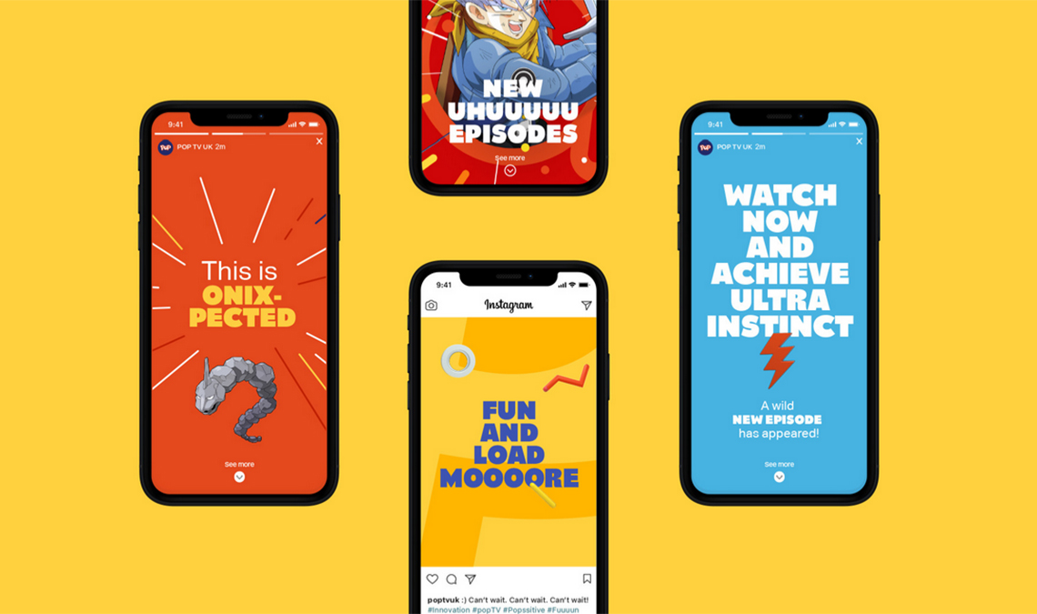
It was important to provide elements that would be fresh, so the team at Superestudio developed an icon library to be regularly updated with many different variants within the brand’s structure.
Check out the reel below and the brand guide to see it in action.


TypeTogether is an indie type foundry committed to excellence in type design with a focus on editorial use. Additionally, TypeTogether creates custom type design for corporate use. We invite you to browse our library of retail fonts or contact us to discuss custom type design projects.
Schedule an introduction meeting to learn more.