A look back at Typographics 2017

July 2017

The multitalented Roxane Gataud, both a type and graphic designer, reports on Typographics, the New York-based conference for graphic designers and type designers. Though this is the first time someone from TypeTogether attended Typographics, it certainly won’t be our last.


by Roxane gataud

As a proud member of TypeTogether, I had the chance to attend the third edition of Typographics this year. In case you aren’t familiar with this conference, it’s a rather young event organised by and happening at Cooper Union’s two buildings — a ten-day design festival ‘for people who use type’ that’s held in New York each June. It celebrates type with a bunch of events, workshops, lectures, a two-day main conference, Typelabs, a lettering tour through the city, and a book fair — an enormous buffet for every taste.

Since I started working in the typeface design industry, I have become used to attending font conferences full of type aficionados, where almost all the content is type related. I’ve wanted to attend Typographics since the first year because it brings together both designers and users of type, which is something I felt was missing for both categories. And, even though the sun and heat can be insane in June, who doesn’t want to visit New York City?


the pre-conference

I arrived early in New York City and had the chance to attend the lecture and book signing by House Industries on June 12th. Andy Cruz, Rich Roat, and Ken Barber presented how they founded House Industries, their new book and exhibition, explained their process, and presented a bunch of work they did over the years, even explaining where their name came from. As a type company, the fact that their name doesn’t involve the words type, typo, font, or foundry is quite a rare thing.


typelabs

Typelab is ‘a space for informal events to complement the main schedule of the Typographics conference,’ where lectures, demos, and even a game day happens. The sad part is that it overlaps with the main conference, making it hard to choose what to attend between the two options. The first day thankfully didn’t overlap, so I was able to attend the main programme’s all-day lectures and type critiques.

Since I was preparing my own presentation, I wasn't able to listen to every speaker throughout the entire conference, but here are some highlights from the broad range of talks I attended.

Ben Kiel and Jesse Ragan presented the recent release of their XYZ Type foundry. Fun fact about their identity: all the geometric shapes displayed on their website are period glyphs from their typefaces.

David Jonathan Ross
presented his latest passion project, The Font of The Month Club, a really interesting way of distributing typefaces: one typeface per month for $6. He explained that some of his designs didn’t fit his actual foundry, and this was his way of creating a new space for those smaller projects.

Jean Baptiste Levée presented his latest release and gave insights about the process of his Spectral family. He also showed inspiration from 19th century French cuts and how from this he made a relevant typeface for screen reading, which is available on Google Fonts.

Frank Martinez, a lawyer specialising in type design cases, gave a great presentation full of legal insights about intellectual property and the entrepreneur model. He concluded that sometimes designers need to adjust their own licensing and business models to find what works best for them.

Last but not least, the Alphabettes Variety Show rocked the Typelab room. Indra Kupferschmid, Amy Papaelias, Bianca Berning, and Tânia Raposo took the stage to broadcast a live podcast, showcase work, and hold quick discussions and small interviews with a number of Alphabettes members, ending with a Q&A session. The Alphabettes header contest and Alphabettes Bingo were definitely fun. Check out the podcast, available here.


Hansje Van Halem, Lara Captan, Shiva Nallaperumal and Agnieszka Gasparska.

Hansje Van Halem, Lara Captan, Shiva Nallaperumal and Agnieszka Gasparska.


main conference

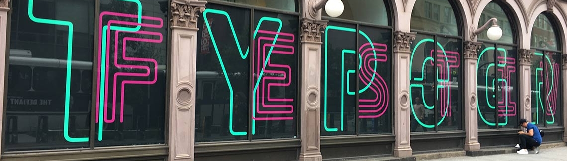
The two-day main conference was held in the old Cooper Union building. The conference structure was ideal: a 30-minute talk followed by a panel that answered questions at the end of each session. Before the breaks, the ‘spotlights’, a five-minute talk from selected designers, were like entertaining treats between talks. A big shout-out to Stephen Coles for his short but enlightening talk about using the ‘Metrics Kerning’ option rather than ‘Optical’ in InDesign. He emphasized that designers should not choose ‘Optical’ since it overrides the type designers’ built-in professional kerning, something all designers need to know.

The speaker lineup was a stimulating mixture of graphic designers and type designers, from talented ones I have admired for years to those whose work was new to me.

Type designers Shiva Nallaperumal and Jonathan Hoefler each presented their latest releases: Calcula and Inkwell, respectively. Agnieszka Gasparska’s talk echoed Hoefler’s about the state of handwriting. Kris Sowersby spoke about his latest releases too, Untitled Sans and Serif, but unfortunately my English skills weren’t good enough to understand over his accent. Happily for me it was recorded so I can watch it again. Ilya Ruderman gave a presentation about Type Today and gave his point of view on the contemporary state of typeface design. Questioning design was part of Silas Munro and Marlene McCarty’s talks.

I really enjoyed the graphic design talks. Natasha Jen (Pentagram) presented a selection of her works, of which I really appreciated the insights on the Teabox identity project. Astrid Stavro (Atlas) presented her work, which I thought was fantastic, but I would have appreciated a bit more insights and depth about the projects shown. I am not a huge fan of portfolio talks, but the works of Stefanie Weigler & David Heasty (Triboro), and of Annik Troxler were so nice that I didn’t mind. Hilary Greenbaum presented the identity of the Whitney Museum of American Art. Even though I thought the use of Neue Haas Grotesk can be questioned, it was interesting to see how the graphic system is displayed in different media.

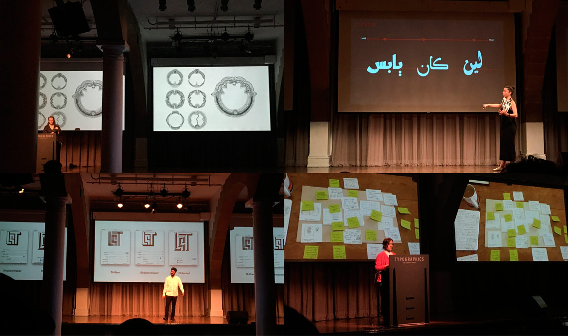
The indie magazine panel featuring Kara Haupt, Elana Schlenker, and Ryan Essmaker was really interesting as each speaker showed that publishing personal projects helped them in their career. As no surprise, Hansje van Halem’s talk was as fantastic as her work. I really enjoyed Jonathan Key’s talk too, especially when he presented the type workshop he did with kids. On the teaching side, Lara Captan presented the typeface design program that she founded with Kristyan Sarkis, Arabic Type Design: Beirut.

Helen Yentus, art director of Riverhead Books gave a really interesting talk on book cover design. Loving reading and therefore loving books, I was really hooked by her presentation. She mentioned how book cover design evolved recently, due to the transition from the physical to the digital, and how this influenced book cover design practice. Just think of a book cover’s size on amazon.com — 1.5 inches — and how designers need to think about creating bold and legible covers. She also compared book cover design to poster design, as the goal of them is the same: create a visual moment that grabs attention instantly.

However, my favourite presentation was Ken Barber’s amazingly well-documented talk about 20th century American advertising lettering. He also talked about the most badass lady in the industry at that time, Ruth Guzik (1932–2011), who was an employee of one of the biggest lettering studios in NYC. She was incredibly skilled and could work in different styles. Ruth didn’t just do her own impeccable work, she also refined other designer’s lettering. In the ’50s, she had the courage to complain about not being paid the same as her male colleagues for the same work. For that reason she quit her job, but was quickly called back by the company. Not only did they rehire her, but they gave her a bigger salary because they couldn’t afford to lose her. Ruth is definitely my new hero!


brooklyn letter tour

On Sunday, after the main conference party and a karaoke night, I attended the Brooklyn Letter Tour conducted by Alexander Tochilovsky. I was excited about this tour and waking up early was definitely worth it. Armed with sunscreen and plenty of water, we walked around Brooklyn’s Fort Greene area. Not only were the signs really interesting, but the insights from Sacha on architecture and city history were priceless. For those interested in type, history, and discovering a new location, I couldn’t recommend this tour enough. This makes me wish I hadn’t missed New York’s ‘Old Neon Signs’ with Thomas Rinaldi. Hopefully next year!


Roxane Gataud in Typographics 2017

summary

Typographics was an excellent conference. I really enjoyed attending an event that mixes both creators and users of type. Amidst the inspiring talks I met friends old and new. It was the kind of conference that makes you feel proud to belong to this industry and motivates you to give your best in upcoming projects. It was awesome, so congratulations to Alexander Tochilovsky, Cara Di Edwardo, and all those involved in bringing it together again this year. See you next summer, Typographics!


About Us

TypeTogether is an indie type foundry committed to excellence in type design with a focus on editorial use. Additionally, TypeTogether creates custom type design for corporate use. We invite you to browse our library of retail fonts or contact us to discuss custom type design projects.