A few days ago, a twitter post by Bold Monday’s Pieter van Rosmalen claimed that the design of one of the styles that is part of the larger type family called Soleil, was stolen from another font family called Macula.
We rarely get engaged in these kind of discussions when they happen on a platform that is less than ideal for proper discourse of the different positions. However, we believe the original post was made with the sole purpose of defamation, and so, to show that we take these matters very seriously, we decided to clarify a few things in order to set the record straight.
We first learned about the existence of Macula only after we had announced the release of Soleil Magic Caps, an additional cut to our successful typeface family Soleil, when, on 8 January 2015 Paul van der Laan from Bold Monday sent an email pointing out the existence of Macula.
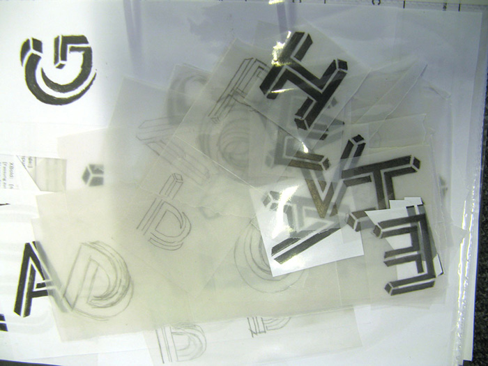
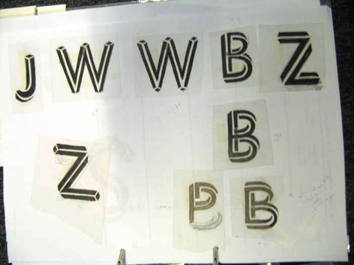
Soleil Magic Caps had been developed independently of Macula and its design dates back to 2011. A folder with sketches and also email exchanges (between Wolfgang Homola, the designer of Soleil, and TypeTogether) proving this, do exist.
We brought all of this to Paul’s attention, and Paul’s subsequent emails made clear that he himself perfectly understood that Soleil Magic Caps had been designed in a different context and independently of Macula.
We also suggested several proposals for how to deal with this situation, including a joint statement. Regrettably, none of these proposals were taken up by Bold Monday — they instead chose to tweet publicly.
We strongly reject this claim, and attach below extensive documentation with detailed descriptions, so that our readers and viewers can make their own judgement.
1. Soleil is an original type design, and a very good one
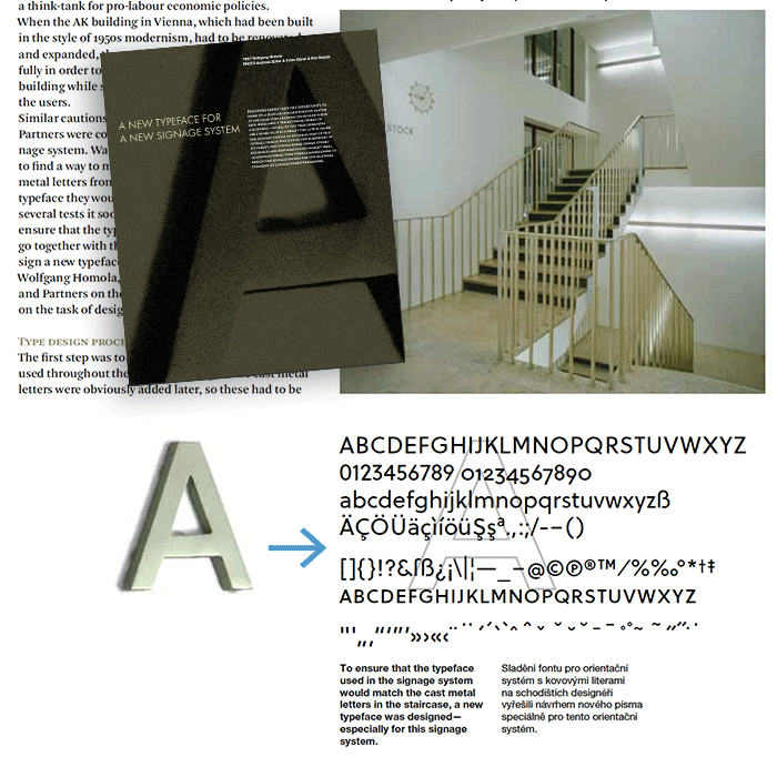
The Soleil type family originates in a commercial project to design the signage system for the Chamber of Labour (AK) Building in Vienna, executed by Bohatsh and Partners. In order to maintain the original character of the modernist building, the design team decided to have a custom typeface developed that would be based on the shapes of the original cast metal capital letters seen throughout the building. Wolfgang Homola was commissioned with this task. The complete process was later very well documented in issue 41 of Typo Magazine.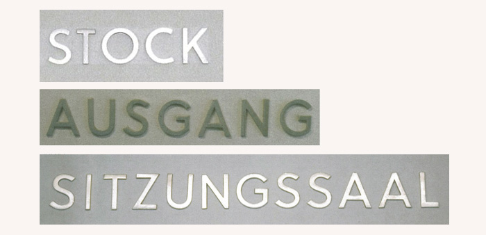
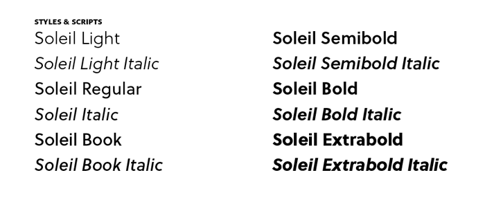
With this original project as a starting point, Homola set to tackle the geometric sans genre with an original approach to countershape treatment, and converted this into a full type family that is meant for a wider editorial purposes. Soleil became a very successful typeface for books and magazines due to its quality in text setting, the wide range of styles (six weights and matching italics) and the extended character set, including several sets of figures and small caps.
Soleil's careful execution and design was recognised with the Joseph Binder award Silver and the ISTD certificate of Excellence.
The type specimen may be downloaded here.
2. Soleil Magic Caps is a new addition to the Soleil typeface family
Within this context, the Magic caps in question is an additional and playful style within the broader Soleil family with the purpose of enhancing book usage such as with drop caps, hence the name Magic Caps.
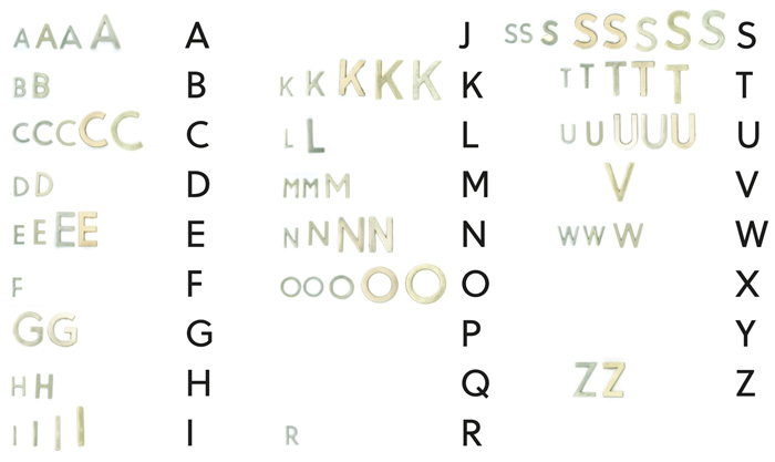
Wolfgang Homola is one of the best book designers in Austria and he is thankfully one of those designers who diligently keep records of their project files, which is part of the teachings in the University of Reading. As a result, there is a complete folder with early sketches, drawings, proof sheets, spacing tests, and more, showing step by step the full process of the whole Soleil family, including the Magic Caps style.
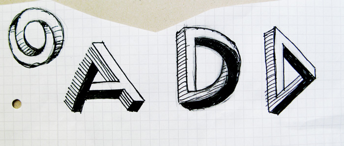
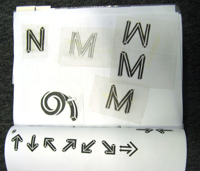
3. The concept of impossible geometry has been around for a long, long time
From Luc Devroye’s Type Design Information Page: “Bronislaw Zelek, a Polish type designer who lives in Vienna made his Zelek fonts in the early 70’s: Zelek Black, Zelek Shadline, Zelek Bold, and Zelek Boldline. Zelek Black looks twisted and almost geometrically impossible.”We will not bore you with more details. But you can see just a tiny sample of what’s out there:
Frustro, by Martzi Hegedűs
Penrose Geometric, by André Themoteo Alves Corrêa
Bron, by Jeremia Adatte
New Zelek Font, by Alexey Kustov
Core Escher, by S-Core
Bad Escher, by Mike Wolf http://www.dafont.com/bad-escher.font
Oxymora, by Birgit Palma
'Impossible Alphabets and Fonts', collected by Vlad Alexeev
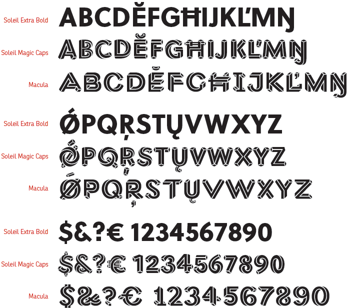
4. Soleil and Macula are different in almost every aspect
GoalUnlike Macula, Soleil is not a display or decorative typeface. It is a font family for editorial use based on geometry and modernism. The Magic Caps cut is just another tool within the typeface’s broader palette, playfully exploring of the theme of impossible geometry pioneered by Roger Penrose.
Family
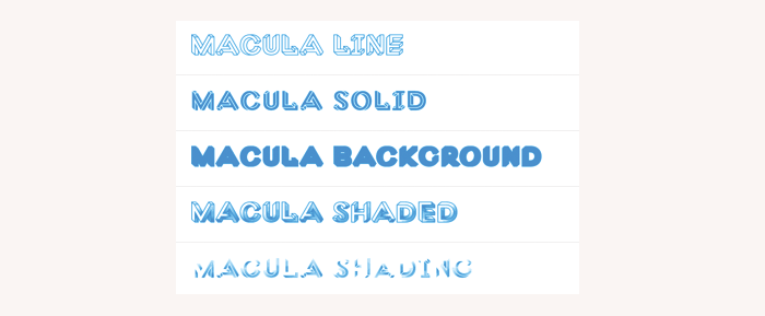
The Soleil Family has 12 styles, each one of them with over 900 glyphs. Another three cuts will be added soon: Black, Black Italics, and Magic Caps. Macula has one cut with alternative letter shapes and a range of effects or derivative styles that may be overlayed.
Construction
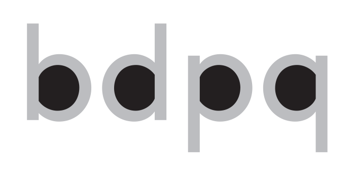
The Magic Caps derive both in terms of construction and proportion from the original Soleil Family. This makes them very different from Macula’s approach in both senses. Taking away the impossible geometry concept, it is clear and obvious that Macula is based on the so-called Neo-grotesque Sans Serif and Soleil on Geometric models. See comparison:
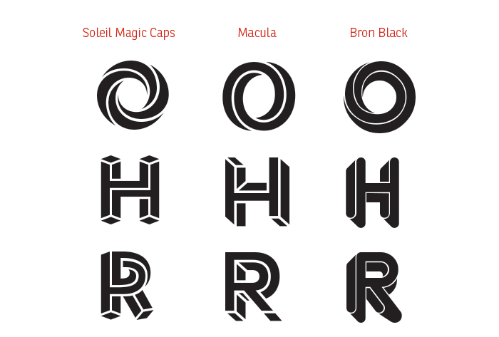
Even if the differences in lettershape style and construction were not enough, the actual approach of both fonts to impossible geometry is not the same. Here is a comparison between some characters of Soleil Magic caps, Macula, and Bron, a very nice type family by Jeremia Adatte that is more closely based on the work of Bronisław Zelek.
Note that for some letters such as the O, shown below, there are not many ways of constructing the effect of impossible geometry, and all three fonts use a similar approach. However, most of the other characters of Soleil work with the concept of a twisting plane, such as a Möbius Strip. Macula and Bron on the other hand seem to dig into an interpretation of perspective that derive more from architectural or 3D shapes. It seems to us that the only similarity between Soleil and Macula is the width of the white inline inside the characters, which is hardly enough similarity to claim one is copying the other.
5. TypeTogether made an effort toward dialogue and a collaborative solution
To fully disclose the issue, we are pasting below parts of the email exchange we had with Bold Monday about the font. (Please note that we cannot publish complete emails that were sent to us.)In this exchange we:
- Proved that Soleil Magic Caps is an independent and original design
- Explained that the fonts do not look the same and are actually targeted differently
- Stated that we are bound contractually and morally to Wolfgang Homola for the release of the font
- Suggested different ways of collaborating that could enhance both font families commercially
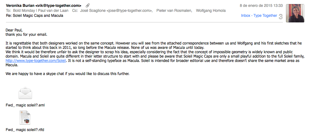
On Jan 8, 2015 we received an email from Bold Monday stating that they had seen a sneak preview of Soleil Magic Caps and that they had noticed the similarities with Macula. They asked us to reconsider releasing Soleil Magic Caps.
Our reply:
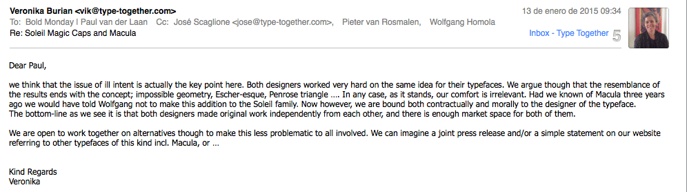
In their reply, Bold Monday agreed that they could not claim exclusivity on the Escher-esque typefaces. And after seeing proof of the originality of Soleil they argued that “the issue whether there is ill intent is not interesting”. And for a second time suggested that we do not publish the font.
Here is our reply:
We received no reply from Bold Monday to this last email.
We believe that replacing mature dialogue with a malevolent Twitter attack, not even mentioning our handle, or the full depth of the issue, or acknowledging the ongoing efforts to work together toward a solution is not the way to solve things.
Please feel free to contact us with any questions about this issue using the form on this page.
About Us
TypeTogether is an indie type foundry committed to excellence in type design with a focus on editorial use. Additionally, TypeTogether creates custom type design for corporate use. We invite you to browse our library of retail fonts or contact us to discuss custom type design projects.
Schedule an introduction meeting to learn more.