The future is variable: Protipo and the variable font format

December 2019

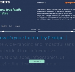
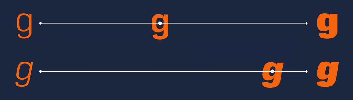
With the November 2019 Adobe InDesign release, the long-awaited variable font support has finally become a reality. Sketch, the website and mobile app design tool, had provided variable font support only a month earlier. See how your design work can benefit from the use of variable fonts and meet one of the variable heroes of the day: Protipo, a modern sans serif family for all things data by TypeTogether type foundry.


Variable fonts for all

Variable fonts are an OpenType font format offering unique typeface customisation. As described in the 2016 official announcement, variable fonts are a “single font file that behaves like multiple fonts.” The variable font format therefore allows graphic designers to adjust typeface properties such as width, weight, optical size, and slant. Designers can define custom instances of a typeface anywhere within the total ‘design space’ of the font family instead of only selecting one of the predefined styles, such as bold, extrabold, or bold italic.

Type designers already had this kind of infinite design flexibility and versatility at hand in various font editing tools, but it was unleashed into the hands of all digital type users when Adobe Photoshop and Illustrator started to support variable fonts in 2017.

Irene Vlachou,
type designer of TypeTogether type foundry, explains: “Variable fonts are basically the same as a standard TTF or OTF file, but which contains information about multiple styles of a traditional font family and requires the user to install only one file. This compressed file has many advantages, from the clean and easy instalment of just one font file to easy navigation between styles.” 

“One variable font contains all the styles of a traditional family,” says Vlachou. “Apart from the named instances, the user can navigate smoothly around the entire design space of the font — the ‘in-between’ stages of the design such as a weight anywhere between semibold and bold, or a width anywhere between condensed and expanded.”

Vlachou explains the interpolative benefits of the variable font format. “These ‘in-between’ styles aren’t defined by the type designer as such, but the type designer has explored the design space of this font family and made the required adjustments in the master styles of the family in order to avoid bad interpolations of weights, widths, and styles that don’t make sense to exist.”


HOW VARIABLE FONTS WORK

For instance, the creator of a variable font sets one parameter at each of the extremes for a typeface’s weights; one parameter is at the font’s thinnest weight and one at the heaviest, and the font cannot extend beyond those poles. So when a designer is developing the UI for an app, instead of only choosing either the semibold or bold, they could select a weight anywhere on that thin-to-heavy spectrum — even if it’s somewhere between a semibold and bold. This means that the user now has almost infinite control over the weight, width, and overall style of the font’s appearance in their design.

Moreover, these settings can be defined within the app to render differently based on the detected screen, browser, pixel density, ambient lighting, dark mode usage, and much more. These interpolated font weights and their dynamic interaction with a range of changing criteria is the future of typesetting and UI design.

Vlachou highlights another important feature of variable fonts: space-saving ability. “Another advantage of the new variable font format, and for many the greatest advantage, is the small size of the file. This makes it more usable for online typography, small digital products like a watch, for low bandwidth usage for developers, and embedding in applications.”


Variable Protipo grotesque

The Protipo sans serif font family created by Veronika Burian and José Scaglione, the type designers and co-founders of TypeTogether, is performing very well in all information design situations from apps and infographics to wayfinding, posters, and even internet memes.

“We at TypeTogether intend to grow our font library within the scope of our interests in editorial design and curate our type offerings in such a way as to avoid repeating the same stylistic theme,” says Veronika Burian. “In 2016 we felt that our font library was missing a stiff and formal grotesque font family, one within the characteristics of the ubiquitous DIN fonts. Our goal was to develop a font family within the rigid grotesque theme with a broad design perspective, which would become a versatile typographic tool not limited to advertising or poster design.”


Along with the three text widths, a separate headline family, and two-weight icon set, Protipo includes the advanced variable font format, all with TypeTogether’s signature feature: the extensive Latin Pro character set for unmatched language support.

Irene Vlachou adds: “Protipo is a font family intended for information design where flexibility, precision, and fine-tuning are required. For these reasons we decided to include a wide variety of weights and styles. Halfway through the project we realised that these criteria match perfectly with the new idea of the variable font format, and it would be a real benefit for the user to be able to manually adjust the font to their exact needs.”


Try it!

If you feel like experimenting with the variable font format, try TypeTogether’s special minisite. If you want to experience the full potential of Protipo variable in your projects, simply get the full Protipo bundle. The variable font format is included.


About Us

TypeTogether is an indie type foundry committed to excellence in type design with a focus on editorial use. Additionally, TypeTogether creates custom type design for corporate use. We invite you to browse our library of retail fonts or contact us to discuss custom type design projects.