Type is magic: Interview

August 2025

In 2024, Anne-Dauphine Borione became the tenth recipient of the Gerard Unger Scholarship with her Dargon font family inspired by the world of fantasy. Dargon stimulates our imagination and offers a wide range of future applications, from video games, board games, and trading cards to film titles, album covers, brands, and apps.


What made you fall in love with type?
I graduated in 2016 from Central Saint Martins in London, UK. My passion for graphic design had not waned during my fine arts bachelor’s programme, so after graduation I decided to study artistic direction in Paris. It was there that I discovered the power of drawing my own letters, thanks to one of my teachers, and this passion has only grown stronger since.

I graduated in 2020 with a master’s in graphic design and typography from the École de Communication Visuelle in Paris, then went freelance for a few years. I had an intense personal interest in actually designing type but my master’s was more about typography in general, so I decided to go back to my studies. I was advised to look into Type and Media, applied, and to my equally great surprise and joy, was accepted. I graduated in July 2024 with the typeface Dargon as my final project, and here I am!

What kind of typeface is Dargon?
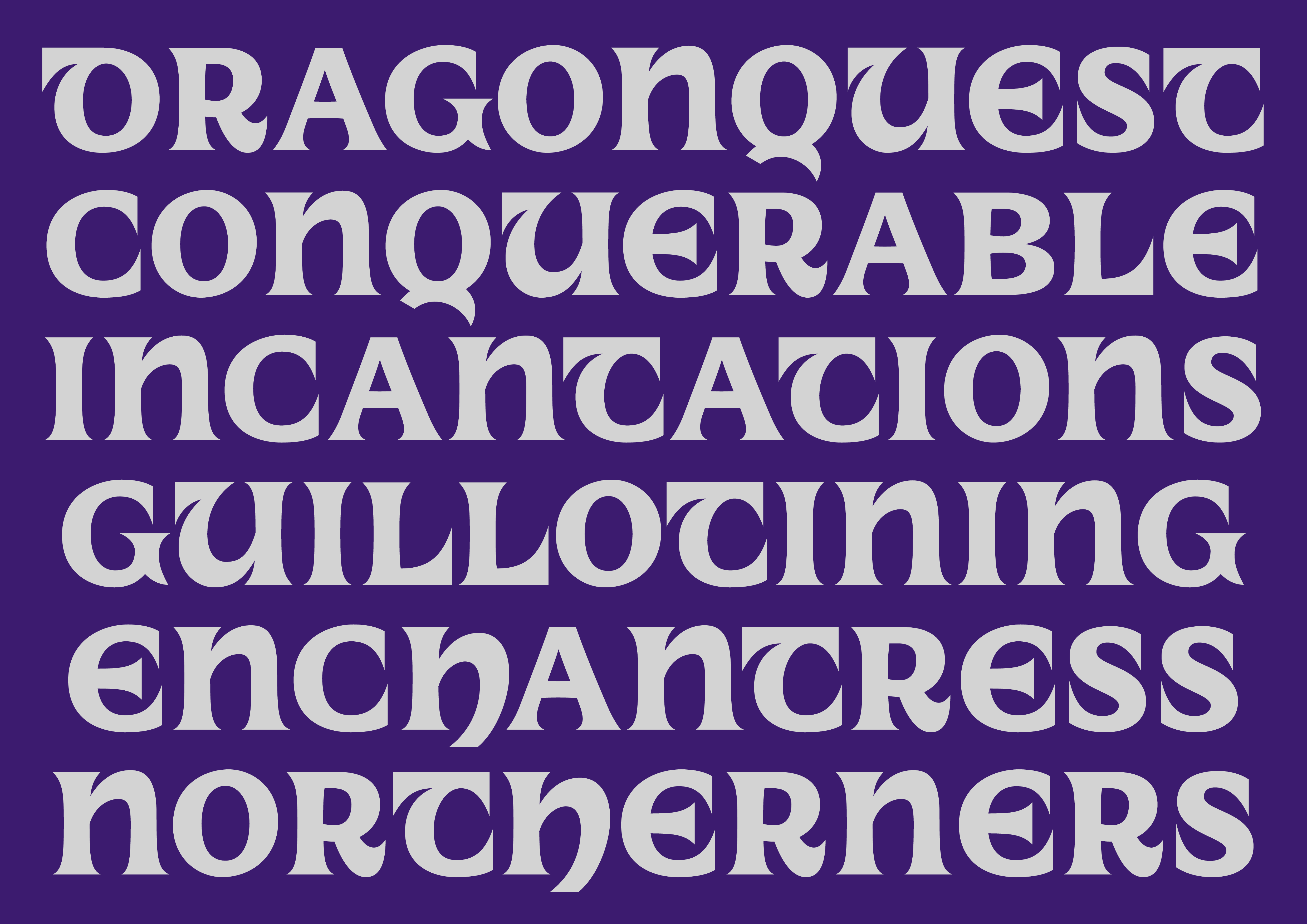
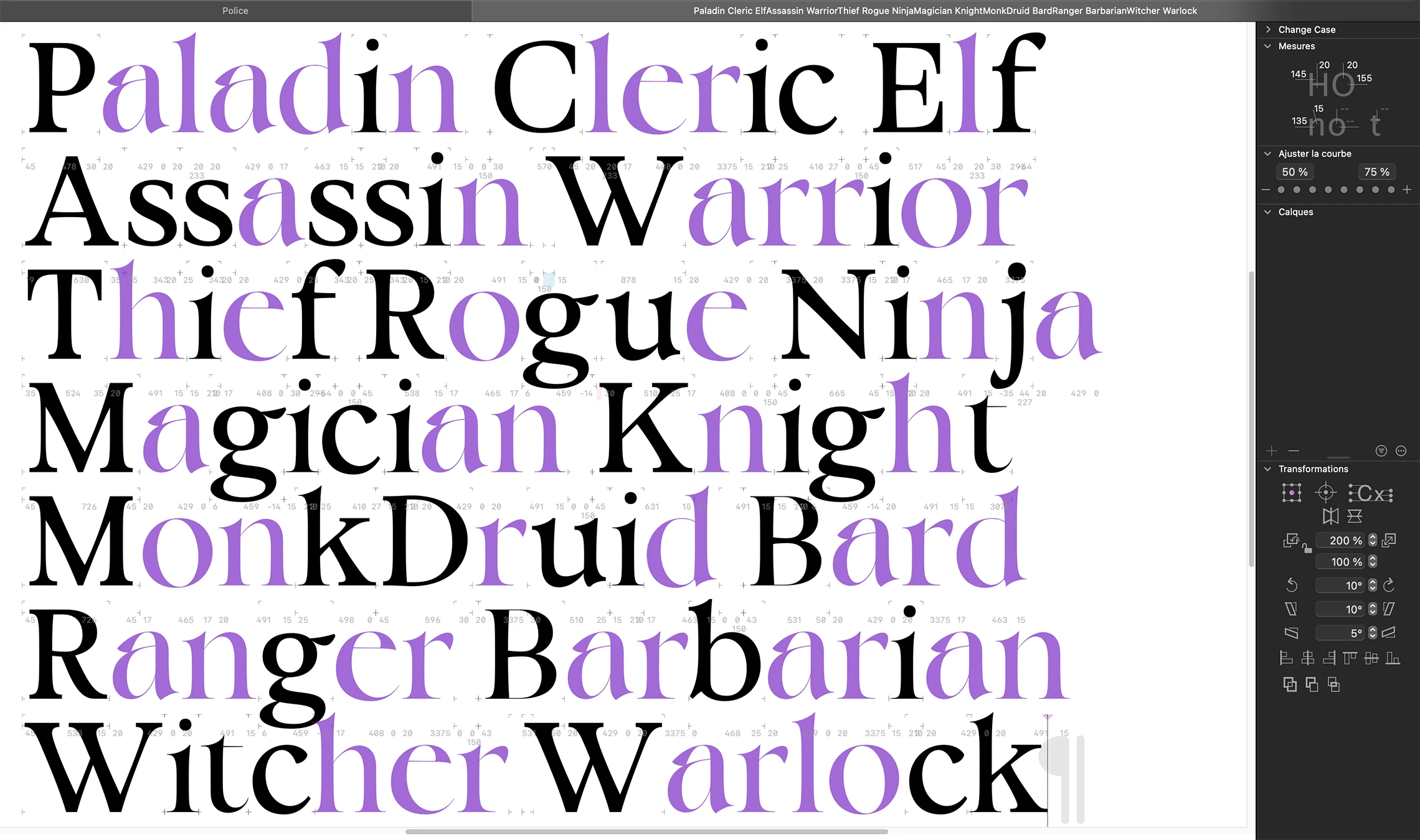
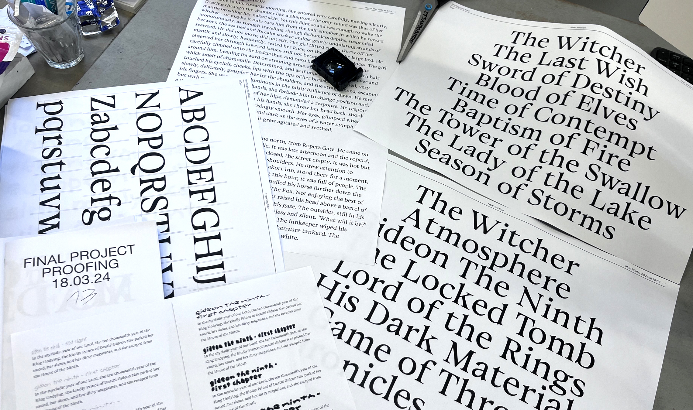
Dargon’s intention is to be a versatile, flavourful, contemporary typeface, whose main intent is to work both for text and for headings. Since the beginning of this project, I have been proofing Dargon with excerpts from fantasy books, mainly The witcher and Gideon the ninth, and slowly it became apparent to me that this genre would be perfect in relation to the shapes I was drawing.

Where did Dargon originally come from?
Dargon is directly inspired by my obsession with all things fantasy. Stories of dragon riding or dragon slaying (depending on my mood) populate my mind. From Lord of the rings to The witcher and from “Baldur’s gate 3” to “The elder scrolls” video games, and everything in between — books and games, movies and series — fantasy has guided me since childhood. I find immense comfort in the imaginary worlds I create both in my mind and in type. It is my escape.

I believe typography is a fantasy, an artistic endeavour, a universe in itself. Type enhances my reality, it is a conduit for enchanting myself, a portal to realms yet unseen. One might see type as purely utilitarian; I see it as a powerful source of magic. Transcending the confines of conventions and evoking profound emotions and narratives is the true power of type design. Quoting the character Yennefer in The witcher book series, my favourite invented universe of all time, “Magic is Chaos, Art, and Science. It is a curse, a blessing, and progress.” And type design is magic. And, to me, Dargon is designed as the embodiment of this concept.


Is Dargon meant for like-minded users only?
Dargon is a typeface designed for anyone in need of something reminiscent of fantasy, the medieval era, or uncials, but with a contemporary flavour and a lot of personality, both in text and in its heading style.

You have been working on completing your typeface for over a year now. How much has it changed over the course of the scholarship?
I am impressed to see how much Dargon has improved, in all aspects, all while retaining its core essence and feel. I am so thrilled that the TypeTogether team, in particular Veronika and José, helped me improve my text font skills, especially spacing, in a way that makes me feel very confident with the direction it’s going. Dargon is looking better than ever! More and more it is becoming the typeface I dreamt of when I started it at Type and Media. It is essentially an oldstyle looking text font for the text weights, but with so much flavour and a contemporary feel, I love that it looks unmistakably mine. I actually am having so much fun drawing the regular text style, I would say it is my favourite style right now, which I didn’t expect, and am super happy about. I am also exploring a lot of different styles for the uncial, which looks very fun and promising!

How finished do you consider Dargon to be at the moment?
There has been some significant progress on the regular glyphset, which is not far from being complete, and also on the extrabold style and the uncial with its different stylistic sets. Next step is starting the italic from my Type and Media draft, which is both daunting and thrilling! I would say that because Dargon is my first text font ever, it still requires a lot of love and care, but I am absolutely making progress and improving my skills, and the development is evident, which I am very happy about.

Dargon is not your first typeface. You already have experience with designing display and experimental fonts.
Though Dargon is my first proper text typeface, I have been designing display and experimental fonts since 2015. Actually, I started learning Glyphs with a sans serif text font, which I have been working on since 2018 — it was more of a learning project than anything else and at the antipodes of everything else I have worked on so far! I am much more known for my extreme approach to exploring the limits of legibility and readability, and that is why it means so much to me that I was the recipient of the Gerard Unger Scholarship for a text typeface.


What is it like when a type designer finishes a font and releases it — when you can’t improve it anymore and you see it being used in unexpected (and perhaps even undesirable) ways? Has this happened to you yet?
Because my typefaces are mostly on the unreadable side, I do not see them in use often. But when I do, I’m lucky to say it’s always incredible. Recently, the band Fallgrapp used my typefaces Aliénor (made in collaboration with Lou Rainaldo) and Sichem for the identity of their new record, and it was just a purely joyful and amazing experience to see my typefaces used so beautifully, especially in relation to music.

Where would you definitely not like to see the Dargon type family used?
This is extremely important to me. I am absolutely against seeing Dargon used in any way that would be hateful or detrimental to others, particularly in discriminatory contexts. I wouldn’t want it used in hate speech, violence, racism, sexism, or any other malicious ways. My only goals are to become a better person and to design better type, and I hope the future uses of Dargon flow in the same direction!

And what would be, on the other hand, your dream use of Dargon?
My dream use of Dargon would be in video games and board games related to fantasy. I designed it with the specific application of trading card games in mind, but originally I wanted it to be used for board games. I have been an avid fan of fantasy video games and their culture since childhood, “The legend of Zelda: Ocarina of time” being the first video game I ever played. And if I can ever see one of my typefaces, especially Dargon, used in this context, I will be over the moon! And if I can truly dream, I would like Dargon to be used for “The witcher” or “Baldur’s gate” video games, as they are my favourite fantasy games of all time.


* Anne-Dauphine Borione (1994) aka Daytona Mess, is a type designer from Levallois-Perret next to Paris, France. She is mostly known for her experimental and display approach to type, influenced by her bachelor’s in fine arts from Central Saint Martins, London (2016). In 2024 she graduated from the Type and Media Programme at the Royal Academy of Art in The Hague, the Netherlands, where she learned how to draw more conventional typefaces and gained traditional typographic skills, which are now feeding back into her display practice.


About Us

TypeTogether is an indie type foundry committed to excellence in type design with a focus on editorial use. Additionally, TypeTogether creates custom type design for corporate use. We invite you to browse our library of retail fonts or contact us to discuss custom type design projects.

Schedule an introduction meeting to learn more.