Lektorat in motion
November 2020
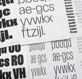
Methodical in rationale and irrepressible in function, Lektorat’s 27 styles are the embodiment of editorial expression.

Methodical in rationale and irrepressible in function, Lektorat’s 27 styles are the embodiment of editorial expression.
Lektorat is the sans family capable of setting a full range of editorial publishing. Its six concentrated text styles speak directly to readers, and its three display widths equal 21 fonts capable of informing, persuading, and entertaining en masse. The Lektorat typeface was forged with a steel spine for pixel and print publishing. It unwaveringly informs, convincingly persuades, and aesthetically entertains when the tone calls for it. Its sans serif forms expand in methodical ways until the heaviest two weights close in, highlighting its irrepressible usefulness to the very end. Lektorat is an example of how much we relish entering into an agreed battle of persuasion — one which both sides actually enjoy.
Credits
Motion Design: Cecilia Brarda
Typeface Design: Florian Fecher
TypeTogether is an indie type foundry committed to excellence in type design with a focus on editorial use. Additionally, TypeTogether creates custom type design for corporate use. We invite you to browse our library of retail fonts or contact us to discuss custom type design projects.