Obtaining “Liberties” with Garalda
February 2024
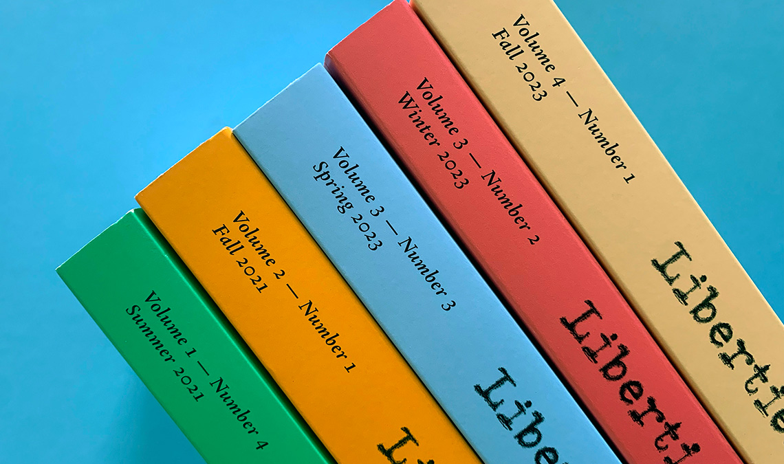
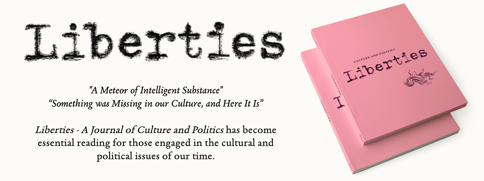
Liberties is a quarterly journal devoted to educating the general public about cultural trends, politics, and possibilities.
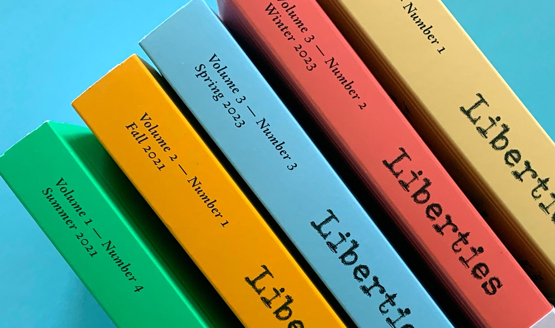
Liberties is a quarterly journal devoted to educating the general public about cultural trends, politics, and possibilities.
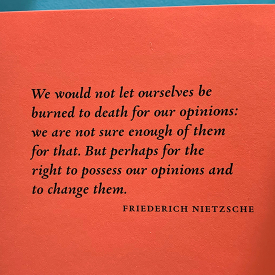
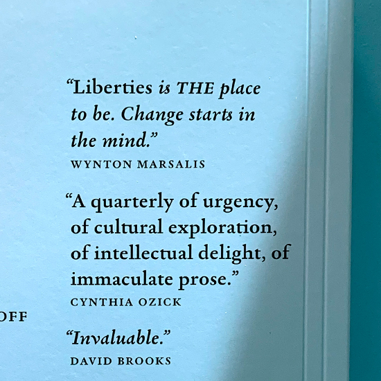
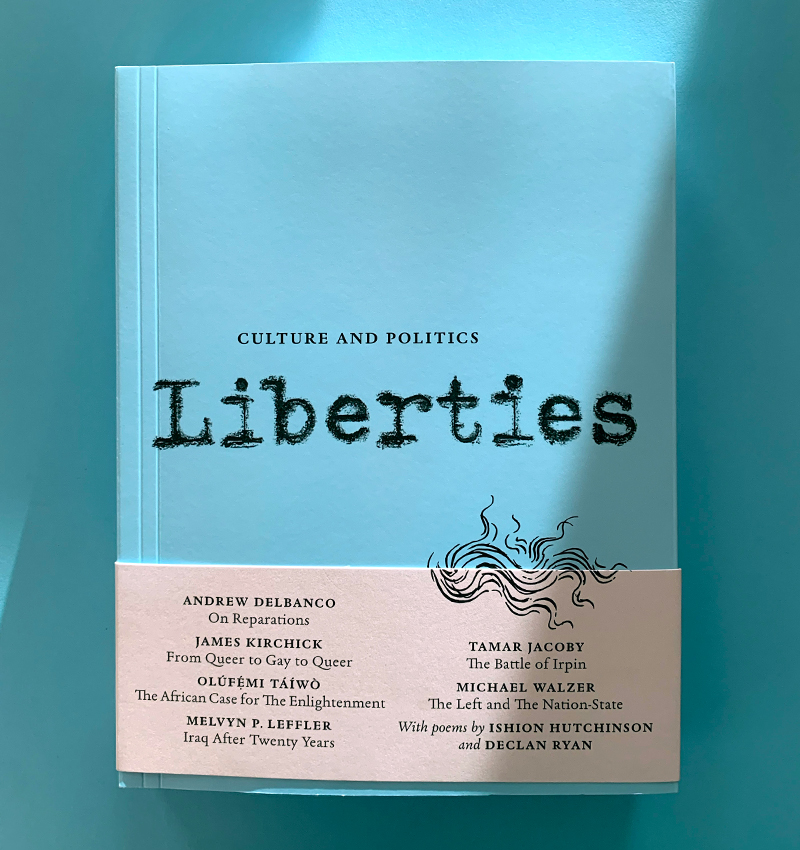
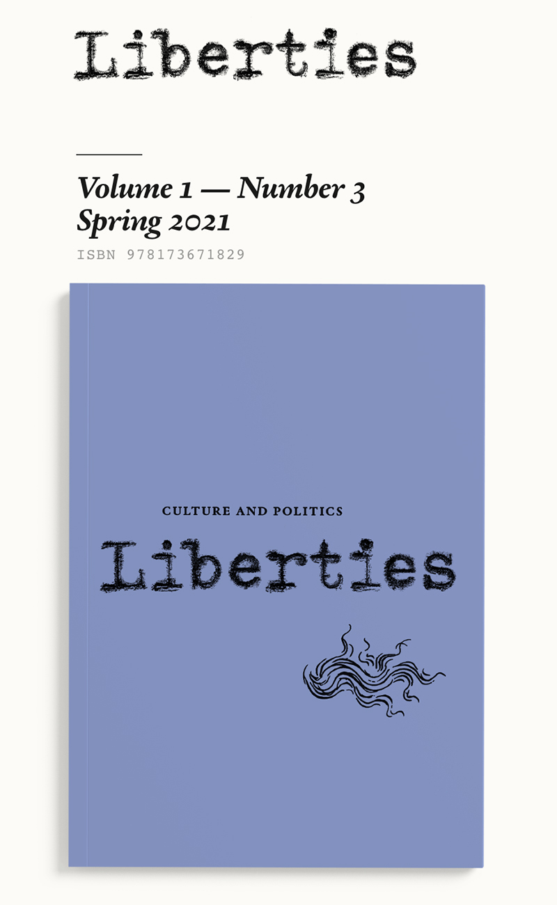
Liberties, a quarterly journal of culture and politics based in Washington, DC, is devoted to educating the general public about the history, current trends, and the possibilities of culture and politics.
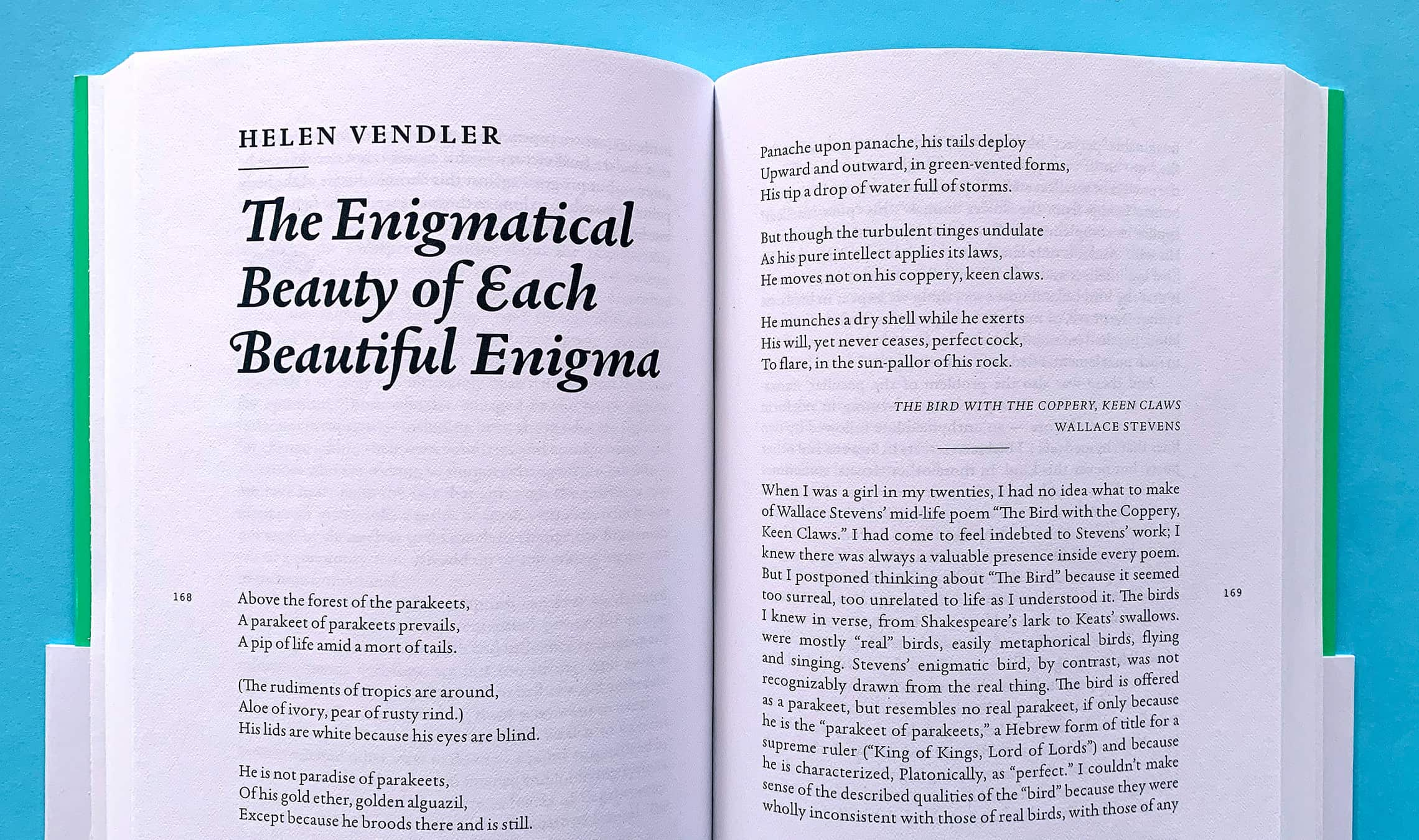
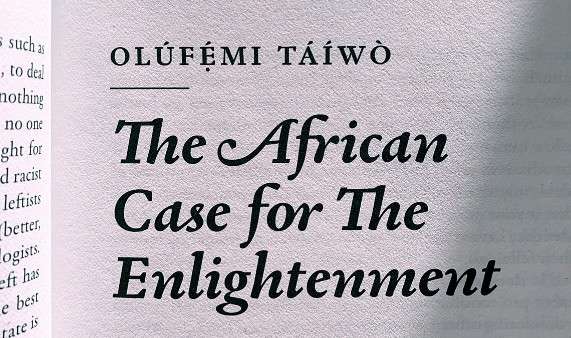
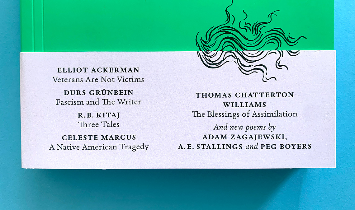
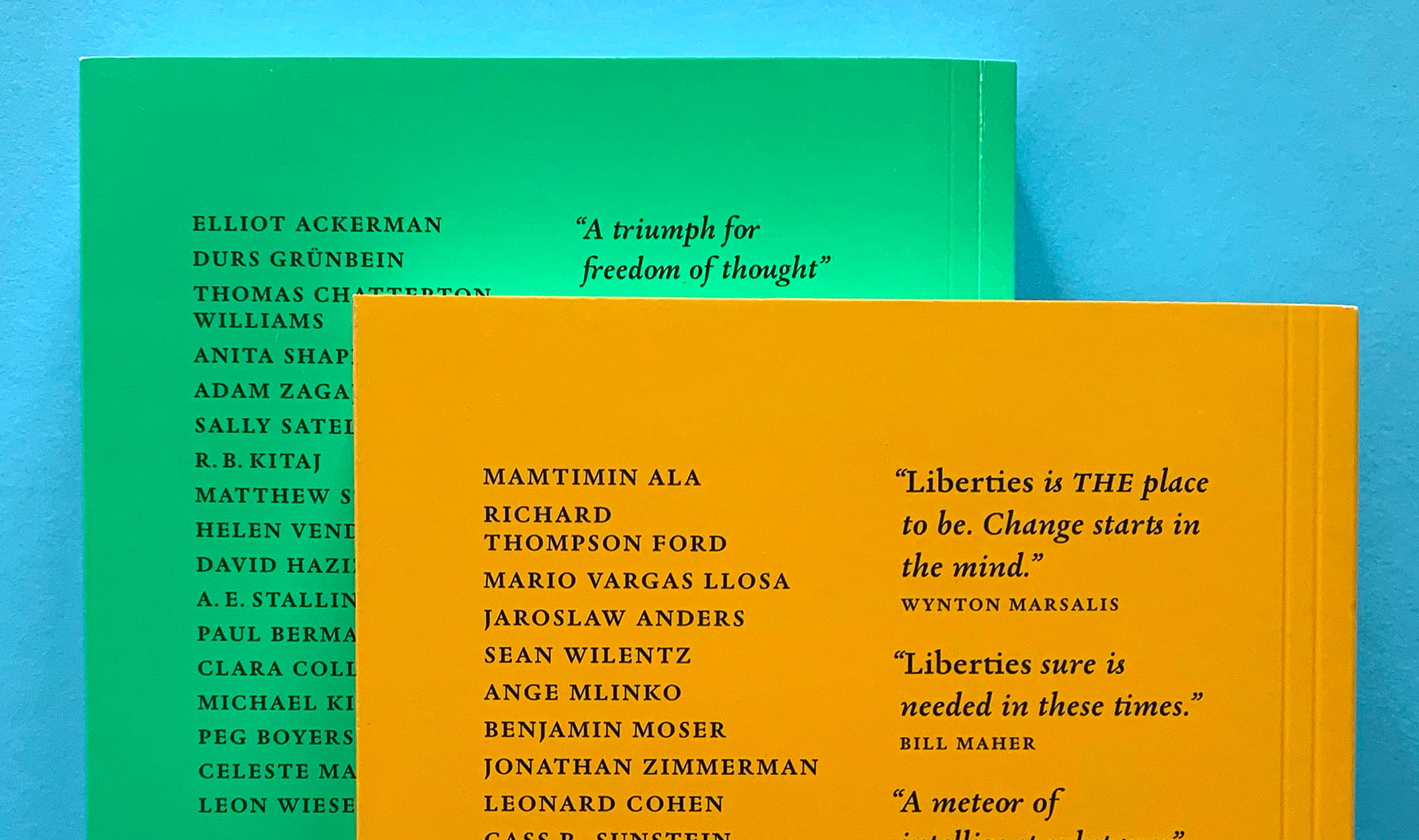
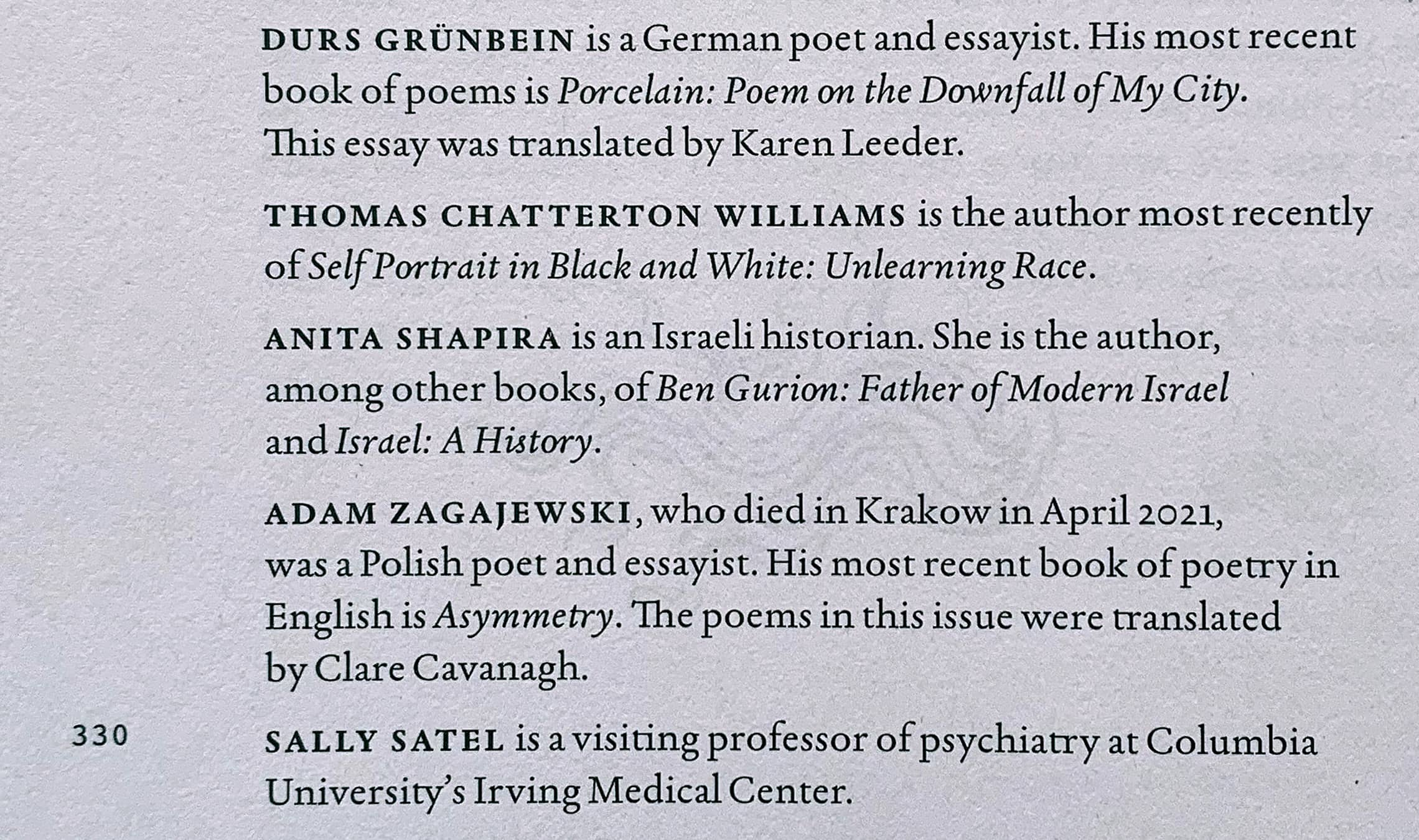
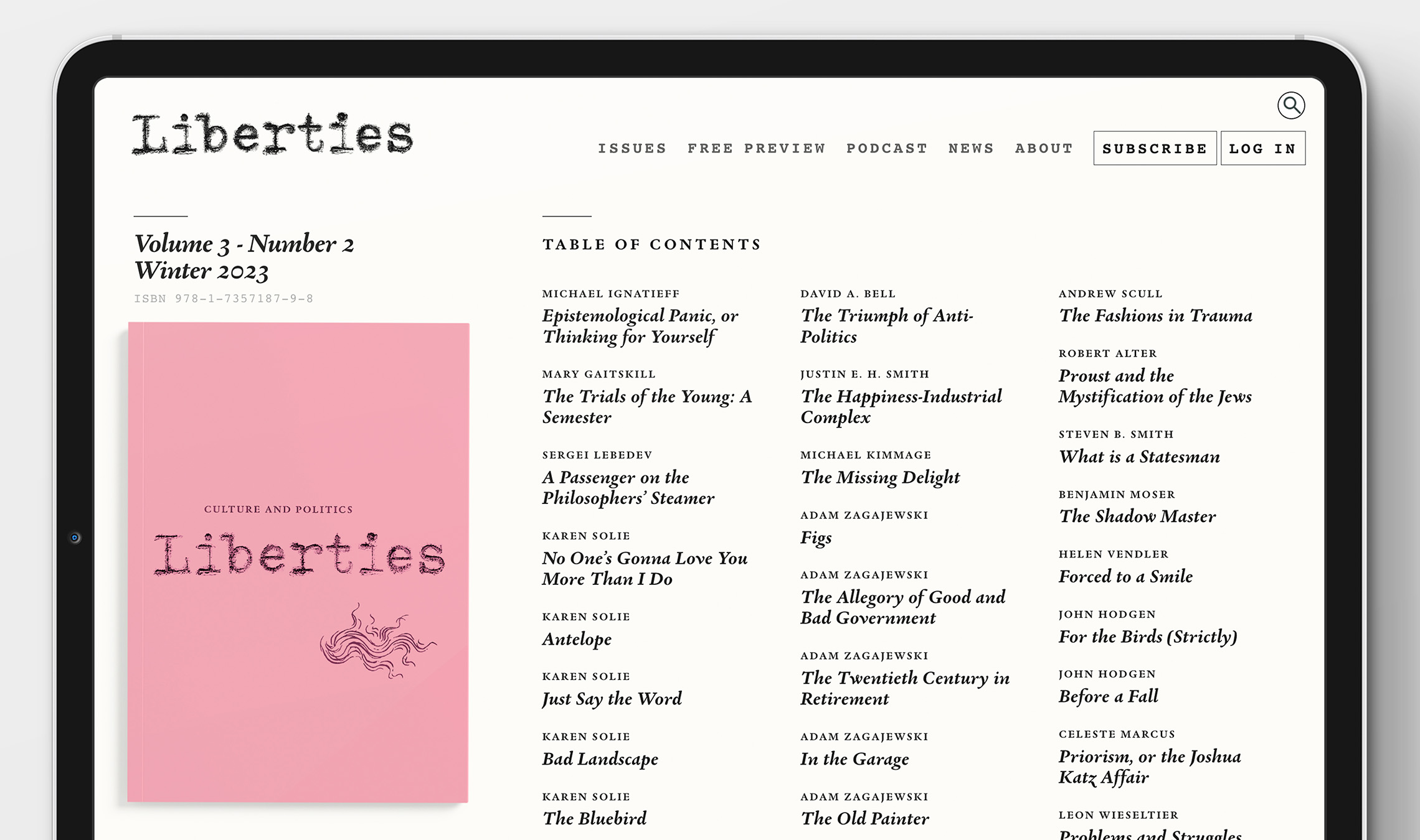
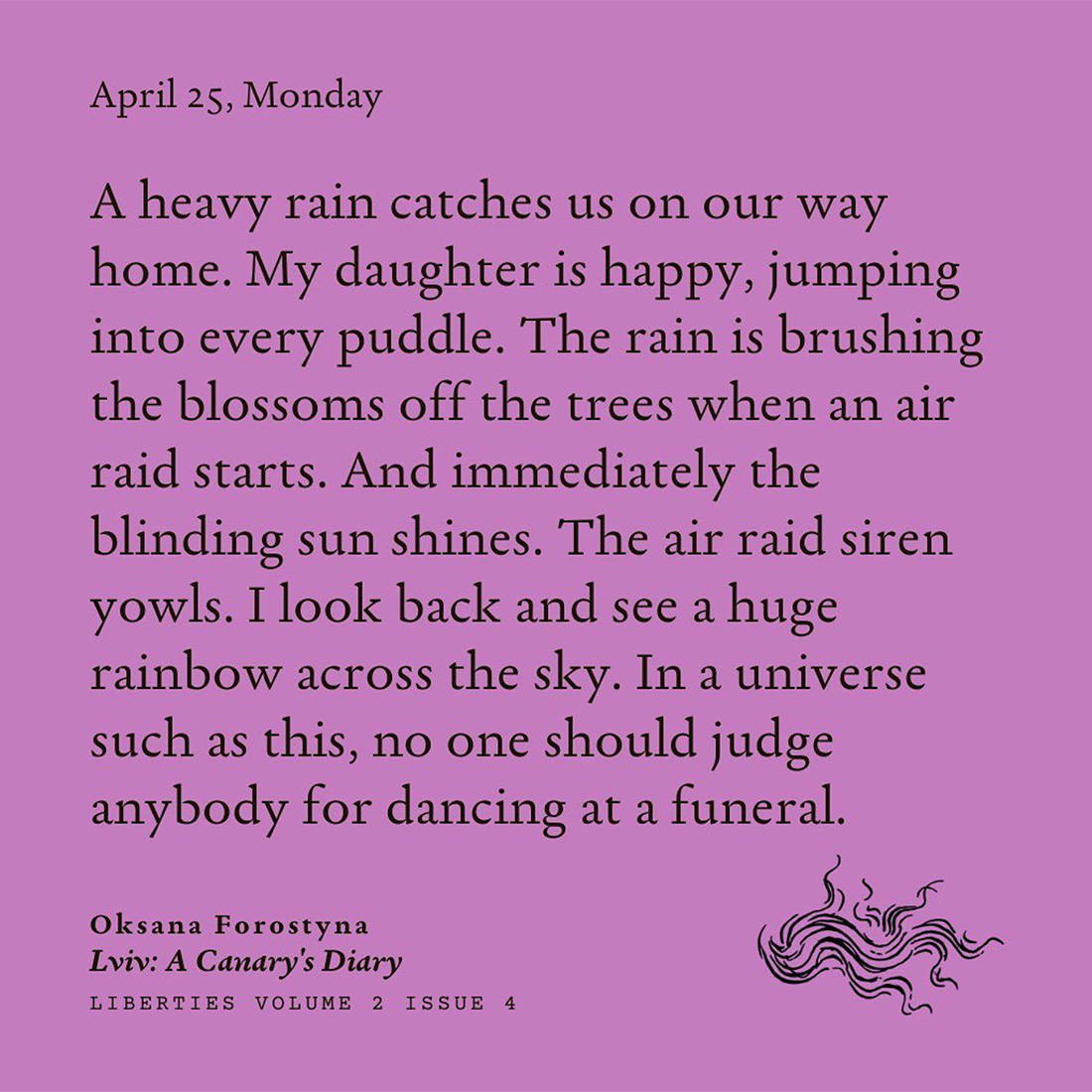
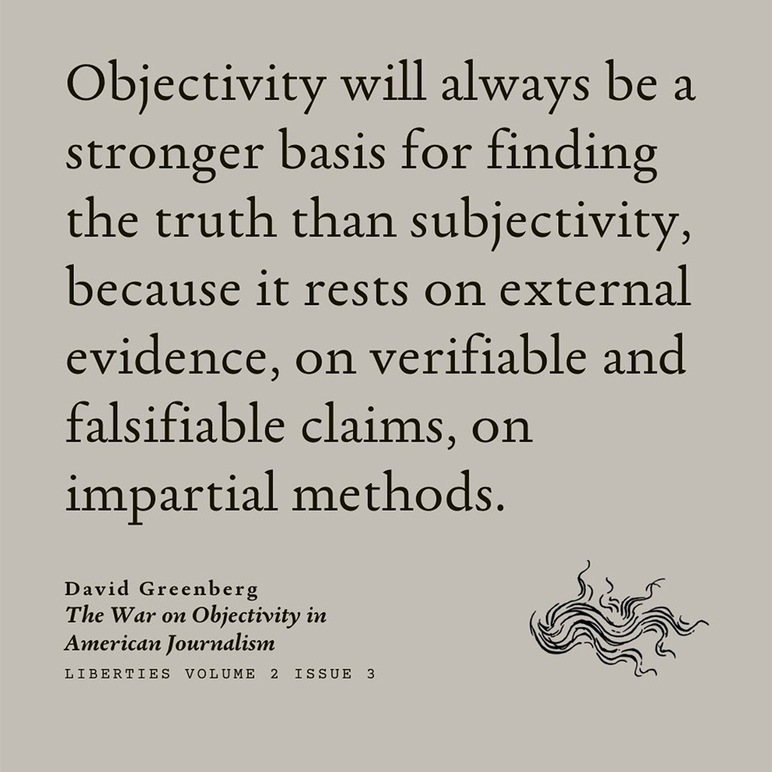
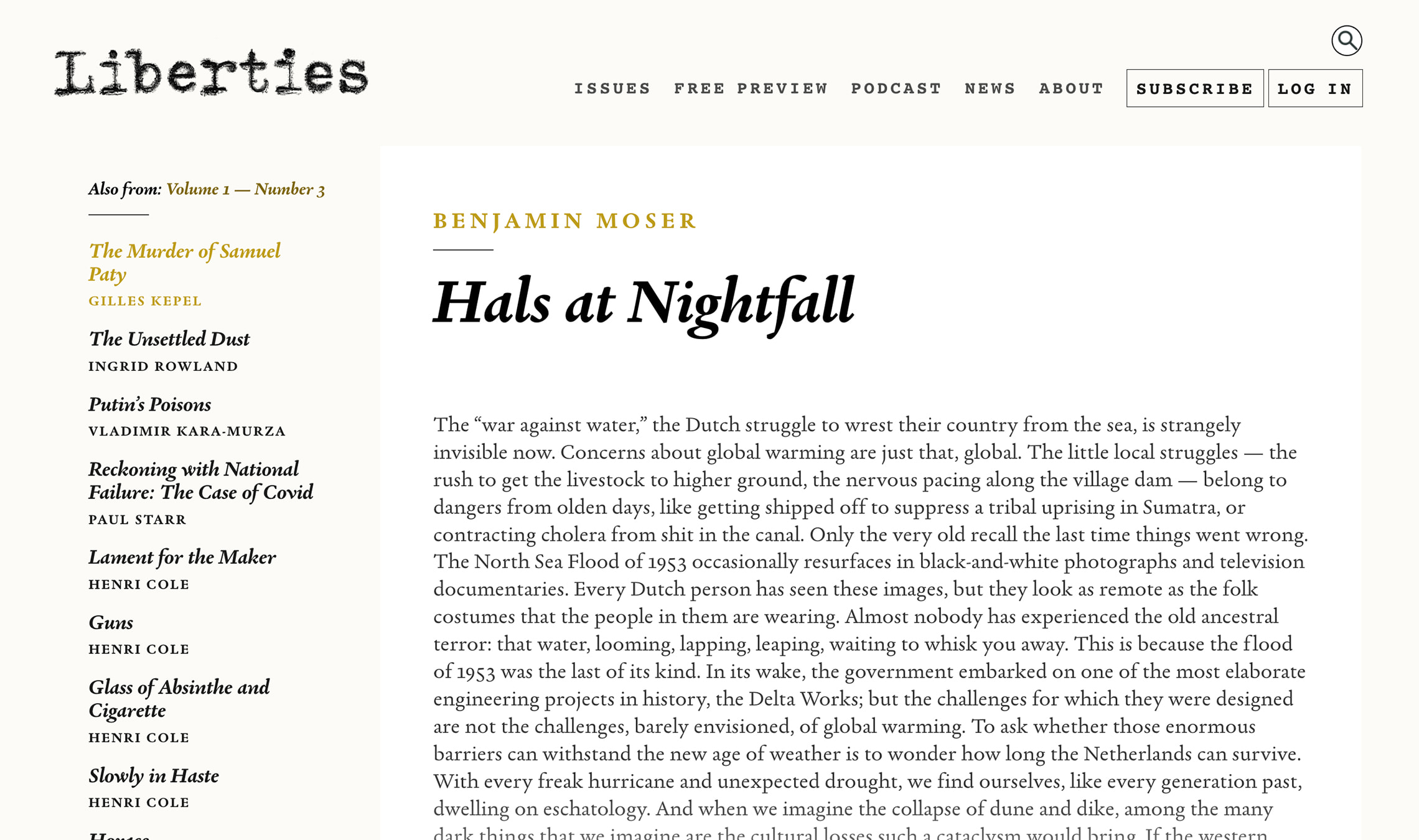
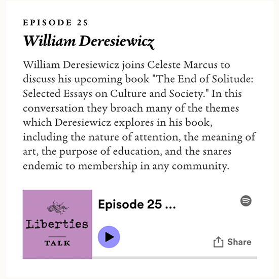
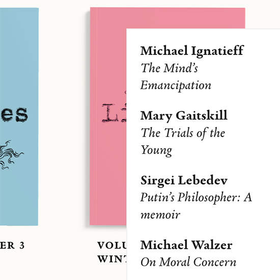
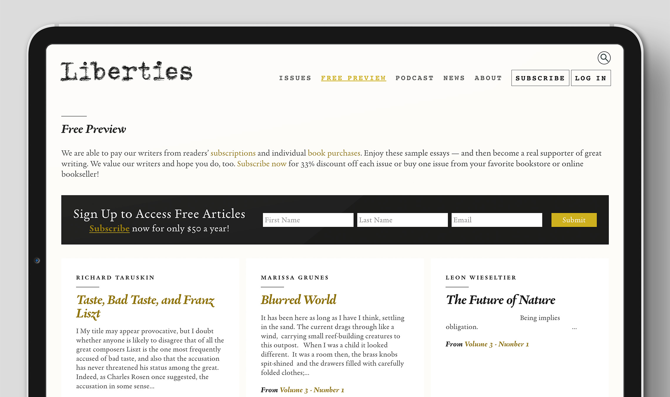
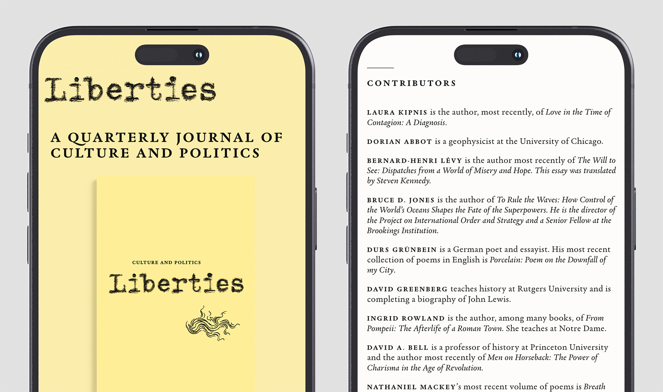
As the designer behind the publication, William van Roden chose Xavier Dupre’s Garalda family as the identity and design voice. Garalda is not only used on the website and social media, it takes center stage in the printed publication with its easily-read text, swash alternates, and striking details when enlarged.
Van Roden explains his choice of Garalda: “We explored a handful of serif fonts for the journal. We wanted a smart serif that had classicism as well as modernity, and we had Garamond in the mix as a kind of exemplar. The design is obviously classic, but it also felt a little tired and overused for this project. After comparing a few different font families, Garalda offered a much more vibrant alternative to the familiar Garamond. After testing sizes and weights, I was able to permeate the system with small bold caps, bold italics, and book weights.”
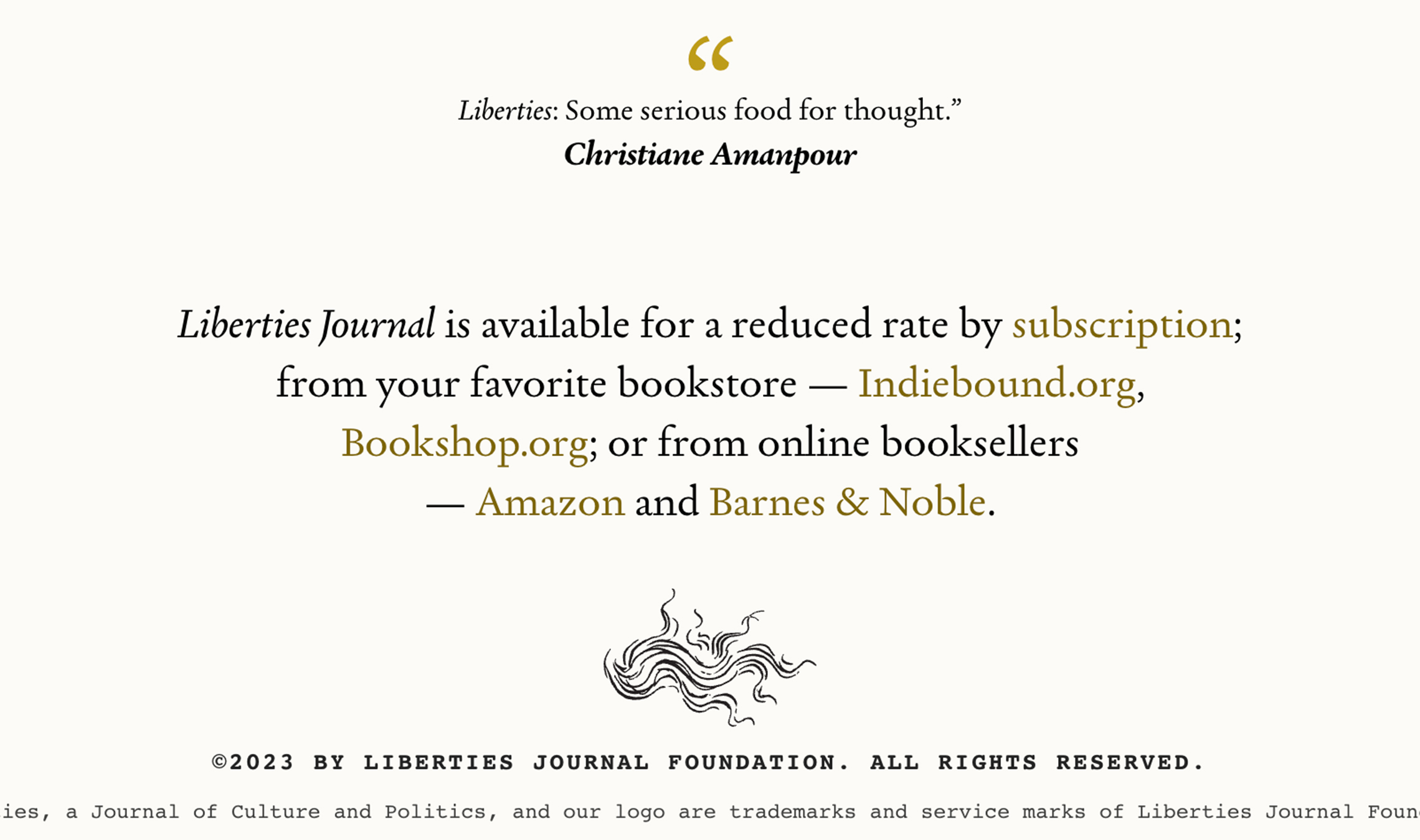
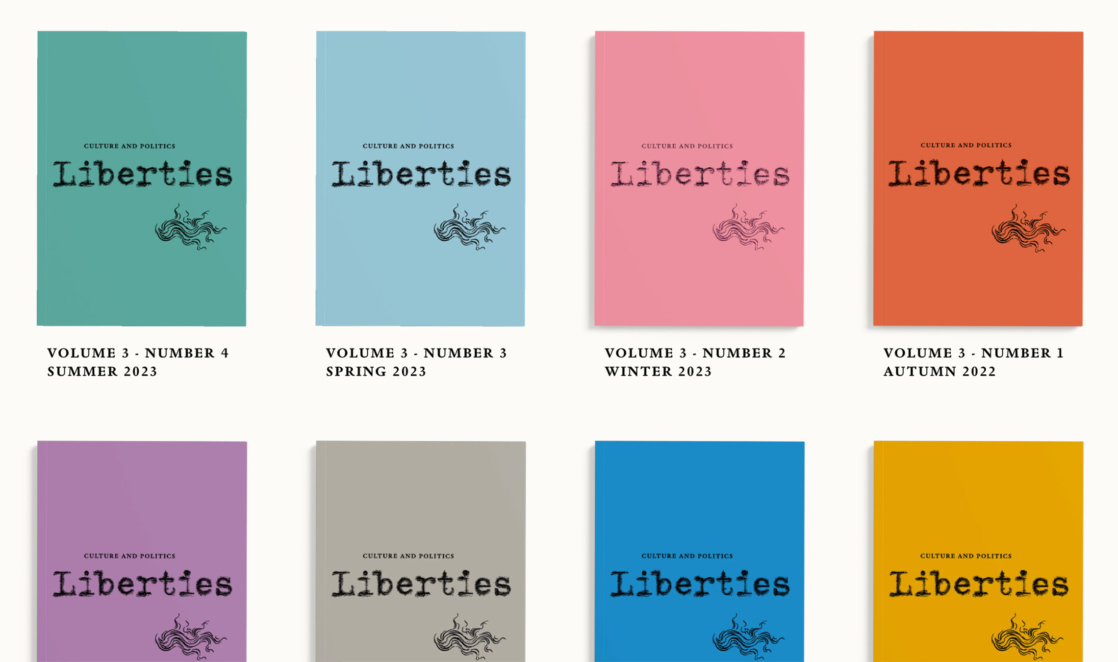
“Liberties uses an insignia on the cover and other locations,” says van Roden. “This insignia was initially derived from details in Bottocelli’s drawings for Dante’s Divine Comedy, which were executed between 1480 and 1495. With Garalda, there are gorgeous alternate swash options for the capital letters. These alternate glyphs align well with the flare and beauty of the insignia. And in the lowercase italics, I love the sexy ‘w’ and ‘y’ letters! For us, Garalda works hard, reads well, and looks elegant.”
Garalda is a charming family that renews a legacy of finesse. Its workaday personality encourages easy long-form reading, but this reinvented Garamond is certainly not basic. Garalda is an humanist slab serif, but with a mix of angles and curves to give the classic shapes a fresh, unorthodox feeling. While almost invisible in paragraph text, these produce a graphic effect in display work, resulting in a contemporary family with rich heritage.
TypeTogether is an indie type foundry committed to excellence in type design with a focus on editorial use. Additionally, TypeTogether creates custom type design for corporate use. We invite you to browse our library of retail fonts or contact us to discuss custom type design projects.