Protipo becomes a Plug and Play brand pillar
May 2023
The tech catalyst company Plug and Play chose the tech-and-information-savvy Protipo family in their recent rebranding.
The tech catalyst company Plug and Play chose the tech-and-information-savvy Protipo family in their recent rebranding.
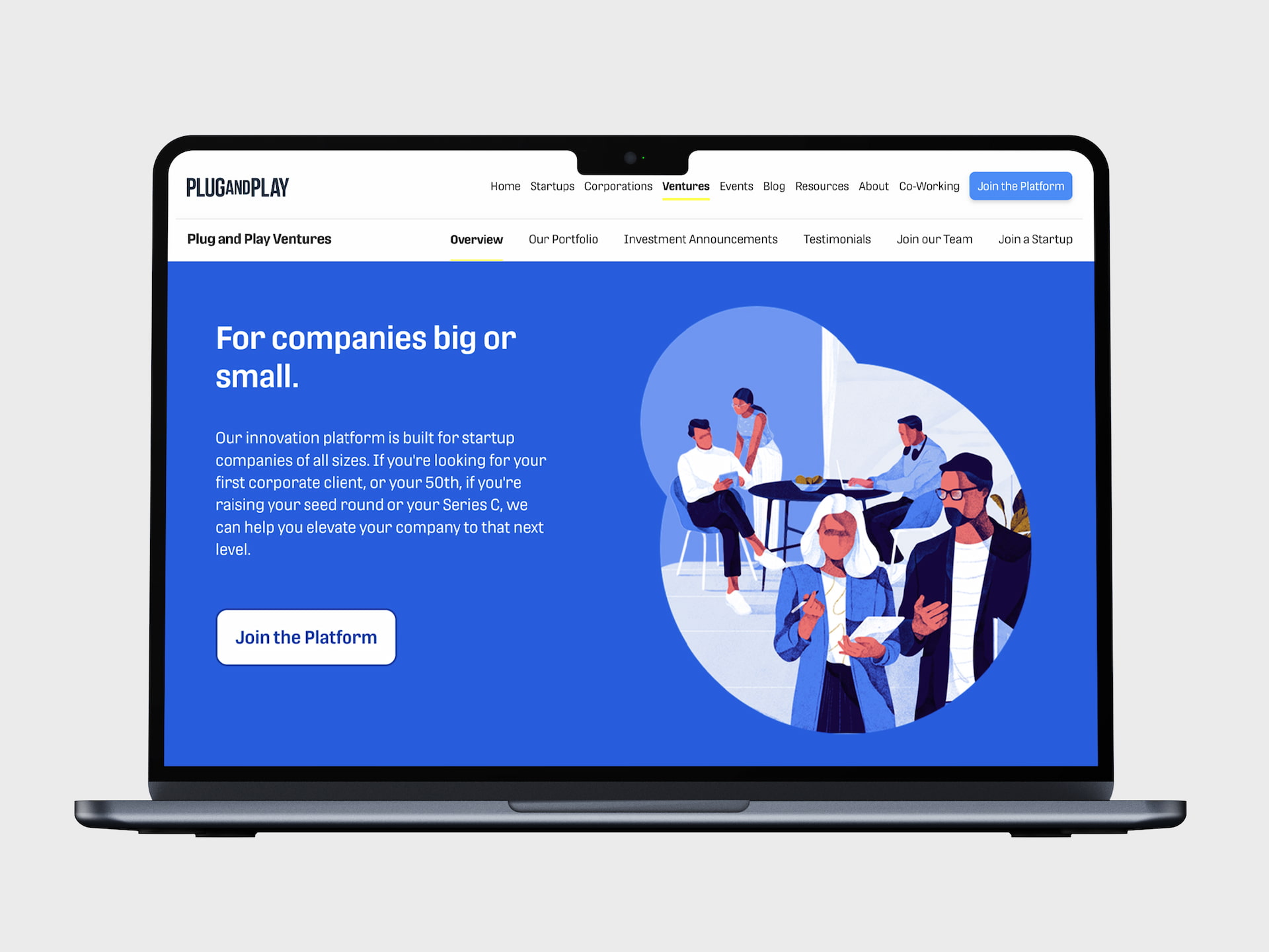
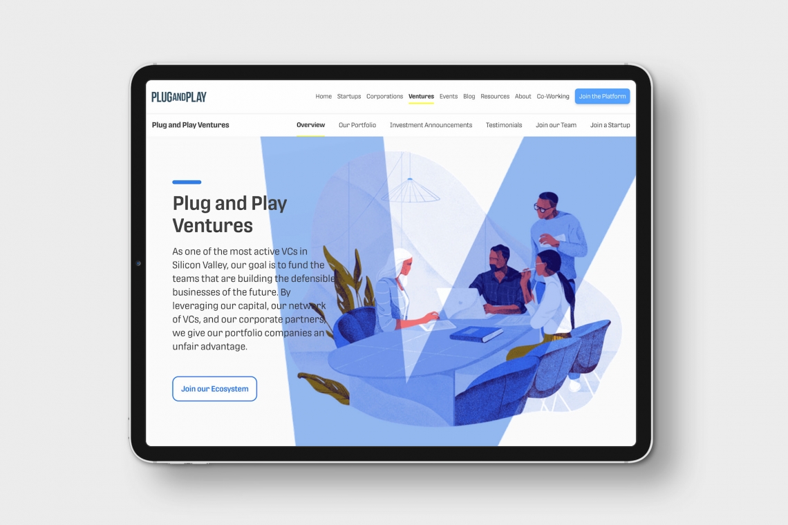
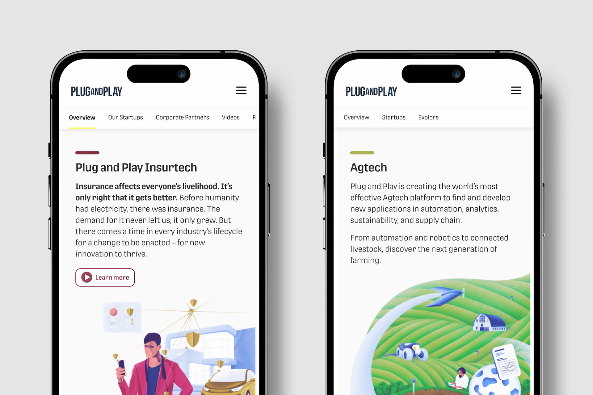
Plug and Play, a company devoted to assisting and connecting tech startups around the world, wanted to take their brand further by working on the consistency and coherence of their brand and typographic assets. One of the main concerns was to find a suitable alternative for their body text font, aiming to reinforce their brand identity, achieve consistency, enhance brand recognition and memorability, and future-proof their typographic requirements across various media in light of the company’s expected growth.
One of the major issues with branding in general is that when a particular typeface or style of type catches on, it tends to be the hot new thing. Seemingly overnight, everyone chooses the same one and all the companies risk becoming indistinguishable amidst the trend.
Whether branding strategy is approached as a container for the message or as a way to gain a market position, distinction wins the branding game. Looking like everyone else is like being another drop of water in the ocean rather than being the island oasis — the useful, the different, and the inspiring destination. As much as possible, brands should own their assets and their position both in their category and amidst the culture.
Plug and Play came to several important realisations about their previous type choice in their search to connect with their customers in a deeper and more authentic way: it was an all-too-common sans serif; it had no discernible personality; unlike their entire reason for existing, it was made almost a century ago rather than being made for the digital age; it failed in paragraph text; its character set was limited; and it said nothing significant about their identity, how they help clients, or who they believed they could be.
And, while they needed to solve these issues, Plug and Play did not want to get too far from what initially drew them to their prior font choice. Going in a completely new direction would only increase the amount of work across all internal and external print communications, internet presence, and digital representations.
Former Global Brand Manager and Creative Strategist Sara de la Mora, who was in charge of the typographic restyling and rebranding, explained, “Finding a typeface similar to their previous corporate font would facilitate a seamless transition, eliminating potential technical and logistical challenges. Opting for a vastly different font would have imposed a significant burden on the company, necessitating time-consuming updates to templates and recreating various documents and communication assets.”
Their brand evolution had to be simple, purposeful, and functional — sensible in every respect. All these challenges can fortunately be overcome, and it’s one of our joys to partner with our collaborators to make it happen.
Plug and Play scheduled a series of meetings to assess options with TypeTogether CEO José Scaglione, and he partnered with them to think through their challenges holistically. After a thorough corporate evaluation and testing phase, they chose our Protipo type family not just to be an aspect of the brand, but to carry the entirety of the text and be the voice of the company.
De la Mora recalled, “After careful consideration, the typeface Protipo was selected because of the possibilities to work in digital and print environments, to perform in large and small sizes, and due to its similarity to the previous corporate font.”
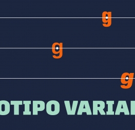
Plug and Play’s mission and tone of voice is matched by how Protipo’s simple, impactful, and wide-ranging abilities become a brand pillar. It’s also a type family engineered to handle complex information in infographics and UI, helping those designers work smarter. To us, it looks like a perfect match.
According to De la Mora, “Throughout the entire search process, TypeTogether provided invaluable assistance and guidance, addressing all our technical inquiries and ensuring the chosen typeface fulfilled all Plug and Play’s essential requirements.”
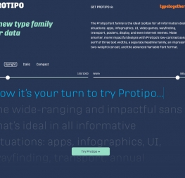
If you’re interested is seeing the entire Protipo family, including its extensive icon set, visit our special minisite and take it for a test run.
TypeTogether is an indie type foundry committed to excellence in type design with a focus on editorial use. Additionally, TypeTogether creates custom type design for corporate use. We invite you to browse our library of retail fonts or contact us to discuss custom type design projects.