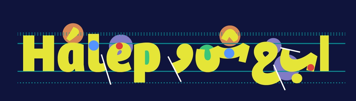
Douglas Arellanes: I’m here with typographer and designer Azza Alameddine, and we’re talking about Arabic typography, which I have to admit is a complete blank in my knowledge. And Azza, you’ve designed several Arabic fonts. How does that work? How do you adapt an existing font, an existing Latin font, for Arabic? That sounds like just a massive task.
Azza Alameddine: Usually the client comes with a Latin font and they need its Arabic equivalent. So this is really your source. And this is the thing you should look at. This is the only source you have. So actually, the first step would be to really look at the features of the Latin typeface. You can write keywords describing the typeface, and you need to find a way to translate those keywords into Arabic and this translation doesn’t necessarily mean that the keywords for the Arabic would be the same.
But I think in my opinion, this is really a good starting point to really look at the Latin and see its essence. And it’s very, very important. Once you look at the Latin and study the letters to know that actually what you need to translate into Arabic is not just the translation of the stylistic features.
I think it’s very important to translate as well the function of the typeface. So for example, if the Latin one is a text typeface, then the Arabic should also serve as a text typeface. If the Latin is display, the Arabic should also be a display. So this is a very important point.
So when you’re working with, for example, the stresses of the letters, how does that work? Because it seems like in Arabic script, there’s quite a bit of of stress between the different characters, right?
In Arabic each script has their own contrast, and thick and thins are really different in terms of positioning depending on the script, depending on the pen when it rotates, when it turns. So these are things you need to really, like, learn. There aren’t rules. You need to learn the script and see where thick and thins are, where the stress is in each letter.
So this is something inherent in the script — you cannot change those things. So what I do is actually... these things aren’t translatable. These things are set by the specific script, and therefore you cannot change them. You can change, of course, the contrast; the contrast of the Arabic letter should always match the contrast of the Latin letters in terms of the ratio between thick and thin.
But the positioning of thick and thins in Arabic are set by calligraphy. And like these are a kind of set rule. You cannot, as a designer, change them. You would be really modifying a lot the essence of the script.
Now you’ve worked on several of TypeTogether’s typefaces, including the typeface Bree. How did you actually adapt Bree to Arabic? What was that process like?
So the process is like adapting any other Arabic typeface. Like I said, I look at the Latin. I write the keywords, and then I translate first the function. So, for example, in Bree, Bree was more of a display typeface. Usually users would use it in big sizes. So the Arabic had also to be kind of a display thing.
So this is what I call the function of the typeface. So the function is to work in display. And then I really look at the structure of the Latin letters. So, for example, Bree was what we call an upright italic. So it had this handwritten feel to it. So I had to translate also this function into Arabic.
And once I decide the style of the Arabic typeface, then I start to match it visually. So then I start to match the size between Latin and Arabic, so that there the size is consistent. Then I try, I match the weight, then the contrast, then the features. So it’s really a step by step, I think. First thing function, and then the visual matching.
Do you have a character or a detail or a letter that you like to start with?
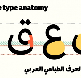
Usually I start with five letters in Arabic. One that I think is very important to start with is like it would be the equivalent of an n if you would like in Latin is the beh letter in Arabic. It’s beh, it has a... in its isolated form it looks like a boat, it’s an elongated shape and this letter sets a lot of the proportions for the future letters.
And so I start with this one as an isolated form. And then I start with, of course, the initial, medial, and final form of the beh... So the isolated form sets the proportions and the medial form is very important because it sets the spacing of the typeface, which is very important in Arabic, because in Arabic spacing is within the letter.
So you have to really work on your outlines in order to space. It’s not like in Latin where your spacing is just set in units. And therefore I start with this letter and its four forms, and then the next step would be to do a similar letter that also has a tooth.
So the beh, we call it a tooth letter because it has a small vertical tooth as a medial form. And so I start in the next step to do the seen, which has three teeth. So this is important also after the beh to start with because then you can decide whether you want your typeface to have consistency, where the shape is quite similar. Or do you want really to differentiate these shapes?
So this is a decision you have to make in the beginning of making a typeface. And then I start to do completely different shapes of letters to also decide on other shapes. For example, I do the waw, which has a counter shape. So also this is a decision you have to make. What’s the shape of the counter? How would you like the counter to be?
And then I do alef for example, because it has an ascender and the hah because it has a descender. So you try, within these five glyphs, to cover decisions, most of the decisions in your typeface.
But these are just... this is kind of my process. It’s not really a set standard. So you can start with any letter at the end. But for me, this helps me to make decisions in the Arabic typeface.
When you were working on Bree Arabic, were there particular characters or glyphs that gave you a lot of headaches?
I remember in the bold weight and yeah, the very heavy weight. There were many. There were ligatures because ligatures are quite compact. So in the bold it becomes even more compact, to get the weight right and without the ligature being so wide and so big, you have to make so much compromise and make optical corrections.
I remember some ligatures were really difficult to make. And also the hah has a really tight, small counter, so you had to also manage a bit of the white space in the counter. So yeah, the ligatures I would say were really difficult.
I’m trying to get my head around the scope of work. How much time did it take to adapt Bree to Arabic?
I think if you count just workwise without the feedback, I think it took me around 9–10 months. It was quite a long project. Because at the beginning, the first phase is the most difficult to really make decisions, and make sure that you are sure of your decisions because they will have an impact throughout your whole process.
So it was very important the first few months that you are really convinced with what you've done.
Now with Bree, Bree’s just a lovely face. I’m wondering about how you would see Bree Arabic with its ideal use? Where would you see it best used, or where have you seen it best used?
I think because Bree Latin is used very often in branding, but as a display. So for example, it’s used a lot in packaging and logos. I think you can even use it in titles on digital interfaces if it’s not set in a very small point size. It looks really, really nice online.
So I would see exactly the same usage for Bree Arabic because this is, as I mentioned before, this is how I designed it. I designed it to be functioning like Bree Latin, so it had to work in a display size. Of course you cannot control how people use it. I mean, some people will use it in paragraphs. It will still work, of course. I mean because it’s a system and it should work in all the circumstances. But we advise people to use it more in headlines.
Now because Bree Arabic was done in the style of Arabic Ruq’ah, is the handwritten style for Arabic, I would see it, I would see the Arabic more in informal settings like really cool posters, music. It could be music posters, it could be political posters like banners, because it has this really informal feel and like, it’s kind of friendly and it’s, yeah, it has this attractiveness to it, especially the bold weights are quite chunky and cute. So I would use it more for fun stuff rather than serious usage.
Related to this question, where’s your favorite example of seeing Bree Arabic in use?
Well, recently we used it, students used it in really nice leaflets. I think one student did a leaflet about a very famous Lebanese singer, and she did a really nice layout related to music, if I remember correctly. I haven’t seen it. I have to say I haven’t seen it in the wild yet. It was more student usage. We [also] did a really cool poster at TypeTogether promoting Bree Arabic. And I use it a lot for personal work.
Aside from Bree Arabic, what is that feeling like when you see one of your faces in the wild?
It’s really nice, but then the first thing, it’s like you always see the mistakes (laughs). So at first you’re like, ‘Ah, it’s so nice.’ And then you're like, ‘Why is this outline, not looking like this?’ But no, in general, it’s really such a nice feeling, especially when it’s in big sizes.
Adelle Sans Arabic was used last year in the Spanish pavilion at the Dubai Expo, and I remember I went in by coincidence, and then I saw it everywhere in huge sizes. So it was such an amazing feeling. And it was really a good use. Sometimes when the use of it is kind of done in a bad design, you regret that they chose yours, but when it’s well done, it’s really, really nice.
Now, you mentioned working with students. Would you have any advice for type designers who want to make their first Arabic face?
I think a very important thing to do before going into type design is to research the history of calligraphy. Because in the end, you’re researching shapes that have been here for hundreds of years, and so it’s really important to know the past and to know what the rules are, because these rules are really involved in reading and culture. You cannot change them from one day to another. They’re really embedded in our minds. It’s very difficult to just invent shapes. People wouldn’t accept them.
So my first advice is to look at old calligraphy, and learn the essence of each letter. Why does this look like a lam? Why does this look like a meem? What are the limits? If I extend it, where does it stop looking like a meem, and where does it start looking like a meem?
So this is a really very, very important point, I think, to know the limits of modifying letters. And of course this is very difficult, I think. But I think also if you ask people, if you go to workshops or if you read articles, sometimes you can also learn a lot about type design in a practical way.
But my first advice is to go more in a theoretical approach, and to learn a bit of the history of the letters.
That’s great advice — great advice. Azza Alameddine, typographer and designer. Thank you so much for talking with us today.
Thank you so much, Doug! Thanks a lot.