Beirut student project

January 2023

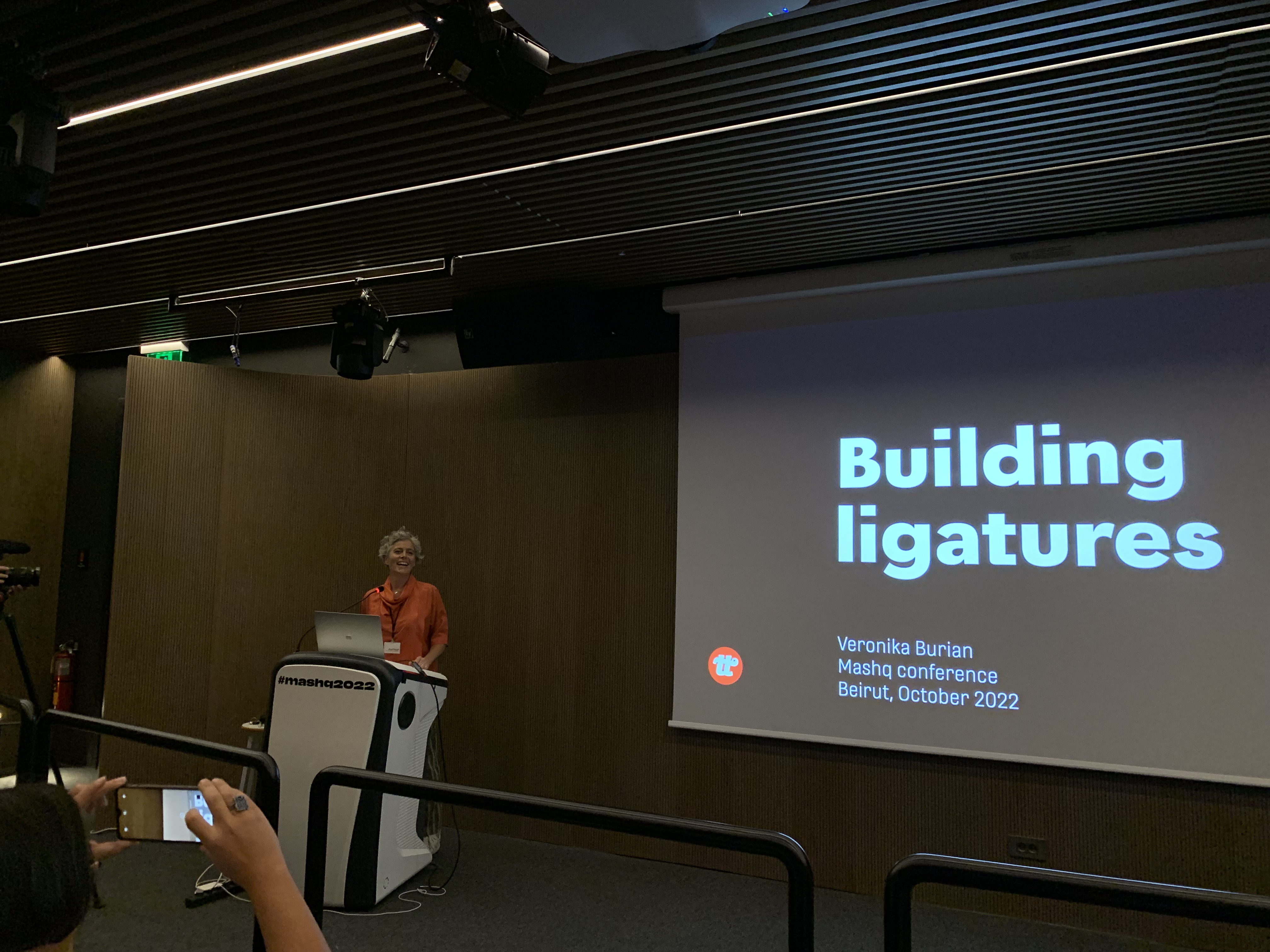
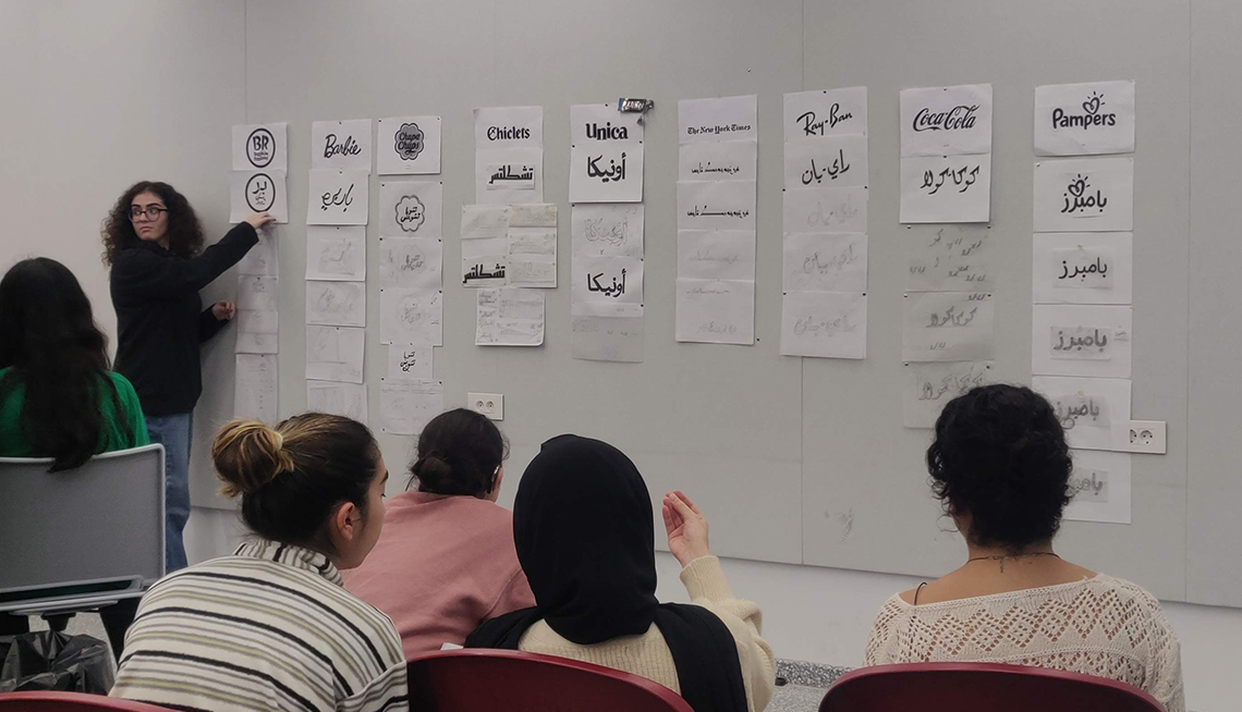
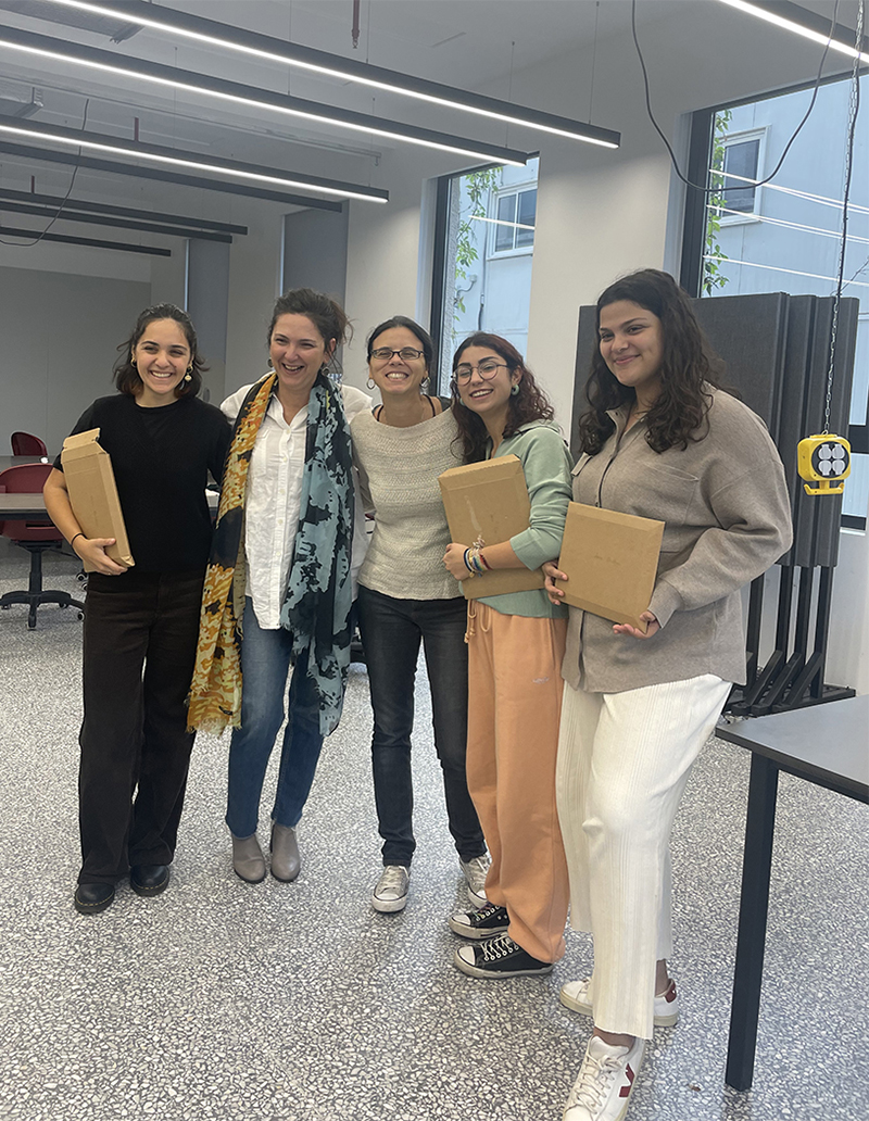
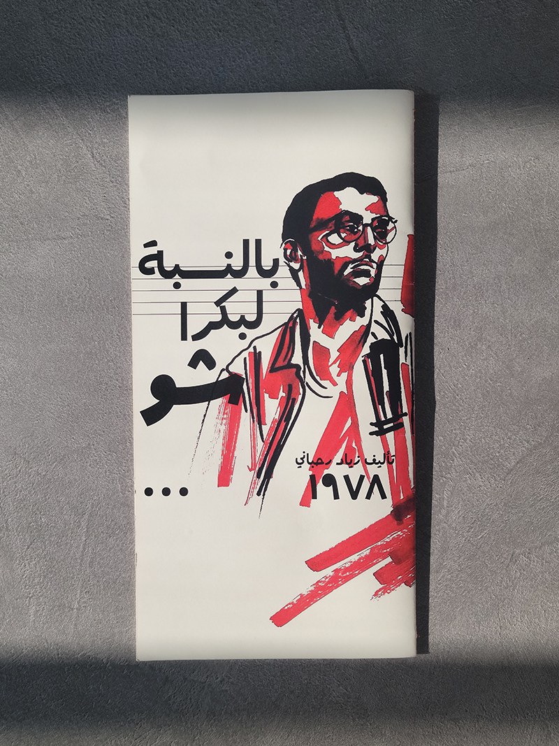
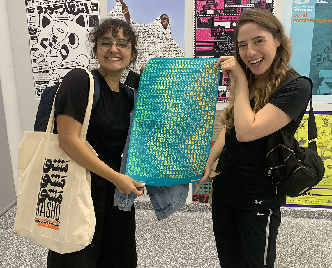
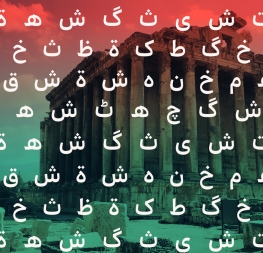
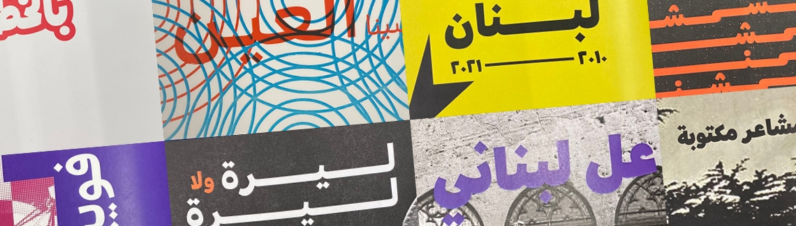
A couple months ago, Veronika, Azza, and Rabab spent some time at American University of Beirut (AUB) for the Mashq conference. Besides presenting on type and design, Veronika judged a student assignment and Azza led an Arabic logo design workshop.


Azza’s workshop had the students take a well-known logo and create a matching Arabic logo. The students started by first deciding which Arabic script (Naskh, Kufi, etc.) most closely related to the original logo in style and intention. They then began a process of logo iterations to arrive at a final design that harmonised with the look and purpose of the original while respecting the expectations of an Arabic logo.

Veronika presented a lecture on TypeTogether’s key principles: collaboration, quality, community, diversity, and good karma. She included the role of the modern type foundry, the challenges faced by independent companies, and the possibilities that open up for collaboration in the fields of global typography, education, and new media. As an alumni of AUB, Rabab was a huge help with the conference and a great liaison among students, faculty, and TypeTogether.


TypeTogether also collaborated with the Graphic Design department at AUB, specifically with professor Yara Khoury who gave the students a short assignment for their Publication course. The students were to produce a booklet using TypeTogether’s Arabic typefaces. They were free to choose the content themselves: anything from a personal story to a subject they are passionate about. The task was to show the qualities of the chosen typeface and its characters using color, size, weight, styles, cropping, hierarchy, graphic elements, etc.

The results were surprisingly elaborate and well considered for this short two-week assignment. Well done AUB students!

Veronika and the professors at AUB chose three winners: Nour Kaddour, Sana Bou Hamdan, and Zeina Houssari, who each created quite different booklets using Bree Arabic and Athelas Arabic.

As for the prizes, the winners were awarded these fine wares:
1. One font bundle, the TypeTogether book & posters
2. Font voucher, TypeTogether book & posters
3. Font voucher & posters

Our congratulations again to these students and the fine work they produced!


The three winners with professors Yara Khoury and Greta Khoury.


Publication design by Nour Kaddour.


From Nour Kaddour:
Upon first glance, Bree Arabic reminded me of the lettering on the posters of old Arabic theatre and film. I thought that merging this face with the similar, illustrative style of these posters would result in something rhythmical, blurring the lines between type and the image. It only seemed natural to choose a musical by the iconic Lebanese composer and playwright, Ziad al Rahbani.

As for the design concept, I wanted to represent Bree in all its formal glory to create a musical composition that conveys the mood of the play via elongations of syllables, reprises of text treatment, and strong visuals. Finally, I ended with a Bree Arabic cast line-up — a final goodbye before the curtain closes — hopefully leaving my audience shouting “encore!”


Publication design by Sana Bou Hamdan.


From Sana Bou Hamdan:
Bree Arabic is a fun and experimental typeface; its circular, geometric form gives it a hand-drawn feeling. It instantly reminded me of how it would be fun to design and create a joke book introducing the font. And what’s better than “Abou Abed Jokes”.

The type specimen contains nine jokes, and each spread refers to one joke, treated differently from the other. Yet they all revolve around the same concept of taking the quirkiness of bold weights and enlarging the letters or keywords to give a three-dimensional aspect to the page, each followed by the joke in the center. It is a full typographic type specimen where some spreads introduce images for nostalgic or aesthetic purposes to fit the joke.

The typeface Bree Arabic has a strong impact as a display font and it is rather an interesting and entertaining font, taking into consideration the forms that the typeface produces once enlarged, creating a variety of experimental posters.


Publication design by Zeina Houssari.


From Zeina Houssari:
The Athelas Arabic typeface is perfect for Arabic’s graceful aesthetic qualities. I was really inspired by its natural and delicate details to tackle Ibn Muqlah’s legacy in building the basis of the Arabic script. In the process of brainstorming for Midad, I dove into ancient manuscripts, which I was really influenced by, to get the feel of the primitive Arabic scripts, because I felt that it would highlight Athelas’s intricate qualities. From Ibn Sina to ancient Quran, all those small details in the manuscripts were fascinating to me. Therefore, I reinterpreted the exquisite manuscripts into Ibn Muqlah’s revolutionary teachings.

The specimen covers Ibn Muqlah’s three principles, the black ink, the calligraphy pen, the arabic letterforms, the diacritcs, the arabic letters dots, the different type of scripts, and rules for a calligrapher.


Results of the TypeTogether assignment by the other AUB students taking part in the Editorial Design course led by teachers Yara Khoury and Greta Khoury.


Bree Arabic poster in Mashq conference goodie bag.

About Us

TypeTogether is an indie type foundry committed to excellence in type design with a focus on editorial use. Additionally, TypeTogether creates custom type design for corporate use. We invite you to browse our library of retail fonts or contact us to discuss custom type design projects.