Behind the Protipo typeface
March 2018
In this article we show the inspiration and development process of our Protipo type family.

In this article we show the inspiration and development process of our Protipo type family.
We at TypeTogether intend to grow our retail font library within the scope of our interests in editorial design and intensive text typography use. We curate our type offerings in such a way as to avoid repeating the same stylistic theme and therefore give enough room to each type family. In 2016 we felt that our library was missing a stiff and formal grotesque font family, one within the characteristics of the ubiquitous DIN fonts.
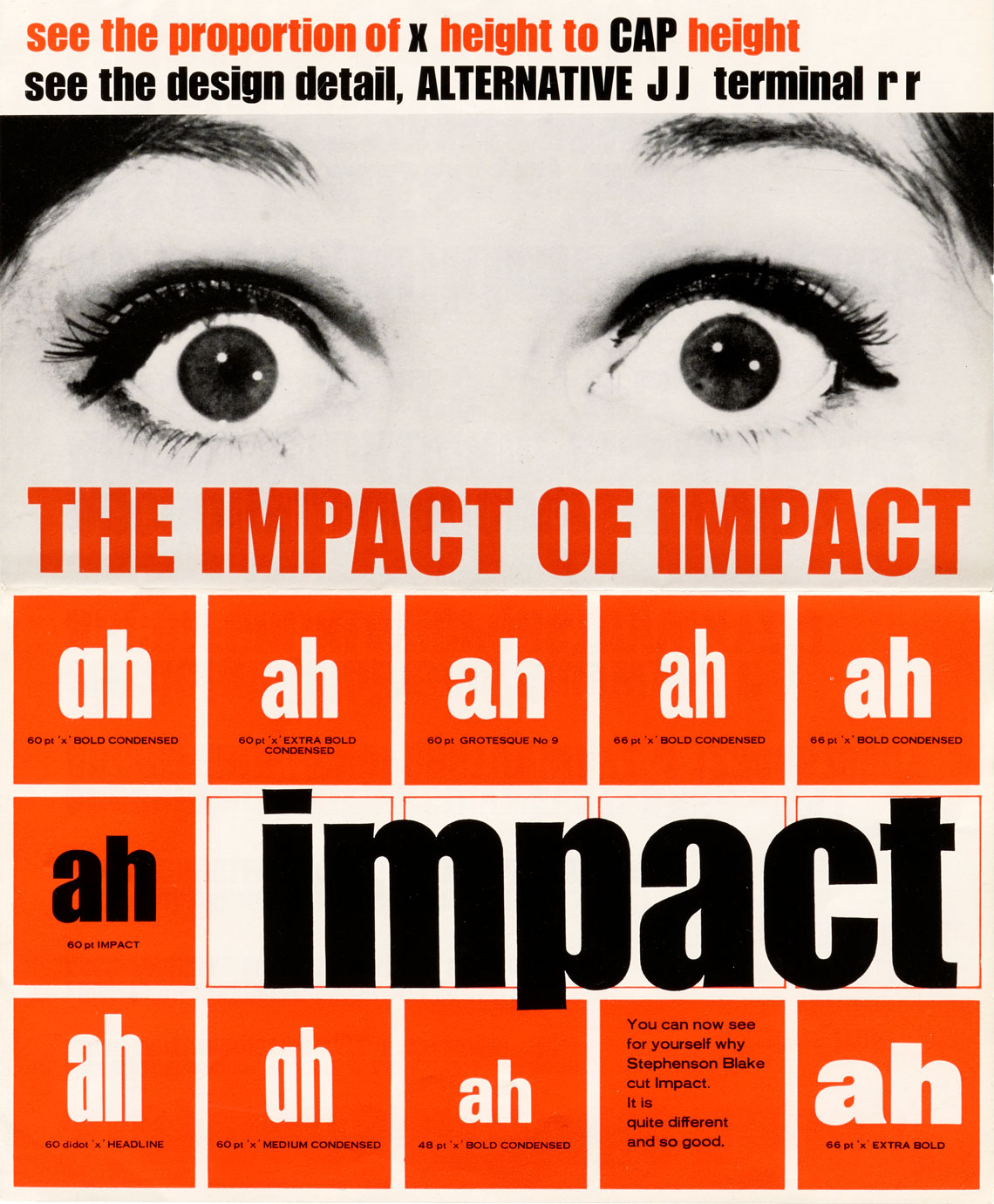
Stephenson Blake's Impact, specimen designed in 1965 by Geoffrey Lee. Reproduced with kind permission of Letterform Archive.
During preliminary research we came across the original specimen of the typeface Impact from 1965 and released by the Stephenson Blake foundry. Some of its details immediately caught our attention and we set out to dig deeper into this particular style. We discovered several other typefaces from that era with structural similarities to Impact, such as the Schmalfette Grotesk (Walter Haettenschweiler, 1954), Compacta (Fred Lambert, 1963), Helvetica Inserat (1957), and Helvetica Compressed (1966).
As with most of our recent typefaces, we get inspired by historical examples and a genre, but do not copy any particular shapes. Instead, all the information collected gets processed over weeks or months, and then becomes expressed in the first design drafts.
Our goal for this project, initially named GeoGrot but later changed to Protipo as suggested by Gerry Leonidas, was to develop a font family within the rigid grotesque theme but with a much broader design perspective than Impact, and which would become a versatile typographic tool not limited to advertising or poster design.
At the time, the surge of information design, infographics, and wayfinding systems led us to believe that the extended family should serve such purposes. With appropriate treatment of forms, we intended to have subfamilies that could be used in data intensive applications, both in print and digital.
We were of course aware of the existing competition by contemporary fonts which share some structural design features, such as the mechanical feel, vertical stress, straightened stems in round letters, etc. We, however, envisioned a more polished and extensive solution for the intended users.
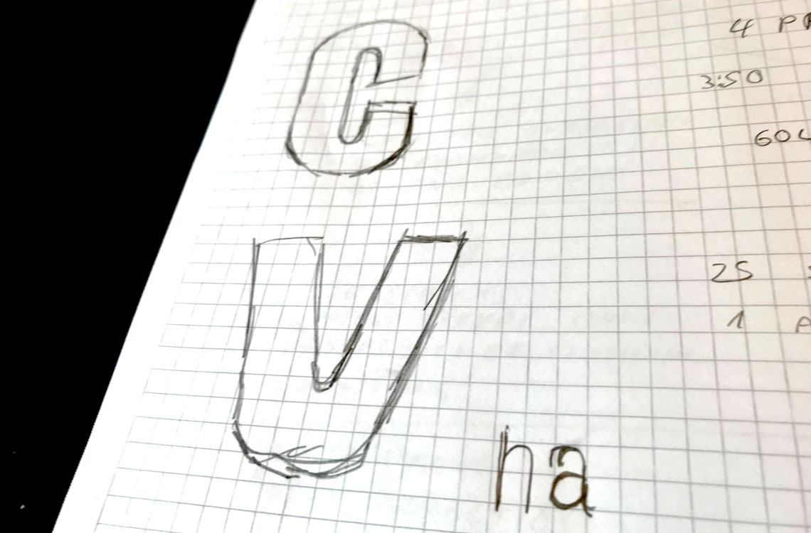
Very early sketch of Protipo.
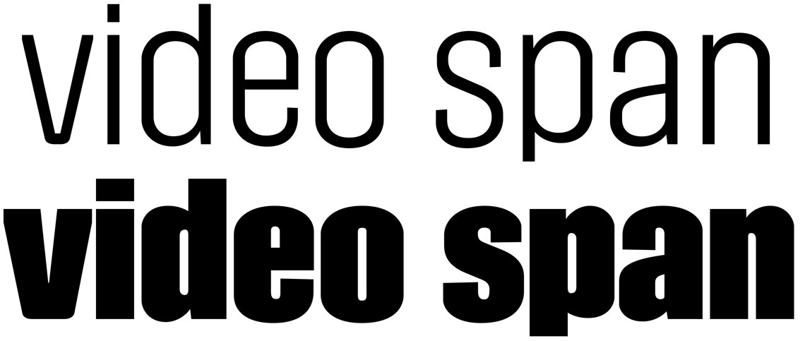
Early digital sketch showing our usual control characters. In this design the extenders are kept very short and the transitions between vertical stems and curves are quite abrupt and almost sharp.
We started the project by sketching our selection of control characters, the words video span. In these first comps, we started by drawing a heavy display style, which is often part of the most expressive corner of the design field for this type family. It featured very vertical and compressed lettershapes, straight segments for the curved stems of letters (for example in ‘o’, ‘d’, and ‘p’), very short ascenders, and even shorter descenders.
Compressed letters need minimal letter spacing. In this scenario, the fitting of triangular letters (‘v’, ‘w’, ‘y’, ‘k’) is problematic because of the naturally large countershape that oblique strokes create. To solve this issue and to enhance the sense of verticality in the design, we introduced vertical cuts in those strokes, which are probably one of the most recognisable features in Protipo.
The short vertical cuts in the diagonal letters help create a tight and harmonious fitting.
One of the main characteristics of Protipo are the flat, vertically stressed curves.
Unlike Protipo's early iterations, we decided to reverse the contrast in the ‘s’, making the spine thinner and the rest heavier. The result is more balanced now.
The second stage in the search for the family’s DNA was to examine possibilities for variations of the shapes by changing the compression of the characters, their weight, and their vertical proportions. By the end of this process we were able to formulate a complete Protipo font family plan which consisted of two sub-families: one of them a series of display styles with very compressed proportions and short extenders, and the other one a group of fonts for reproduction at smaller sizes, capable of handling large amounts of data, and working together with charts, graphics, and rulers. To enhance this functionality we stacked the text family with Narrow, Regular, and Wide versions as way of organising information by subtle adjustments.
The family includes a display style (Compact), text styles of three different widths, and two icon fonts.
For Protipo’s development, we decided to start the external Beta testing of the family much earlier than usual. We guessed — correctly — that feedback from professionals with proven experience could have a significant impact on some of our design decisions.
Some of the beta testers we worked with are Alvaro Valiño, an information designer who usually works for the Washington Post and who designed the pictograms for the 2016 Rio Olympics for the Washington Post, and Sandine Miller, who specialises in information design and has designed a series of small-scale up-to-date print maps for Oxford University. Another tester was Vizzuality, a design studio located in Madrid with branches in Porto and Cambridge, which creates digital tools and applications using data that help governments and organisations to make decisions based on real data, like Climate Watch platform for the World Resources Institute.
The Beta testers applied the early fonts to existing designs and real-life pieces that had been successfully produced. This also gave us the opportunity to compare Protipo’s performance against competing fonts under the same usage conditions.
One of the testers, Sandina Miller, encouraged us, saying, “I can see the relationship to DIN, but Protipo is rather lovely and not stocky or stilted. And I like the detail of the cut-off stroke terminals so the ends are blunt rather than pointed. Overall it’s readable and space efficient (I very much like the large x-height). The Narrow isn’t tight and compressed, and the Wide is not overly so — a very nicely balanced type family.”
We made several changes based on the results, such as longer descenders, more open spacing for text setting, and some shape details that enhanced the clarity, legibility, and appearance of the typeface through iteration with specific goals in mind.
The text version of Protipo also includes italics, which are really slanted upright shapes that were then optically corrected. However, to create a distinct enough change of rhythm and texture, we decided to modify and ‘italicise’ some of the frequent lowercase letters: ‘a’, ‘c’, ‘e’, and ‘f’.
The italic is mostly a slanted upright in structure without changing weight or width. However, four letters have been modified to suggest enough change in texture.
To further increase Protipo‘s functionality as an infographics font, we added some alternate letters that would work better in certain circumstances.
Toward the end of the development process we decided to add two more features we thought would be appreciated by hardcore information designers. The first one was the addition of the Variable font format, which provides the most flexible typographic tool available for multi-platform, multi-device data dissemination. Variable fonts allow designers to define custom instances of a typeface anywhere within the total “design space” of the font family and, in Protipo’s case, to fine-tune exactly how condensed and how bold it should appear. To learn more about the Variable version of Protipo, don’t miss Irene Vlachou’s (aka the Variable Queen) article.

The second feature we added to Protipo’s large family were icon fonts designed in two weights by Luciana Sottini. Protipo Icons has over 150 icons and symbols for infographics and two sets (solid and outline) of dynamically framed letters.
For optimal integration, the icons share the same design language as the rest of the Protipo font family and our objective is to regularly update them to add new categories to the existing ones of business, economy, population, buildings, and currency. Have a suggestion? Send us an email! We’ll happily consider any input from users.
To make things easier, we programmed quick access shortcuts to the icons. Simply apply the appropriate stylistic set, start typing the name of the icon, and it will appear. Currently only English words can be used, though.
From annual reports and wayfinding to front page infographics and poster use, designers consistently turn to the simplicity and starkness of grotesque sans fonts to get their point across. And the Protipo type family is made for these demanding environments.
TypeTogether is an indie type foundry committed to excellence in type design with a focus on editorial use. Additionally, TypeTogether creates custom type design for corporate use. We invite you to browse our library of retail fonts or contact us to discuss custom type design projects.
Schedule an introduction meeting to learn more.