A contemporary, eclectic typeface drawn from roots in Romanesque Europe.
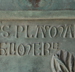
Alverata is Dr Gerard Unger’s resolutely modern typeface inspired by his doctoral research on Romanesque type in 11th and 12th century Europe. Capital inscriptions are the basis for this face, which can be seen in its short, thorn-like serifs and flared forms. Alverata also brings in secondary considerations from the early 20th century model, but tweaks them to prevent blandness and imitation.
Alverata stretches conventional letterforms without disturbing readers with unfamiliar details. Its primary Romanesque forms are robust while refinement is shown through myriad details, such as how the curves meet stems and how terminals of curves are resolved. Alverata comes in three styles to serve a wide audience (Regular, Informal, and Irregular), each with their own purpose and feel. The Regular sets the overall tone while the Informal style introduces an unexpected softness with such things as a single-story ‘a’ and calligraphic terminals.
The Irregular style is where real distinction lies because it’s made for scenarios where combining uniqueness with eclectic historical reference is the primary goal. Curved shapes prevail in the conventional Latin lowercase, whereas straight lines and angles dominate in the uppercase. Alverata Irregular exchanges these characteristics, experimenting with the characters themselves rather than increasing their weight or creating an accompanying sans.
The secondary characteristics of the early 20th century model, mentioned earlier, are seen mostly in details and familial relation: Alverata has a large x-height, is slightly condensed, and has large interior spaces within letters. By attending to these details, Alverata performs beautifully in both digital and physical applications, delivering excellent openness and legibility in small text and proving lively and attractive at large sizes.
To complete the Alverata family, Dr Unger collaborated with Gerry Leonidas (University of Reading) and
Irene Vlachou (Athens) to develop the
Greek version, and with
Tom Grace on the
Cyrillic version. All three styles of Alverata, along with our entire catalogue, have been optimised for today’s varied screen uses.