Noam Text in the Book of Names
December 2019
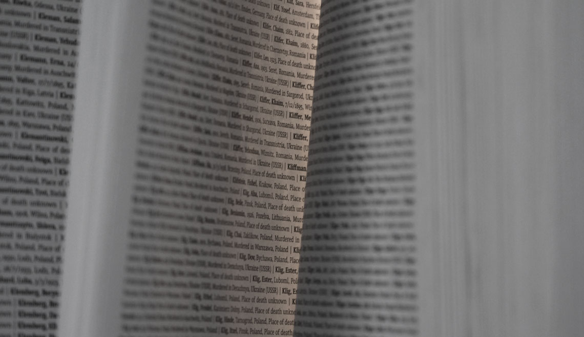
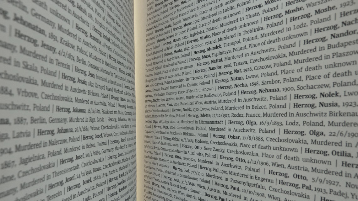
Noam Text in use in the Book of Names at SHOAH, the new permanent exhibition in Block 27 at the Auschwitz-Birkenau State Museum.
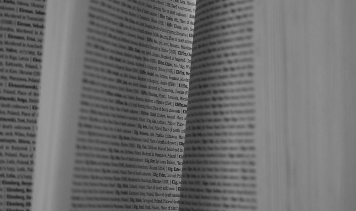
Noam Text in use in the Book of Names at SHOAH, the new permanent exhibition in Block 27 at the Auschwitz-Birkenau State Museum.
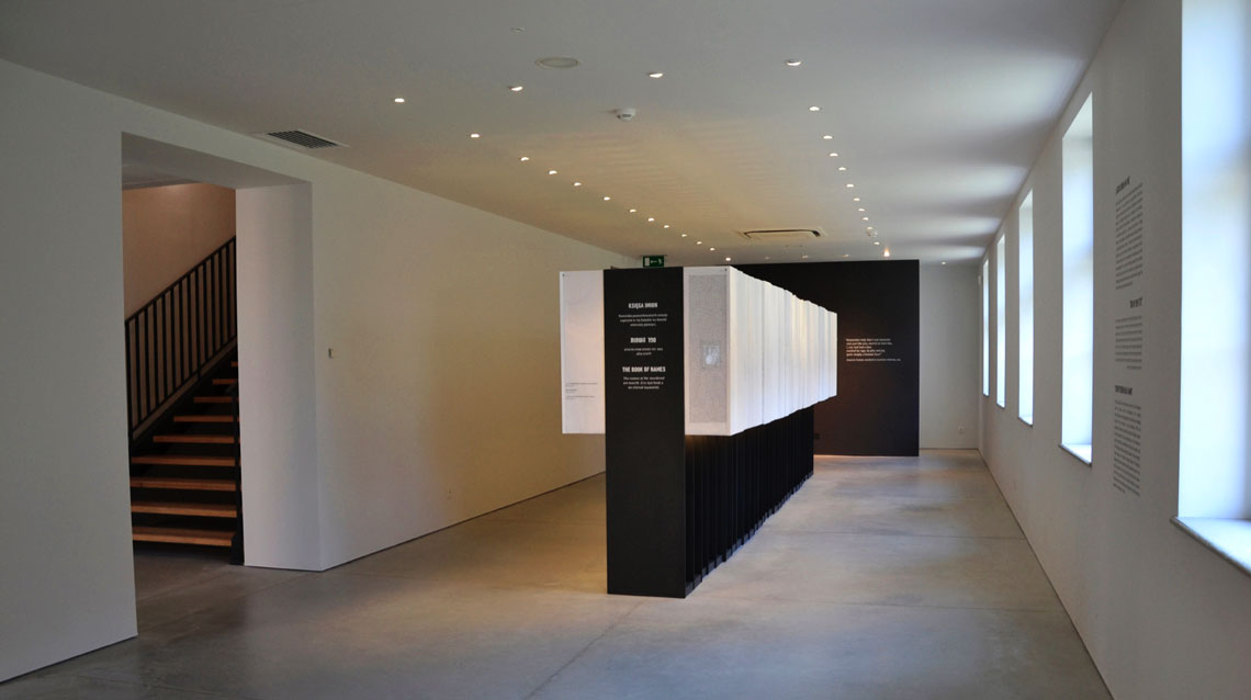
The new permanent exhibition in Block 27 at the Auschwitz-Birkenau State Museum deals with the Shoah — the murder of the Jewish people — in its entirety. The exhibition imparts, as concisely as possible, the fundamental aspects of the Holocaust in order for visitors to comprehend how Auschwitz-Birkenau was a component, albeit a central one, of the larger and more complex story of the Shoah.
Prof. Chanan de Lange, from Studio de Lange and former Head of the Department of Industrial Design at the Bezalel Academy of Arts and Design in Jerusalem, was appointed to coordinate the layout of the new Jewish exhibition at the Auschwitz-Birkenau State Museum.
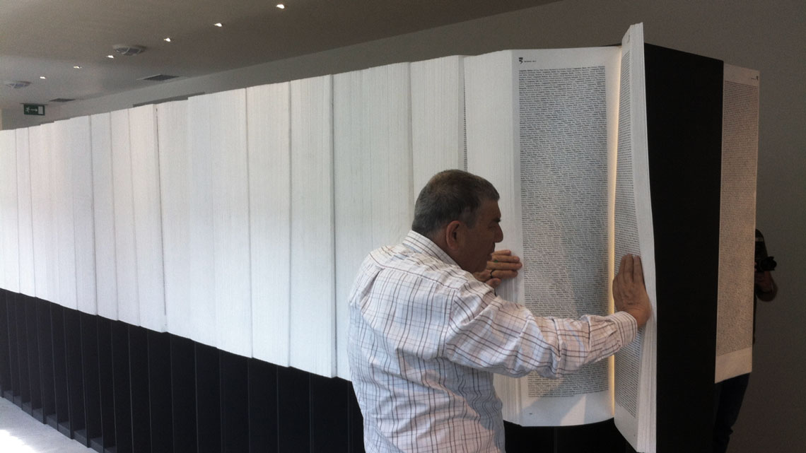
One of the fundamental aspects of the exhibition is to commemorate with visitors the names of each murdered Jew. This essential project has been running for more than six decades so far, and until now around 4.2 million names have been documented. This is a significant achievement of course, but, since it is incredibly difficult to express these numbers visually, they are all represented in the Book of Names.
The Book of Names includes the name, birthdate, origin, and the place and date of death for all Jewish children, women, and men who were murdered in the Holocaust. The goal is to create an “everlasting, permanent memorial to these murdered Jewish men, women, and children — one that would encompass both their inconceivable numbers as well as their individual identities.”
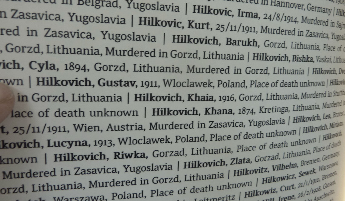
The whole book is set in the Noam Text typeface designed by Adi Stern, a Hebrew-Latin multiscript family. In Adi’s own words: “This, for me, is one of the most meaningful creations I’ve ever done. The names of all the known victims, including my own close relatives, are set in a typeface I crafted with my own hands.”
Noam Text masterfully combines resilience, harmony, and progress and is intended mostly for setting long texts. It strives to achieve maximum legibility in minimum space with its large x-height, short and fairly condensed Latin capitals, large and open counters, and low contrast. Among other technologically advanced details, Noam Text was programmed for all expected scenarios of mixing Hebrew, Latin, figures, and punctuation.
TypeTogether is an indie type foundry committed to excellence in type design with a focus on editorial use. Additionally, TypeTogether creates custom type design for corporate use. We invite you to browse our library of retail fonts or contact us to discuss custom type design projects.
Schedule an introduction meeting to learn more.