Marlon Wobst
May 2018
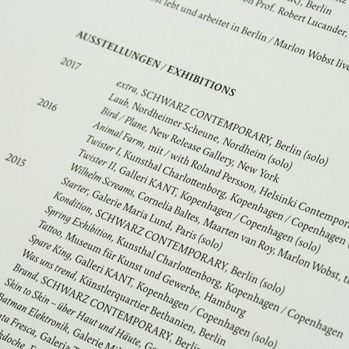
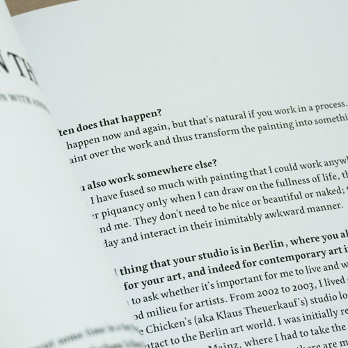
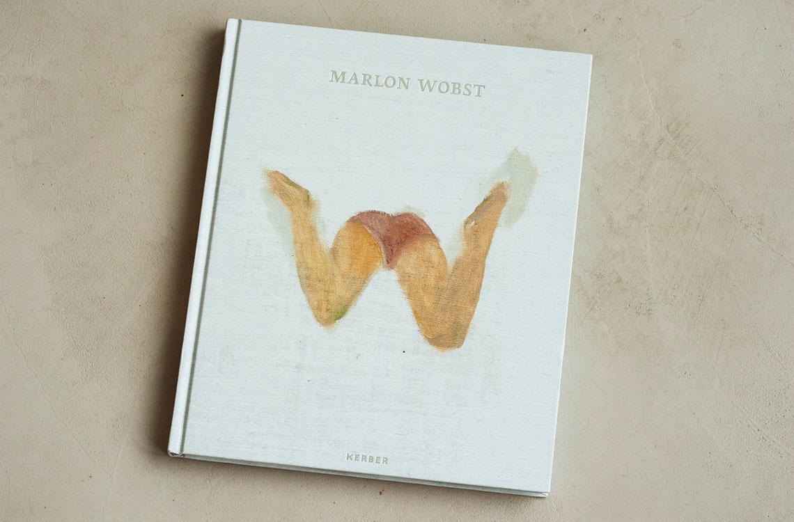
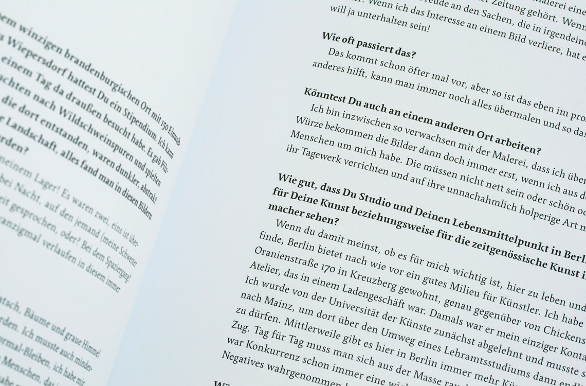
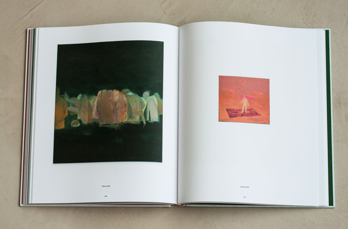
Renowned book and type designer Verena Gerlach selected Pilar Cano’s Edita typeface for a 2017 book accompanying the exhibition “Marlon Wobst — extra, Schwarz Contemporary”.
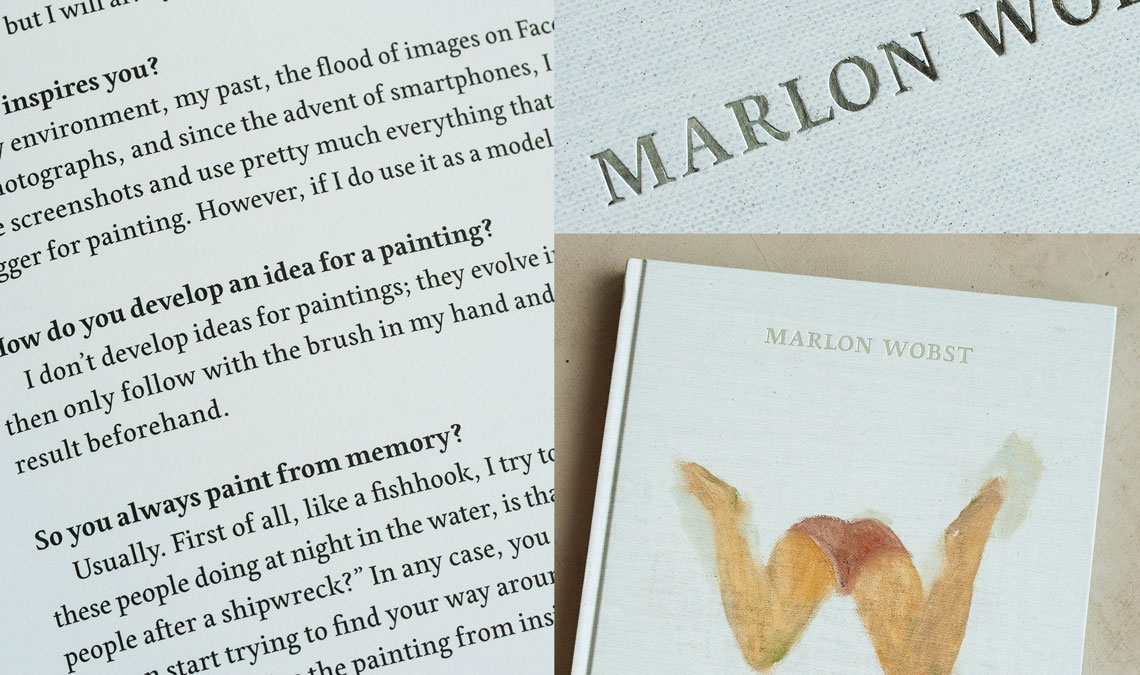
Renowned book and type designer Verena Gerlach selected Pilar Cano’s Edita typeface for a 2017 book accompanying the exhibition “Marlon Wobst — extra, Schwarz Contemporary”.
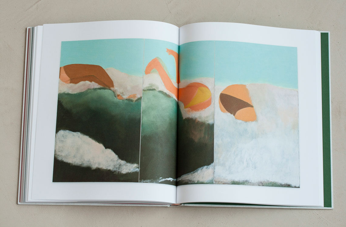
'Große Welle', 2016.
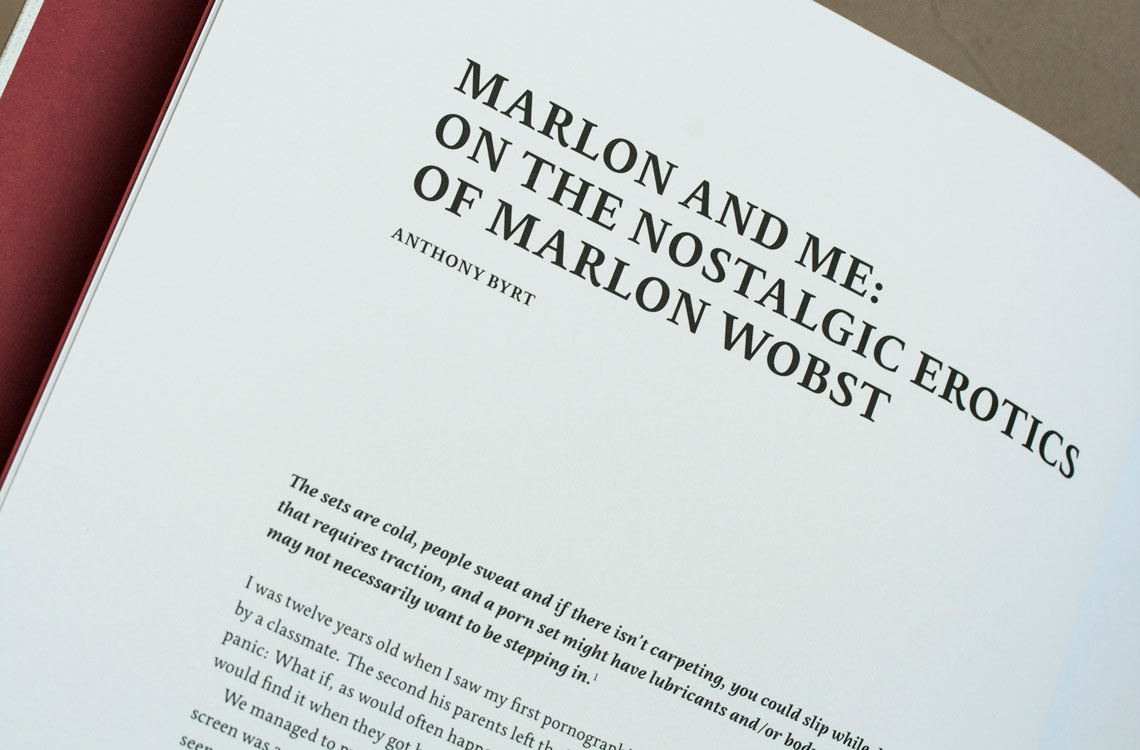
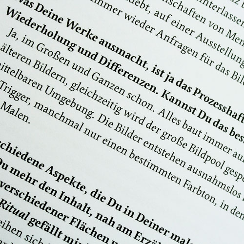
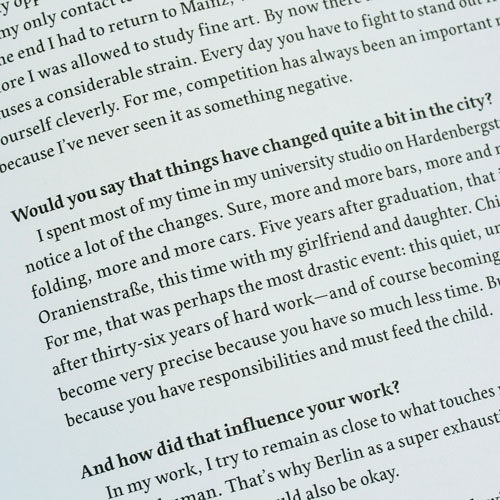
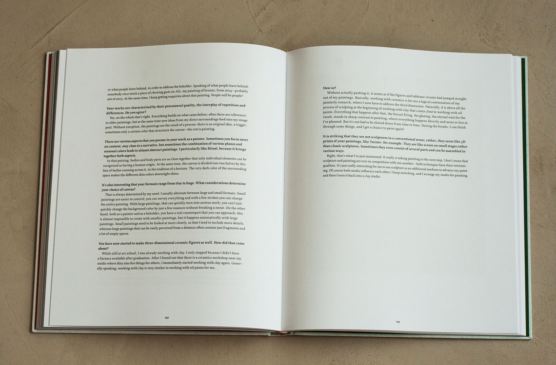
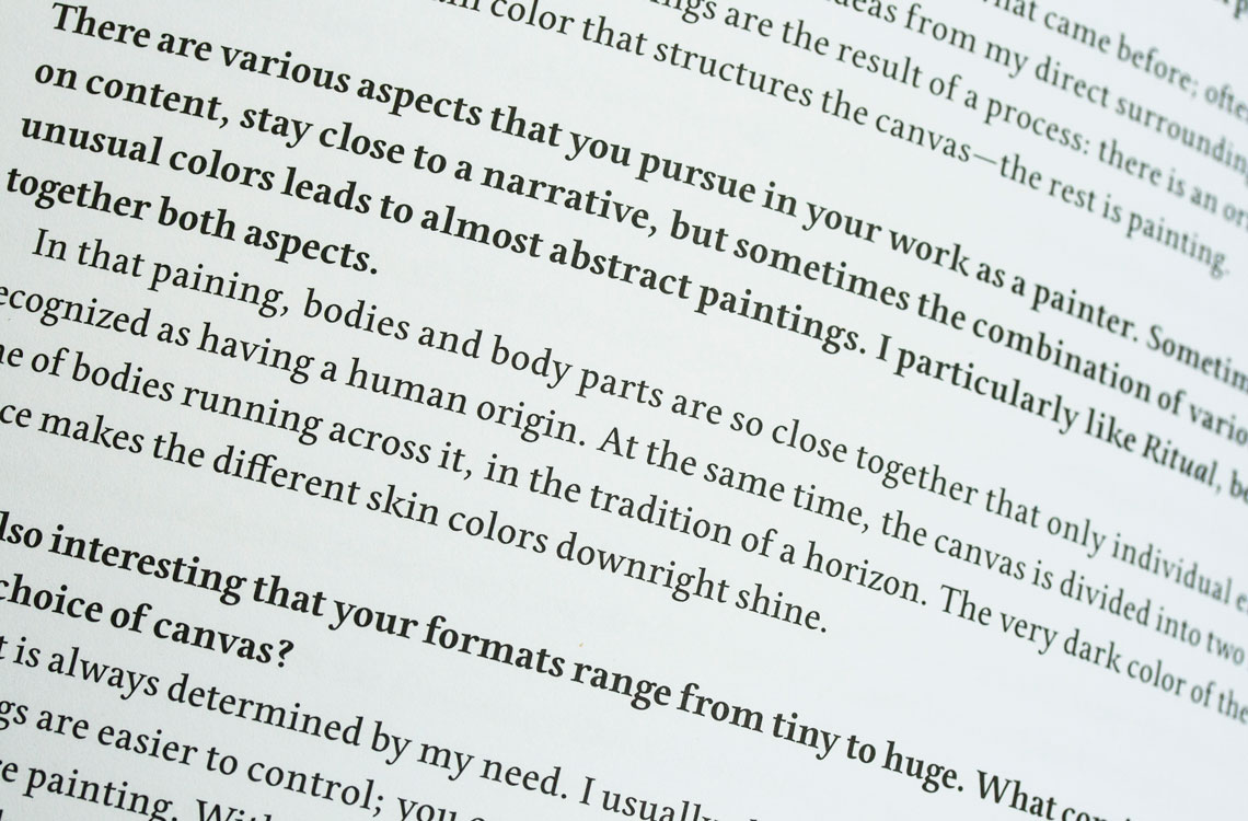
Gerlach exquisitely uses the Edita font family, the contemporary book typeface with a soft and warm voice, in all texts, titles, and tables throughout the book. The contemporary feel — where softness and fluidity play a very important role — is especially seen in its italics, which are loosely based on handwriting.
Gerlach explains, “German artist Marlon Wobst has an humorous approach to his paintings and ceramic sculptures. They show mostly contemporary humans in their everyday lives, and does so in quite a graphic, sometimes rather abstract way. Edita underlines this vivid mood by elegantly matching Wobst’s lively scenes. Edita’s humanist, renaissance oldstyle shapes are distinctive and legible, especially when used in the small, chic captions. The typeface has a balanced contrast between Bold and Regular, and the Italic is just gorgeous!”
Serving as the catalogue’s typography, Edita’s touch of spikiness nicely mimics the edgy motives of the artist’s work. His wish for the book design and typeface was: “Classic and elegant, and STRAIGHT INTO YOUR FACE!”
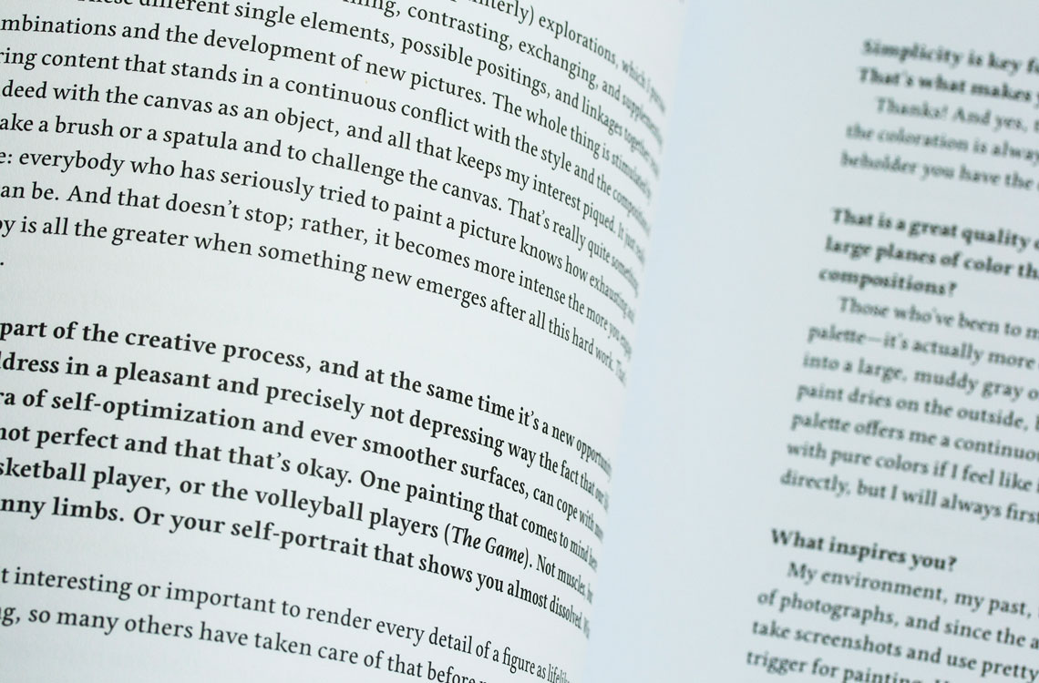
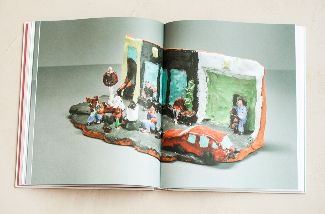
'Search', 2016.
TypeTogether is an indie type foundry committed to excellence in type design with a focus on editorial use. Additionally, TypeTogether creates custom type design for corporate use. We invite you to browse our library of retail fonts or contact us to discuss custom type design projects.
Schedule an introduction meeting to learn more.