Interview with Xavier Dupré

November 2016

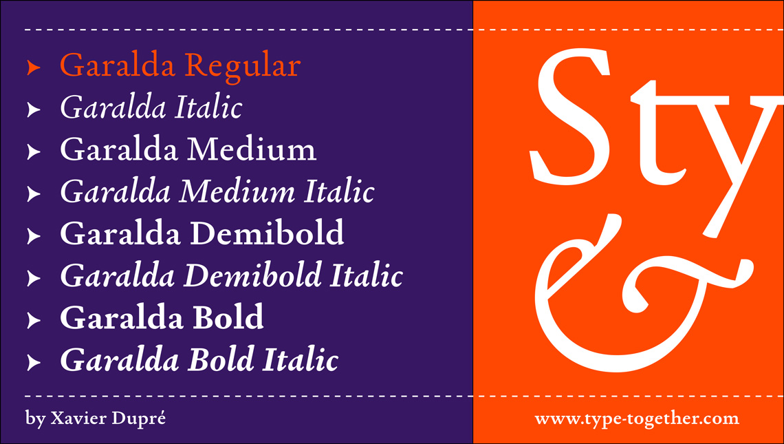
Type designer Xavier Dupré’s recent design, Garalda, is a charming 21st century family that renews a legacy of finesse. As paragraphs on a page, Garalda’s overall impression is of a workaday personality, committed to the main purpose of the job: easy long-form reading. But setting it in display sizes proves something different: this reinvented Garamond is anything but basic. We asked Xavier Dupré a few questions about the design of Garalda, the inspiration and the process. With this we start a series of short interviews with the type designers represented in our catalogue. Enjoy the read!

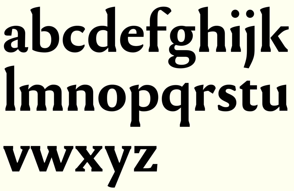
Garalda by Xavier Dupré

Garalda

Where does the inspiration for Garalda come from?
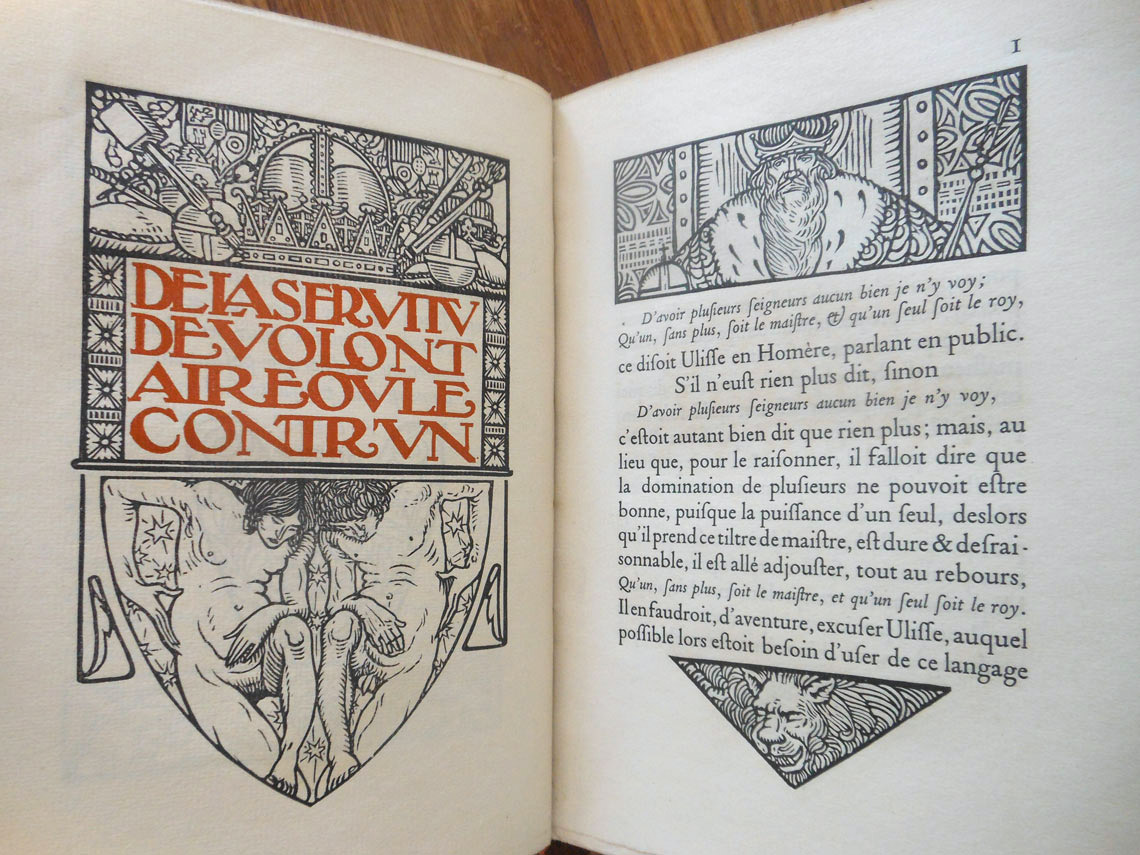
The story of this family started a few years ago, when I was at the Fondation Louis Jou in Provence, southern France. It’s a wonderful XVI century building in a village where it is possible to see gorgeous books that were set, illustrated and printed by this artist, Louis Jou, between the 1910s and the 1960s.

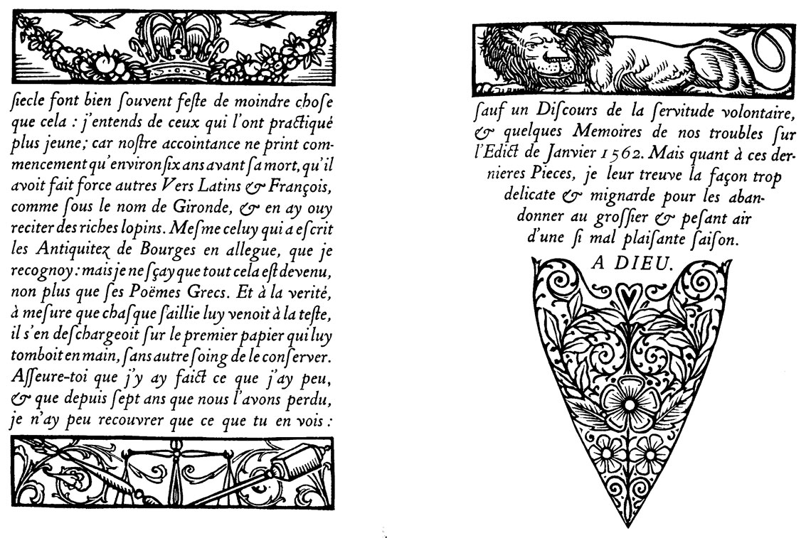
The curator of the foundation showed me the book Discours sur la servitude volontaire printed in 1922. It was set in a garalde I didn’t know called Tory-Garamond (I didn’t find any information with this name) and I really fell in love with this typeface, especially the italic cut, absolutely charming. I asked him if I could scan a few pages and he told me he will send me later a few ones.
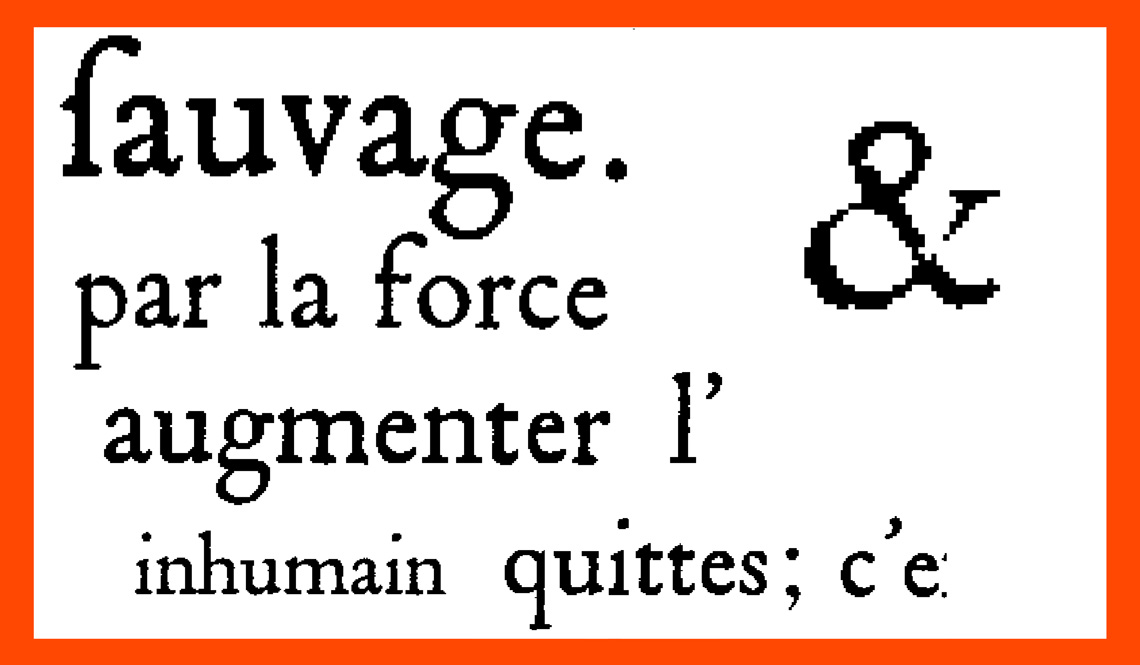
When I get the scans, the resolution was not really good but fair enough to start a new design without copying all shapes, keeping a part of freedom in the design.


Images of the book Discours sur la servitude volontaire, by Étienne de La Boétie, first published in 1576. The version in the photographs was set and printed by Louis Jou in 1922, an artist, engraver, illustrator, typographer and edi­tor born in Spain and emigrated to France (Luis Felipe-Vicente Jou i Senabre, 1881–1968). Photo by Xavier Dupré.


Scans used by Xavier Dupré for the first sketches of Garalda, taken from Discours sur la servitude volontaire, by Étienne de La Boétie.


Enlarged scans that were Xavier Dupré’s starting point for Garalda,  from Discours sur la servitude volontaire.


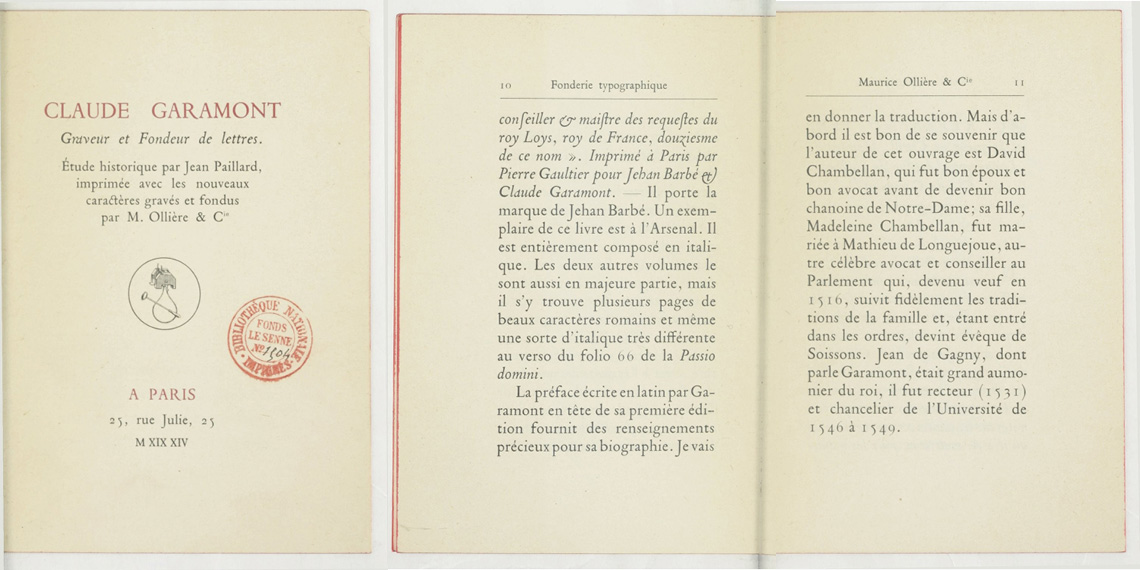
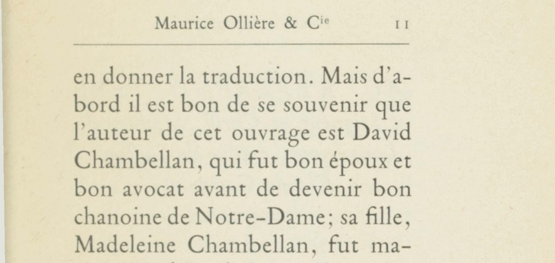
After I finished this family, Julien Gineste — co-author of the book Excoffon et la fonderie Olive — told me this Tory-Garamond was probably the mythical Garamond Ollière cut in 1914. This Garamond was used in bibliophile books in the 1910–1920 but after that, we don’t see it anymore.


Claude Garamond, graveur et fondeur de lettres. Étude historique par Jean Paillard, printed and typeset by the Parisian typefounder Maurice Ollière in 1914. According to James Mosley the type had been ‘made in 1913 from photographs taken under Paillard’s direction from 16th-century works at the Bibliothèque nationale and the punches were cut by Plumet, Vuarant and Malin’. Images courtesy of Bibliothèque Nationale de France, Département Philosophie, Histoire, Sciences de l’Homme, 8-Z LE SENNE-4392.


Detail of Claude Garamond, graveur et fondeur de lettres. Étude historique par Jean Paillard,  1914. Courtesy of Bibliothèque Nationale de France, Département Philosophie, Histoire, Sciences de l’Homme, 8-Z LE SENNE-4392.


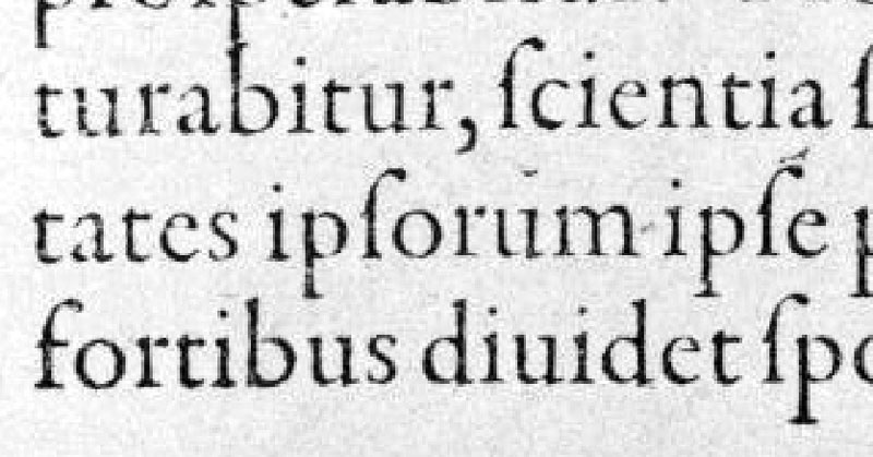
I also observed old specimens like Egenolff-Berner (1592) without copying directly the shapes. I wanted to draw a Garamond for a long time but I was afraid to not be thorough enough to do it. I started it in 2011 and took my time to propose a typeface different than the existing ones.


Low-res detail of Egenolff-Berner type specimen, Francfurt 1592.


the process

Can you describe how was the process of designing Garalda?
With Garalda, I struggled to keep initial proportions and shapes of Tory-Garamond but I designed it with a mix of angles and curves which give a fresh feeling to the classic shapes. In body text, the shapes look smooth but in bigger size, these quirks and unorthodox details are really visible. Like my previous typefaces, FF Yoga or Mislab, I chose squared serifs in roman cut, so we can say this garalde is a bit mecanised.


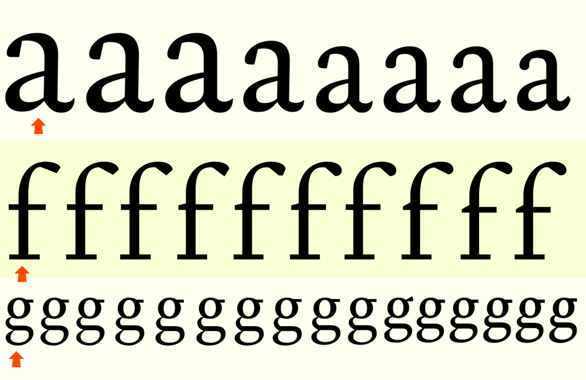
Evolution of the lowercase ‘a’ ‘f’ and ‘g’ in Garalda, by Xavier Dupré, 2011–2016.


Early sketches of Garalda Bold with shorter serifs. The idea of having a Bold weight displaying different serifs than the regular was dismissed later in the process


What are the notable features, different from the rest? What are Garalda’s peculiarities?
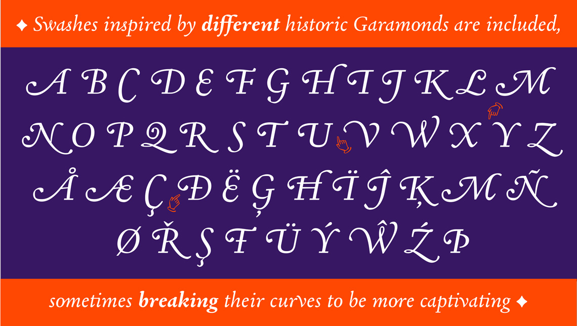
The Garalda font family is a professional family with a complete character set — about 1000 glyphs per font and even more for the italics — including five kinds of figures, even for small caps. There is an interesting set of ligatures in romans and italics to be unique in display use, to create lovely logotypes. In the italics, I included some swashes inspired by different historic Garamonds, their curves are sometimes broken to be more tasty.

Garalda is more crude, less refined that most of Garamond because my first interest is the proportion and the weight of letters and also to offer an effect in display use (like square notches). In small size, these quirks are invisible and don’t disturb the reader. I finally added arrows and ornaments some of which are directly those of Louis Jou we can see in his books.


Some of the scans of swashes from different Garamonds and used by Xavier Dupré as inspiration in the process of designing the italics on his typeface Garalda.


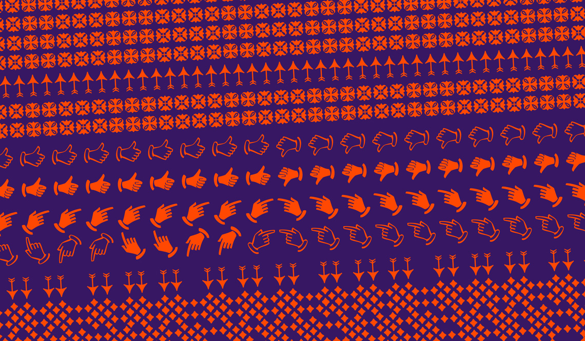
Arrows, manicules, and other ornaments in Xavier Dupré’s Garalda.


Garalda featured in Xavier Dupré, typographical itinerary, published by Zeug, 2016.


the garamond theme

Why tackle the Garamond theme now?
The French-Italian Renaissance has been very inspiring for me since my first released typeface FF Parango and then FF Absara or Malaga. Besides, after five centuries, Garamond’s shapes are still widely used in the book. Even though there are numerous of Garamond available on the market, we can still explore this classic of the french typography to propose a variant.
Garamond in France or Aldus in Italy struggled to publish books with a fine typography, different shapes for each size and subtle proportions. They are very important for our European culture and they have inspired all type designers since then.


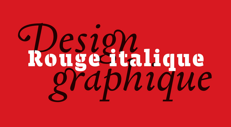
An early use of Garalda, by François Moissette – Rouge Italique, a friend of Xavier used to test his designs.


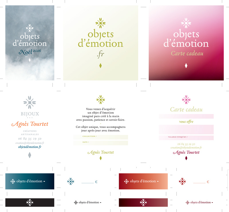
Another early use of Garalda, by French designer François Moissette – Rouge Italique, for the atelier Objets d’émotion.


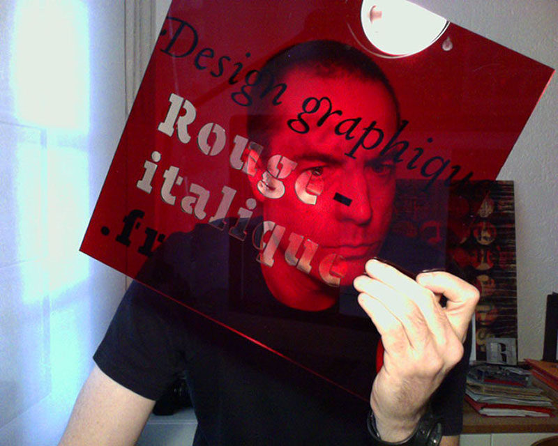
Early use of Garalda, by François Moissette / Rouge Italique – webcam photo during a webconference.


The Garalda family comes in eight styles, includes some of the original arrows and ornaments, and speaks multiple languages for all typesetting needs, from pamphlets to fine book printing. The complete Garalda family, along with our entire catalogue, has been optimised for today’s varied screen uses.


Order Garalda or download the online specimen.


About Us

TypeTogether is an indie type foundry committed to excellence in type design with a focus on editorial use. Additionally, TypeTogether creates custom type design for corporate use. We invite you to browse our library of retail fonts or contact us to discuss custom type design projects.