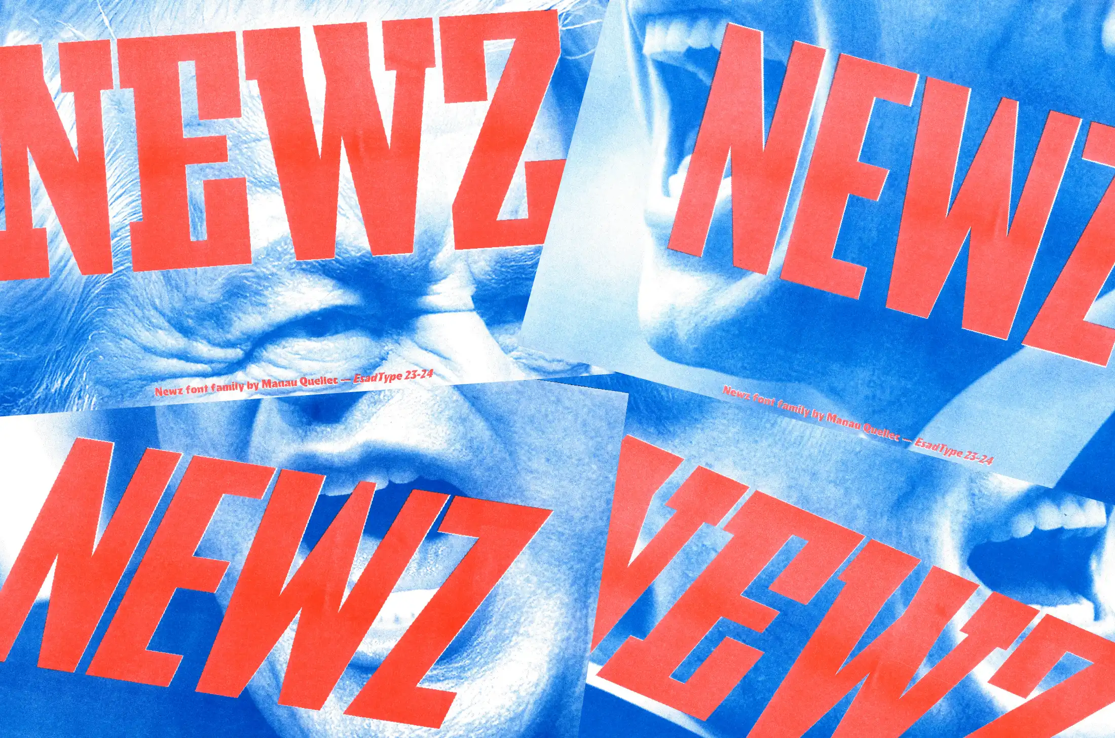
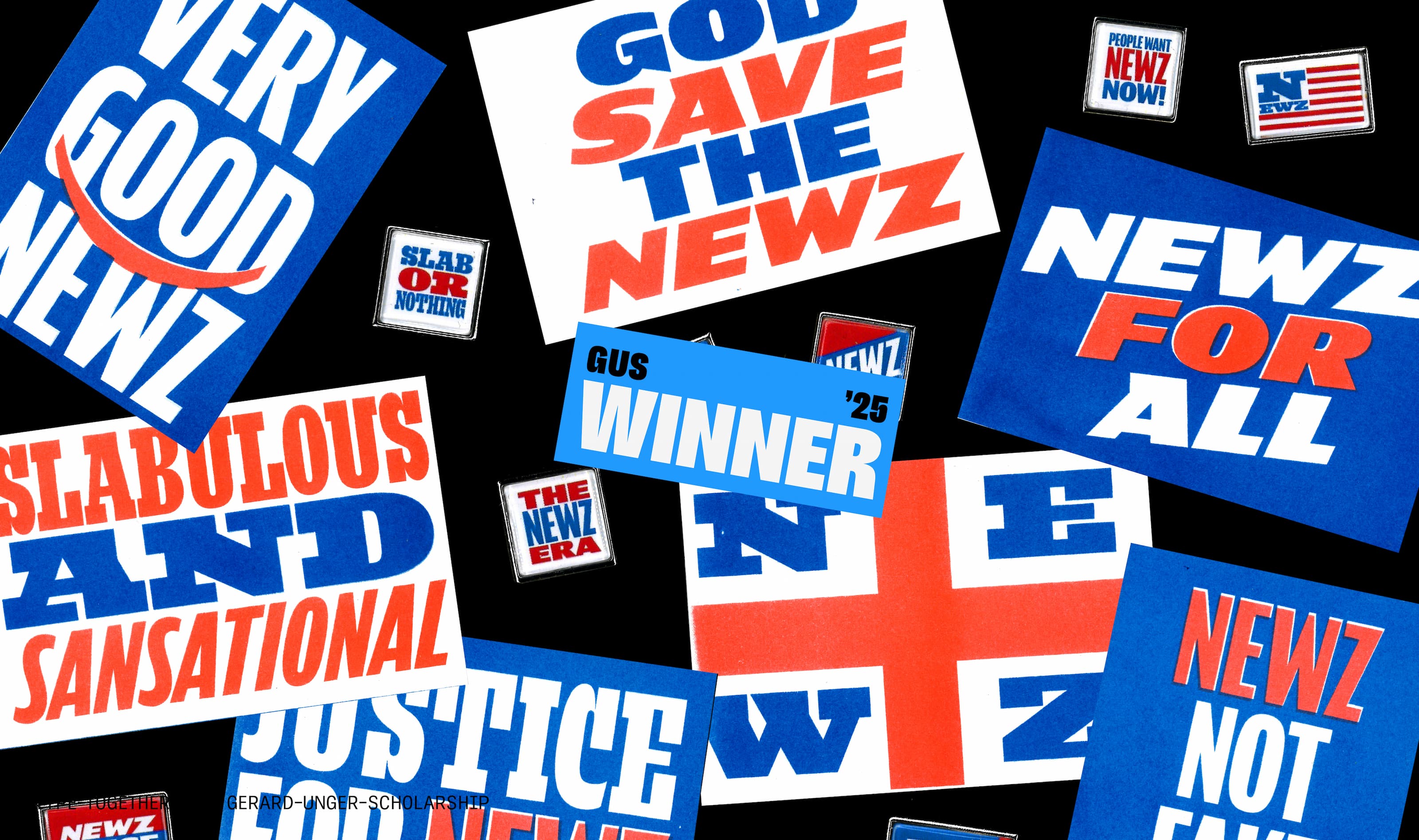
Inspired by popular culture, ideal for bold statements, intense, impactful, and loud. Meet NEWZ, a fresh typeface by the French graphic and type designer Manau Quellec, founder of the Art and Design Schools Football League (READ), and the 11th recipient of the Gerard Unger Scholarship.
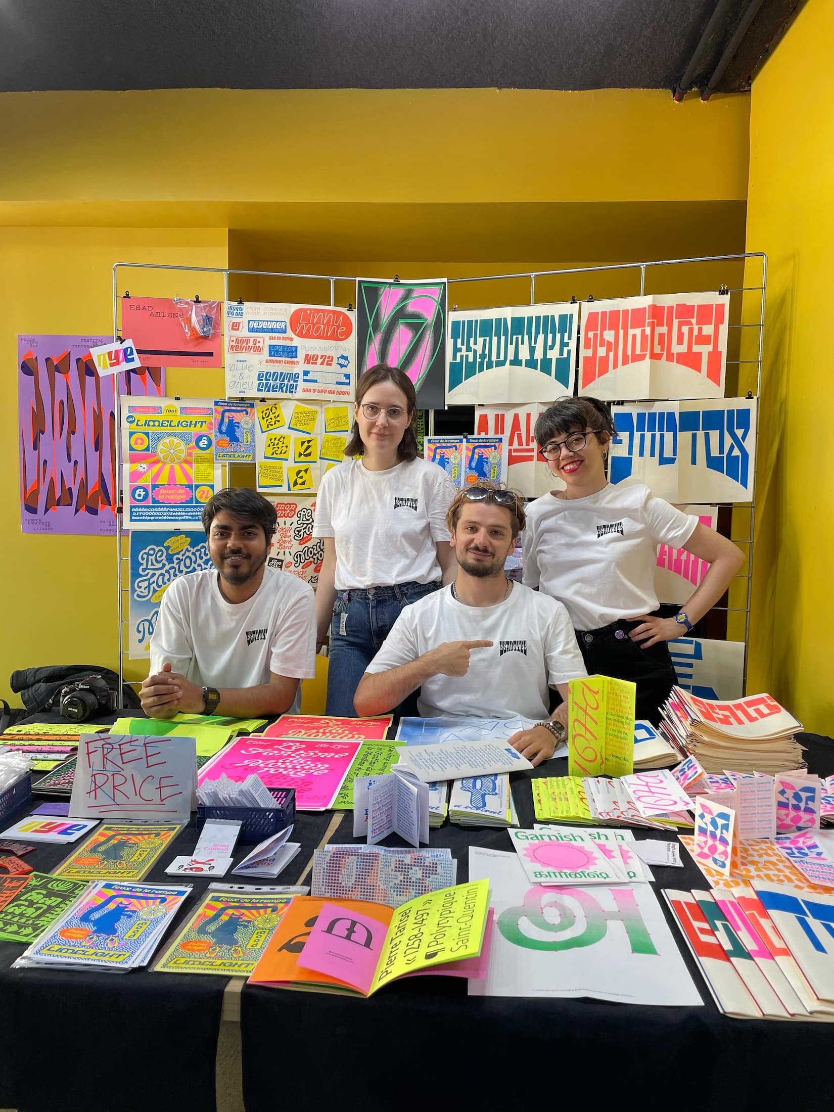
Esadtype class 23–25, at Pucestypo 2024.
What was your first thought when you realised you had received the Gerard Unger Scholarship?
I was really happy and relieved, but above all super excited to keep working on this project, and to be surrounded by an experienced team of designers!
What did your personal journey to type look like? My design studies really confirmed something that was already there, a kind of intuition, sensitivity, and curiosity for letters, signs, logotypes… Once I was sure I wanted to dedicate all my energy to drawing letters, I was lucky enough to study at a school that also happened to host one of the best type design programs, the Type postgraduate course in Amiens. That really gave me the best possible foundation for learning the craft. It was definitely my most in-depth experience with type design.
My time at EsadType was also a huge privilege to meet incredibly talented classmates like Arnab Chakraborty, Yaprak Buse Çağlar, Oksana Sheinman, and so many others from the previous batches. Together, we’ve built a real community, the future of type design, made in Amiens.
But if I had to tell you my “type origin story” I’d say it started really early: I was obsessed with football logos. I used to redraw them as precisely as I could, using rulers, compasses, and markers. I was super proud of them. I even showed them off in the schoolyard.
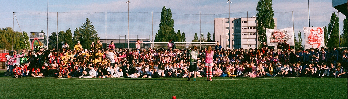
Your passion did not end with drawing football logos, though. During your studies, you founded ÉSAD Amiens’ football club, and not only that…
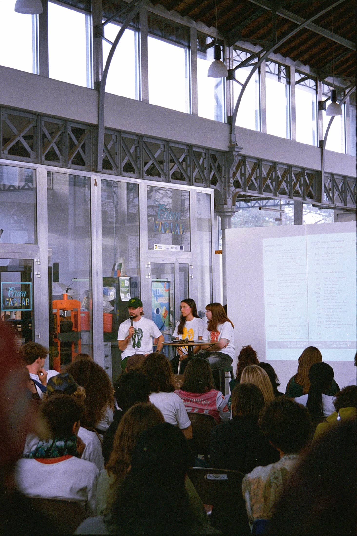
We work in a very solitary field. Most of the time it’s just us and our screens. I’ve always been drawn to collective dynamics and the spirit of community, something that surely comes from my passion for football, which was everywhere in the Paris suburbs where I grew up. So when I brought team sports into art and design schools, it immediately sparked a new kind of energy. It first began at my school in Amiens with my closest schoolmates (@clubfootesad), and soon, by reaching out to other schools and sharing online, students started forming their own teams and wanting to connect. That’s how the Rencontre Étudiante d’Art et de Design — READ (@read.festival) was born.
It began as a simple football tournament, but after three editions it evolved into a full student symposium. It has now become an annual gathering for art and design students: a festival with talks, exhibitions, conferences, tournament, and concerts, a true space of collective creation, solidarity, and engagement. In a context marked by uncertainty and the economic difficulties of art education in France, READ offers a breath of fresh air for our generation, a shared space for connection, activism, and cooperation that celebrates diversity in practice and the power of togetherness.
You are the fifth EsadType graduate to receive the Gerard Unger Scholarship. At TypeTogether, we sometimes wonder what makes this course so special that we like their graduates’ fonts so much…
I am indeed the fifth student from EsadType to receive the Gerard Unger Scholarship, but I’m the first to have gone through the entire ÉSAD Amiens program, from the first year all the way to the postdiploma, before receiving the GUS! I arrived in Amiens at 19 and left at 26, which is quite rare, as most of my EsadType classmates only join for the postgraduate program.
I couldn’t tell you exactly what makes this school so “special,” but I can say that at EsadType, we are given time (three full semesters). And time is a rare thing in our profession. It allows ideas to mature, to develop into sensitive projects, but above all, to reach a high level of execution. Of course, we are encouraged by our mentors to push our projects further, and in that sense, applying for the GUS scholarship felt like a natural continuation of that process.
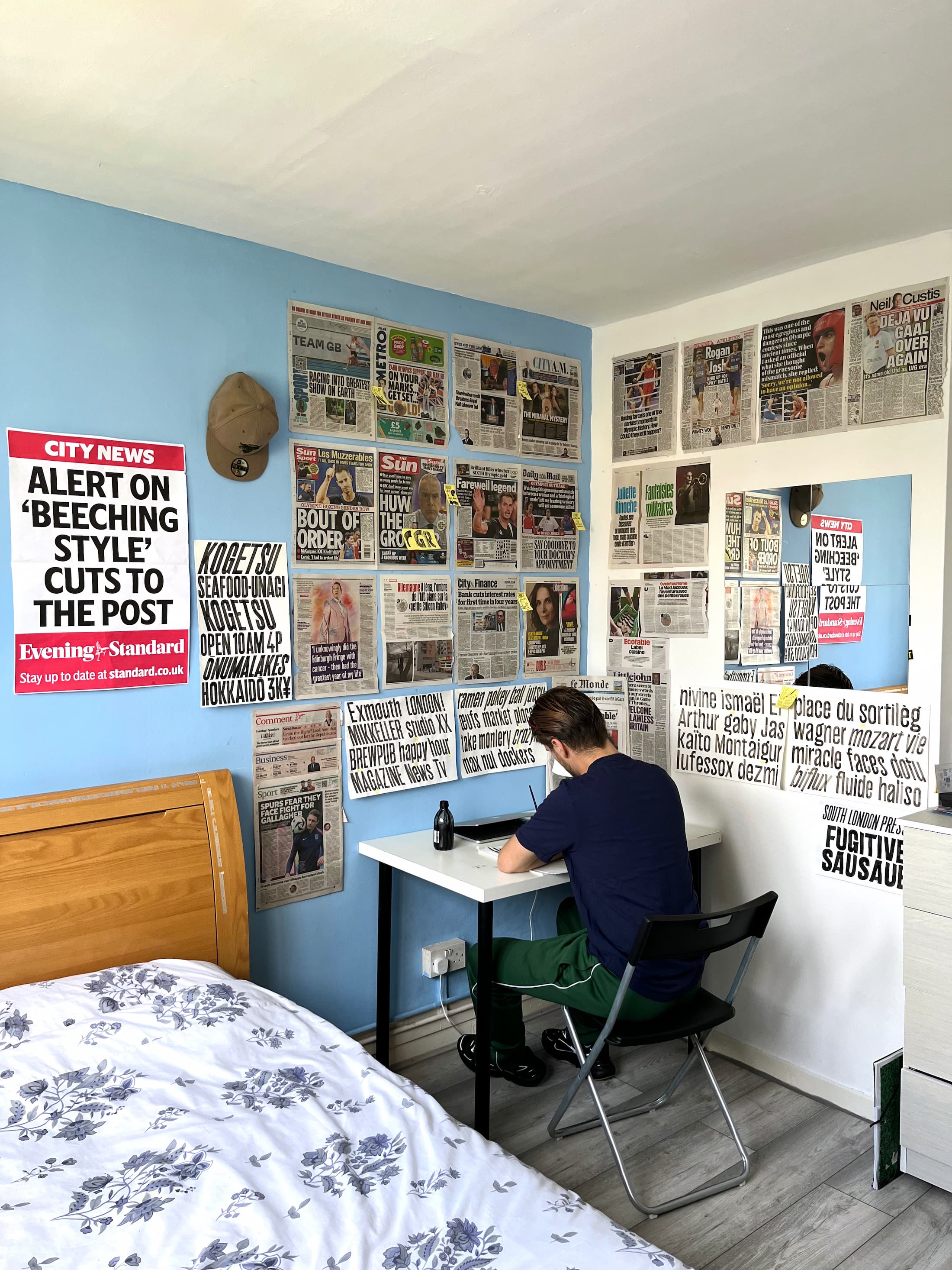
Workspace and room in London during the summer 2024.
You have experience working as an intern in a type foundry. What is the main difference between academic projects and "real-life" type design assignments?
EsadType first gave me a chance to level up my skills and explore. It was a space where I could really develop my sensitivity to projects, not just in terms of drawing letters, but in thinking about art direction, concept, and creative approach. I genuinely believe that creative qualities are very precious and best developed at school, while technical skills come with professional experience and real-world encounters. Now I know I still need to progress on a technical level, and only real work can give a concrete and accurate vision of what the profession truly demands in terms of technical know-how.
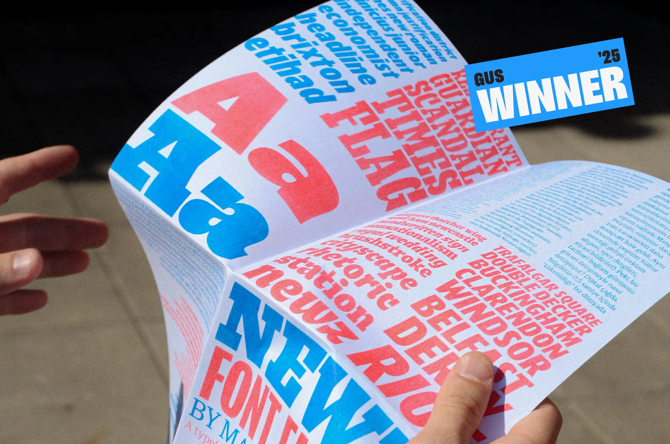
What kind of typeface is NEWZ, your winning typeface?
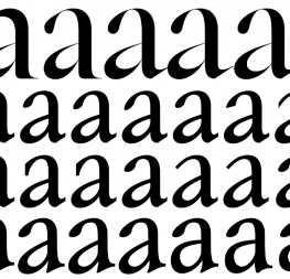
NEWZ isn’t just a name, it’s a statement. It’s loud, rough, dynamic. It’s a typeface born from a time of fake news, deepfakes, and nonstop scandals that blur into entertainment. A time where outrage is manufactured and news is commodified. NEWZ positions itself as an ongoing reflection on how typography mediates the language of urgency, adapting to both historical and contemporary rhythms of mass communication. It’s made to carry tension, between truth and fiction, between speed and impact.
Newz, Gerard Unger Scholarship winner 2025 by Manau Quellec.
What sources does NEWZ come from?
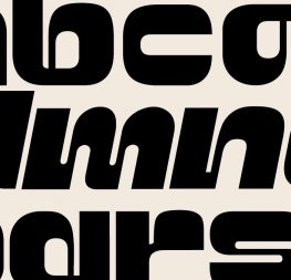
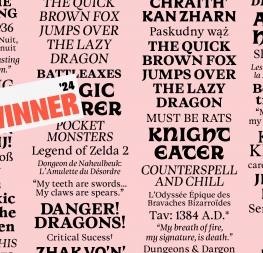
NEWZ is a typeface forged at the crossroads of historical print traditions and today’s visual culture. On one side it draws directly from the typographic heritage of the 18th-century English press, whose bold, solid letterforms came out of the rise of industrial printing. On the other, it taps into the visual language of late 20th and early 21st century mass media, things like sports magazines, ’90s and 2000s action movie posters, or video game covers, where aggressive slants and tight spacing push energy and urgency. It’s somewhere between The Fast & The Furious and British billboards. For me, it’s really a study of impact, tension, and space, shaped by the way headlines have tried to grab attention across different eras. The two styles, SLAB and SANS, respond to each other in a stylistic dialogue that feels coherent and rooted in trans-generational typography.
What sort of projects is NEWZ meant for?
For newspaper headlines, truck tarps, sport logotypes, concert posters... Anywhere it needs to be seen, anywhere you want to be louder than the noise.
How finished do you consider NEWZ to be at the moment? Is there even room for improvement?
There’s always room for improvement in type design. That’s actually one of the biggest challenges of being a type designer: that constant pursuit of precision. In the case of NEWZ, the structure is there. Now it’s about pushing all the technical sliders, making sure every detail, every curve, every accent can scream: I AM NEWZ.
What would be your dream use of NEWZ?
I’d love to see those four red letters on a big airplane flying across a blue sky.
Does anyone know someone with a plane?
Manau Quellec, originally from Créteil in the eastern suburbs of Paris, studied graphic design and editorial practices at ÉSAD Amiens, where he also gained a foundation in type design. His education allowed him to experience diverse contexts, including studying at Bauhaus University in Germany, working at Oaza Studio and Publishing House in Zagreb, and interning at London’s Contrast Foundry during his EsadType postgraduate programme. Passionate about newspaper typography, Anglo-Saxon tabloids and British billboards, his typeface NEWZ seeks a transgenerational design, drawing from 18th-century English press canons while embracing early 21st-century popular culture. Somewhere between The Fast & The Furious and Figgins.
TypeTogether is an indie type foundry committed to excellence in type design with a focus on editorial use. Additionally, TypeTogether creates custom type design for corporate use. We invite you to browse our library of retail fonts or contact us to discuss custom type design projects.