Photographs for Documents
December 2014
Berlin based book designer Tom Mrazauskas created this beautiful publication, crafted with special attention to detail. He chose Soleil, by Wolfgang Homola, as the main typeface.
Berlin based book designer Tom Mrazauskas created this beautiful publication, crafted with special attention to detail. He chose Soleil, by Wolfgang Homola, as the main typeface.
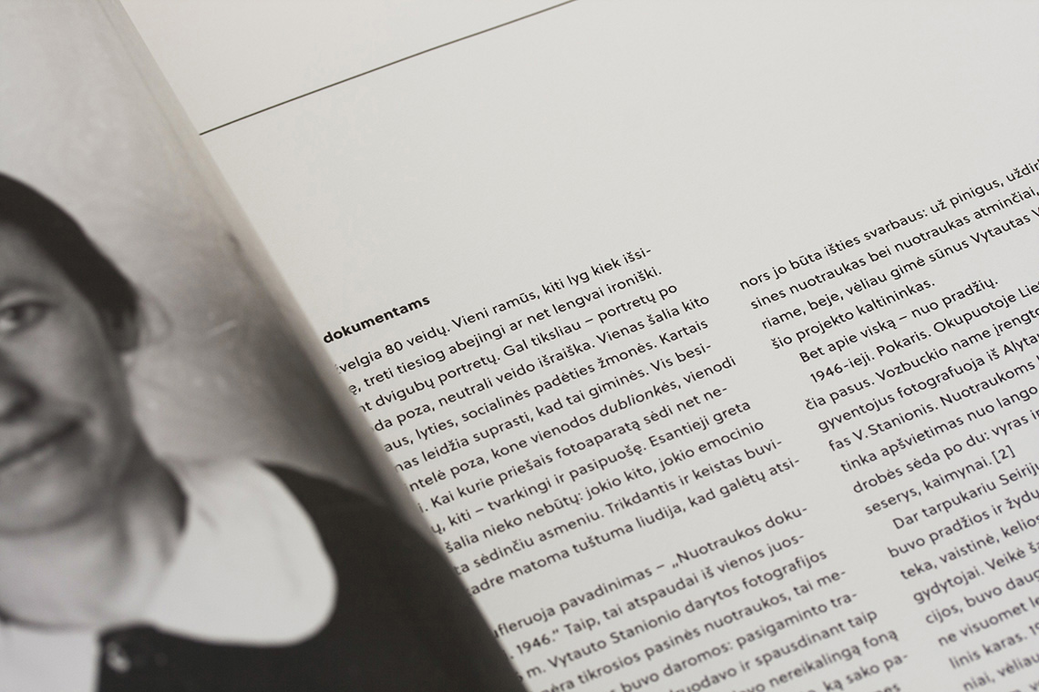
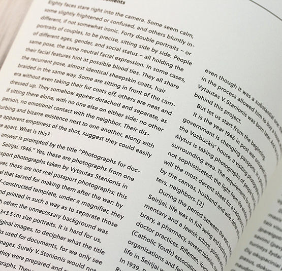
The book Nuotraukos dokumentams / Photographs for Documents contains 40 double-portraits taken by Vytautas V. Stanionis (1917–1966) in Seirijai, a small town in southern Lithuania and commissioned by the Soviet authorities in 1946. Usually two unrelated individuals were portrayed in each photograph due to shortage of materials in postwar Lithuania; portraits that were later separated. The images were found years later by Vytautas’s son, also called Vytautas, who was exploring his father’s archive.
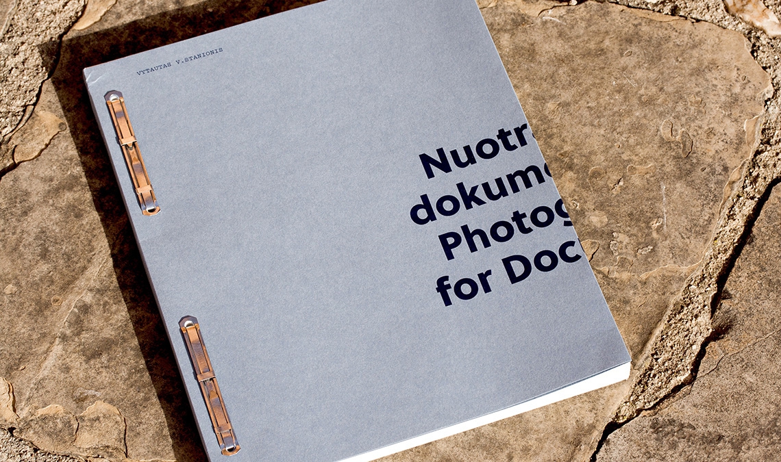
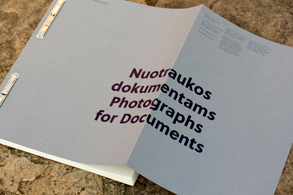
Berlin based book designer Tom Mrazauskas created this beautiful publication, crafted with special attention to detail. He chose Soleil, by Wolfgang Homola, as the main typeface. Every image was visually cut into half by folding the pages, avoiding repetition and creating a different rhythm. The duo-tone plates were printed on thin uncoated stock. Published by Kaunas Photography Gallery in 2013 the book has received several awards.
The designer Tom Mrazauskas told us how Soleil was the perfect fit for this book. His starting point was a ‘geometric typeface, used all over the Soviet Union, mostly for setting text in magazines, but he wanted to have a modern version’. Mrazauskas also pointed to the parallels between the cold approach of the passport photographs and the pure geometrical forms of the typeface; and how at the same time there is a personal character in the photographs and a humanistic touch in Soleil. ‘Everything worked together’.
TypeTogether is an indie type foundry committed to excellence in type design with a focus on editorial use. Additionally, TypeTogether creates custom type design for corporate use. We invite you to browse our library of retail fonts or contact us to discuss custom type design projects.