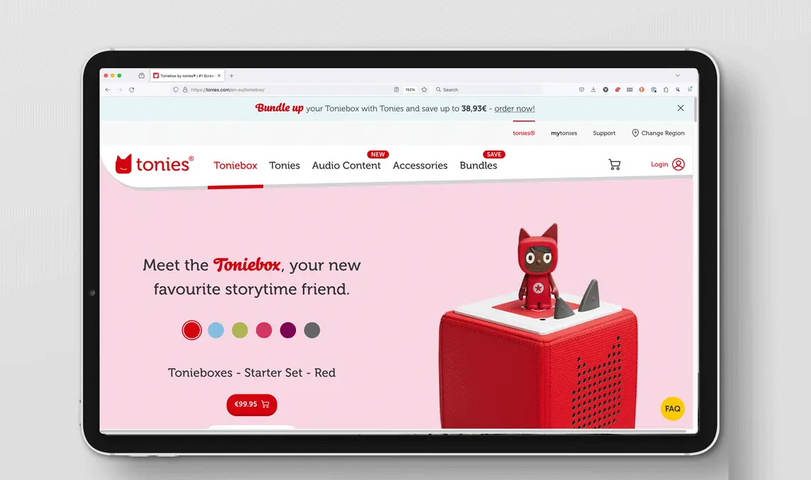
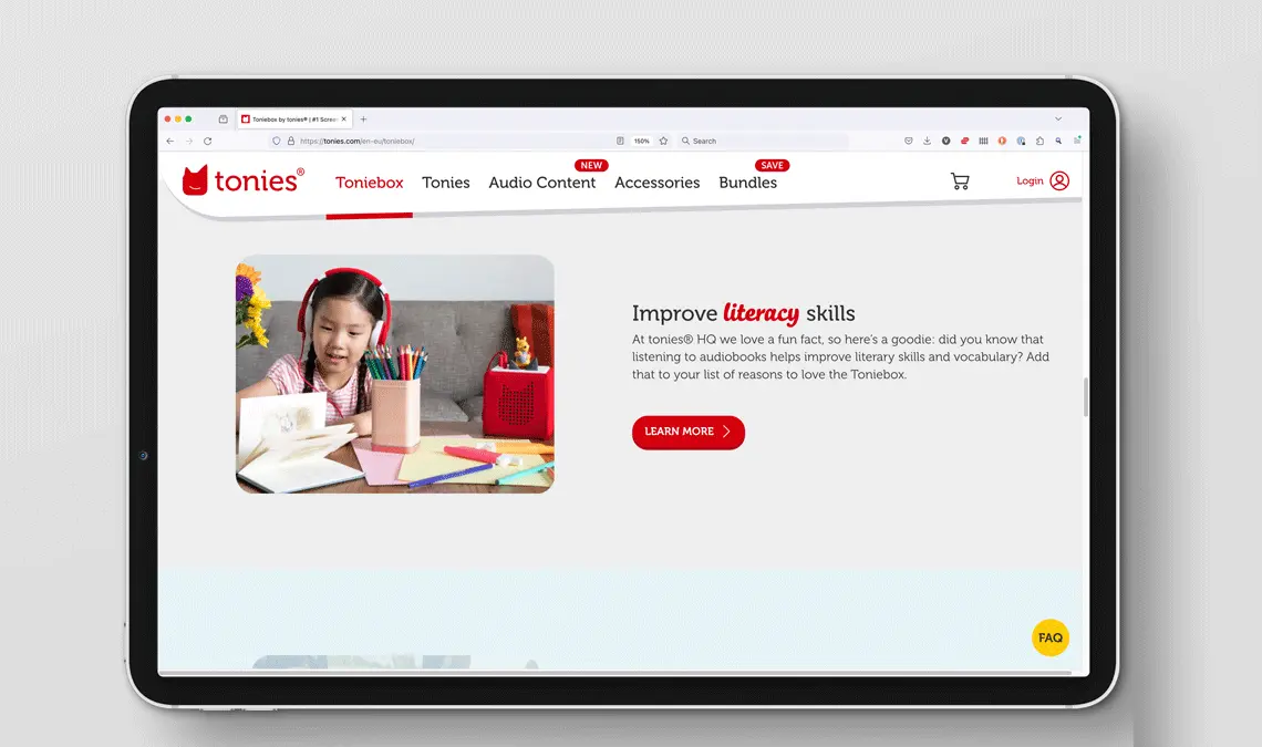
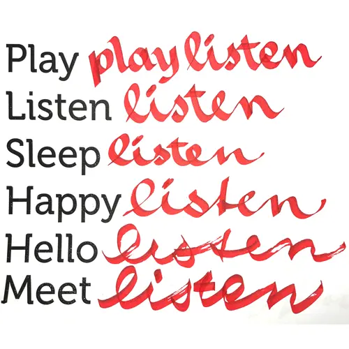
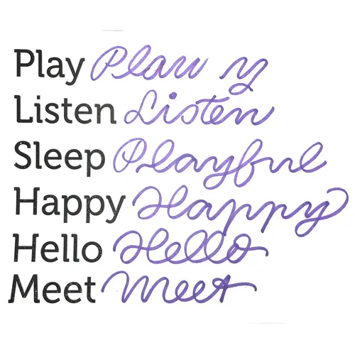
The previous design utilized an adapted version of Bello Script Pro, but it faced several challenges. Key issues included low legibility of certain glyphs and difficulty in recognizing some letter combinations, which impacts readability. Additionally, there were concerns regarding font licensing, and the font also struggled with scaling restrictions, limiting its adaptability for various design sizes and formats. These factors necessitated consideration of alternative solutions to address these limitations effectively and thus Tonies decided to commission a new ownable brand typeface.
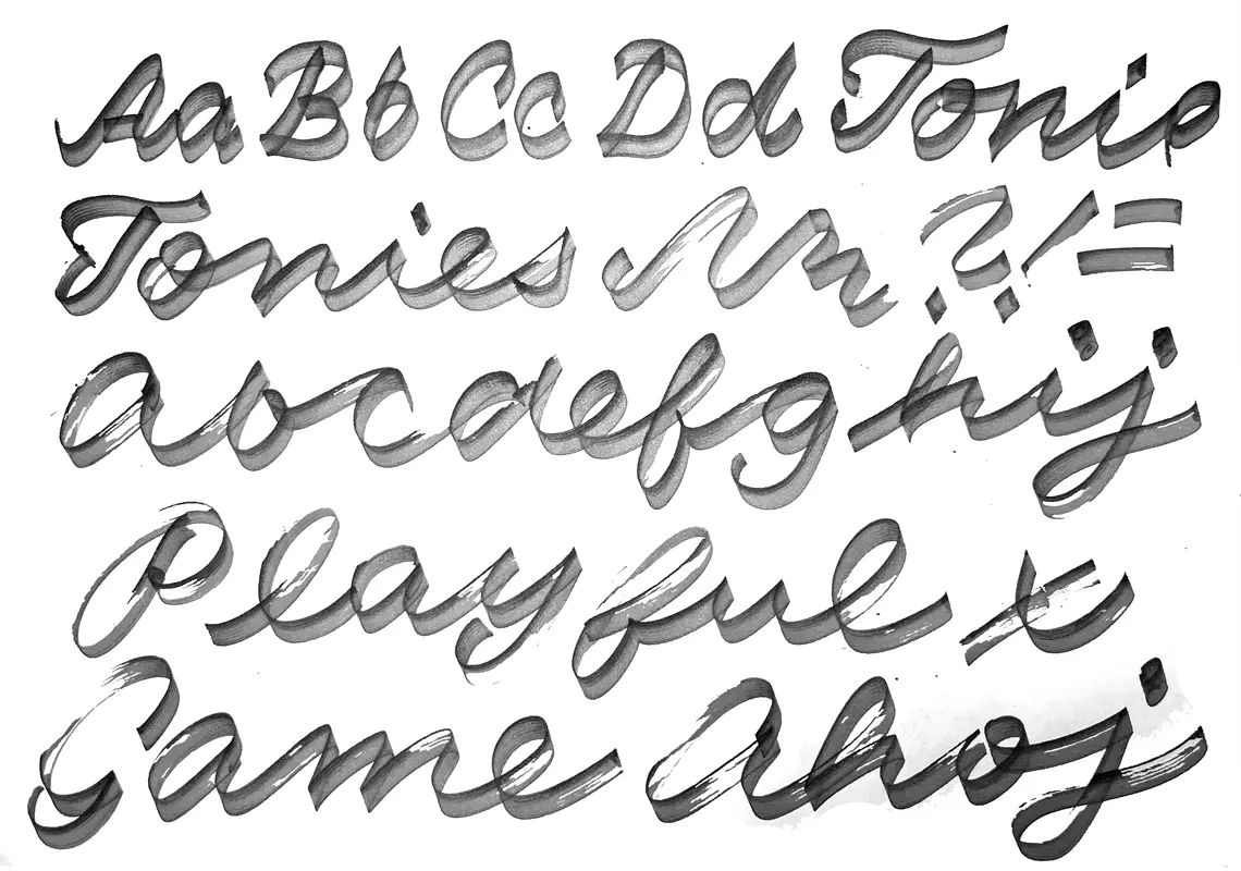
Ella Tonies Script is designed for versatile usage, spanning commercial printing, in-house low-cost POS, in-store displays, LCD screens, online platforms, motion graphics, and newspaper printing. It offers excellent legibility across a full range of sizes, ensuring clarity on both digital devices and print media, including newspapers. The font’s recognizability and distinctiveness of glyphs are particularly effective in medium display sizes, making it ideal for brand differentiation.
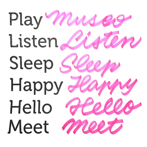
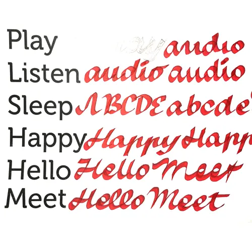
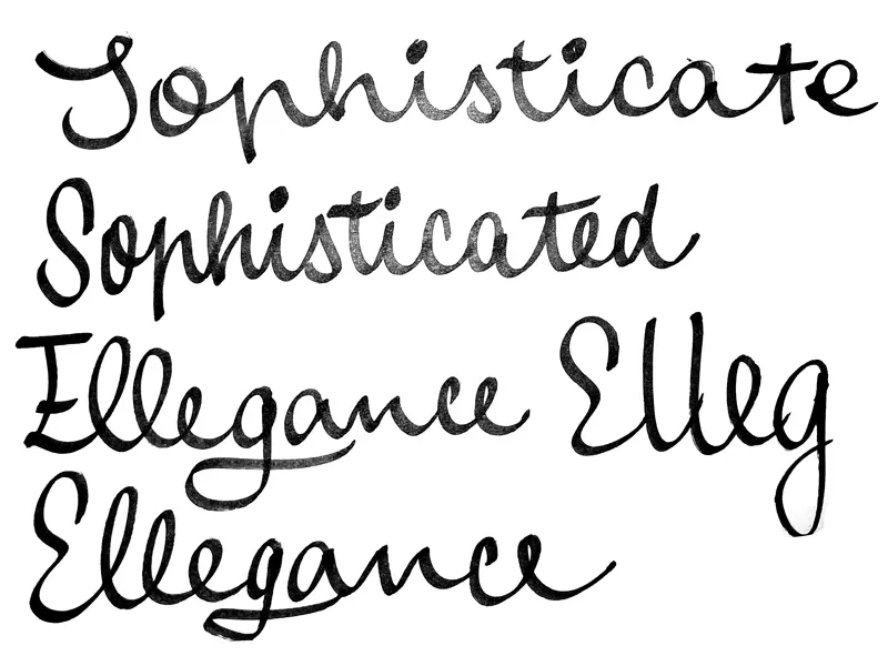
Particular attention needed to be paid to enhance the clarity of certain glyphs, such as t, h, d, and r. We have worked intensivly with Collaborate and the internal design team at Tonies to find the best and convincing solutions for the various problems faced. Over the course of several months and with great help by super talented designer and letterer Petra Dočekalová we have explored different directions and expression for Ella Script.

