TT & Brazilian wood type

November 2022

Although commercially obsolete, printing with wood type has been rescued in contemporary times in the context of graphic design and graphic arts by professionals who use it as a differential in their projects, as Rafael Neder, a Brazilian designer and design educator, observed in his MA dissertation (2014). This revival is partly due to the fascination with the materiality of letterpress printing, its ancestral history, and the possibility of combining contemporary technologies with the traditional workflow.

by Rafael Dietzsch


Since the Middle Ages, wood has been used in the graphic arts for the making of printing matrices, not only for woodcuts but also for manufacturing wood types. Because of their physical and mechanical properties, wood types were commonly used for large type bodies (usually larger than 48pt). In the 19th century, the use of wood type had its heyday, notably in posters and other printed matter that used large letters. Many of the existing types in collections around the world were produced during that period.


The letterpress revival

With the availability of today’s digital fabrication techniques such as CNC milling and laser cutting or engraving, it is possible to produce new wood types with repeatable precision. It is also possible to create type with other synthetic materials of better or similar quality, giving new meaning to their manufacture and taking advantage of contemporary industrial processes.


The Brazilian Wood Type project

This idea formed the basis idea for a 2017 research group on wood type initially formed by Rafael Neder, Rafael Dietzsch, and Leonardo Buggy. The first efforts of this group resulted in a study on the characterisation of wood type by a network of three Brazilian universities and the Brazilian Forestry Service. The group started with the intention to produce new wood typefaces for use in contemporary letterpress practice. However, species such as maple, oak, and pine are exotic to South America, leading to the hypothesis that local species were used for Brazilian wood type throughout the 20th century. Since no wood type factories survived and little has been written about the topic, we turned our attention to primary sources.

With the help of enthusiasts around the country, examples of Brazilian wood types were collected and examined by researchers at Forest Products Laboratory: Alexandre Gontijo, Thiago Oliveira Rodrigues, and Maria Luiza Costa Silva. Tests included microscopic images, prototyping and printing tests, and testing for resistance, torsion, and flexibility.

The laboratory analysis confirmed the hypothesis: microscopic images and anatomic comparison of eight native and a couple of exotic species were used to make type in the region. This analysis allowed the identification of alternative native species with similar properties for the making of our prototypes, and obtaining printed tests from these materials. Furthermore, this initial study also evaluated the first wood types produced with the suggested Brazilian native woods, as well as some results obtained from these printed tests, as shown in the presentation at the ATypI conference in Antwerp, 2018.


Back to the woods: Catalpa Extrabold

After this presentation, Veronika Burian of TypeTogether type foundry showed interest in the project. She mentioned that she was working on a project that had a lot to do with wood type and about her wish to see that project cut in wood. Time passed and in 2020 José Scaglione got in touch with us inquiring about the possibility of cutting a version of TypeTogether’s Catalpa typeface in wood.

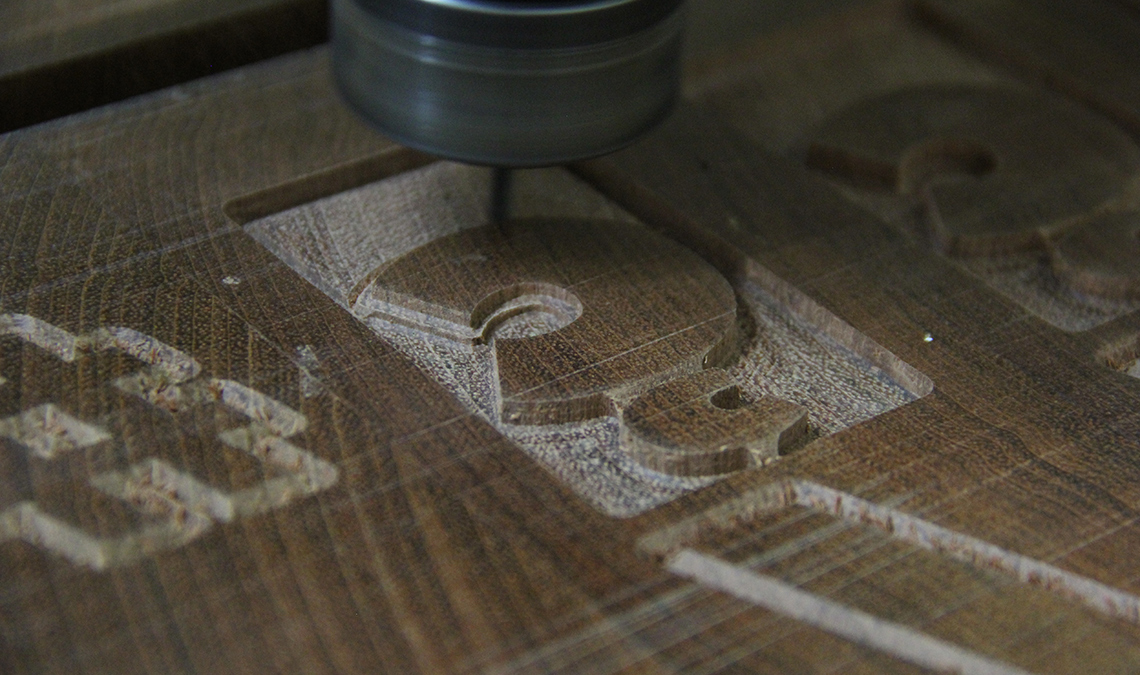
This is when Nícolas Loiola Camargo, a brilliant designer and skilled carpenter, joined the project. For his postgrad degree project at SENAC, São Paulo, he developed the Ibirapitanga type family, from its inception as a digital font to its materialisation as wood type. With Nícolas aboard, the group joined forces to produce the third generation of wood types.
 
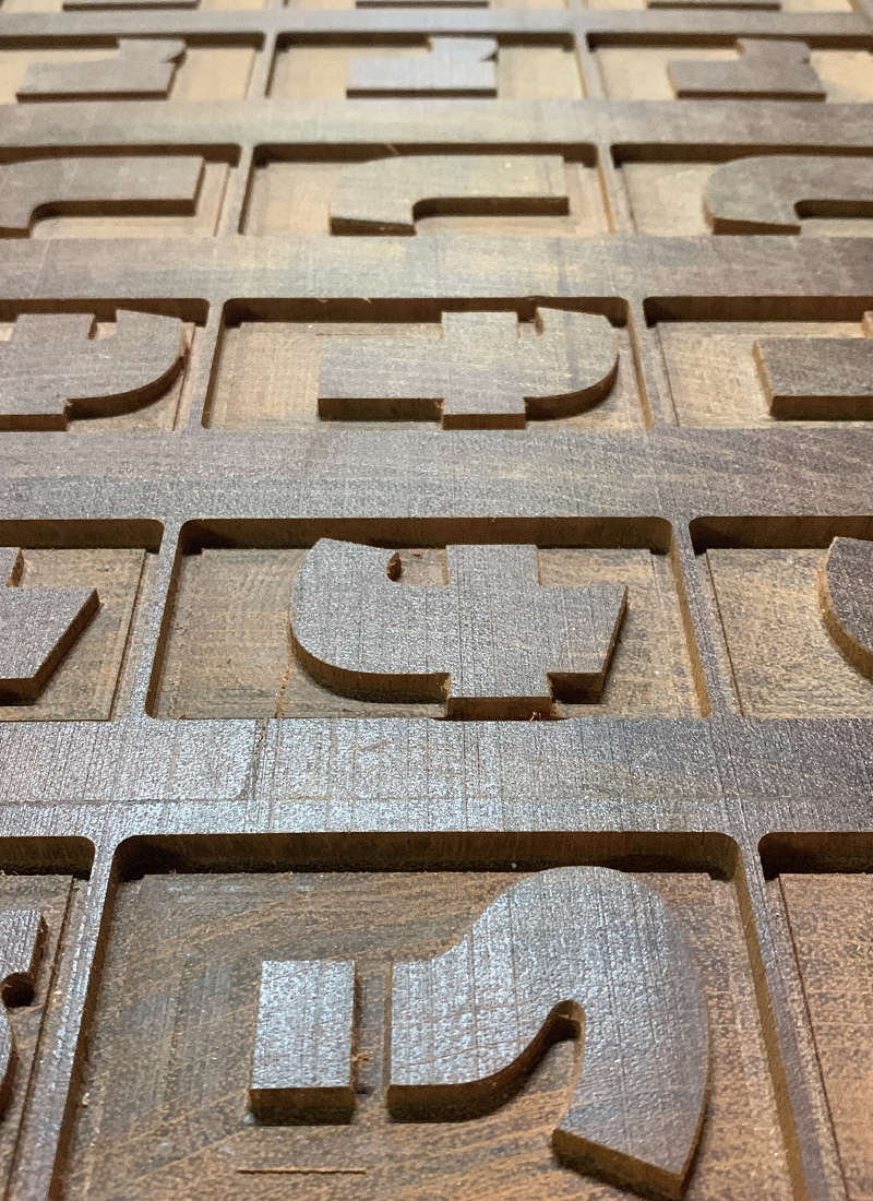
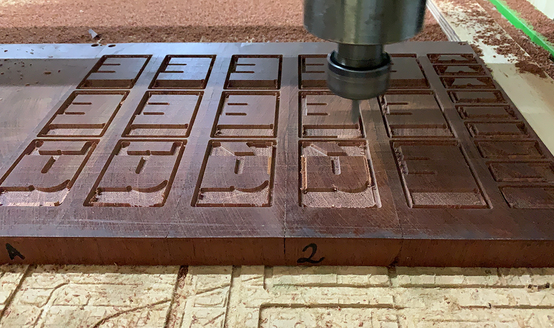
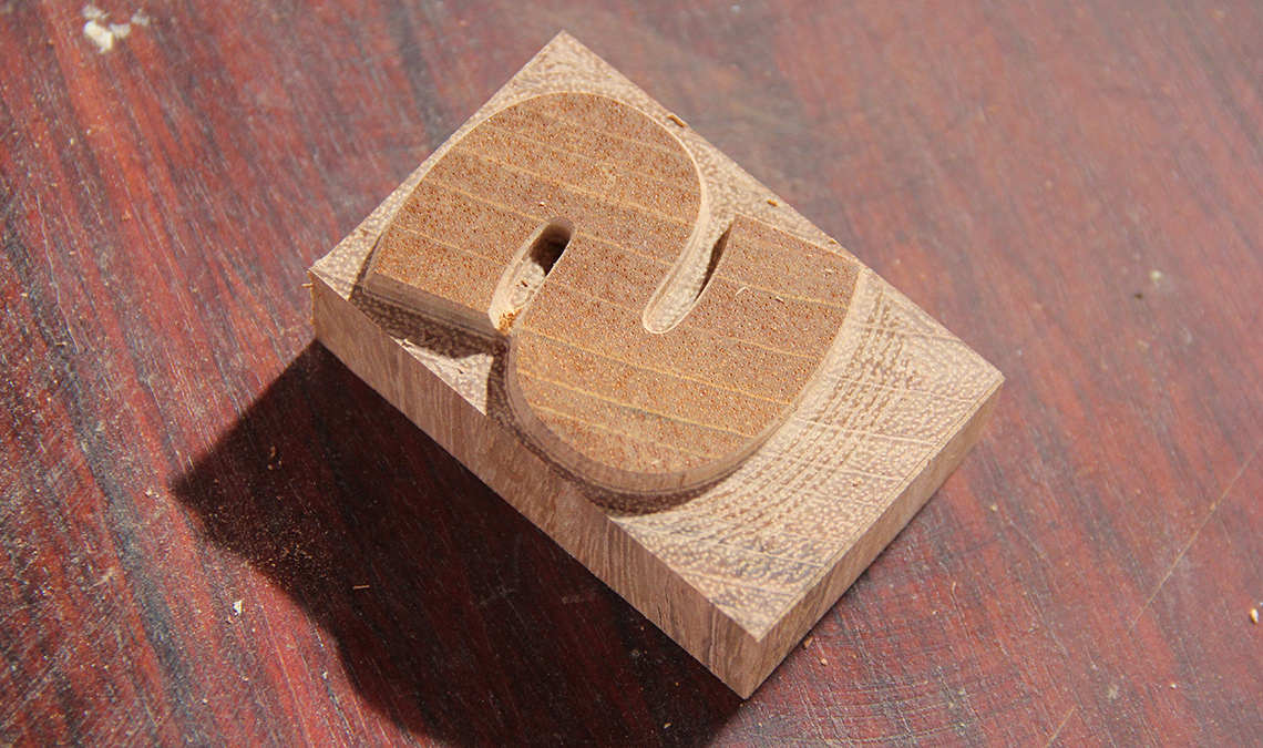
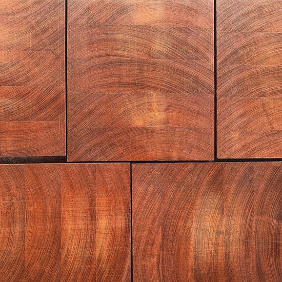
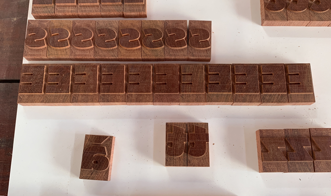
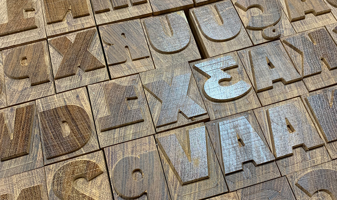
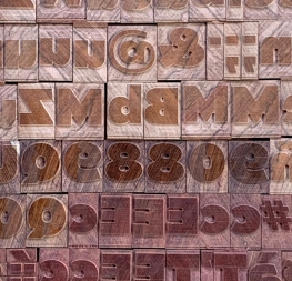
The final result is a wood type version of Catalpa Extrabold. The font contains more than 400 characters: uppercase and lowercase letters, numerals, a basic set of symbols and punctuation marks, and some accented characters. With this character set it is possible to compose texts in Portuguese, Spanish, or English.

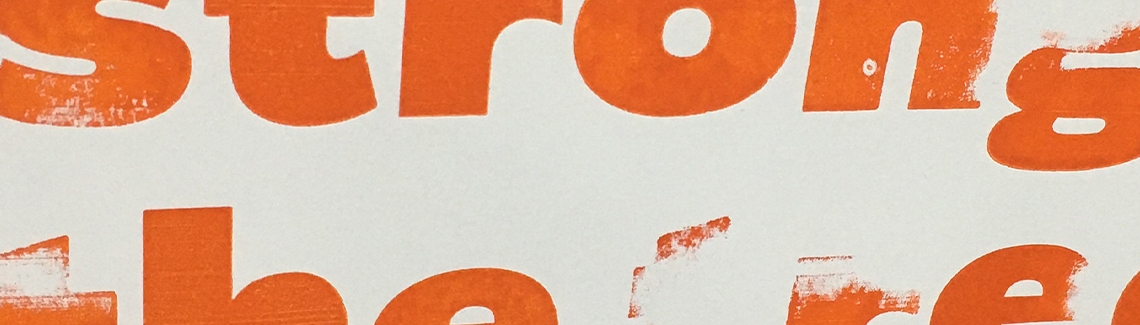
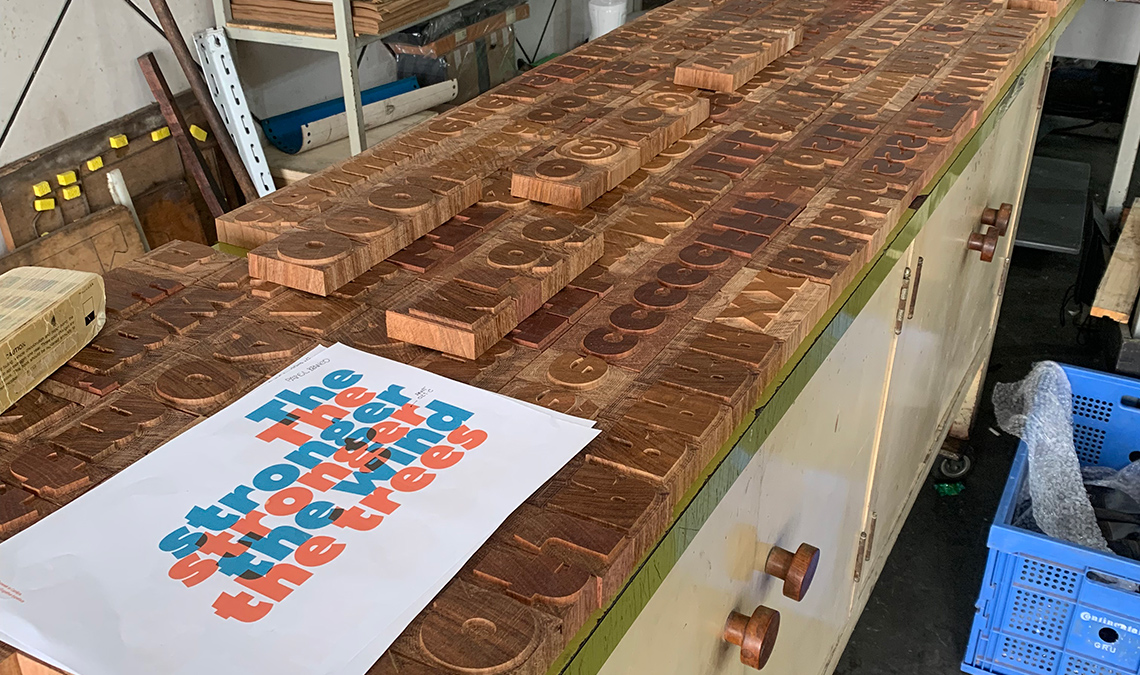
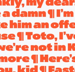
The project would not be complete without the development of a printed specimen — a poster (colourway one and colourway two). The idea for the poster was to work with something related to wood, trees, and forests. After all, Catalpa is also the name of a tree. The fragment of the text used on the poster, The stronger the wind, the stronger the trees, comes from the poem “Good timber” by American poet Douglas Malloch.

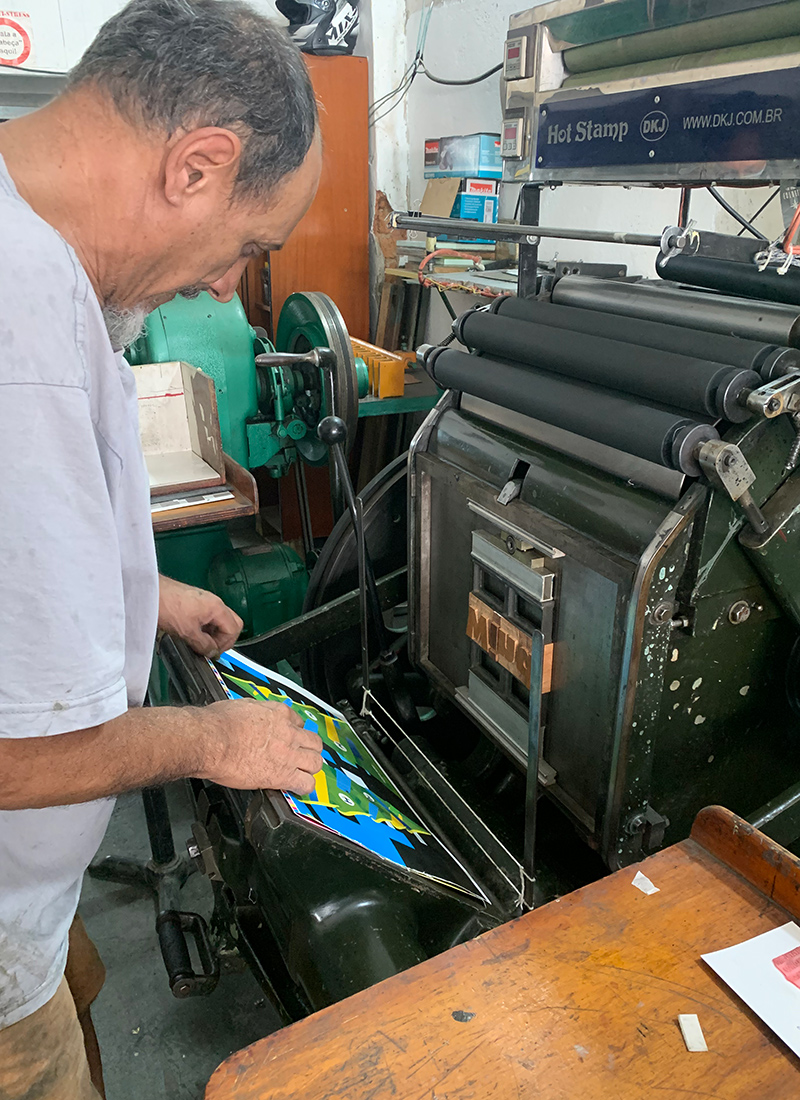
After some digital layout tests, the famous type designer Cláudio Rocha made some prints with the actual types. We unfortunately realised many of the characters needed to be replaced due to a host of reasons: milling and finishing problems, baseline alignment, damaged sorts, and other issues. Once we corrected the hands-on difficulties of dealing with wood type and were more careful in the production process, Rafael Neder printed the final version of the poster at Tipografia Matias print shop in Belo Horizonte, Brazil with the help of the master printer himself, Ademir Matias.


About Us

TypeTogether is an indie type foundry committed to excellence in type design with a focus on editorial use. Additionally, TypeTogether creates custom type design for corporate use. We invite you to browse our library of retail fonts or contact us to discuss custom type design projects.