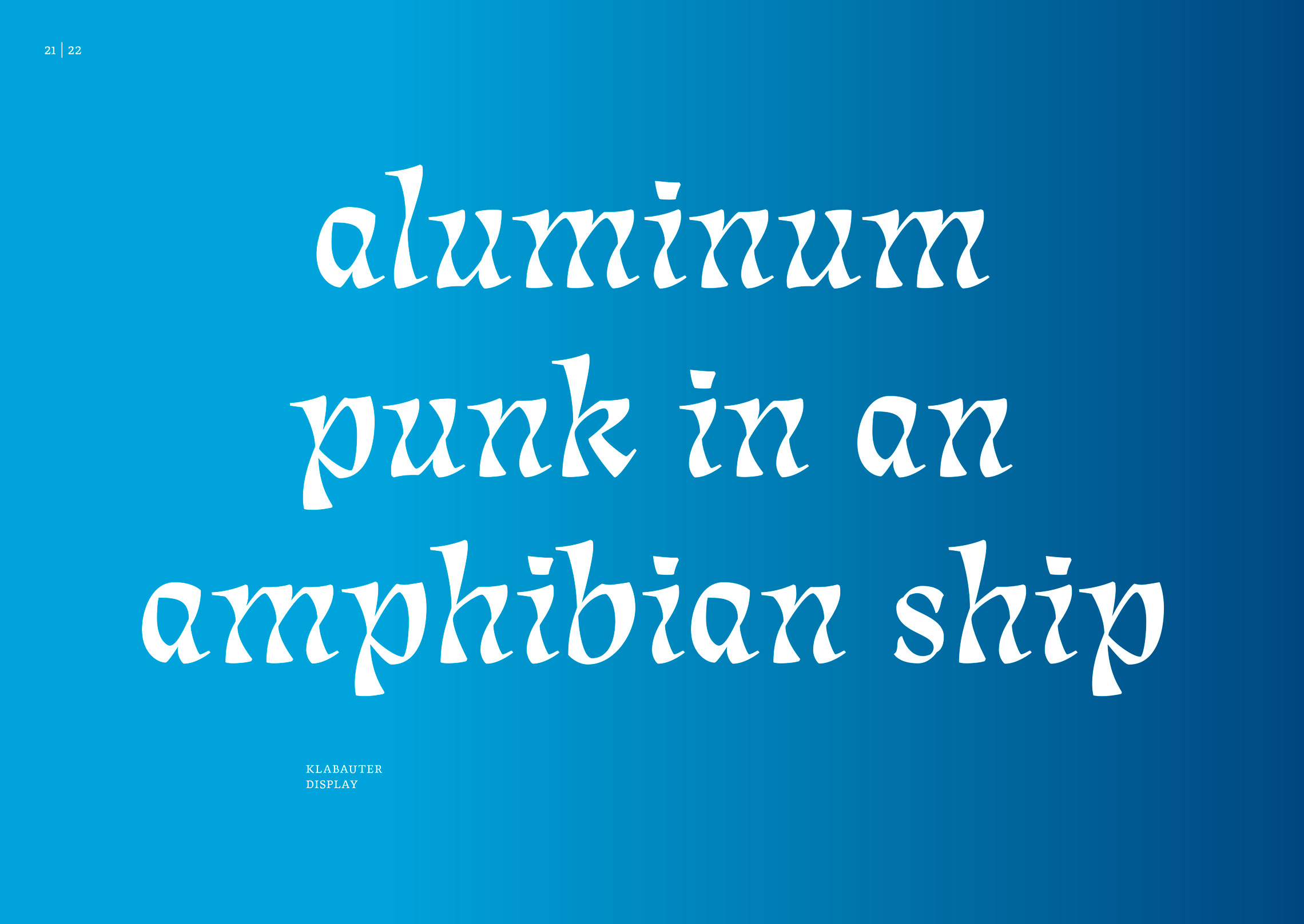
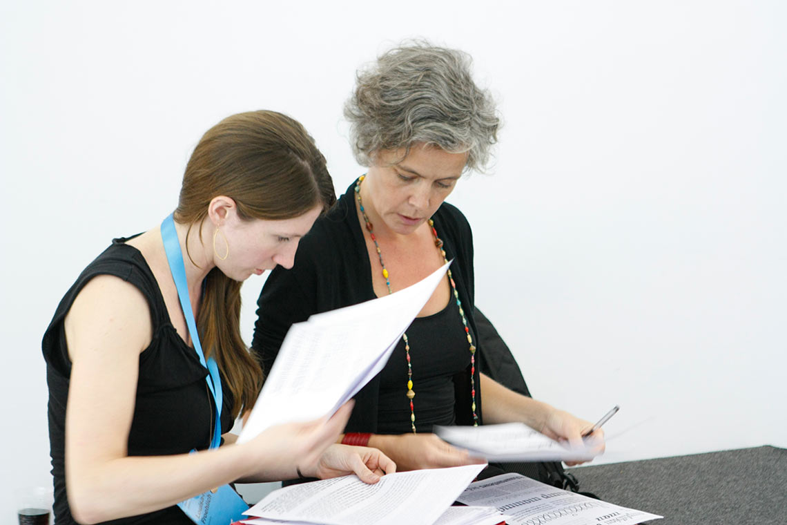
Processing Lisbeth’s stylistic largesse: an interview with Louisa Fröhlich

February 2017

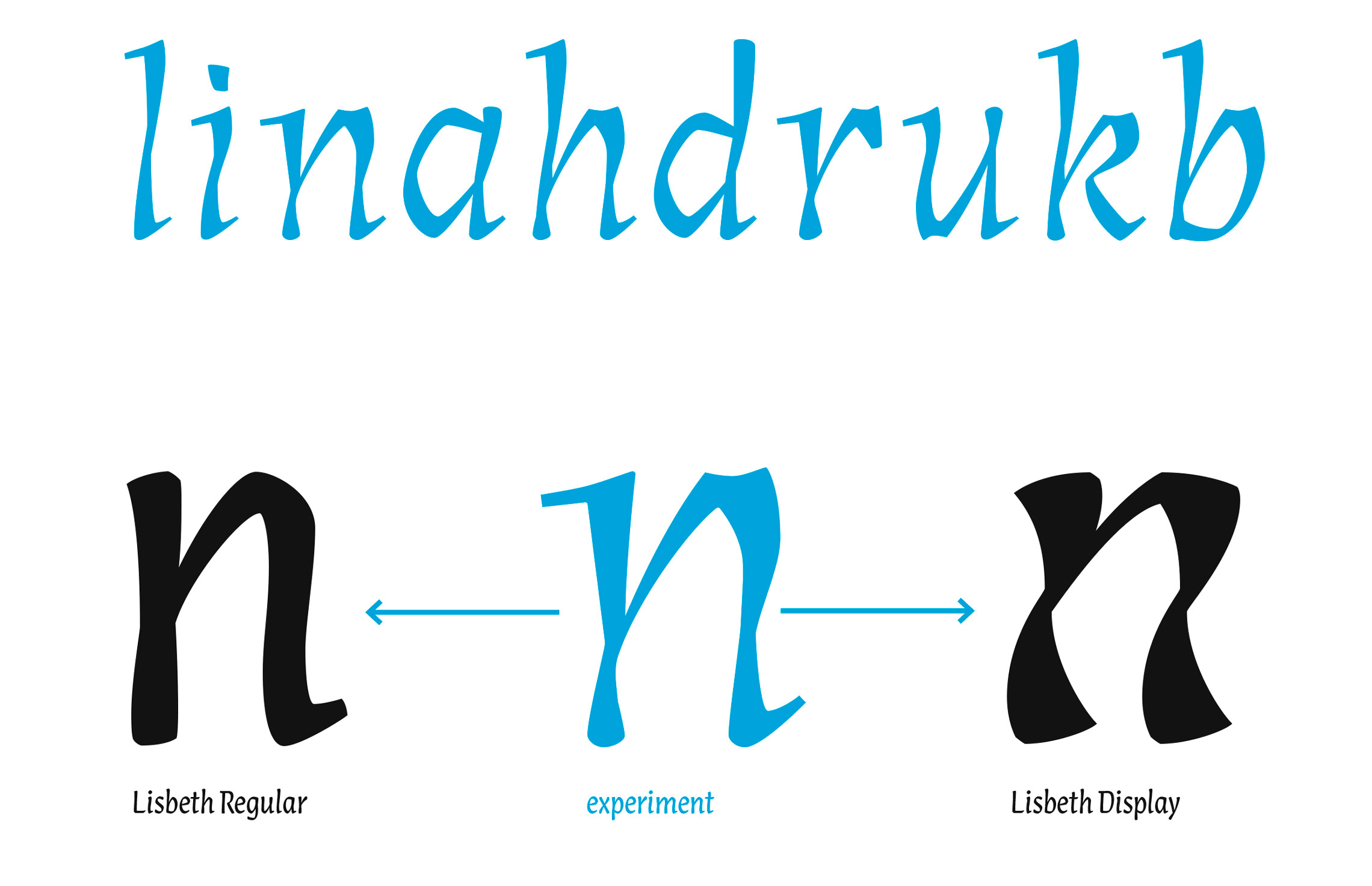
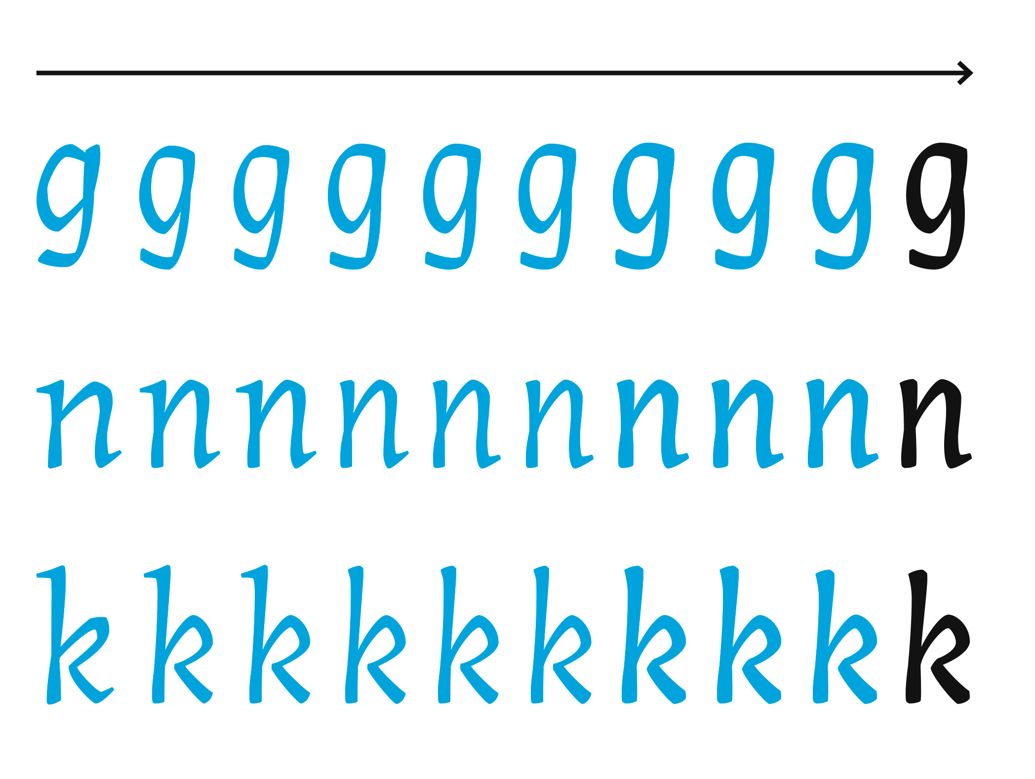
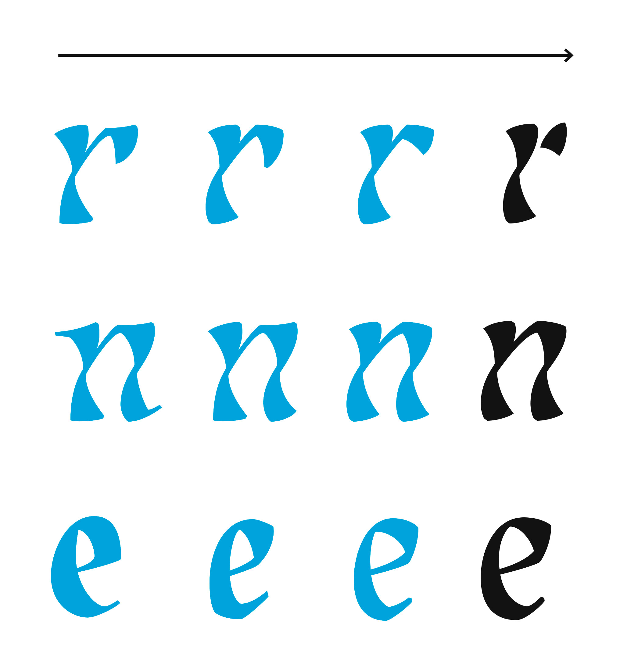
Louisa Fröhlich released Lisbeth as TypeTogether’s first type family of 2017. We talked with her about the creating her all-italic family and twisting display, and ask where she sees Lisbeth going from here. Grab your favourite drink (Louisa recommends a good sherry) and read about this all-italic typographic trailblazer.

Typeface design: Lisbeth

Klabauter, the beginning 

Lisbeth originated during your MA in Reading. Can you explain how you arrived at such an idiosyncratic design?
Correct, the design process of Lisbeth started in 2012 as part of my MA in Typeface Design at the University of Reading. At that point in the process, Lisbeth was the companion to the roman serif face in my MA typeface Klabauter.

The work on this typeface can be characterized as an exciting and also a tough struggle, since I had to learn a lot at once: the design tools, the letter proportions, the relevant type history, and I also had to develop a type designer’s eye.

Klabauter Display as it was presented for the MA in Type Design, University of Reading in 2013. 


After a few months I felt like I was only copying or adjusting already existing designs. So around Christmas 2012 I locked myself into my room for one week with the aim of excessive experimentation until I found something exciting ... something that would be mine. After a lot of crazy experiments with tools, writing surfaces, a lot of sketching, and some sherry, I came up with this energetic stroke, that twists around itself.


I always liked the idea of a stroke which has a subtle three-dimensional feel to it and which has the ability to somehow move more freely. Not to create a swashy diva, but rather to put this vividness and energy inside practical and effcient letter proportions. I wanted a typeface which is capable of easily handling longer paragraphs of text. This was the feisty italic’s true inception, which later became Lisbeth in all its current glory.

Once the main idea was decided, the design process was very free and filled with pure joy in creating the shapes, which fortunately came very easily to me. Highly enjoying this process, the roman and the italic purposefully shared only a loose connection to give the design of the italic maximum freedom.


Louisa’s room, where Lisbeth was created.


How should the stroke behave in challenging letters?

"How should the stroke behave in challenging letters?" 
Problem solving worked best with quick, rough sketches (2015).


Early type design sletches

Early sketches (2013).


The process of finishing Lisbeth was paused due to the birth of your first son, Oskar, so tell us what challenges you experienced in completing this type family?
After completing the MA course at Reading, it took me some time to finish the text styles since I simultaneously started my own independent design business. When I had finished five of the six styles, my son Oskar was born which was so wonderful, though it made the thought of a normal schedule disappear. It was a huge challenge personally and professionally to continue the project and it took me one year to finish the final display style. It was also very emotional because, being my  first typeface, I wanted Lisbeth to be special and strong. It felt a bit like giving birth all over again. :-) I’m so happy to finally see Lisbeth released to the world now!


The final version of Lisbeth Display

The final version of Lisbeth Display, more evenly designed and less angular.


All-italic

Where did the idea of creating an italic-only typeface came from?
I met Veronika Burian and José Scaglione after the MA program and they proposed releasing the design as a purely italic family. I was instantly thrilled by the idea. Dismissing the idea of a roman style as the protagonist in a typeface family was a bold move, and in my eyes that makes the Lisbeth font family a little bit of a rebel. It’s also a reflection of the Renaissance tradition to set whole works in an italic style.

So that was the family idea of Lisbeth — to be a charming italic rebel with wild cursive styles that can handle any sorts of texts on her own.


Louisa Fröhlich receiving feedback from Veronika Burian during ATypI Barcelona 2014.

Louisa Fröhlich receiving feedback from Veronika Burian during ATypI Barcelona 2014.


twisted strokes

Lisbeth  is a unique and recent entry in the font world. What are the peculiarities of Lisbeth and what was the process behind creating Lisbeth’s particular twisted style?  
I fell in love with the idea of the twisted stroke and was curious how this strong design feature would behave through the different styles of a typeface family. Integral to the design was the handling of the contrast, which gave the letters their three-dimensional appearance. I found it easiest to design a letter first in the expressive bold style where the contrast is more pronounced. Then I just had to tone everything down for the lighter weights.

The weights in the middle of the family are optimized for use in paragraph text. The character is still vividly present, but weight and contrast is reduced. The almost upright angle and the high x-height is perfect to read even longer texts comfortably. The amount of information able to be packed into a small space is an important part of type design, so I made Lisbeth slightly condensed horizontally to maximize what could be included on a line.

At first I was a bit nervous about the thin style because I feared if I lost the expressiveness of the contrast, there wouldn’t remain enough personality. Now I love this style, because it shows another side of Lisbeth and it lets the graceful, slightly condensed structure of the letters shine. The contrast is still there, but it’s much more subtle and delicately balanced.

The idea for the the display style developed right at the beginning of the project. It illustrated the design idea so convincingly that I had no worries about this style. As the project developed, I mainly concentrated on the text styles first. I wanted to be sure everything would work well as a text face. When I was frustrated with a challenge in the text weights, I sometimes jumped back to the display. It seemed to come more naturally and always helped relax my mind. In the end it was really fun to finish the display style.


This was the first digitisation of Louisa’s experiments. The shapes were somehow wild, unbalanced, and rough, but promising. Some of the ideas developed during the phase of sketching had to be abandoned to gain more harmony insde the lettershapes and an even texture in paragraphs. However, the essence of the original sketches, such as the modulated stroke, is still present in the text styles of Lisbeth and even more prominent in the Display.


Evolution of Lisbeth Regular, 2013 to 2016.


 from bold to thin

From Lisbeth Bold to Lisbeth Thin there is a huge difference. Can you explain how you created all the intermediate weights?
At the beginning of Lisbeth I already had the design for a regular weight and a bit of the bold from my Masters program at Reading. My original plan was to complete the bold, then design a thin weight, and interpolate the other styles in between. Unfortunately, the tests for the interpolation were really unsatisfying. The interpolated regular became somewhat boring and lifeless, which is definitely not who Lisbeth is. 

So I decided — very time-inefficiently — to create a third master for the regular weight to restore the vibrant feel I originally had in mind. Although, at the time, I was cursing the extra time it cost me, when I look at Lisbeth now I am very happy with this decision. 

As designers we are always influenced by our tools and the technical possibilities, and many typefaces are designed to work well with interpolation. Interpolation is natural and smart if you want to have a highly efficient workflow and if there are deadlines.

Regarding Lisbeth, I am happy I took the time to be stubborn and do an extra master. It is very satisfying that Lisbeth remains strong and energetic in every style, exactly like I wanted it to look, and is not a compromise based on technical limitations.


lisbeth in use

How do you see Lisbeth being used by designers?
I can see Lisbeth used in identities, branding, and magazines. The strong character of the typeface is perfect for this and Lisbeth effortlessly masters the challenges of the two major typographic disciplines: text and display.

Lisbeth is stunning in text setting and I do hope that designers will be bold enough to use her for that, even though it is not common to set longer passages in an italic style anymore.

Often italics are either too docile (being the partner to a strong roman) or too extravagant to use them for all-italic text setting. This is a shame because italics, originating from the the movements of the human hand, have the potential to communicate at eye-level with the reader. Lisbeth wants to fill that gap.

In my eyes Lisbeth is a characterful alternative to the omnipresent roman styles.

The five text weights perform excellently in text settings without losing their distinct personality. The angle of the letters is almost upright and the x-height is relatively large, so even longer texts can be read comfortably. Lisbeth is also slightly condensed and can structure a lot of information space-efficiently on the page.

The extremes of the family — the thin and the bold style — were also conceived to convince in display situations. When enlarged, the shapes show their inherent striking quality and add more sound and exceptionality to every page.

Most of all, the gestural liveliness of the handwritten feel plus the extra dimension of the twisted stroke form Lisbeth’s distinct personality. These make her perfect for identities, branding, and magazines.


A ficticius use of Lisbeth combining Lisbeth Regular and Bold with Lisbeth Display.


An early use of Lisbeth, a logotype designed by the studio Atelier Löwentor for the German school Freie Comenius Schule

An early use of Lisbeth, a logotype designed by the studio Atelier Löwentor for the German school Freie Comenius Schule.


Finally, graphic designers love typographic features such as contextual alternates, ligatures, and extra figure sets. What is there for them in Lisbeth?
Lisbeth supports numerous languages (extended Latin) and comes with nice ligatures and some contextual alternates to produce beautiful typography. The character set contains proportional lining and oldstyle figures as well as their respective tabular gure sets. There is also a full set of numbers for subscripts, superscripts, and fractions.


Some of the OpenType features availables in Lisbeth

Some of the OpenType features availables in Lisbeth: all-caps, ligatures, and contextual alternates. Some of the ligatures are very subtle, such as the ‘fi ’, that tightens the space between the two letters.


Lisbeth includes four sets of figures that can be activated by using the OpenType panel.


Ordinals, numerator and denominator, fractions, and superior and inferior.


The display style has a slightly reduced character set compared to the text styles — just proportional lining figures, a few less fractions, and only 1–4 in superscript. The display also has some ligatures and contextual alternates.

Ordinals, numerator and denominator, fractions, and superiors and inferiors in Lisbeth Display.


Thanks for talking with us, Louisa. We wish you all the best with your son Oskar and can’t wait to see how Lisbeth is used by bold and talented designers!

Order Lisbeth or download the online specimen.


SaveSave

About Us

TypeTogether is an indie type foundry committed to excellence in type design with a focus on editorial use. Additionally, TypeTogether creates custom type design for corporate use. We invite you to browse our library of retail fonts or contact us to discuss custom type design projects.