A refined serif newsface with distinctive character and clarity.
The Coranto 2 font family, based on Dr Gerard Unger’s 1997 typeface Paradox, arose from a desire to transfer the elegance and refinement of that type family to newsprint. Coranto 2 has a larger x-height and has been made more robust in many places to apply to the demands of newspaper printing. The Headline version has an even taller x-height for increased legibility and is more condensed to save space in the demanding medium.
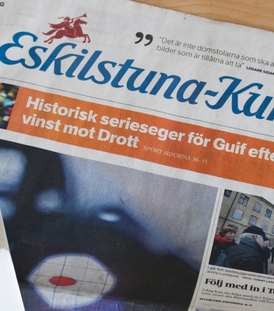
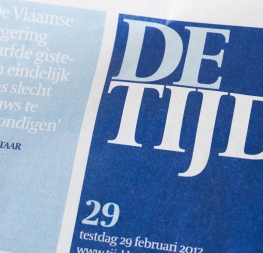
Newspaper production has seen spectacular improvements over the past 50 years in paper and print quality, the introduction of colour printing, and more consistent and accurate register. Newspaper production still demands numerous letterforms, but advancements in printing are better able to bring out details and make typography more appealing to readers. Newspaper text no longer needs to sacrifice its compelling and unique look in order to gain functional superiority, but instead a top priority has become enjoying the reading experience.
Today, newspapers are not merely a matter of cheap grey paper, thin ink, and super-fast rotary printing; and type design no longer has to focus on surviving the mechanical technology while providing only elementary legibility. Now there is also room to create an ambience, to give an editorial a clearer identity of its own. There is scope — demand even — for precision and refinement. One consequence of this is that newspaper designers can now look beyond the traditional group of newsfaces. Conversely, a well made newsface can be used outside the newspaper — not an uncommon occurrence.
The OpenType update to the refined Coranto 2 type family includes the addition of over 250 glyphs featuring full Latin A language support, small caps, new ligatures, four sets of numerals, arbitrary fractions, and superiors and inferiors. Furthermore, kerning was added and fine-tuned for better performance. Just as is expected, Coranto 2 is intended for running text and Coranto 2 Headline, with its comparatively taller x-height and condensed width, is intended to set headlines.
The complete Coranto 2 family comes in eight styles, speaks multiple languages, and, along with our entire catalogue, has been optimised for today’s varied screen uses. Please download the type specimen to find out what’s new in Coranto 2.