Adelle Mono Flex in Foundations of Type Design
October 2020
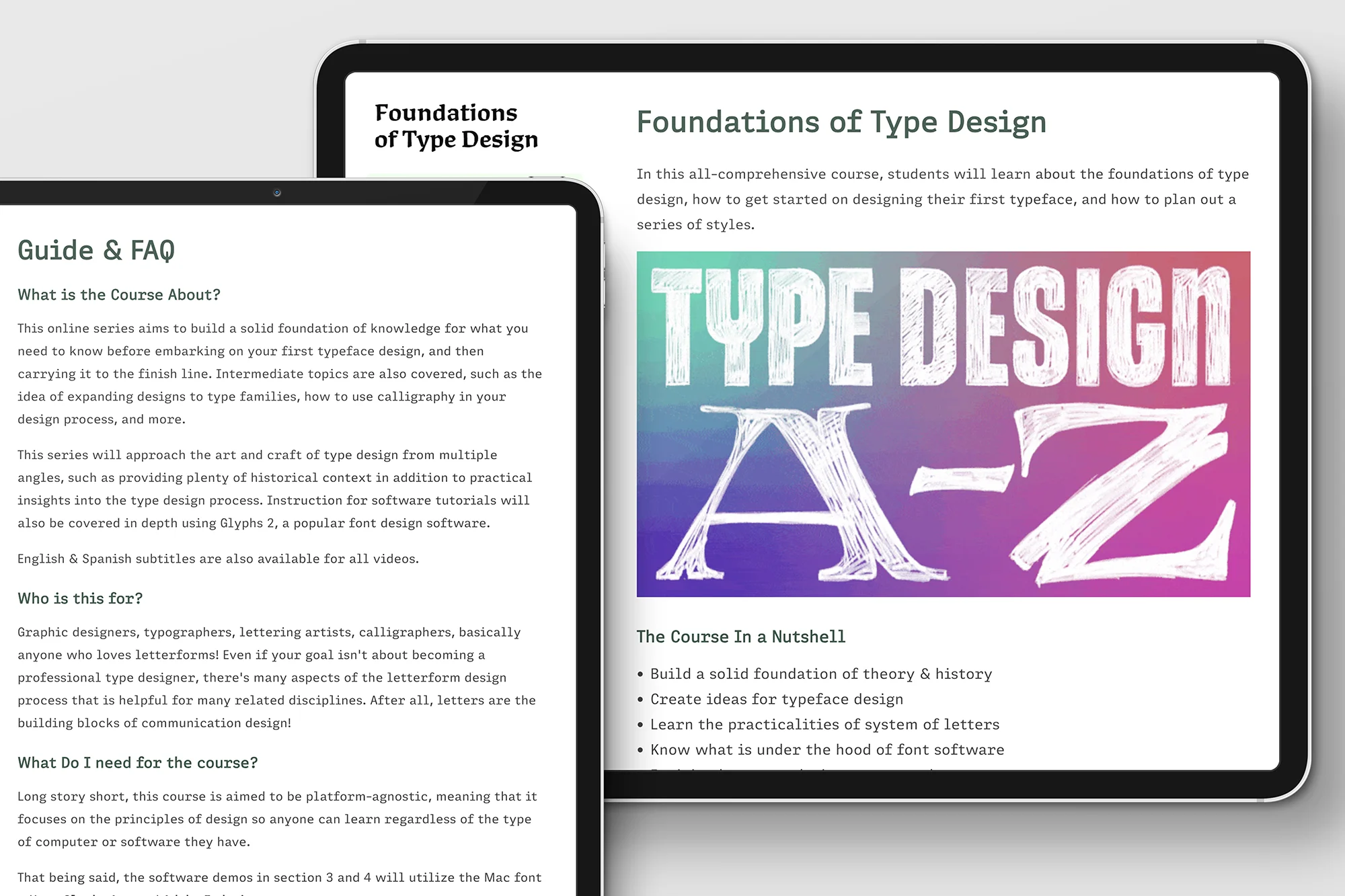
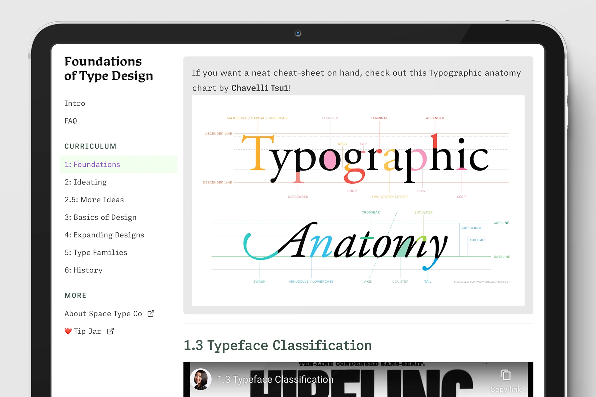
Adelle Mono Flex, our take on a monospace design that also has a version with proportional spacing, has been used on the Foundations of Type Design website, created by Lynne Yun.
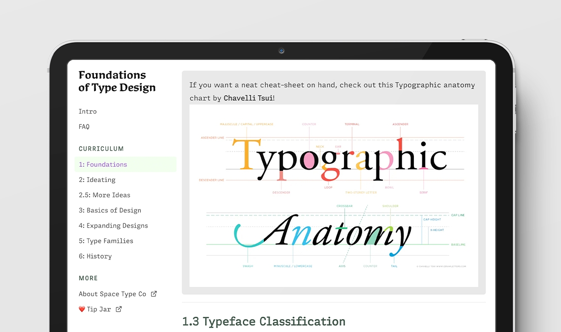
Adelle Mono Flex, our take on a monospace design that also has a version with proportional spacing, has been used on the Foundations of Type Design website, created by Lynne Yun.
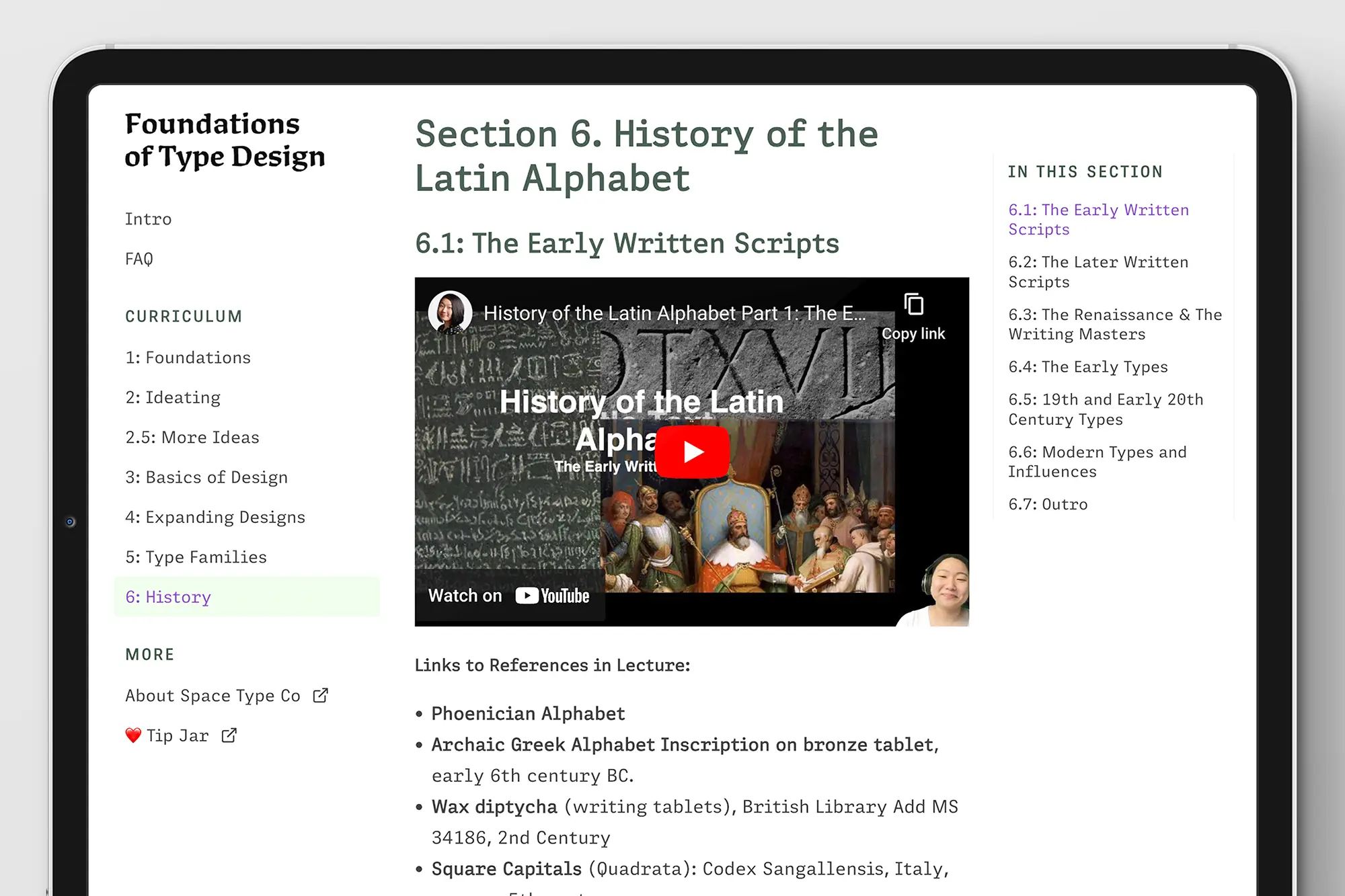
Our Adelle Mono family is one idea stretched across two designs. Adelle Mono is a strict monospace version that fits each glyph within a set bounding box. But the “flex” in Adelle Mono Flex signifies our proportional monospace font with all the characteristics of the monospace genre, but spaced like a traditional proportional font (as we explain in this article).
Designer and lecturer Lynne Yun has put Adelle Mono Flex to work in her course Foundations of Type Design, which covers the basics of type design and is free for everyone to watch (donations welcome).
Adelle Mono Flex helps deliver the information in a clean and organised way, without the overly-constrained feeling monospace fonts generally convey — all the aesthetic feeling with none of the rigidity.
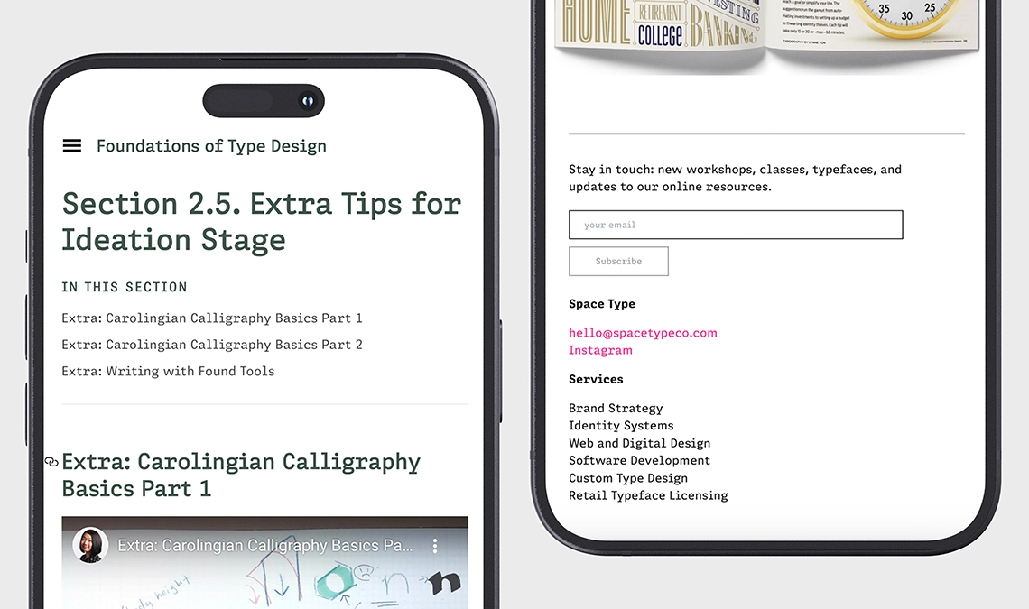
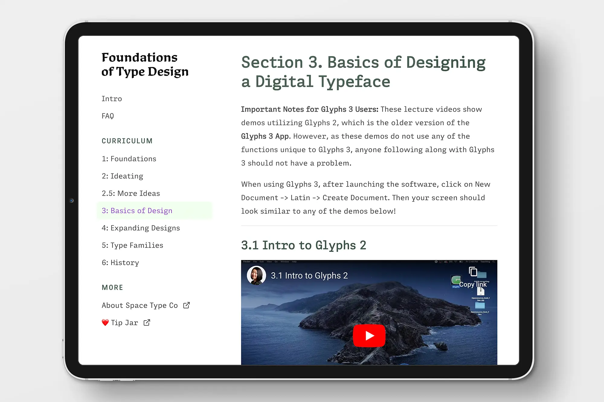
TypeTogether is an indie type foundry committed to excellence in type design with a focus on editorial use. Additionally, TypeTogether creates custom type design for corporate use. We invite you to browse our library of retail fonts or contact us to discuss custom type design projects.
Schedule an introduction meeting to learn more.