La Gazzetta dello Sport
June 2017
Tablet Gothic in use in the Italian sport newspaper La Gazzetta dello Sport.
Tablet Gothic in use in the Italian sport newspaper La Gazzetta dello Sport.
With a focus on sports coverage, La Gazzetta dello Sport is the most widely read daily newspaper in Italy. The first issue was published in 1896, on time to cover the first modern Olympic Games held in Athens.
The paper was published in broadsheet format until 2008, when it was redesigned as a tabloid. The newspaper, published on pink paper (our version was on an off-white paper since it was purchased in Greece), sells over 400,000 copies daily, and even more on Mondays when readers want to catch up on the weekend’s events. The 2008 redesign was commissioned to Cases i Associats, a consultancy company based in Barcelona. According to Pablo Ruiz, the former senior designer at Cases i Associats and founding partner of R2 Media Factory, changing formats in such an established newspaper is a risky move. For this reason they opted for a ‘conservative but versatile’ choice of newspaper font: Font Bureau’s Titling Gothic.
A few years later La Gazzetta dello Sport contacted the same consultants for a redesign. This time they suggested a typographic change to our then-newly released Tablet Gothic font family. According to Ruiz, The typographic choice was immediately approved, partly because of legibility improvements, such as the seriffed capital ‘I’ which cannot be confused with a lowercase ‘l’, but also because of the range of combination possibilities its 84 styles granted. From the first moment, it looked like Tablet Gothic was especially made for a newspaper like this.
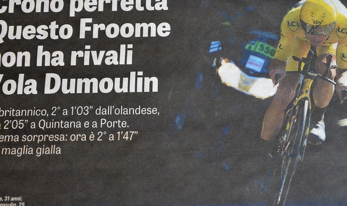
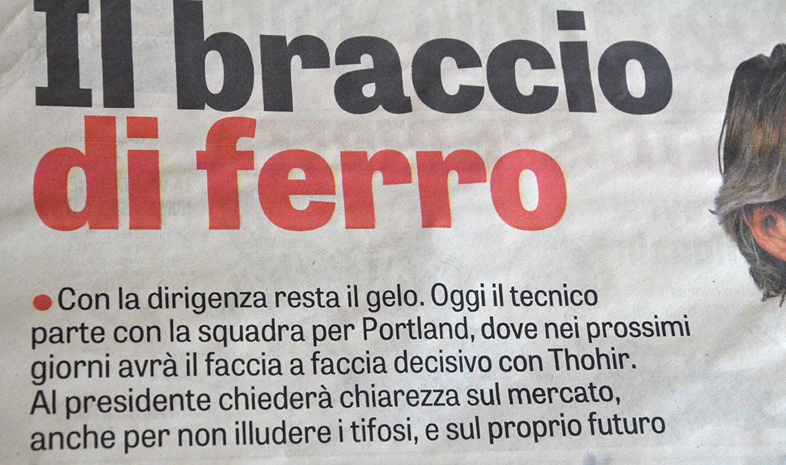
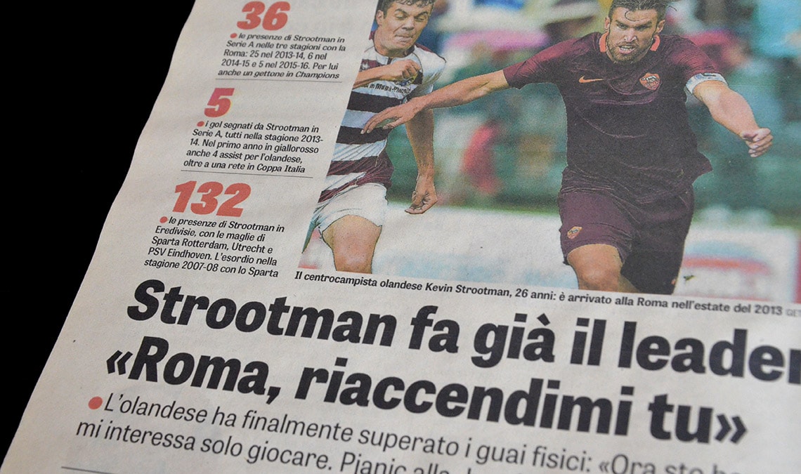
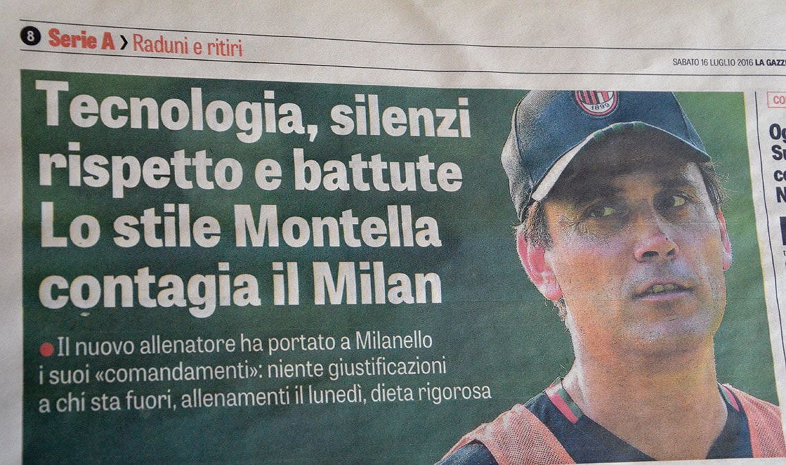
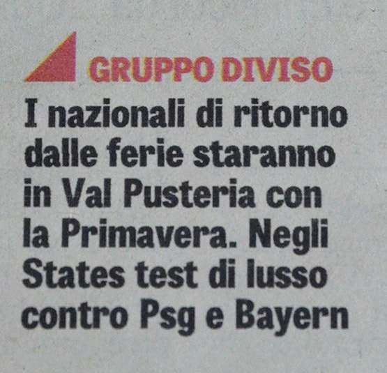
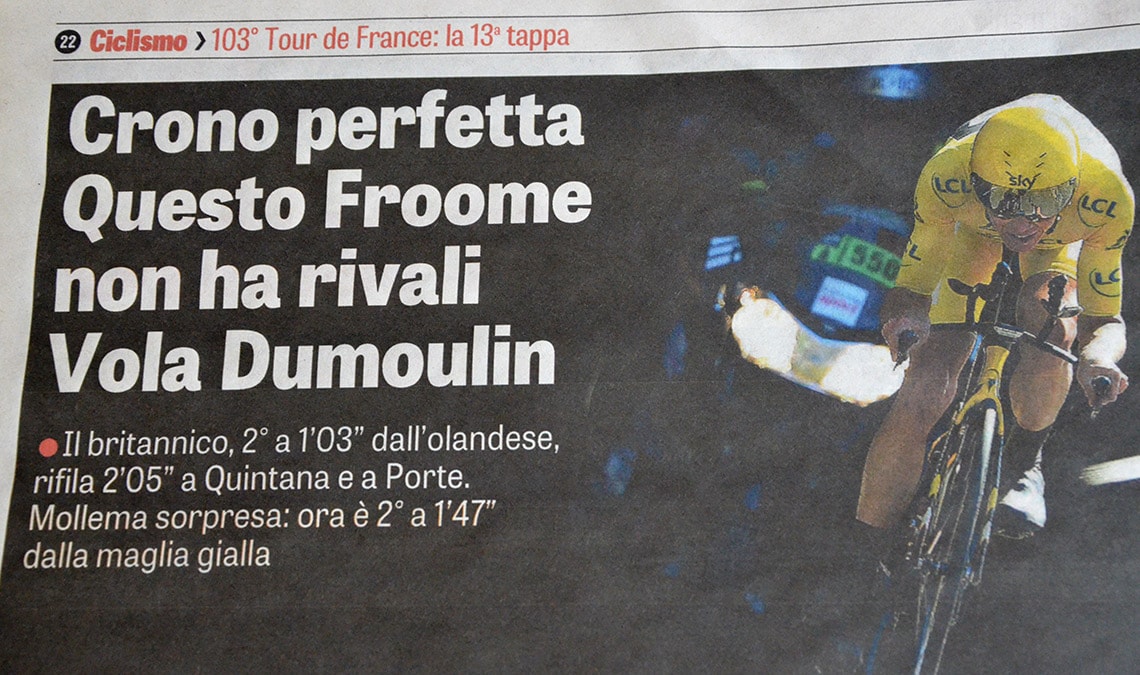
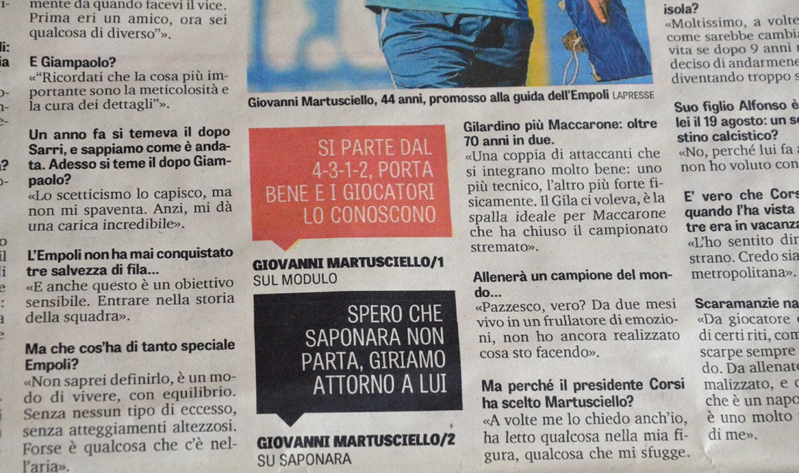
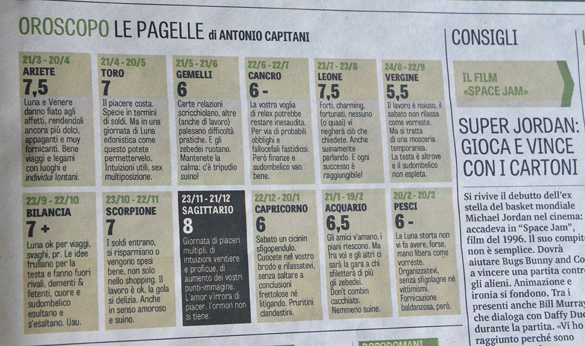
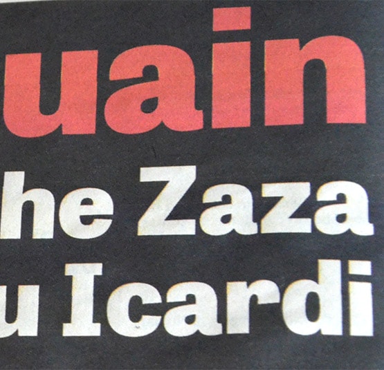
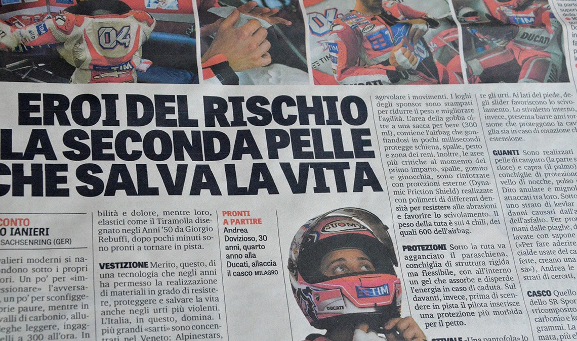
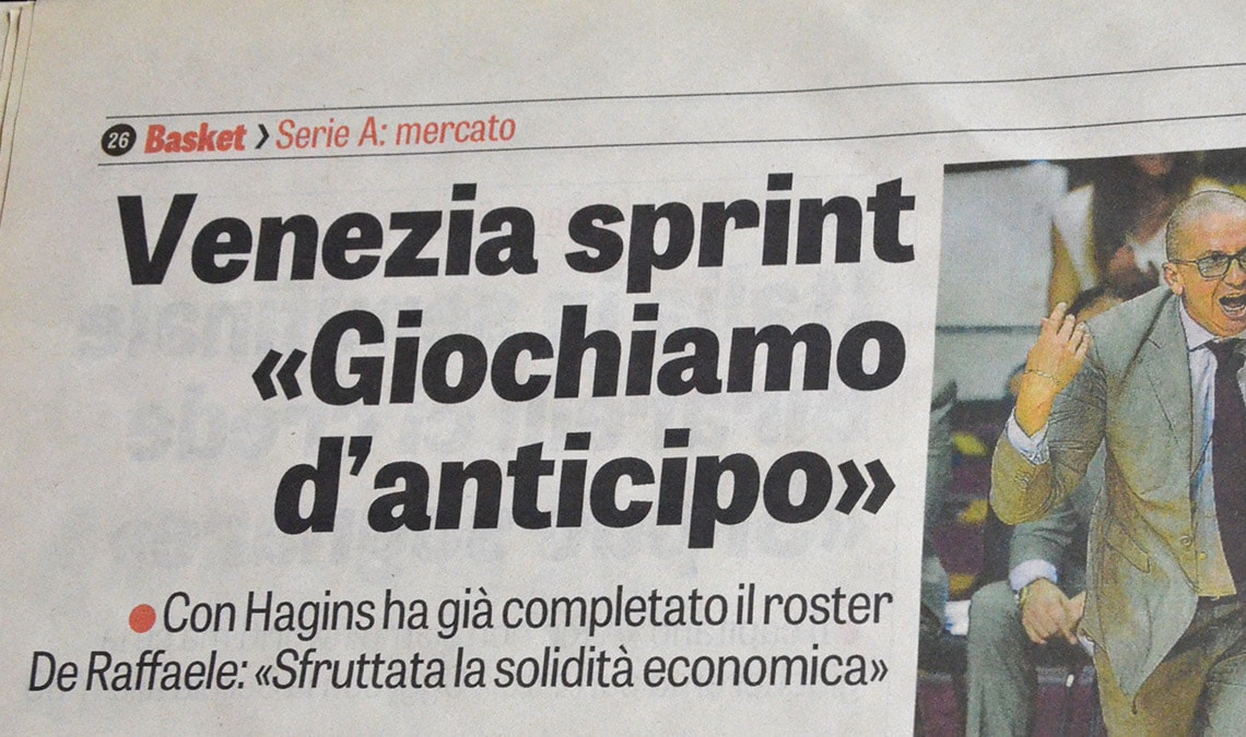
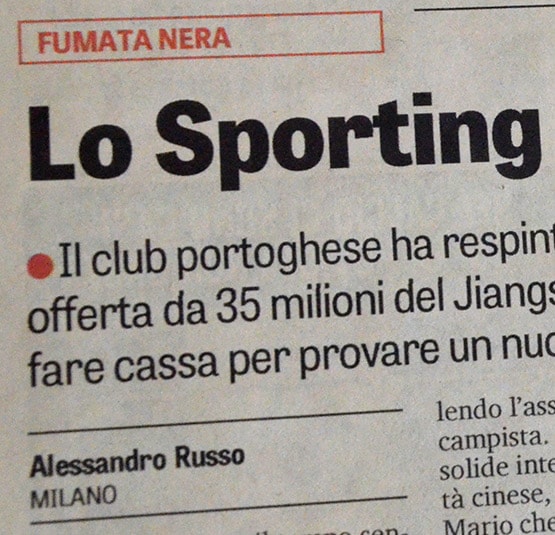
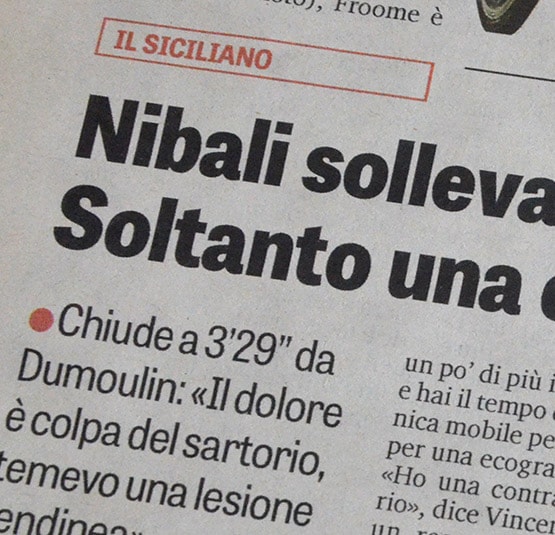
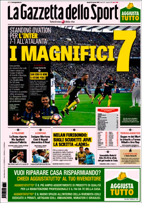
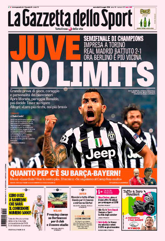
Tablet Gothic is used for almost everything except the body copy. Titles appear frequently as a combination of uppercase and lowercase text setting, many times with coloured text, or on background colours or photos. Most of the time there is a combination of different Tablet Gothic styles in title, deck, and pull quotes that give the pages a very cohesive look and feel.
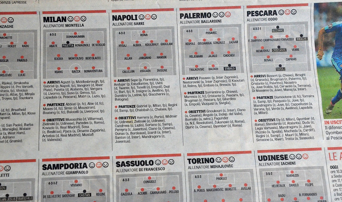
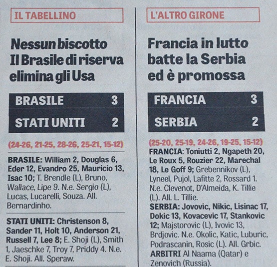
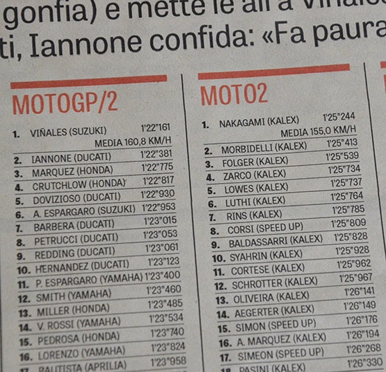
The neat use of colour, tables, mugshots with quotes, callouts, and other news design devices make this newspaper attractive, eye-catching, and simple to navigate. Tablet Gothic responds beautifully to the skilled hands of the designers, even in applications for which it was not originally intended. We were delighted to discover score tables where the intermediate weights of the narrow styles deliver clear legibility and character recognition at very small sizes.
Ruiz’s final sentence in his email gave us some food for thought: If I had to design La Gazzetta dello Sport again, I would switch out Tablet Gothic only if I had a Tablet Slab. This sounds like a perfect challenge, don’t you think?

TypeTogether is an indie type foundry committed to excellence in type design with a focus on editorial use. Additionally, TypeTogether creates custom type design for corporate use. We invite you to browse our library of retail fonts or contact us to discuss custom type design projects.
Schedule an introduction meeting to learn more.