Making the Aneto family

October 2022

Our new Aneto family contains three subfamilies and is made to take on every hierarchical part of magazine text and layout. But the journey for Aneto Skyline, Aneto Text, and Aneto was almost 15 years in the making, from a rejected sketch to its polished form now in variable font format. This article takes you behind the scenes to witness its development.


Worthwhile seeds

Aneto is a brand new type family with three subfamilies, but the first idea for its design dates back to 2008. TypeTogether was still only a two-person operation and we worked on new designs for our small retail library of fonts. From time to time we received commissions for custom type and lettering projects. One such project was to design a new logo and header for a Jordanian magazine called Islamica. They defined themselves as “the Newsweek of the Middle East”. After a series of briefing sessions and some research, we created several logotypes and then finished the project.

Weeks later, we looked at the discarded designs and found something that could become a new typeface. The shapes seemed, at least to our eyes, to have a certain Flemish feel so we not-so-creatively codenamed the design Dutchy and later changed it to Odette.


skteches for the new Islamica magazine header


It is likely that every type designer has drawers, notebooks, or files full of sketches. In our case, leaving ideas alone for weeks, months, or even years is part of our standard procedure for all new projects. Looking back at old sketches with fresh eyes helps our ideas mature and it also separates the good designs from the not-so-good ones. If it still feels current and worthwhile after being abandoned for some time, then it is probably worth our investment to produce it. So while the Dutchy/Odette design was never continued, the desire to create a font family with a hint of Plantin’s heritage was never entirely lost.


Type specimen, Monotype Plantin Light.


Example of Plantin used on a book cover.


Difficulties combining fonts

Pairing fonts is a fascinating topic. Typographers, type designers, and graphic designers have spilled rivers of ink trying to grasp it in its entirety, and share processes and best practices for achieving it. It is not an easy topic because different design archetypes call for unique typographic responses. The possible scenarios are manifold, which adds a thick layer of complexity to the font combination problem.

When we wrote our own primer about typomatching we warned about the use of the so called super-families or serial designs that feature sans, semi-serif, and full serif fonts with very little structural change. These, when combined, may not create enough tension between them and consequently fail to emphasize content, which is usually the main reason behind typographic changes.


Pairing, not matching

Our approach to type combination went in parallel with the concept we wanted for our retail font library: to create several type families that got along really well without having them look like siblings. Pairing Karmina with Ronnia, Abril with Tablet Gothic, and Portada with Protipo are good samples of this perspective. The glyphs are in all cases visibly different, each rooted in their own design style, but each typographic pair shares an homogeneous approach to things that are harder to describe outside the type-making world: the speed of the curves, the variation in horizontal proportions, and how organic or mechanic the alphabet structure feels.


Typefamily combinations [from left to right]: Ronnia-Karmina, Tablet Gothic-Abril, Portada-Protipo


Special type specimen showing Portada and Protipo in use.


But the historical criteria for combining type was not always as careful. During the period spanning from the industrial revolution to the first decades of the 20th century especially, it is very easy to find posters, pamphlets, and all sorts of little publications that are extremely eclectic in this respect; more a random mish-mash than a purposeful harmonisation. This style of design made a comeback in the 2010s with the lettering trend and, even if sometimes overused, paved the way for brilliant pieces of graphic design that dared to combine typefaces based on artistic, functional, or historical reasons rather than formal ones. Some very good type families were cut with this in mind, such as Jeremy Tankard’s Trilogy (2009) and the suite of fonts that Henrik Kubel designed for Gail Bichler’s New York Times Magazine redesign (2015).


The MagSuite

In 2017 TypeTogether was busy working on several new typefaces. Among them, a typeface loosely inspired in wood typography, which, after an extensive brainstorming session, was codenamed Woody. The plan was to expand this sans serif design into an extensive type family that made use of layers to combine styles in many different ways, but the results for these layered-fonts did not look good enough. Way before colour fonts were a thing, we even played with the possibility of adding illustrative elements to the design. Here is an extract of an internal document circulated to the TypeTogether team back then:


Sketches and explorations of decorative elements and special nesting ligatures for Catalpa.


“The efforts we invested into trying to develop the Woody project as a font family that goes beyond the wood type/display genre have been futile. We tried several times to convert it into a wider geometric sans serif family but the results, especially in the intermediate weights, were unconvincing.

As an alternative and a way to make the Woody project viable we are proposing to consider it as a stand-alone font family that fits into a broader suite of fonts which, even if generally unrelated from a purely aesthetic point of view, can be combined successfully in editorial design pieces.”

It is in that very same report that the idea to develop three typefaces for multi-platform editorial use was born — three type families that were not intended to be used side by side in the same line of text, the same size or same weight, and also designs that were clearly different and create enough tension between them whilst maintaining certain familiarities.


First internal presentation of the Magsuite. The beginning of the ABC series.


Three type families for magazines


The Woody project soon became Catalpa, a small type family for titles, featuring very thin and very bold styles but nothing in between. And Belarius was conceived from the start as a large, variable font family geared toward multipurpose editorial use — for everything but titles and continuous text.

The then-new possibilities granted by variable font technology excited us enough to attempt a four-axis design. Given the loss of quality control in the extreme ends of the designspace though, especially for the backslant/slant axis, we decided to paddle back and reduce our ambitions a bit. And for the third typeface in this group it quickly became clear we wanted to pick up the Odette sketches from 2008 and go for a Dutch-inspired text face with an optical axis. This was the birth of the Aneto family.


Aneto: an hybrid design

It would be wildly inaccurate to say Aneto is based on our rejected 2008 Islamica sketches or in the Plantin typefaces, but it is certainly inspired by both. Bringing oldstyle features to the design was important in order to create the right kind of clash with the rather geometric and constructed lettershape designs in Belarius and Catalpa. And this is also why the design space had highly contrasted titling styles from the very beginning.


The three families of the ABC series.


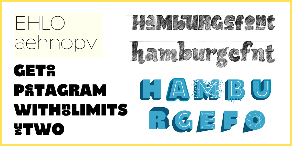
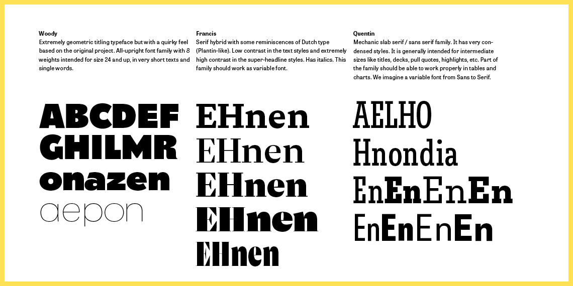
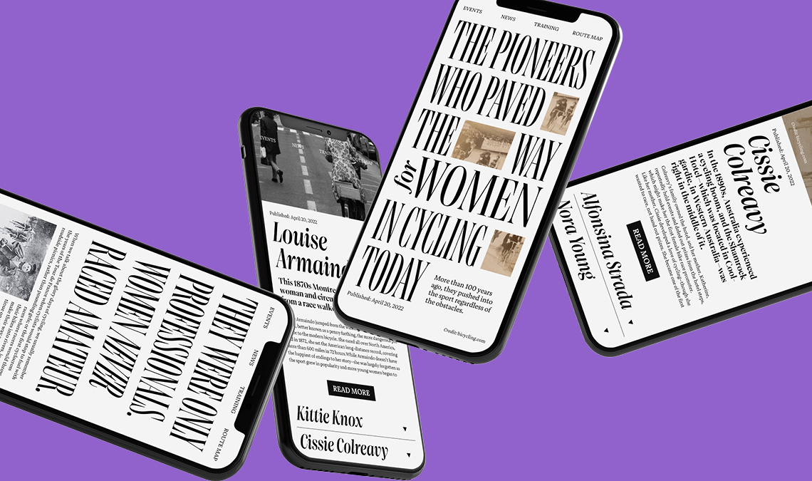
Roxane Gataud got involved rather early in the process once the path of a trilogy family was decided, and one of the first things she suggested was to switch the slabs for bracketed serifs. This granted the design a softer appearance that, as we all agreed, was much more appropriate for its style. At some point soon thereafter we decided to go even further and create special cuts intended for “catastrophe headlines” — very tall, high contrast, and very condensed.

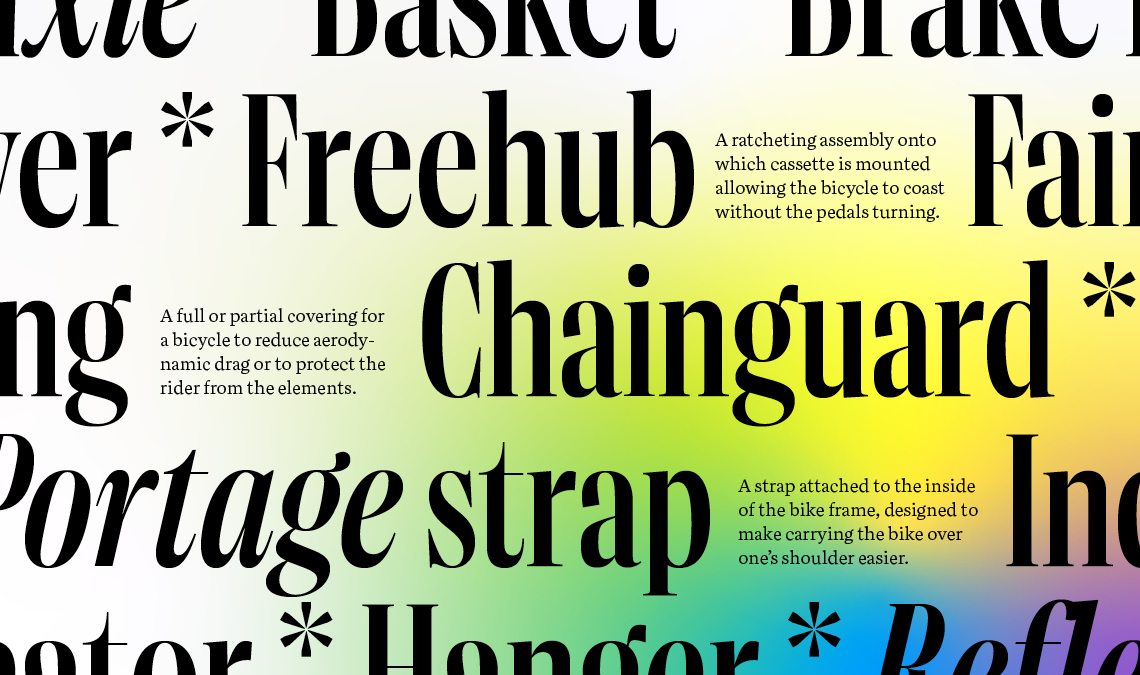
These glyphs were tackled first, and here we worked with two axes that allowed variation of weight and width, and tried to compress lettershapes as much as we could to allow users to fit incredibly tall letters in the most limited spaces. Its intended use in posters, book covers, magazine headlines, and very large pull quotes guided many of the design decisions.

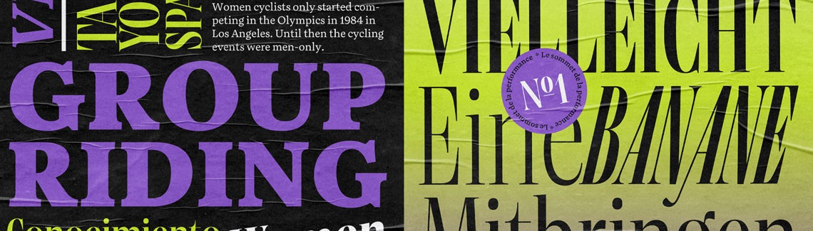
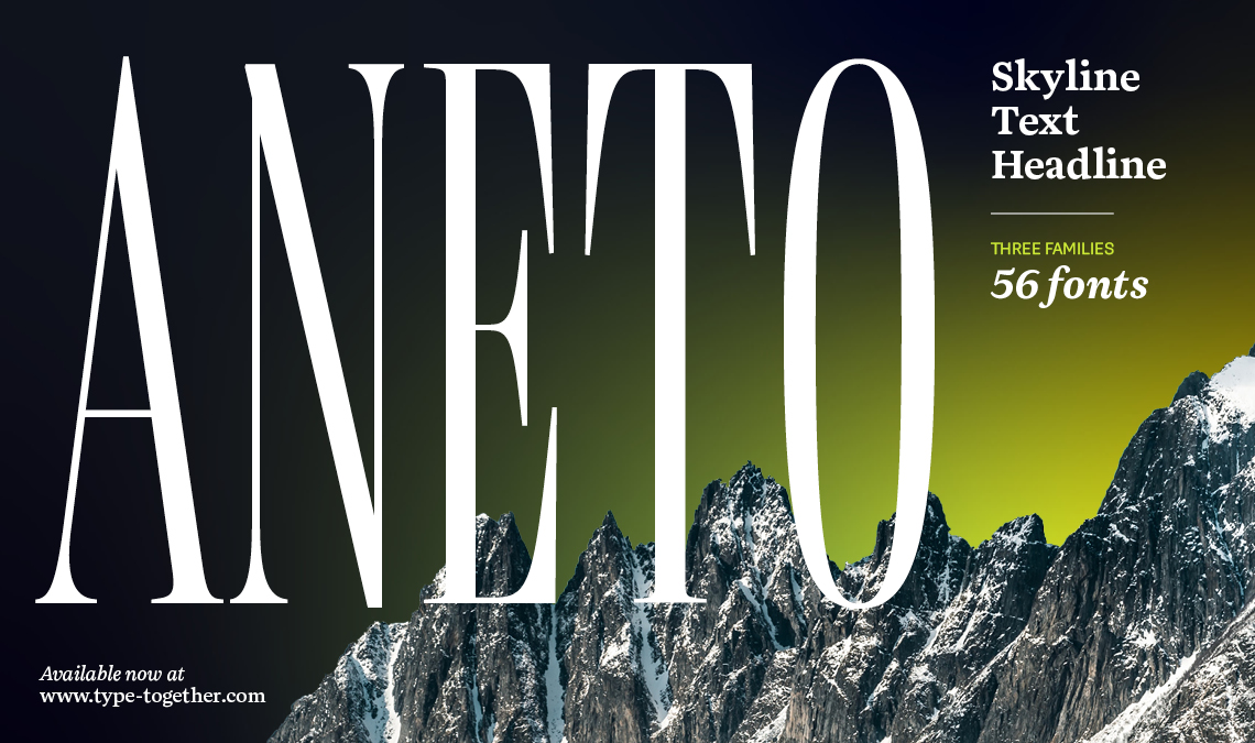
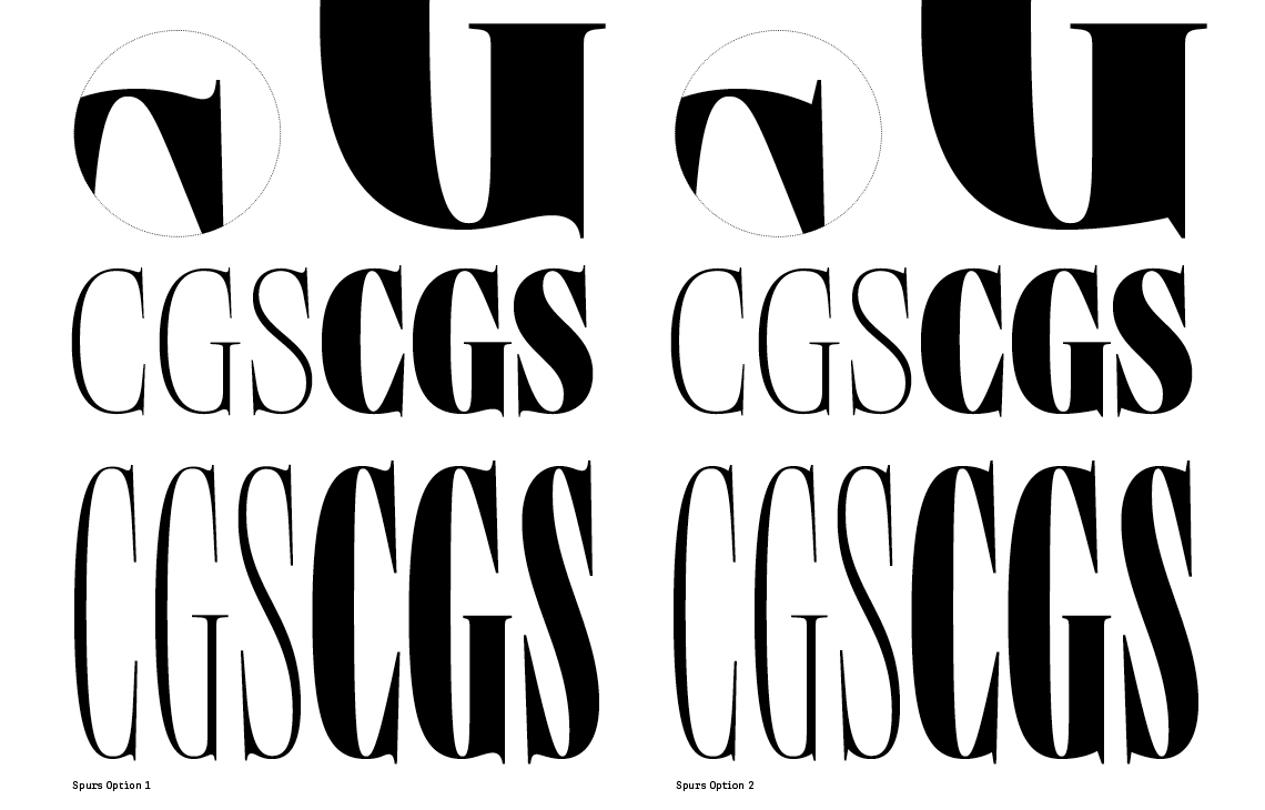
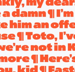
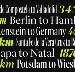
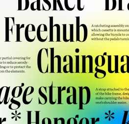
This part of Aneto was cheekily named Aneto Skyline and it is a type family within a type family. It wants to be used in short sentences and single words, trading horizontal real estate for vertical, and catching the reader’s eye in the process. For example, the sharp serif transitions on ‘C, G, S’ and a carved-out ‘Q’ that was real fun to draw but is quite an engineer’s nightmare. The italics feature a curvy design with a steep 13º slant and prominent in- and out-strokes. The dramatic effect can be even further emphasised by choosing the wedged alternates ‘A, M, N, V, W’. Aneto Skyline has six upright and six italic styles that are multiplied across three widths each (Condensed, Compressed, Normal) for a total of 36 fonts.


Exploring two options for the spurs. The soft version on the left was selected.


Aneto Text

On the other hand, the mother family Aneto Text wants to be like an old, familiar friend: comfortable and friendly with a hint of uniqueness. Its lower contrast, hardy shapes, and archetypical familiarity sets a solid foundation to tackle any content. Compared to the SkylineAneto Text has some lettershapes toned down for better legibility. Indeed, the design is probably the most mature and restrained just because it went through various phases of experimentation, modification, and periods of neglect and rediscovery to finally receive its current shape.

When it comes to considering the entirety of type systems and font families, it seemed obvious to add an optical axis to Aneto Text and thus cater to an even broader range of typographic needs. Et voilá — Aneto (Headline)! The playfulness of Aneto’s true italic becomes even more palpable in the heavier, high contrast styles, ready to express anything.

Both Aneto and Aneto Text are decked out with five upright and five italic styles (Regular to Black) for a total of 20.


Shape development of Aneto Text.


In summary, we are proud to present Aneto Skyline, Aneto, and Aneto Text — an amazing family that can set an entire digital magazine, print magazine, or modern newspaper all on its own! It is also able to be a contrast to Catalpa and Belarius for a more wide ranging suite of moods and communication. And for those designers with ideas tucked away, we say: keep them; track their progress; get trusted feedback; envision precisely how it should be used; then make it happen. You never know when the seeds will turn into something worthwhile.


About Us

TypeTogether is an indie type foundry committed to excellence in type design with a focus on editorial use. Additionally, TypeTogether creates custom type design for corporate use. We invite you to browse our library of retail fonts or contact us to discuss custom type design projects.