ABOUT US
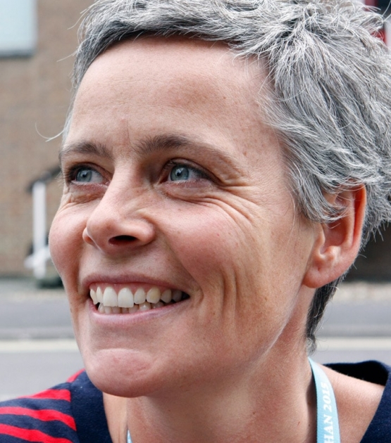
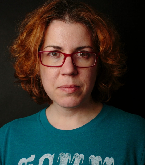
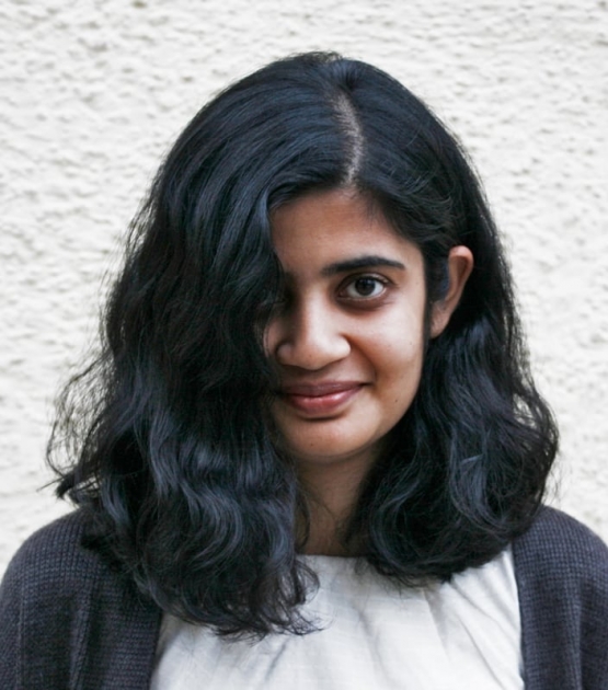
Veronika Burian and José Scaglione met at the University of Reading whilst completing their MAs in Type Design, launching the independent type foundry TypeTogether (TT for short) in 2006.
TT developed out of the desire to publish high quality typefaces and work on new type projects together (hence the name). The foundry provides common grounds for intense cooperation with other type designers, creating an interesting and diverse platform.
TypeTogether’s main interest is finding innovative and stylish solutions to old problems for the professional market of text typefaces, with a focus on editorial use.
|
|
This is where the greatest challenges are faced: creating typefaces that perform well in continuous reading, that also have a high degree of personality.
The aesthetic and functional efficiency of TT’s fonts are accompanied by excellence in technical performance. This is achieved using the latest font software, creating cross-platform Opentype fonts with extended character sets including: broader language support and all kinds of typographic refinements, such as small caps, ligatures and multiple numeral sets.
In addition to TypeTogether’s high quality library of retail fonts, TT also provides custom modifications and specially tailored typefaces; these can serve as vital elements of a company’s visual identity, by communicating a unique feel. Custom typeface projects are developed from solid foundations, based on the client’s brief, targeted research and the open dialogue between all parties. A big advantage of being a small and specialized company is that this allows for closer, and more direct, collaboration with clients; this is often necessary to accomplish their goals, and respond quickly to their needs.
The quality of TypeTogether's work has been already recognized in several international competitions, including TDC and ED-Awards.
|
File: inc_view_static_content1.html
| |
BIOGRAPHIES
TypeTogether was created in 2006 by type designers
Veronika Burian and José Scaglione. Find out more about TypeTogether's founders:
José Scaglione
José Scaglione is an argentinian graphic and multimedia designer, and a graduate from the MA in Typeface Design at the University of Reading, UK. He's working in branding, editorial design and multimedia projects since 1995. He was co-founder of Vision Media Design Studio in Argentina and art director Multiplicity Advertising and The prepaid Press in USA.
José currently leads his own design studio, consults and lectures on typography and graphic communication matters. He also teaches typography at post-graduate level at the National University of Rosario. José is a board member of ATypI (Association Typographique Internationale)
Veronika Burian
Veronika Burian, born in Prague, got her first degree in Industrial Design in Munich, Germany, before she moved on to Austria and Italy to work as a mix between a product and graphic designer. Discovering her true passion for type, she graduated with distinction from the MA in Typeface Design in Reading, UK, in 2003 and started to work as full-time type designer at DaltonMaag in South London until 2007.
After a 3-year stay in Boulder, Colorado, she is now living and working in Prague and dedicates her time fully to TypeTogether. She also continues to lecture about typography at international conferences and universities. Her typeface Maiola that she created during the MA, received the TDC Certificate of Excellence in Type Design 2004, was selected in the Type Design competition from Creative Review 2005 and was part of the touring exhibition e-a-t. Karmina and Bree, two collaborative typefaces from TypeTogether, also won a merit at the ED-Awards competition 2007 and 2009.
TypeTogether is proud to present these type designers who are constantly working to improve and enlarge our library fonts
David Březina, born in Brno, Czech Republic, graduated in Informatics at the Masaryk University in Brno in 2005, spent a term at the Denmarks Designskole in Copenhagen in 2004 and graduated with distinction from the MA in Typeface Design at the University of Reading (UK) in 2007. From 2004 to 2007 he also ran his own design studio DAVI, with projects in graphic, web and interface design.
Back in Brno he is currently working with Tiro Typeworks (Canada) as associate designer.
His interest in non-Latin type design and typography of multilingual and complex texts manifests in the multi-script family Skolar and Surat for Latin and Gujarati, that he started during his MA in Reading. The finalised version is expected to be released through TypeTogether in 2008.
During his time in Denmark, he has also designed the sans serif Codan inspired by the city of Copenhagen.
Leftloft is a visual communication studio based in Milan since 1997. The studio has grown to a staff of 16 people with multi-disciplinary skills, able to provide solutions for all information and communication needs. Leftloft creates projects that aim to improve and implement successfull communication channels for companies, institutions and cultural organizations.
The studio has been established by Andrea Braccaloni, Francesco Cavalli, Bruno Genovese and David Pasquali. All are members of AIAP (Italian Design Association for Visual Communication) and BEDA (Bureau European Design Association).
In addition to their design activity, the partners teach at the Milan Politecnico Faculty of Design. Leftloft is also a promoter of the Graphic Ministry, a cultural association promoting design culture. In autumn 2008, Leftloft opened a new additional office in New York City, USA.
Eduardo Berliner is a graduate in graphic design from Brazil and obtained his Master of Arts in Type Design from University of Reading, UK.
Currently he is working as an independent artist and graphic designer. In 2004, he developed an introductory course in typography for the Catholic University of Rio de Janeiro, which was fully adopted. Eduardo has subsequently worked as a lecturer at the same university.
Recently, Eduardo created, in collaboration with designer Cadu, the graphic structure for the newspaper “museumuseu”, a project conceived by the Brazilian artist Mabe Bethonico. It was exhibited in the 27th Bienal de São Paulo.
Additionally, the first version of Eduardo’s typeface “Pollen”, was shown in the catalogue of the DOBRA (Brésil, une nouvelle génération de designers- France 2004) exhibition.
He has also been engaged in the design of motifs for various fashion clothing brands in Brazil.
Eduardo’s work has been published in books and magazines worldwide, including Brazil Inspired, Étapes, Type One, Typosphere and Type Culture.
Bart Blubaugh has designed and illustrated his way through the retail, automotive, magazine publishing, software development, energy and automation industries. He has set his experience toward delivering visual communication that leads to results by designing forms, logos, stationery, digital graphics, brochures, print ads, event displays, magazines and books. He has spent late nights crafting and maintaining temporary trade show displays on location, and has served his time as photoshop jockey. As a designer with global power and automation technology leader ABB Inc., Bart strives to challenge corporate communicators to leverage their own company's visual identity guidelines and to consider the audience as important as the product.
Bart received his MA in Typeface Design from the University of Reading, in the UK, and has a BSc in Graphic Design earned in the USA.
Pilar Cano is a graphic and typeface designer from Barcelona, where she gained her first degree in Graphic Design. During this degree she studied for 6 months at Lahti Polytechnic (Lahti, Finland), where she started to think of the possibility of studying type design.
In 2006 she graduated from the MA in typeface design at the University of Reading, UK. The same year she co-founded Mídori, a graphic design studio specialised in editorial design. Currently she works on her own as graphic and typeface designer as well as teaching typography at BA level.
Pilar partially edited and wrote the book typosphere, and has developed custom typeface design projects.
A Boston native, Tom Grace is an independent typeface designer and font developer. He focuses on font technology, font development, non-Latin scripts, and creating new logotype and typeface designs. His work can be seen in both retail and custom typeface projects. After completing an undergraduate degree in human physiology and acquiring experience in information technology, his interest in type and typography developed significantly through his work and development in visual design and illustration. He had gained a formal education in type from the Rhode Island School of Design (RI, USA) and the University of Reading (UK), where he received his MA in typeface design.
Winnie Tan is a Singaporean graphic/multimedia designer, who graduated from the typography studio at the Academy of Arts Architecture and Design Prague, Czech Republic in 2009. She is currently back in Singapore working as a freelancer in interface and information design alongside creating her own typefaces. Her attitude towards typeface design is exploratory and investigative. Winnie considers the art of typography the purest way of experiencing forms. She also considers teaching a necessary evil.
Nicolien van der Keur is a Dutch graphic designer with more than 22 years of experience. Her starting point was to design several public- and sponsored magazines. She also supported designers to accomplish a smooth transition from manual page lay-out to computer based lay-out.
In 1990 she started her own studio, 'Van der Keur graphic design'. Nicolien's personal way of working and versatile interests brought her a broad range of work, such as magazines, books, websites, corporate identities and packing material.
While working with books, magazines and corporate identities she experienced the pleasure of choosing a typeface that reads and functions well and is appropriate for its application. This and her experience with type in general, sparked her interest even further in how typefaces and typography can help to structure texts and make the navigation for the reader as clear as possible. This curiosity directed her to the University of Reading (UK), where she received an MA degree, specializing in designing a typeface for dictionaries, encyclopedias and other high-density complex text-environments.
Nicolien is now dividing her work as a typedesigner and graphic designer, working with a deeper insight in typography. You can look at some of her design work at www.vanderkeur.net
 |
|