A versatile and vivid textface for an impressive read.
Karmina Sans was first released by Veronika Burian and José Scaglione in 2009 as a large type family with its own features and personality, able to perform alongside its serifed cousin, Karmina. Karmina Sans shares the same technical excellence and has the same basic proportions, but promises to be a much more versatile tool for editorial designers. Its intermediate weights match the proportions and weight of Karmina Serif and are excellent for setting everything from short texts to long works requiring extended reading, whether digital or in print. The extreme weights at either end of the spectrum are intended for headlines above 14 points and for corporate identity programs.
Early in the design process some of the calligraphic influences present in the serif version were ironed out because they were ineffective in the sans style. For example, the kink on the bowl of the ‘a’ was smoothed, the counter in the‘e’ made bigger, the connections in the italics were made shallower, and the curved strokes on the italic ‘z’ were straightened. Multiple master technology, with the light and extra bold weights as starting points, was used to create three weights by interpolation and a heavy weight by extrapolation process. The characters were then finalised by hand for optimal vividness and versatility. The heavy weight is so potent that it delivers one of the darkest and most powerful impressions out there, all while remaining legible.
Karmina Sans comes in twelve styles and speaks multiple languages. A major update in mid-2026 added variable fonts on the wght axis, in addition to new currency symbols and other minor improvements. Karmina Sans supports the Latin A Extended character set and has ligatures, small caps, a full range of fractions, superior numbers and letters, five sets of figures, and other typographic niceties. The complete Karmina Sans family, along with our entire catalogue, has been optimised for today’s varied screen uses. Be sure to check out Karmina to complete the look of your design with a highly legible and economic typeface that is perfect for extended reading.
CREDITS
Lead design & concept
Veronika Burian
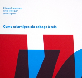
José Scaglione
Assistant type design
Patrycja Walzcak
Engineering
Joancarles Casasin
Quality assurance
Yorlmar Campos
Graphic design
Elena Veguillas
Patrycja Walzcak
Felicia Priscillya
Motion design
Cecilia Brarda
Copywriting
Joshua Farmer
Douglas Arellanes
Social media manager
Douglas Arellanes