Typetogether - Newsletter
NEWSLETTER: FEBRUARY 2020
LFT Arnoldo new!

LFT Arnoldo font: Engraved upon our emotions

Renowned Italian strategy and design firm, Leftloft, have released another font family, LFT Arnoldo — a captivating vehicle of aesthetic expression in a flared humanist sans typeface. Begun as an all-caps titling font and expanded to a 14-style family, LFT Arnoldo is an editorial family whose natural environment is the printed page. Its engraved details make the typeface remarkable in large sizes and maintains legibility in paragraph sizes, and the 60% introductory discount makes it a must-have deal. Use the desktop type tester to see the range of LFT Arnoldo — a companion to the centuries.


TRY THE FONT ONLINE
Tips on Type selection

Choosing the right typeface

You probably know that it’s easy to use a serif and sans within the same family, but is that all designers need to know about selecting an appropriate typeface? Veronika and José weigh in with their considerable knowledge about how to choose the right font family for your next project. Check out the article and, if you have any other questions about it, send us an email or ping us on socials.


READ MORE
Laima wins TDC

Laima wins TDC’s Certificate of Excellence

Bogidar Mascareñas released his Laima family just a few months ago and it’s already making headlines — not just in how it’s being used, but also in the recognition it is receiving. This calligraphy-inspired stencil has just been awarded by the Certificate of Excellence by the TDC, the prestigious foundation that honours exemplary work in type design. Our thanks to the judges and a huge congratulations to Bogidar!


READ MORE
Adelle Ötztal

Iconic destination Ötztal revived with custom branding

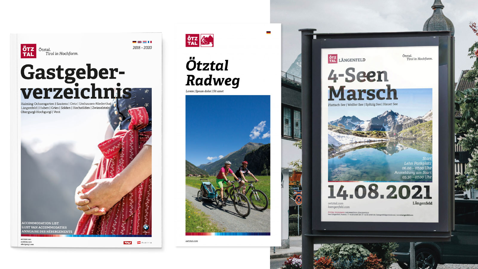
The famous holiday destination, the Ötztal valley in the Austrian Alps, got an extensive brand overhaul including a customised version of our Adelle and Adelle Sans font families. Geographical and cultural research, along with wide experimentation, yielded a host of special characters and ligatures that carry relevant meaning and a distinct look necessary to define “a brand”. The tailored typeface is used for their magazine, posters, advertising, business cards, maps, and all other touchpoints. The entire implementation won agency Norden the prestigious 2020 German Design Award.


READ MORE
Fino Sans TIU

Fino Sans featured at Kubin’s Salzburg exhibition

Ermin Međedović’s typeface Fino Sans is featured at the exhibition devoted to artist Alfred Kubin at the Salzburg Museum. According to design firm Mooi, they chose Fino Sans because it was a contemporary display sans serif with dramatic contrast. We trust Kubin would be proud of how the entire exhibition came together.


READ MORE
Copyright ©2006–2020 TypeTogether. All rights reserved.

https://www.type-together.com/