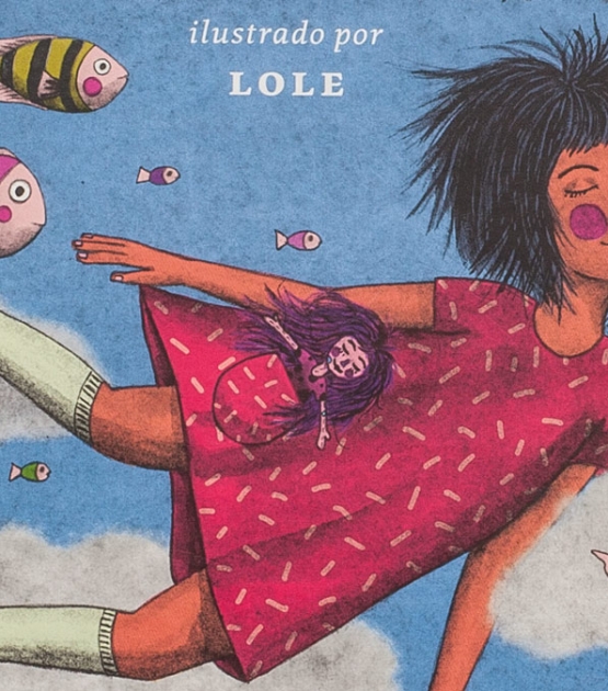
A poetically joyful text typeface from calligraphic roots.
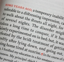
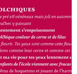
Eduardo Berliner’s Pollen typeface finds a perfect balance between technical excellence, careful design of letterforms for extended reading, and a measured dose of charm and personality. Its informal feel allows for successfully typesetting a wide range of applications, from websites and magazines to fiction books and advertising.
Pollen is the result of mixing traditional and digital processes. Calligraphy, be it done with the broad nib pen, the brush, or other tools, was fundamental in Pollen’s development. Its influence is clearly visible in the construction of the top serifs, the curved bottom serifs, and the fluid aspect of terminals and tails such as on ‘g’ and ‘r’. The shapes of the diagonal letters are based on a less formal calligraphic model, but still use the broad nib pen. The glyphs were then subjected to a further process of pencil drawing and digital reinterpretation to settle their final shape.
In Pollen, calligraphy meets regularity; softness melds with vibrant writing speed. Pollen is equal parts vigorous and sensuous, and the italics only accentuate the speed. The lowercase ‘e’ and ‘c’ are derived from one continuous line, and the letters ‘g’ and ‘y’ bring informal and charming elements to a typeface intended for long text reading — a trait usually characteristic of casual handwriting rather than serif typefaces. Pollen’s wide stance, low stroke contrast, long serifs, and relaxed tracking give the face a mix of confidence and gentility at once.
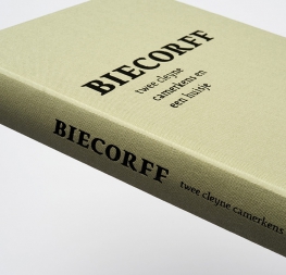
Pollen perfectly serves the most common typographic needs with a focused palette of its four styles and many OpenType features (small caps, arrows, ornaments, ligatures, info-numerals, fractions, arrows, dingbats, superior letter, stylistic alternates, and much more). The complete Pollen family, along with our entire catalogue, has been optimised for today’s varied screen uses.