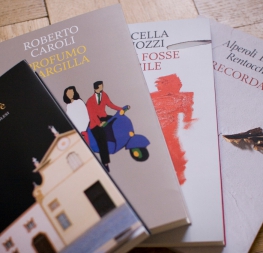
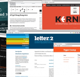
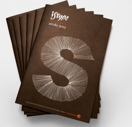
An elegant font family for books, successfully used both on screen and in print.
Inspired by Britain’s classic literature and created by Veronika Burian and José Scaglione, Athelas prioritises the beauty of fine book printing and makes it available digitally and in printed form. It takes full advantage of typographic tranquility — the white space in the margins, between the columns, the lines, the words, and finally within the characters themselves. Athelas breathes peacefully on the page to usher the reader into the wordsmith’s art.
Athelas is a typeface with open counters, elegant curves, and graceful serifs. Fluid shapes in the roman variants meet their counterpart in a more angular italic, but there are no sharp edges in the entire character set. Athelas also takes advantage of the technical developments made in offset printing. It shows its best side in finely crafted books and high quality printing conditions, or in digital works that place a premium on the tone and beauty of the piece.
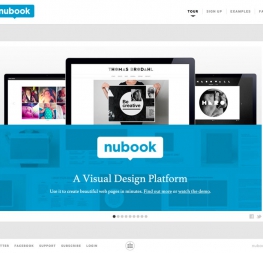
Although inspired by British literature, Athelas respects the cultural needs of languages where diacritic marks play an indispensable role. It has a large character set covering most Latin-based languages, as well as monotonic Greek (designed by Irene Vlachou) and Cyrillic (designed by Tom Grace). As recognised by its use in Apple Inc.’s iBooks app and the desktop operating system Mavericks, the complete Athelas family has been optimised for today’s varied screen uses, along with our entire catalogue.


