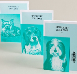
The Abril font family is a credible, contemporary interpretation of a classic newsface, engineered for comfortable, continuous reading in printed and digital environments.
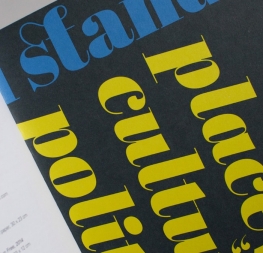
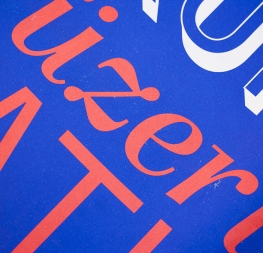
Created by Veronika Burian and José Scaglione specifically for intensive editorial use in newspapers, magazines, and digital media, the Abril font family is of two worlds. The Display styles, based on a contemporary revamp of classic Didone models, have a strong presence on the page without overwhelming the reader with forms that are either unfamiliar or too captivating. Abril Display holds the reader’s attention with measured tension in its curves, good colour, and high contrast. It also features typographic niceties such as ornaments, borders, special dingbats, and alternate letters and numbers that provide a broad palette for the designer’s needs.
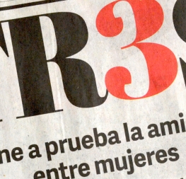
To maintain consistency with the Display styles, the styles of Abril Text give the initial impression of having the same shapes but with lower contrast. At first they may look practically identical, but it is these details which smooth the transition from one font family to the other as well as distinguish them from each other. The Abril Text fonts take inspiration from both 19th century slab serifs and Scotch Roman typefaces, rather than the Didone-style lineage used for the Abril Display fonts. This heritage makes the text darker and with less contrast than the display, which is exactly what each needs.
The letterforms of Abril Text were engineered from scratch to achieve the right colour, texture, and overall width for comfortable, continuous reading in the most challenging environments. This makes it a great type family for newspapers, pocket books, annual reports, and magazines. In terms of space economy, Abril Text competes head to head with such newspaper classics as Utopia and Nimrod, but features a more contemporary look and feel; and improving upon the classics, Abril Text includes a full set of small caps with numbers and punctuation.
The Abril font family consists of 10 text styles and 12 display styles, all of them containing the standard TypeTogether character set that supports over 50 languages, including those from Central and Northern Europe. Abril has dual use in printed and digital environments, so it has consistently been used for top websites and editorials since its introduction. The complete Abril font family, along with our entire catalogue, has been optimised for today’s varied screen uses.