Variable Fonts for all
Variable fonts are an OpenType font format offering unique typeface customisation. As described in the 2016 official announcement, variable fonts are a “single font file that behaves like multiple fonts.” The variable font format therefore allows graphic designers to adjust typeface properties such as width, weight, optical size, and slant. Designers can define custom instances of a typeface anywhere within the total ‘design space’ of the font family instead of only selecting one of the predefined styles, such as bold, extrabold, or bold italic.
Type designers already had this kind of infinite design flexibility and versatility at hand in various font editing tools, but it was unleashed into the hands of all digital type users when Adobe Photoshop and Illustrator started to support variable fonts in 2017.
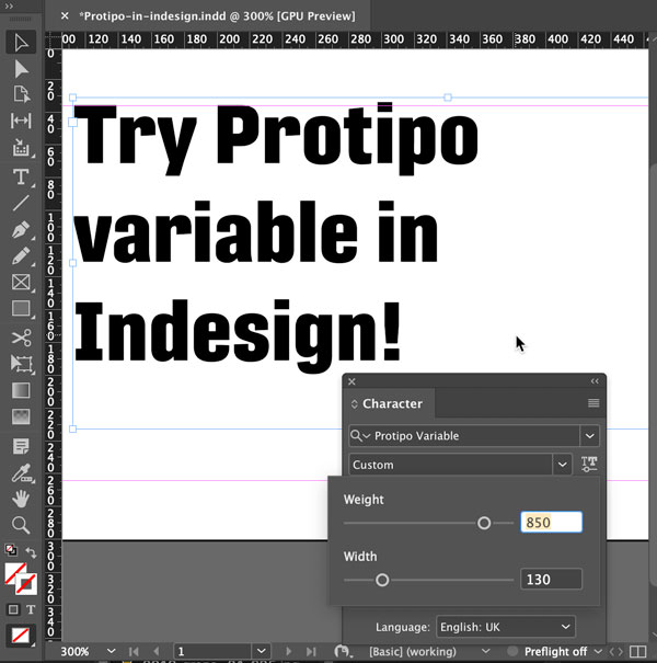
Irene Vlachou, type designer of TypeTogether type foundry, explains: “Variable fonts are basically the same as a standard TTF or OTF file, but which contains information about multiple styles of a traditional font family and requires the user to install only one file. This compressed file has many advantages, from the clean and easy instalment of just one font file to easy navigation between styles.”
“One variable font contains all the styles of a traditional family,” says Vlachou. “Apart from the named instances, the user can navigate smoothly around the entire design space of the font — the ‘in-between’ stages of the design such as a weight anywhere between semibold and bold, or a width anywhere between condensed and expanded.”
Vlachou explains the interpolative benefits of the variable font format. “These ‘in-between’ styles aren’t defined by the type designer as such, but the type designer has explored the design space of this font family and made the required adjustments in the master styles of the family in order to avoid bad interpolations of weights, widths, styles, and such that don’t make sense to exist.”
How variable fonts work
For instance, the creator of a variable font sets one parameter at each of the extremes for a typeface’s weights; one parameter is at the font’s thinnest weight and one at the heaviest, and the font cannot extend beyond those poles. So when a designer is developing the UI for an app, instead of only choosing either the semibold or bold, they could select a weight anywhere on that thin-to-heavy spectrum — even if it’s somewhere between a semibold and bold. This means that the user now has almost infinite control over the weight, width, and overall style of the font’s appearance in their design.
Moreover, these settings can be defined within the app to render differently based on the detected screen, browser, pixel density, ambient lighting, dark mode usage, and much more. These interpolated font weights and their dynamic interaction with a range of changing criteria is the future of typesetting and UI design.
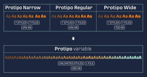
Vlachou highlights another important feature of variable fonts: space-saving ability. “Another advantage of the new variable font format, and for many the greatest advantage, is the small size of the file. This makes it more usable for online typography, small digital products like a watch, for low bandwidth usage for developers, and embedding in applications.”
|