TypeTogether’s first 2021 newsletter is here! This month we have an exciting new release, an interview with Anya Danilova, and an overview of last year’s events.

Typetogether - Newsletter
NEWSLETTER: JANUARY 2021
Belarius, new release

A few years ago Veronika Burian & José Scaglione decided to build a three-family story arc that would encompass the demands of skilled text designers. Belarius is the sans and slab serif middle release of that planned triptych, able to claim its own bright spot on the release charts and also be appreciated as part of the trilogy. Belarius is by nature restrained to fulfill its midrange purpose: packaging, headlines and subheads, advertising, decks, and pull-quotes. And its variable font technology means you are able to fine-tune adjustments for perfect copy, every time.


SEE THE FONT
A summary of TypeTogether’s 2020

That was 2020

Each year we look back to catalogue our achievements and evaluate our effectiveness across our small independent company. As our subscriber, we like inviting you to share in our successes and to see where we are headed next. To answer that question: full speed ahead!


TAKE A LOOK BACK
Interview with Anya Danilova, 2020 Gerard Unger Scholarship winner

“No one achieves anything alone”

Anya Danilova is the Russian type designer who won the 2020 Gerard Unger Scholarship for her Rezak typeface. In this interview we discuss her design history and working together versus working alone.


GO TO THE INTERVIEW
Legibility and typography: the composition of texts, Legibilidad y tipografía: la composición de los textos, is the new book by Horacio Gorodischer and José Scaglione

Legibility and typography

Riding high on the success of his first collaborative book How to Create Typefaces, José Scaglione has partnered with Horacio Gorodischer to release Legibilidad y tipografía: La composición de los textos (“Legibility and typography: the composition of texts”; Spanish only for now). Fonts often become invisible because we use them so much. Written both for students and seasoned professionals, this book discusses how we know typefaces really work, testing them, the rationale behind the type selection process, and more.


SEE THE BOOK
Athelas in use in the book A little-known story about a movement, a magazine, and the computer’s arrival in Art: New tendencies and Bit International, 1961–1973

Type in use: Athelas makes historical statement

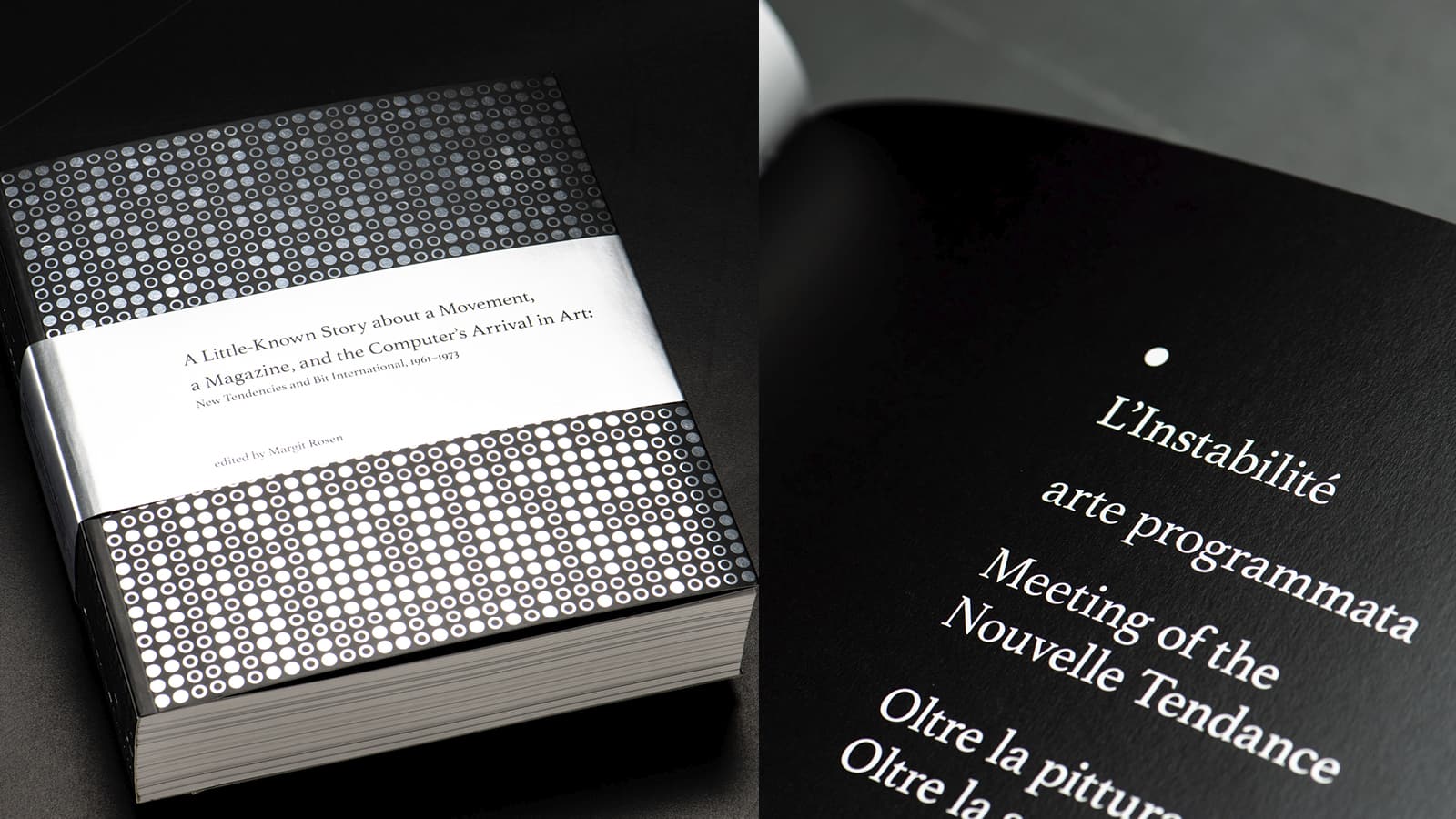
The book A little-known story about a movement, a magazine, and the computer's arrival in art presents over 1,000 pages of research and examples that defined the computer’s entrance into modern (for the 1960s, at least) art and the sciences. The Croatian avant garde scene was the epicenter for using new technology, and this deep dive exposes readers to that 13-year experiment, using the Athelas font family for the entire work.


READ MORE
Copyright ©2006–2021 TypeTogether. All rights reserved.

https://www.type-together.com/
						
To stop receiving these emails click here